In the dynamic world of interior design, the principles of positive and negative space are akin to the artist's brushstrokes on a canvas, shaping the aesthetic and functional essence of a space. As we delve into the realm of interior design drawing, these fundamental concepts take center stage, serving as the blueprint for creating spaces that are not only visually stunning but also harmoniously functional. Let’s dive deeper in this article.
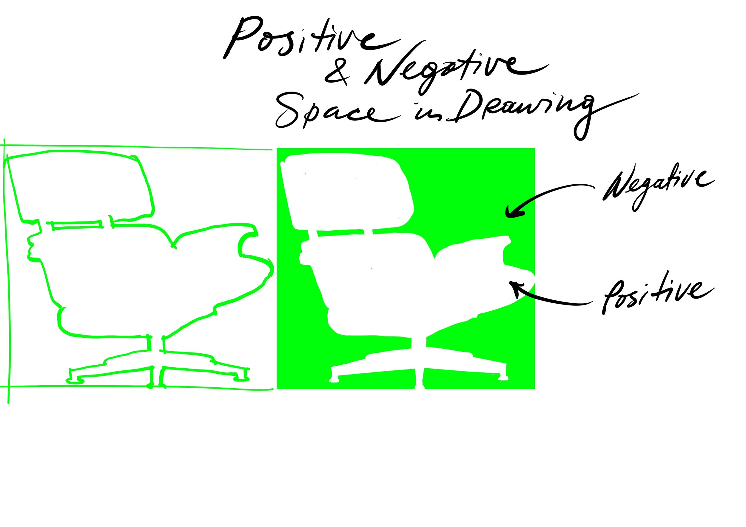
Positive Space: Where Design Comes to Life
In the realm of interior design drawing, positive space constitutes the tangible elements that define and fill a room. Imagine the furniture, fixtures, and decor items—the elements that breathe life into the design. When sketching an interior space, positive space is the canvas upon which the designer articulates their vision, carefully placing each item to create a cohesive and purposeful environment.
Negative Space: The Unspoken Elegance
As the unsung hero of interior design, negative space plays a pivotal role in enhancing the overall aesthetic. It's the open floor space, the unoccupied walls, and the areas around and between furniture. In the realm of drawing, it's the blank canvas that allows for the articulation of design, contributing to the sense of openness, flow, and balance within a room.
Strategic Applications in Interior Design Drawing:
1. Furniture Choreography:
- The arrangement of furniture is a dance between positive and negative space. In your drawings, consider how each piece contributes to both functionality and visual appeal, creating a symphony of form and function.
2. Navigating Traffic:
- Intelligently managing negative space ensures smooth traffic flow within a room. It's about creating paths that are free from obstruction, fostering a sense of ease and practicality in the design.
3. Harmonious Balance:
- Achieving the perfect equilibrium between positive and negative space is the key to a visually stunning interior. Striking this balance prevents a space from feeling cluttered or sparse, fostering a sense of visual delight.
4. Artistic Framing:
- Negative space acts as a framing device, directing attention to architectural features, artwork, or designated focal points. It's the whitespace that enhances the significance of design elements within your interior composition.
5. Visual Comfort:
- A well-considered distribution of negative space contributes to visual comfort. It ensures that a space is inviting, providing individuals with the freedom to relax and engage with the environment.
6. Spatial Symphony:
- Mastering the interplay between positive and negative space is the art of spatial planning. It involves not just meeting functional requirements but doing so in a way that captivates the eye and evokes a sense of balance.
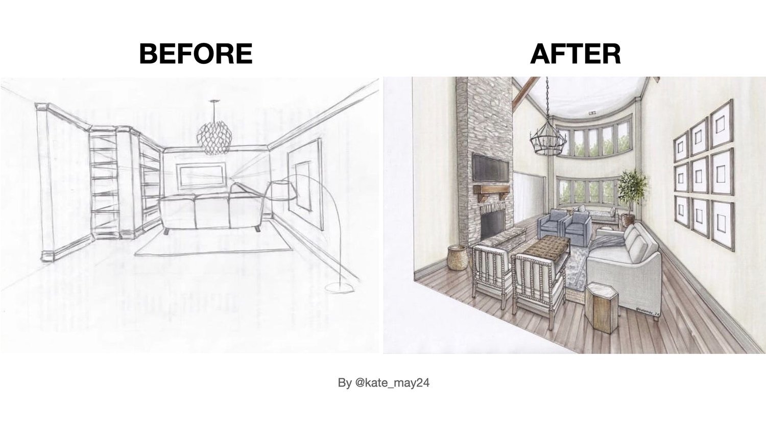
In the realm of interior design drawing, understanding the dance between positive and negative space is the hallmark of a skilled designer. Just as a maestro conducts an orchestra, an adept designer orchestrates a symphony of elements on paper, setting the stage for a beautifully realised interior. As you embark on your design journey, let positive and negative space be your guiding notes, creating spaces that are as functional as they are visually captivating.
(Quick note) Elevate Your Gallery Experience:
As you embark on your design journey, consider applying the principles of positive and negative space to your appreciation of art. The next time you visit an art gallery, focus on the negative space in the paintings. Notice how the deliberate use of empty space enhances the impact of the artwork, guiding your gaze and influencing your emotional response. You'll find that this heightened awareness transforms your gallery experience, allowing you to see and appreciate art in a new and enriching light.
Happy sketching!
Olga Sorokina


