Interior Design

Redefining Interior Designer's Profession: iPad Drawing, White Space and Personal Brand | Interview with Henry Gao

Welcome to another episode of my podcast!

Meaningful conversations with architects, artists, and designers.


Meet my today’s guest — Henry Gao from YouTube @HenryGao

Henry is a home designer, YouTube creator, architecture photographer, and illustrator. His new passion is teaching online iPad drawing for architects.


“Today, I am a San Francisco-based home designer, illustrator, artist, and photographer. I take every bit of inspiration from my childhood into my everyday work. I don’t just design spaces – I tell stories through them.”


In our conversation, Henry redefines the path of architects, focusing on personal brand and creativity over traditional norms. He encourages architects to explore new roles by matching their interests with possibilities. Managing various roles, Henry shares tactics to prevent burnout and maintain a fulfilling career. We also discussed top drawing apps for iPad, making design easier across different project stages.

In his interview with Eric Reinholdt from "30X40 Design Workshop", Henry shares the art of creating "white space" amid architecture commitments. Architects are guided to find time for learning, exploring, and testing new things. Link to that interview: here

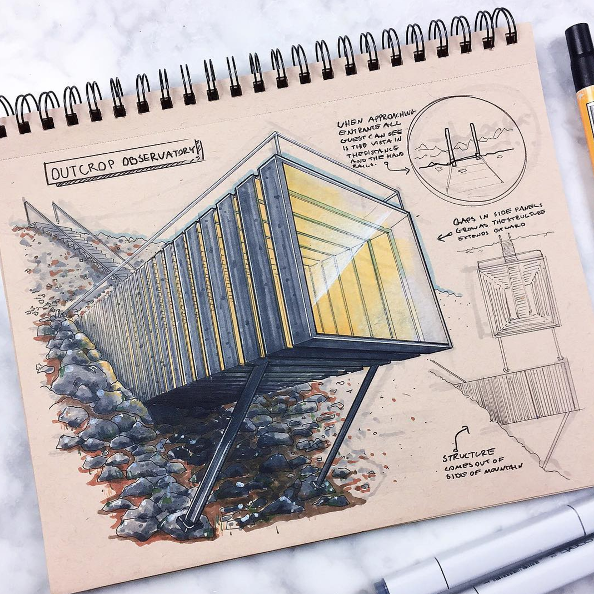
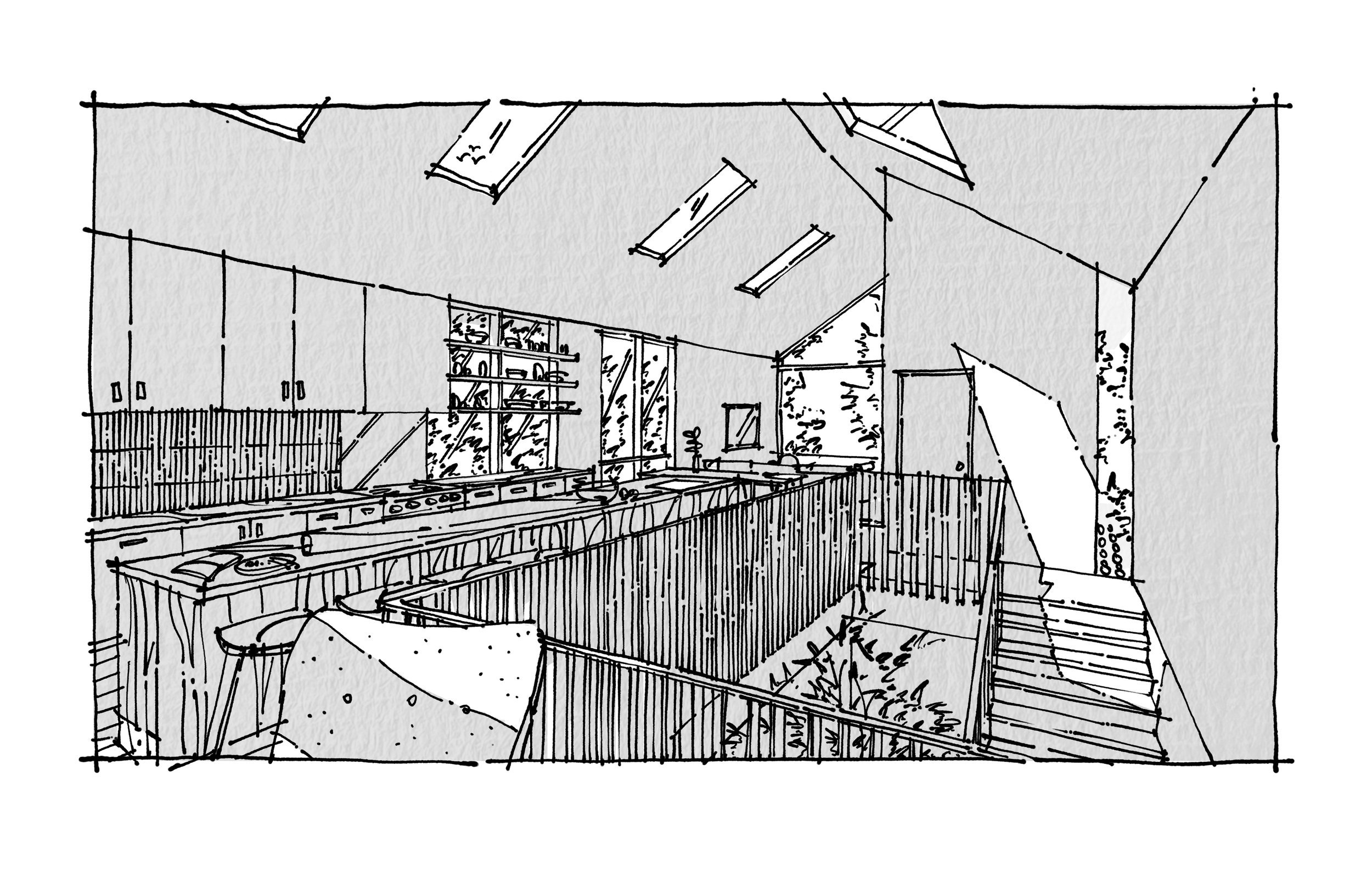
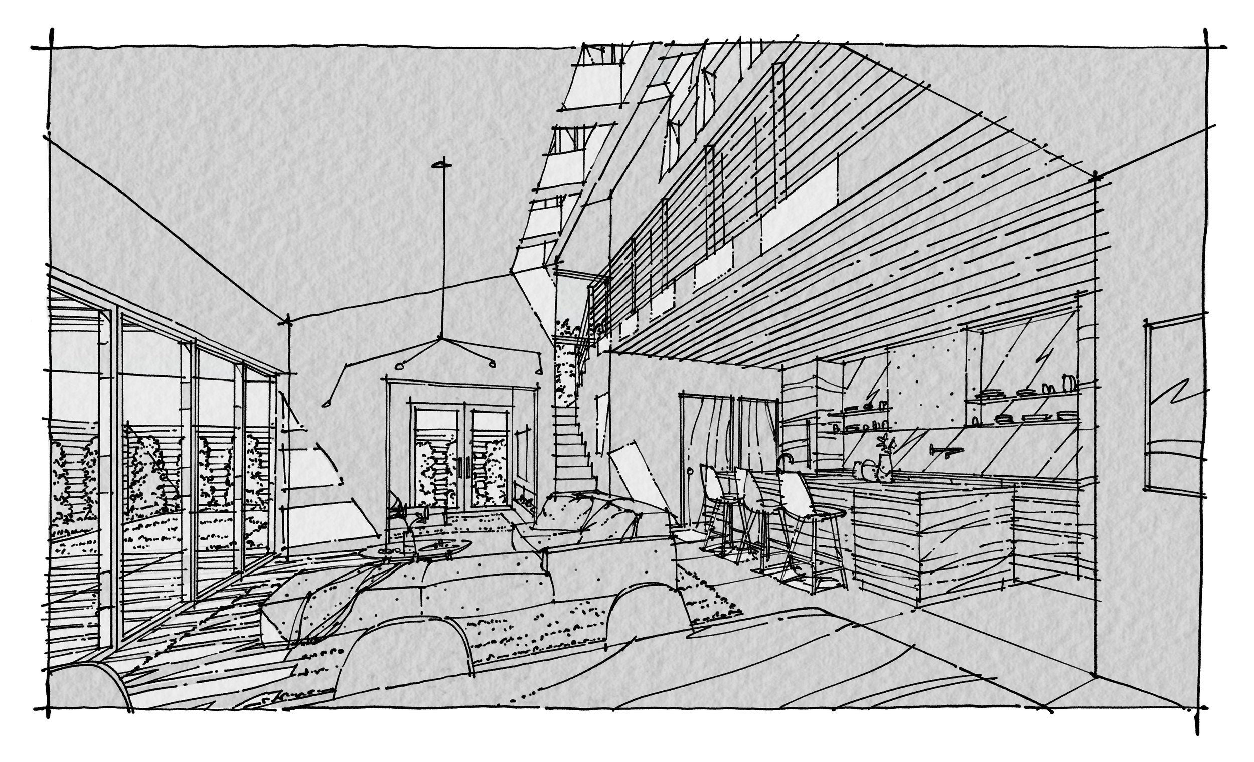
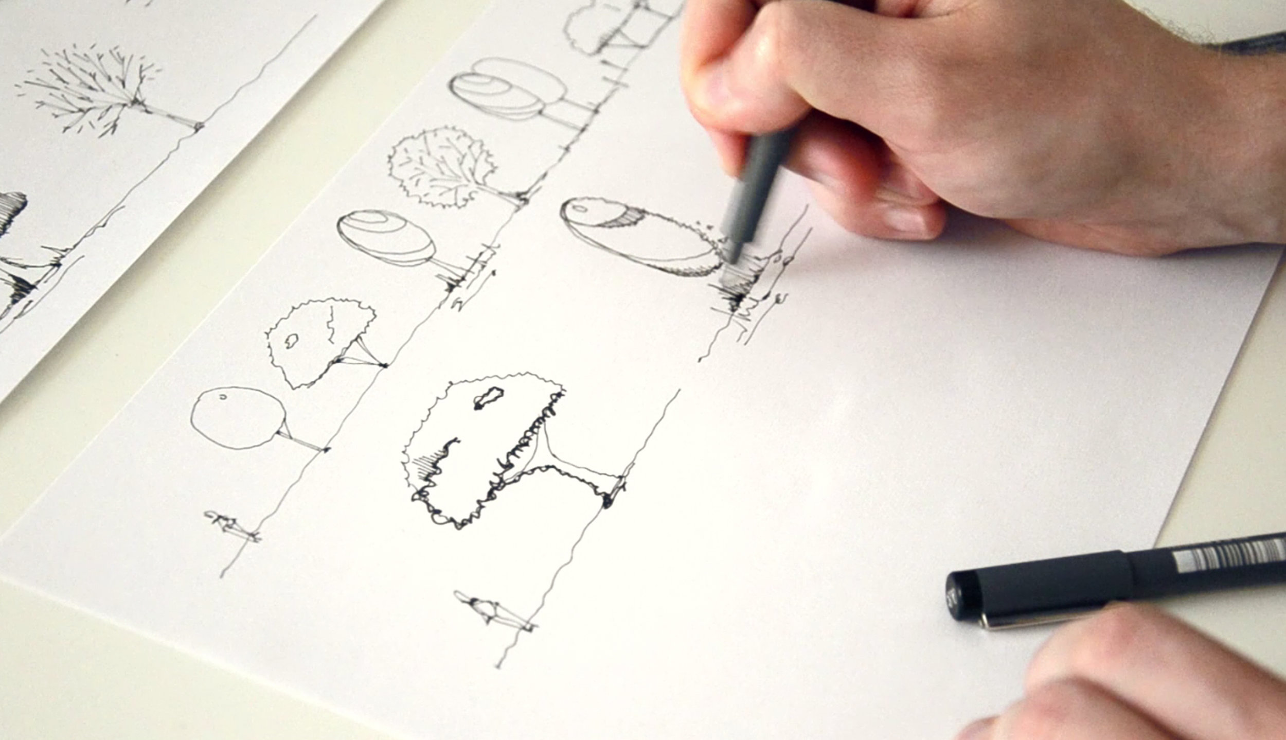
Drawings by Henry Gao, learn about sketching on iPad from Henry in his workshop: here


Watch also Henry’s video "My 4 Streams of Income as an Architectural Designer” :


Stay connected with Henry online:

Website: www.henrygao.com

Instagram: @drawwithgao

YouTube: @HenryGao


Interview with Henry Gao by Olga Sorokina.

P. S. Please share this interview with someone you know will benefit from it.


CHECK MY OTHER PODCAST EPISODES:


check latest articles on MY BLOg:

What is the future of interior sketching? | Interview with Jessika visualisieren.koennen.alle

Welcome to Olga's podcast!

Meaningful conversations with architects, artists, and designers.

Meet my today’s guest — Jessika from Instagram @visualisieren.koennen.alle


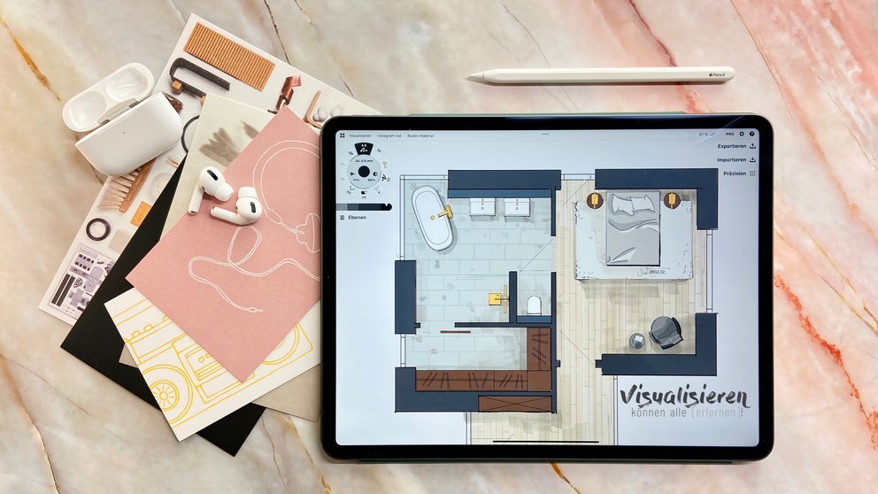
We had such a sparkling and inspiring conversation with Jess about interior sketching, the best apps for sketch artists, AI in interior design, and we even came up with amazing insights on the future of interior sketching.

Floorplan by Jessika


About Jessika:

Miss Interior Architect (Frau Innenarchitektin) Jessika is an Interior architect from Germany, she has been drawing in the field of interior design since 2007. Jessika also teaches sketching techniques on iPad for interior design at technical school and with her online courses.

Here are a couple of questions we’ve discussed:

1 Jessika, I won’t ask you digital or analog. I will ask you digital BUT analog. How have visualizations changed? Which possibilities for sketch artists already exist or may be possible in the near future?

2 Jessika, you have started teaching interior sketching at school, right? What are your insights?

3 I know you love using mood boards for your sketches. Could you please tell us more about why it’s important?

4 Your advice for beginners: Morpholio? Procreate? Concepts? What would you recommend?

5 Jessika, what are your thoughts on AI in interior design?

6 What is the future of interior sketching? How does it look in your opinion?

7 Jessika, you have a couple of online courses on interior drawing, please tell us more about it.
 

P. S. Please share this interview with your friends.


CHECK MY OTHER PODCAST EPISODES:


CHECK LATEST ARTICLES ON MY BLOG:

Interview #5 with Richard Chadwick, hand renderer from Manchester

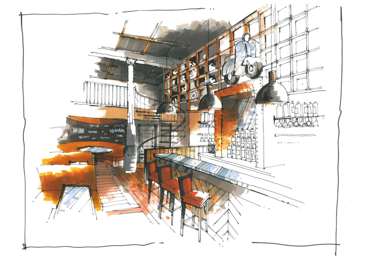
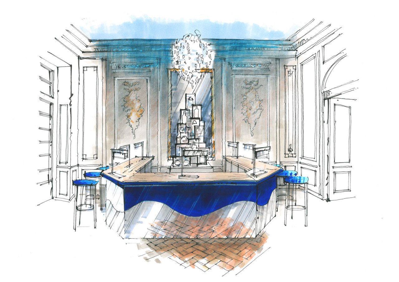
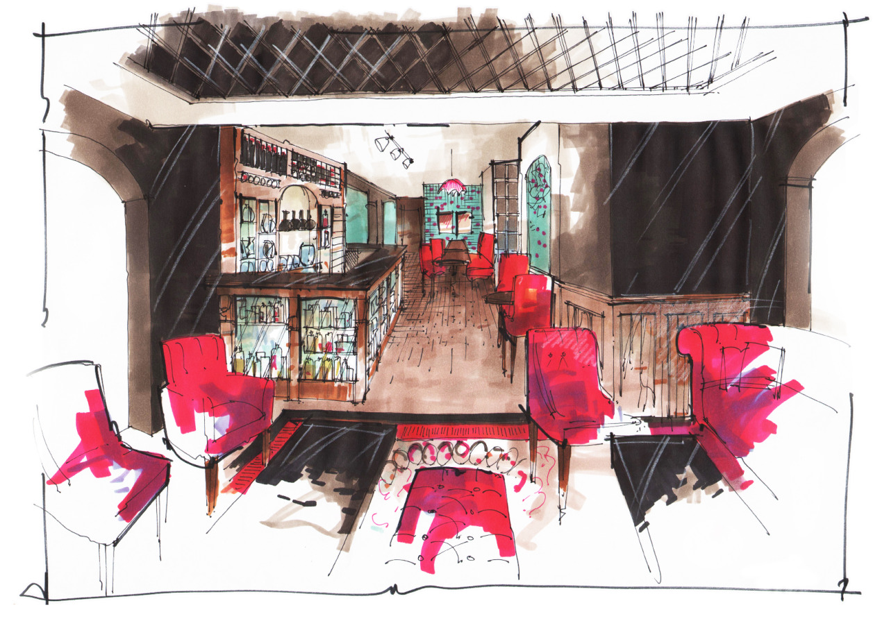
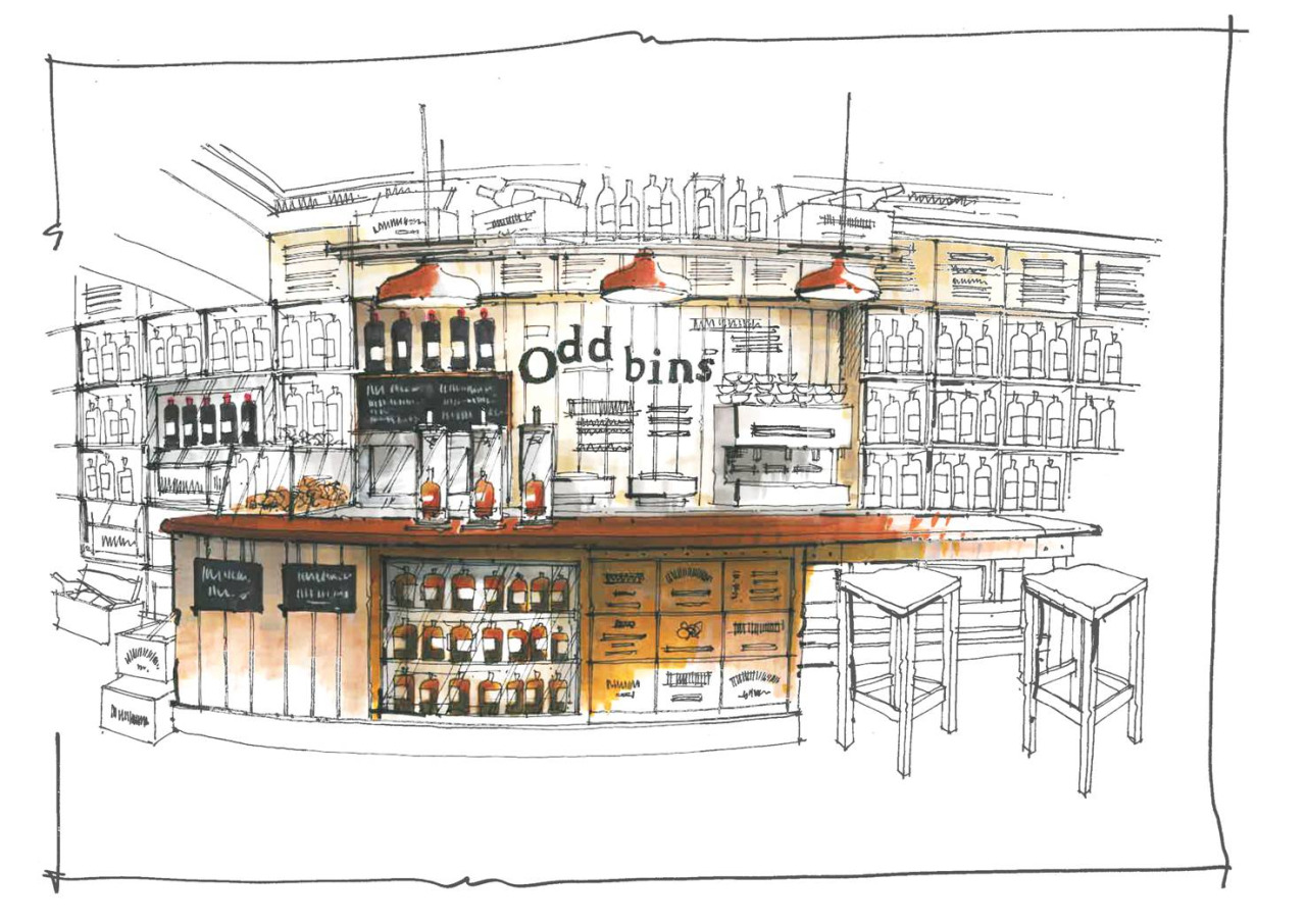
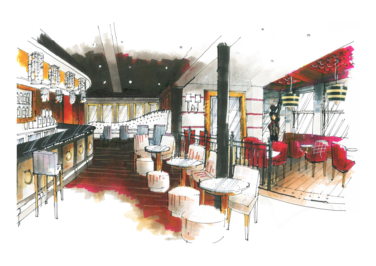
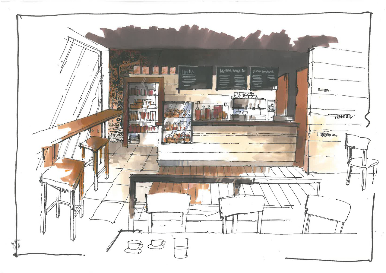
Richard Chadwick sketches

With a background of over forty years working as a designer in the Leisure Industry, Richard is now concentrating on producing interior and exterior sketches for the leisure sector (bars, restaurants, coffee shops, branded outlets, corporate events).

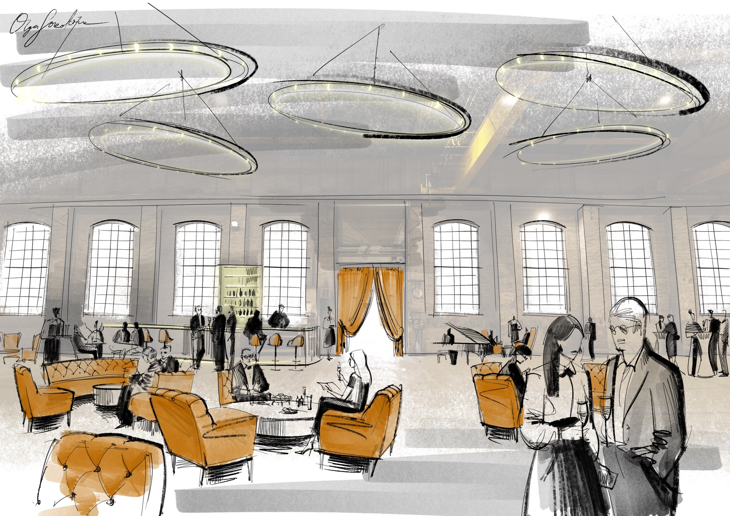
As an antidote to the ubiquitous – and to his mind anodyne – computer produced visual, Richard's are all drawn by hand, mainly pen and marker renderings, capturing the energy of the moment and generally looking far more dynamic than anything produced by a computer programme.


Richard's website: www.interiorsketches.co.uk

Richard Chadwick sketch

1. Olga Sorokina (O. S.): Richard, could you please tell us how did you come to interior design and what was your initial step in hand rendering?

Richard Chadwick (R. Ch.): I went to art college here in the UK in the 1960’s, when interior design was only just starting as a profession , and the Leisure Industry didn’t exist as such, so basically there were no road maps – we made it up as we went along. I was lucky enough to get in with a design practise my tutor was setting up, specialisingin pubs, so it went on from there, really. 

Set up by myself with a partner in 1980, and he couldn’t draw so I had to teach myself how to draw visuals. They were quite rough to begin with but for some reason I seemed to be good at it, and as I still do all the visuals for the practise I get to do a lot. It was just a question of sitting down and working it out.


A return to hand crafted values offers a way forward from an entirely technologically based society and the tactile feel of pencil on paper has its own reward.

2. O. S.: Your style is very bold and recognisable: partial colour filling, focusing on the central part of the composition, freehand lines, no rulers. Could you please tell us about media you use and how it affects your approach if it does.

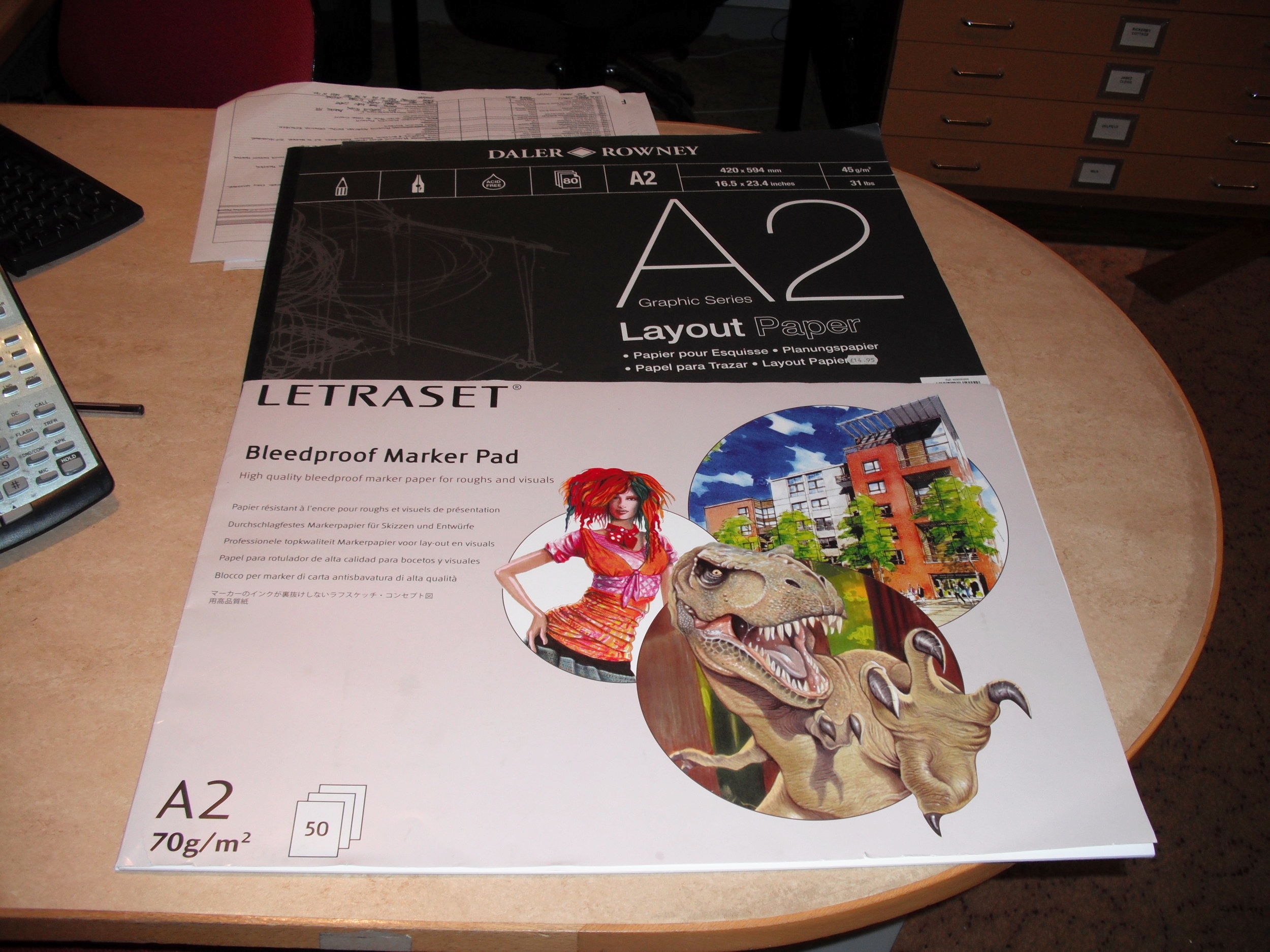
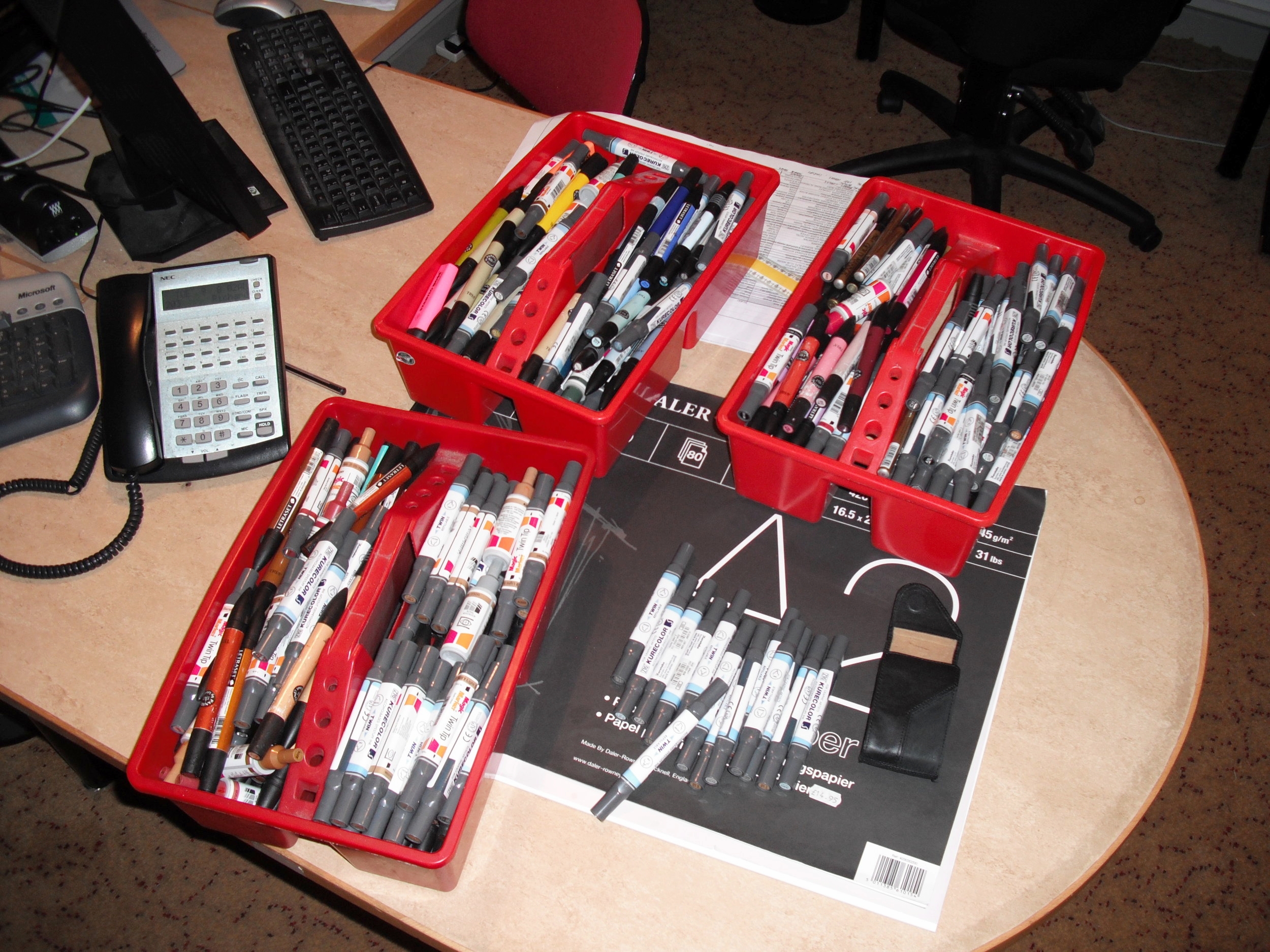
R. Ch.: Well, this has developed over the years, but I soon realised that there is no point in colouring the whole of the sketch, as it just looks too flat – better to get some depth in by focusing in… and colouring the whole sketch takes too much time. I use layout pads and markers, which are great as they are a dry colour but you can blend, they are not a flat colour but transparent to a degree so you can work over one colour on another, and they have their own distinctive ‘ shape ‘ to a mark… and they are quick. I use a lot – see attached pics.

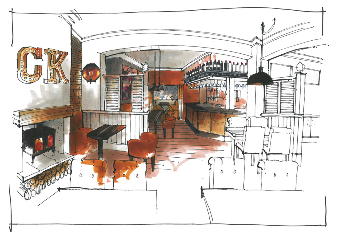
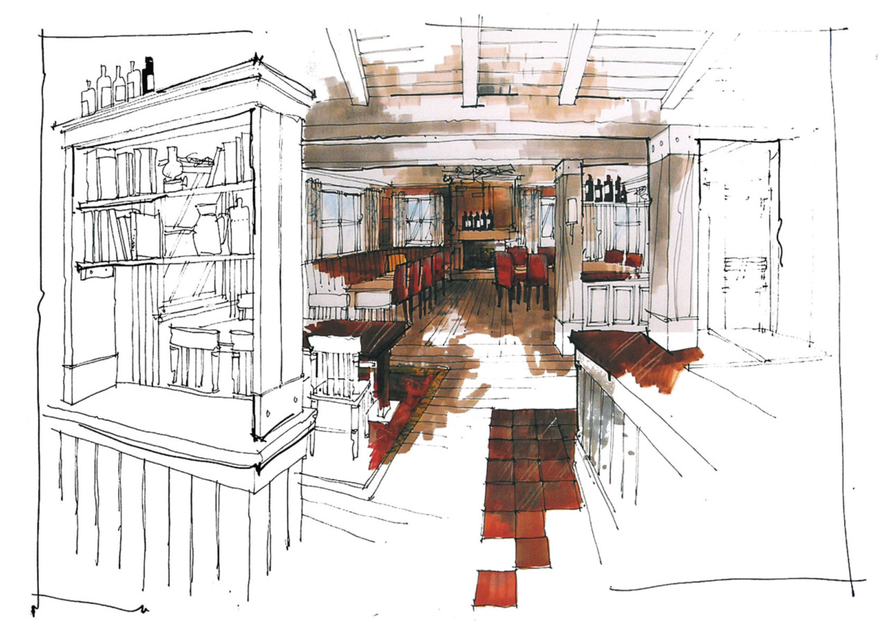
3. O. S.: Could you please describe your process of creating sketches (and how long does it take), for example this one:

Richard Chadwick interior sketch

R. Ch.: Basically I use a thin layout paper, rough out the outline and then lay another sheet over it as you can see the fain marks through it, then i just start to draw in more detail, so I might end up with six sheets on top of each other, each one more detailed than the last. Then I put one sheet of bleedproof paper over the top, do the finished sketch and then colour. The process is pretty fast; the sketch you showed in your email probably took 2 hours to draw max and possibly an hour to colour? Say two and a half hours. Its important to work quickly as it captures the energy. 


As fewer and fewer students are taught to sketch, the ‘hand drawn‘ becomes a premium skill, providing that sense of the personal, the emotional response to a brief that a mechanical interpretation can’t.

4. O. S.: How do you structure your workday or your workweek? 

R. Ch.: Basically there is no structure. I just do what needs to be done next. We have quite a few jobs on as a design practise, so i am working currently on a pub with 10 bedrooms that has to be finished by April and another new hotel in Manchester with 20 bedrooms. I also have to produce in the next week four sketches of a wedding venue for a client in Los Angeles, and another designer wants a couple of sketches for a pizza restaurant in London. Apart from this, I have an exhibition of other artwork opening next week. Workload varies from day to day, week to week and there is no structure as such. For example, my next week structured as follows:

Monday – site meeting for hotel 8.00 am, then design studio, then back home sketching for a wedding venue

Tuesday – design studio and detailing for hotel, the afternoon putting up exhibition in gallery

Wednesday – design studio, then to a pub site to see furnishings contractor, then at home sketching

Thursday – home sketching, then hotel site, then collecting framed artworks, then more sketching

Friday – home sketching, then sketching in gallery

Saturday – home sketching finishing 4 wedding venue sketches, then in gallery doing coffee shop sketch

Sunday – finish coffee shop sketch for client for Monday. Sleep.


Its important to work quickly as it captures the energy.

5. O. S.: Richard, please tell us about your sources of inspiration. What helps you to be productive? 

R. Ch.: Tom Waits / Bob Dylan / magazines / films / long hill walks to clear my head / coffee / Chris Ware / Tiepolo / Rauschenburg/ Tatlin / Alan Moore… 

6. O. S.: How do you see the future of hand rendering in interior design?

R. Ch.: As fewer and fewer students are taught to sketch , the ‘ hand drawn‘ becomes a premium skill, providing that sense of the personal, the emotional response to a brief that a mechanical interpretation can’t. It might become a niche skill, but it will still be a sort-after niche skill.

7. O. S.: What one advise would you give for beginners in hand rendering?

R. Ch.: Look, really look. Practise. Find your own style. Practise. Don’t be precious, it’s only a visual.

Practise. Practise. Practise.


Interview with Richard Chadwick by Olga Sorokina.

P. S. Please share this inspiring interview with your friends, they will be glad you did. Thank you!


Read more interview:

Interview #3 with Tami Faulkner, interior designer and instructor from Northern California

Hand rendering interior design space planning

Meet Tami Faulkner, a Northern California based Interior Designer. She began assisting clients with their design needs in 2000 after graduating with a Bachelor of Fine Arts in Interior Design from California State University, Chico. Her work experience includes commercial, corporate, healthcare, and residential design projects. Tami's speciality is residential remodels: particularly kitchen and bath design. She also designs furniture and does some graphic design. Currently Tami teaches hand rendering seminars for both professional and student designers.

Tami Faulkner

1. Olga Sorokina (O. S.): Tami, could you please tell us how did you come to interior design and rendering and what was your initial step in hand rendering?

Tami Faulkner (T. F.): Drawings and renderings are just a part of the design process. As a design student it was the means in which I learned to design, problem-solve and communicate ideas and so naturally those skills became critical to my design approach as a professional.

2. O. S.: According to your Instagram it looks like your favorite part of design work is ideation on paper using furniture plan and concept board, so what does hand rendering and space planning mean to you?

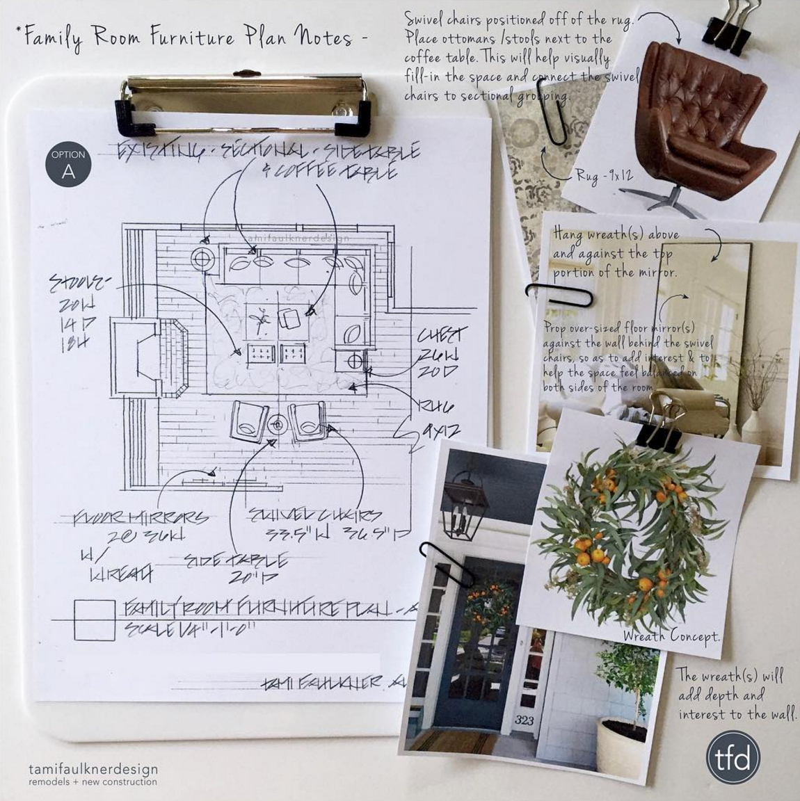
T. F.: The way I see it, space planning is the foundation of any successful design project. It’s critical to understand and know the existing space and the potential for new space, to be able to offer valuable solutions for the client.

space planning interior design

3. O. S.: How do you structure your workday or your workweek?

T. F.: My work days and work weeks are a careful balance between client appointments, onsite visits, research outside of the studio and time in my studio. Although all of these steps are essential to moving a design projects along, I always feel like my time is more productive while in my studio, when I’m actually producing and designing.

4. O. S.: Please tell us about your sources of inspiration. What helps you to be productive?

T. F.: My initial source of inspiration is the client themselves. Along with knowing the space, I try to understand how the client thinks, how they live and what inspires and pleases them. And from there I set to work to come up with creative, yet practical solutions.

Hand renderings add polish and warmth, making the design presentations more appealing to the clients. That appeal helps as a selling tool too, with being able to present design ideas in a pleasing way.

5. O. S.: I have noticed in your Instagram some photos from your Rendering Workshops for creatives, what does it mean to you to share your knowledge?

T. F.: Yes, spending time teaching and mentoring other designers is a highlight for me. I love spending time with creatives and for the energy, enthusiasm and renewal of spirit that I get from other designers.

6. O. S.: How do you see the future of hand rendering in interior design?

T. F.: Interesting question... How do I see the influence of hand rendering in the future of design? Honestly, I have been surprised by the interest designers have in learning a skill that is hardly taught in design school today. That said, there seems to be a push and a rekindled interest in including an artful, hand produced feel to otherwise computer-aided presentations. There is a sense of authenticity that hand rendering adds to a design presentation that is hard to match by using a computer. Hand renderings add polish and warmth, making the design presentations more appealing to the clients. That appeal helps as a selling tool too, with being able to present design ideas in a pleasing way.

Space planning is the foundation of any successful design project. It’s critical to understand and know the existing space and the potential for new space, to be able to offer valuable solutions for the client.

7. O. S.: What one advise would you give for beginners in hand rendering?

T. F.: To those who want to learn hand rendering, I would say to start by following other designers who’s hand rendering styles are admired. Analysis, look at it carefully and consider how they do what they do, and then try to implement the same approach while putting a unique spin on it.
Interview with Tami Faulkner by Olga Sorokina.

P. S. Please share this inspiring interview with your friends. Thank you!


To learn more please visit Tami's website: tamifaulknerdesign.com

Tami's Instagram: tamifaulknerdesign

Interview #2 with Apisit Chuldecha, hand renderer from Hong Kong

Hand Rendering interview Apisit Chuldecha

FIRST IMPRESSION FROM his HAND RENDERINGS IS «WOW», AND AFTER IT COME QUESTIONS «HOW ON EARTH HE DID IT?», «IS IT HAND RENDERING ONLY OR DOES HE USE ANY COMPUTER PROGRAMS FOR GENERATING PERSPECTIVE AND LIGHT EFFECTS?», «IS IT WATERCOLOR AND WHITE TEMPERA FOR DETAILS OR MAY BE COLORED INK?», «HOW LONG DOES IT TAKE TO CREATE ONE PIECE?», «AND HOW LONG DOES IT TAKE TO LEARN TO DRAW LIKE THIS? LOOKS LIKE THIS MAN HAVE BEEN DRAWING AAAALLL HIS LIFE…» SO YOU SEE MANY QUESTIONS ARISE, AND I BELIEVE THIS INTERVIEW WILL REVEAL SOME SECRETS OF apisit Chuldecha's HAND RENDERING «MAGIC KITCHEN».

Apisit Chuldecha hand rendering

Name: Apisit Chuldecha

Born: 30 July 1978 in Bangkok, Thailand 

Education: 2004, B. S. degree Fine Art (interior design), Silpakorn University Bangkok Thailand

Work: Design Basis Ltd. Singapore. Interior Designer, 2003-2004

           Wilson Associates Singapore. Senior Interior Designer, 2004-2008

           Bilkey Llinas Design Hong Kong. Senior Interior Designer, 2009 - present 

Instagram: @chuladecha

Website: www.bilkeyllinas.com


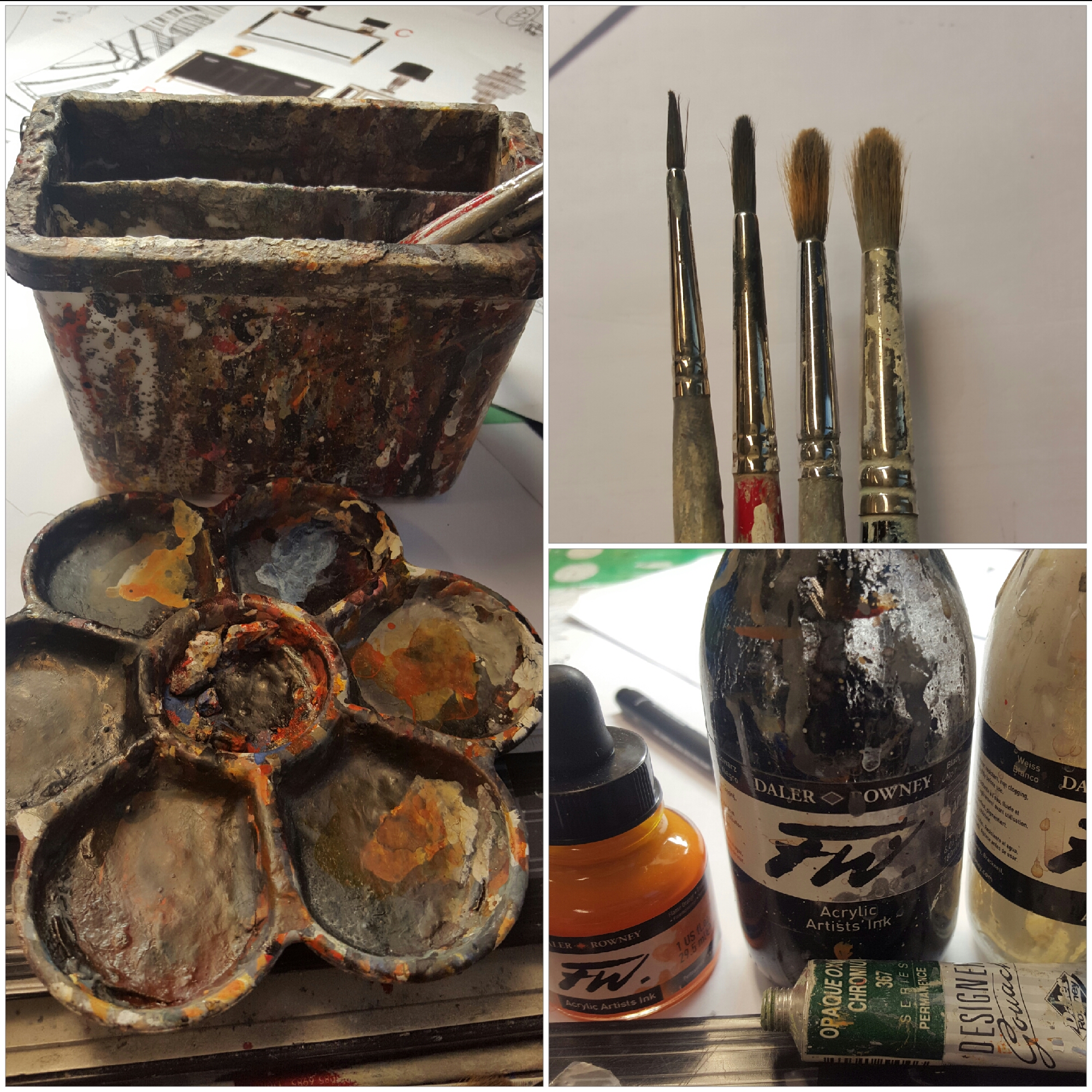
1. Olga Sorokina (O. S.): My first question is all about your technique and materials that you use. I guess a lot of people (and I noticed it in your Instagram) ask you similar questions. Could you please tell us in this interview and answer this kind of question once and for all. What color ink or may be watercolor do you prefer, which brushes are your favorites, which liners, what kind of paper and its size do you select?

Apisit Chuldecha (A. C.): Basically for almost all of my works I use «DALLER ROWNEY FW. Acrylic Artists Ink», and sometimes I use Watercolor. Acrylic Ink and Watercolor imply painting by brush, both of them are water-techniques, but the difference between them is the time they consume. 

When you are painting by «Acrylic Artists Ink», it dries very slowly, and once it dried the color drops one tone down, so that you may need to paint it again adding the next layer until you feel it is the right color. You can paint Ink color over and over again, as many layers as you need, but make sure it has already dried before painting the next layer. It is very slow and time-consuming process in comparison with Watercolor technique, but it is very easy to fix or change the tone or even alter the color itself after finishing your work.

As for the Watercolor, it is not as waterproof as Ink color, but it gives the right color from the beginning, I mean the color you get before painting will look exactly the same way on paper after it has dried (moreover it’s not as time-consuming as Ink and it could be one short paint to finish). But it is impossible to change anything at all after Watercolor has dried on the paper, and also you have to always take care that your work is away from water.

The point is that both techniques have their own advantages and disadvantages. At the same time, it depends on what kind of work you are doing, what style you are using and how much time do you have. So my works are finished by Ink Color mainly because this technique is more appropriate for interior design industry where you have to take into account many things and it is usually rather long process to change design. Ink Color can give you more possibilities to change things that matter in design.

The brush for me is not a big deal, I concern only about the fix number of sizes that I always must have, typically I need for my work at least 4 sizes: No 1,  No 3,  No 6, and No 10. I can use any Brand, so I prefer cheap ones for they can replace an old set after finishing a rendering (one set of brushes per one rendering).

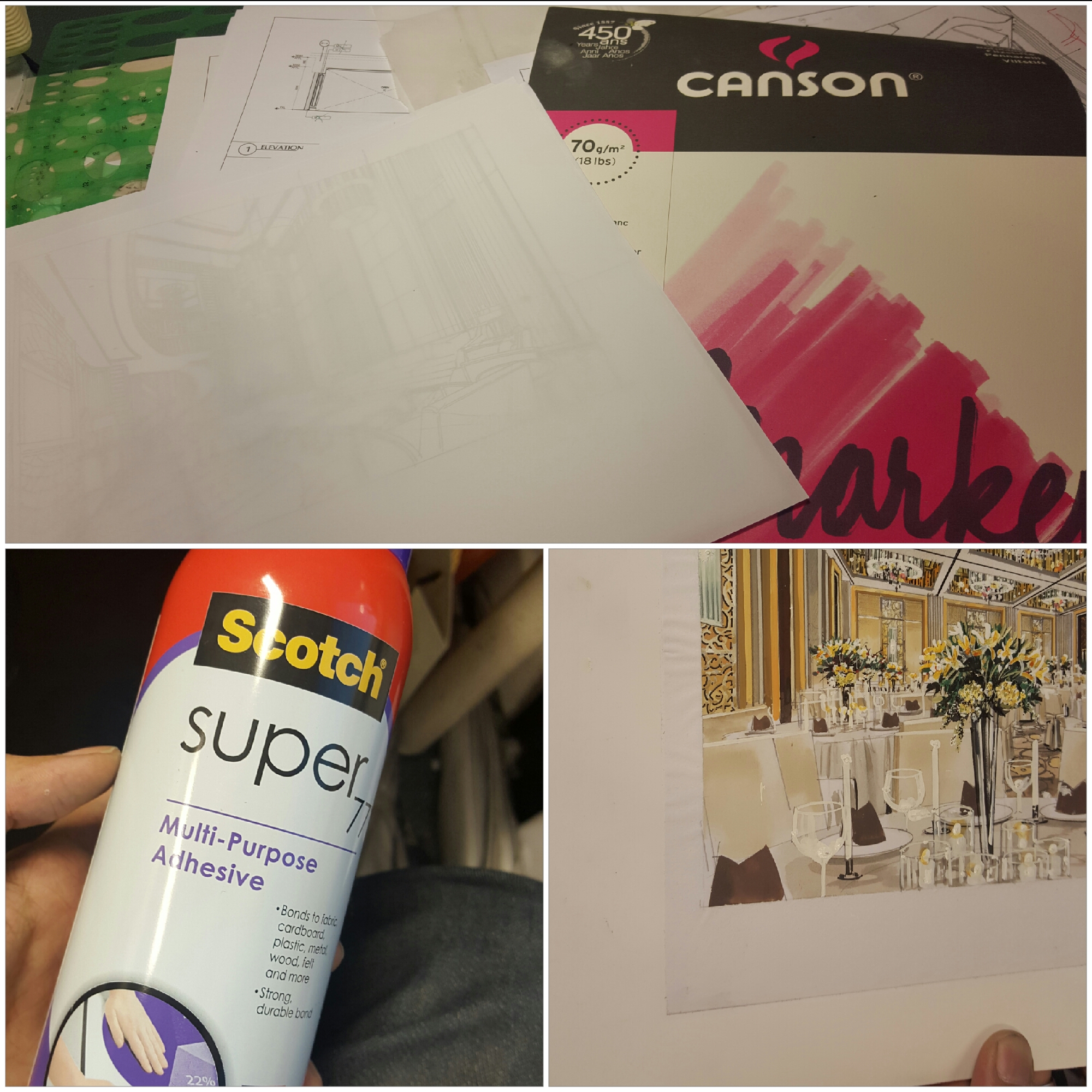
Paper: I use marker paper which is very thin and a bit transparent. The reason is mainly because this marker paper can be seen through so that I can draw a line by pencil using the rough ink sketch by placing the marker paper on it. After finish drawing lines with details by pencil, I stick my sketch on a cardboard by using spray glue. This can make your marker paper become very strong and ready to deal with water during painting process.
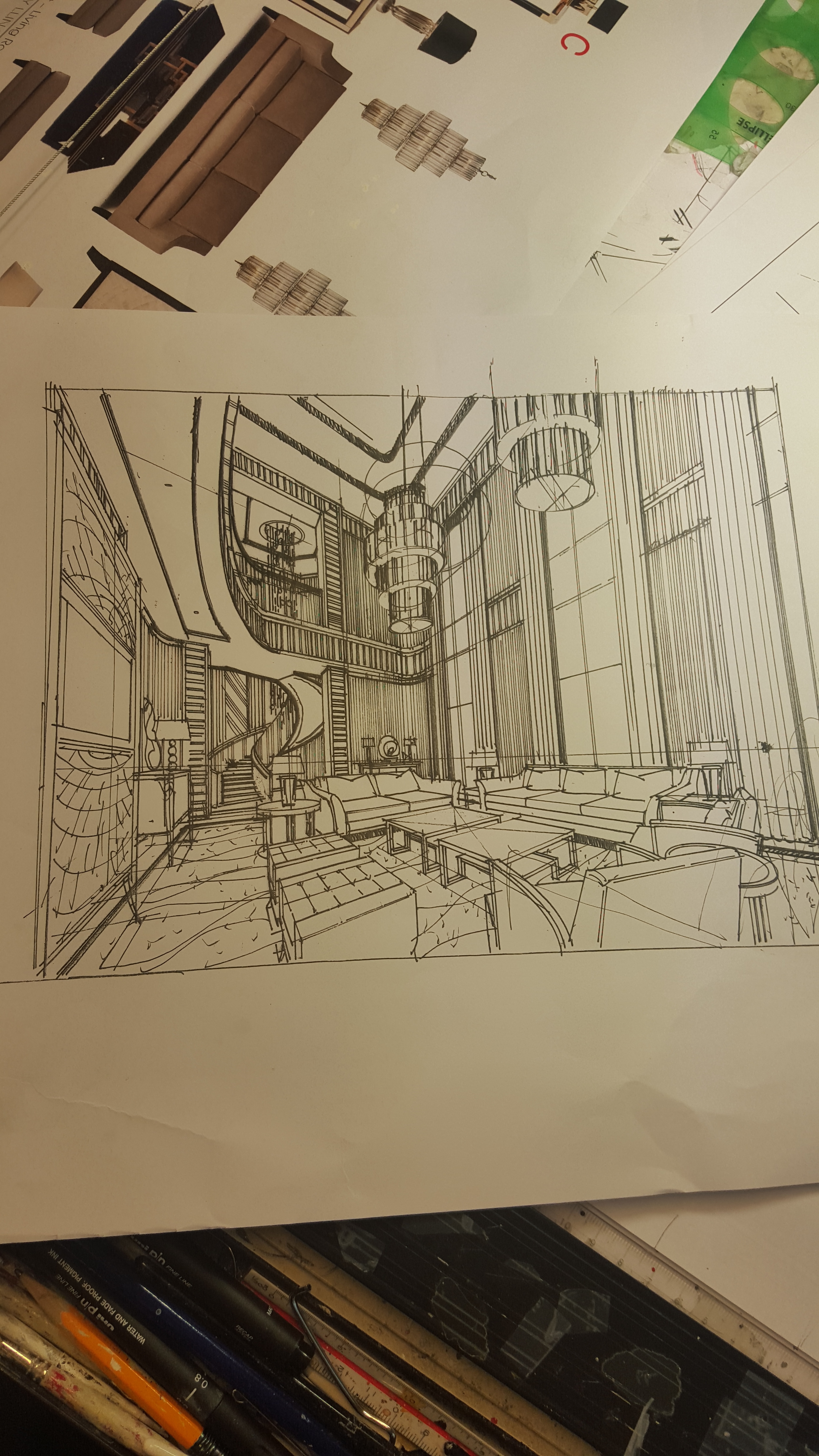
2. O. S.: Please briefly describe your process of creating hand rendering from the very beginning to the end (and how long does it take), for example this one:

Hand Rendering Interior Design Chuladecha

A. C.: Starting from the beginning the process takes about 3 to 4 days if everything is ready and nothing changes about design and material; this example took 4 days of rendering.

The process starts once you have enough design information (at least Layout Plan and the Ceiling Hight). 

My steps in hand rendering:

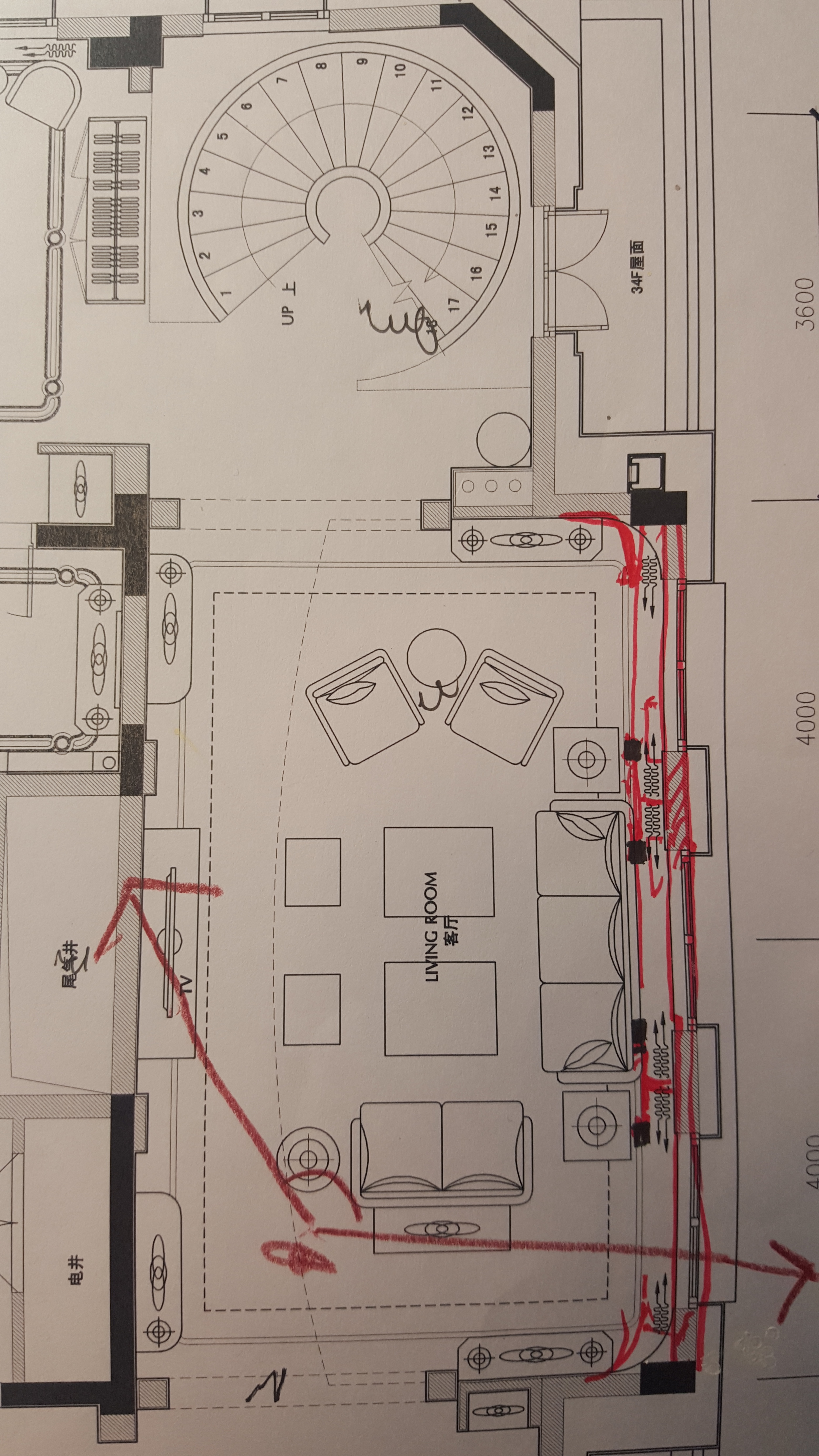
Select the best view based on the Layout Plan by marking the standing point. Set up the sketch showing the view based on the right proportions and standard sizes of furniture plus the hight of the space based on the Ceiling Hight information. So you have the right view on the sketch with the positioned furniture (I call this Black and White Block Out sketch). 

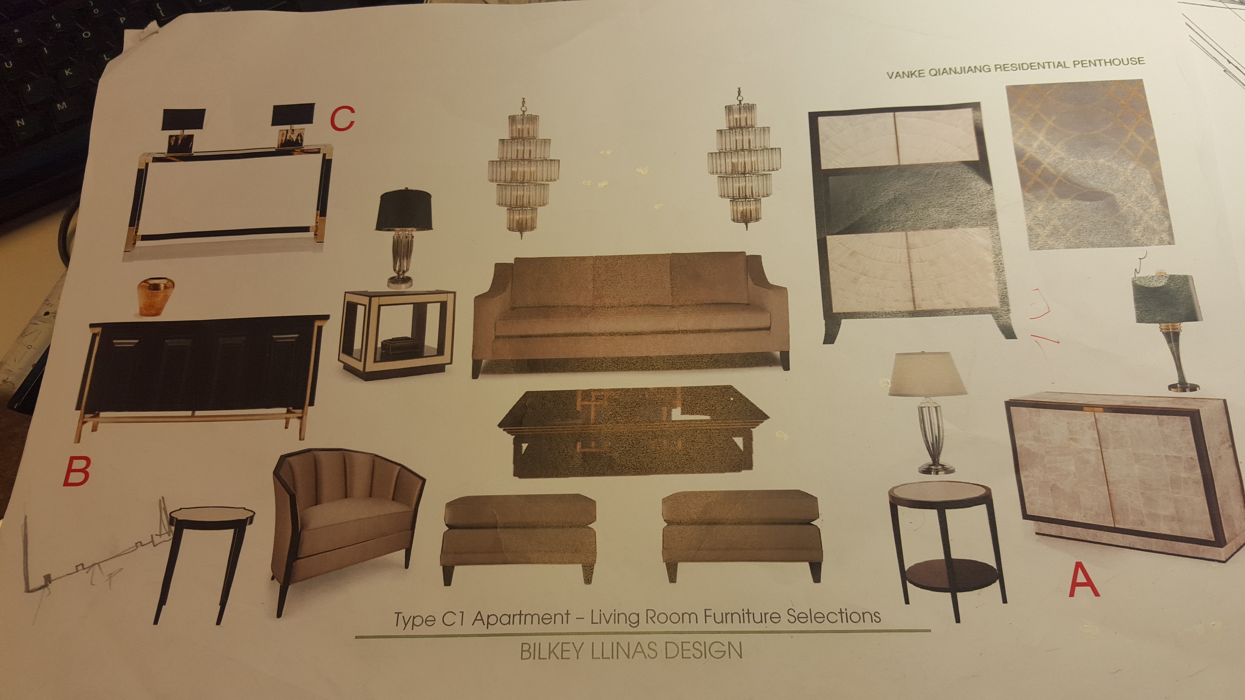
Next step: you should go ahead with more details, as much as it should be according to the design (furniture selected, floor, wall, ceiling, design pattern, lighting, elevation). Then use the Block Out sketch as the basic framework by placing it on the table, then place maker paper on it. Now you can see the Block Out sketch through the marker paper and able to draw more details by pencil (I call this Pencil Line Work Details).

This process should take about 8 hours.

So we have:

1. Black and White Block Out sketch

2. Pencil Line Work Details

The next step is all about the color and the materials. I use Pencil Line Work Details as a basis and then insert on it all information about materials and colors. Once this step is done we can start painting. The painting process usually takes around 2 more days up to finish.

Interior sketching Hand Rendering Freehand sketch Design

3. O. S.: I noticed that you create primarily night views with electric source of light and I have seen only few drawings in daylight on your Instagram. Why is that? Do hand renderings with night illumination look more effective?

A. C.: The reason to do rendering with night time scene is based on the reality of interior design purpose, moreover almost all of my works are about hospitality style (read «hotels») and dealing with light fixture. Night time scene is the easiest way to bring out the potential from each light fixture and to emphasize lighting design for the whole space. This allows to provide the feeling of elegancy from each object and materials such as diamond, crystal, gold, polish steel or any source of sparkle that needs light to increase its value. The reason to do rendering with daylight is based on the design purpose as well. Some projects need to get the benefit of daylight as it helps to present better their design, for example the view of exterior such as beautiful landscape, garden, beach, sea or sky. These are always important elements for the open spaces of interior-architecture projects such as resorts, open restaurants, interior gardens. So daylight or night time, what to select depends on the purpose of the design, not on rendering.

4. O. S.: If you finished your hand rendering and client wants to make some changes in the design - how do you deal with it? Do you use Photoshop, make changes in the finished drawing or start it again?

A. C.: This always happens so it is not a big deal and no need to redo from the zero again. So the way to introduce changes is to draw only the part you have to change by pencil on the marker paper and then spray the glue on this part to stick it where you want it on the sketch and after paint it over again.

Start to collect pictures of the places you like and copy them on paper whatever way you like by hand. A lot of new techniques are waiting for you to be discovered.

5. O. S.: Could you please share your inspiration sources, what are they?  I’ve noticed your passion to the bonsai art, cats and watches, please tell more about it.

A. C.: Bonsai Art for me is some kind of long-term class to learn how to be patient and how to accept unexpectable things that can happen due to the random essence of nature.

Cat is my friend. The watches keep reminding me of the reason why the world doesn't want things to be too perfect; if it wanted it, the majority of us would use digital watches.

6. O. S.: How do you see the future of hand rendering in interior design?

A. C.: Since the digital rendering has become the convenient way to support design industry it seems like it is pushing hand rendering into the frame of «silent art». However, I still think that if the most important point for all renderings is to represent something in the most realistic way, then the hand renderers (why not?) should pay more attention to make their renderings look more realistic in comparison with digital renderings. In my opinion, the main focus of rendering is to present something that is going to be the reality in the future, not now, so this is the crucial difference between renderer and illustrator.

Regarding the future of hand rendering: both types of rendering (hand and digital) are trying to do the same thing - to mirror the reality in the best way. But I think that in the future both rendering types will be undoubtedly more and more different. So this is the main question: how hand rendering can be more realistic than digital one? In reality every pattern in Nature is inherently not perfect, there are always some random errors without purpose. For example if you take a look at the marble grains, they all have something random inside, but still look like a pattern in general. Each piece of marble is unique and unrepeatable just like our finger prints can never be completely the same. Hand rendering reflects this essential concept of the Nature - there will be all kinds of random small errors in your drawing (sometime I call these «good mistakes»), we just need to skillfully control them and correct them if necessary. 

The digital renderings seem too perfect due to 3D programs we use, for instance those patterns look unnatural in them. From the other hand, digital rendering can introduce some random errors with purpose to try to copy the error things in Nature, but that seems harder to make in comparison with hand rendering. But here is the point: if hand rendering will not progress and change during the next 20 years, it might fade away and be completely replaced by digital rendering for the interior design industry. However its value from artistic point of view will always be high.

7. O. S.: What one advise would you give for beginners in hand rendering?

A. C.: Start to collect pictures of the places you like and copy them on paper whatever way you like by hand. A lot of new techniques are waiting for you to be discovered.


Interview with Apisit Chuldecha by Olga Sorokina.

P. S. Please share this inspiring interview with your friends. Thank you!