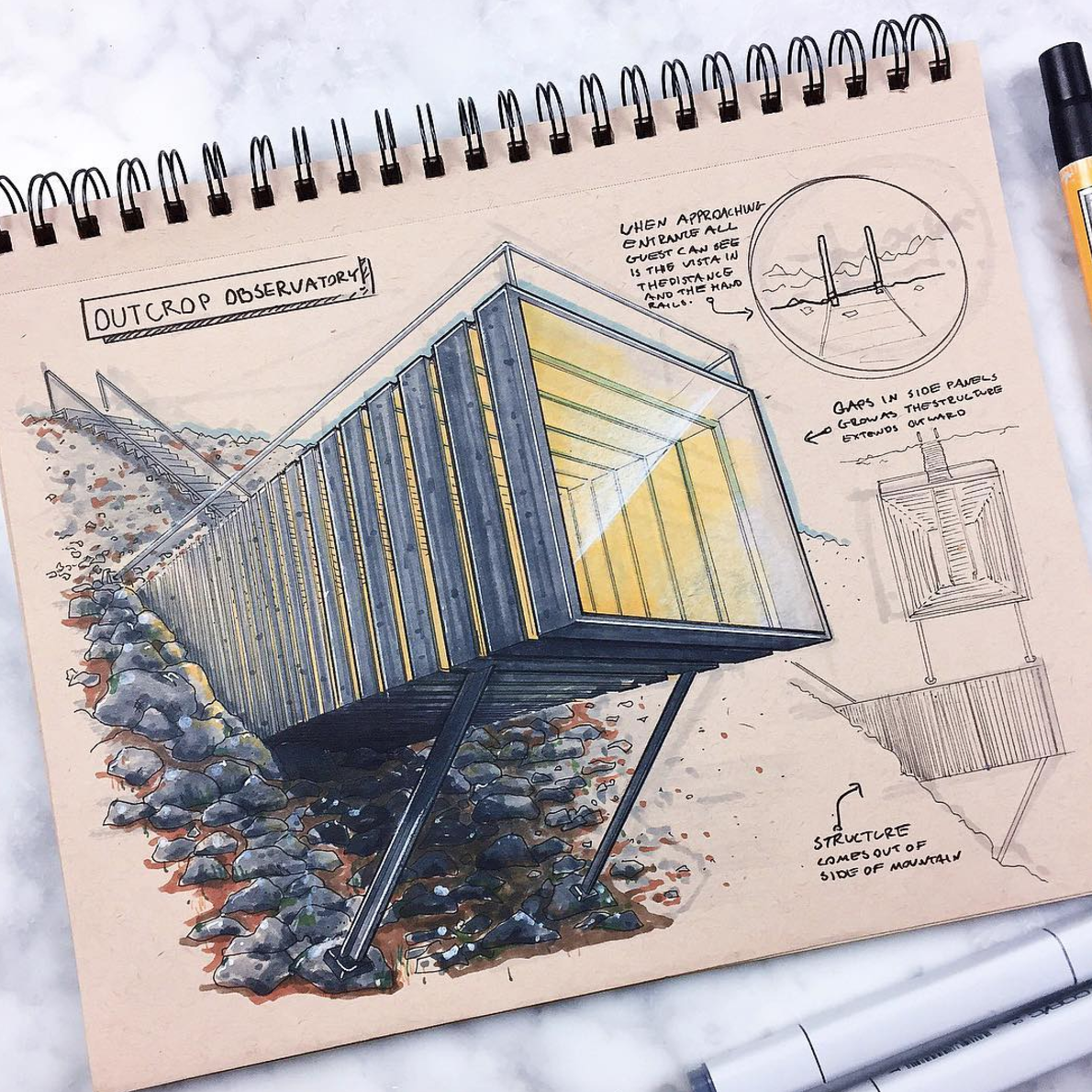
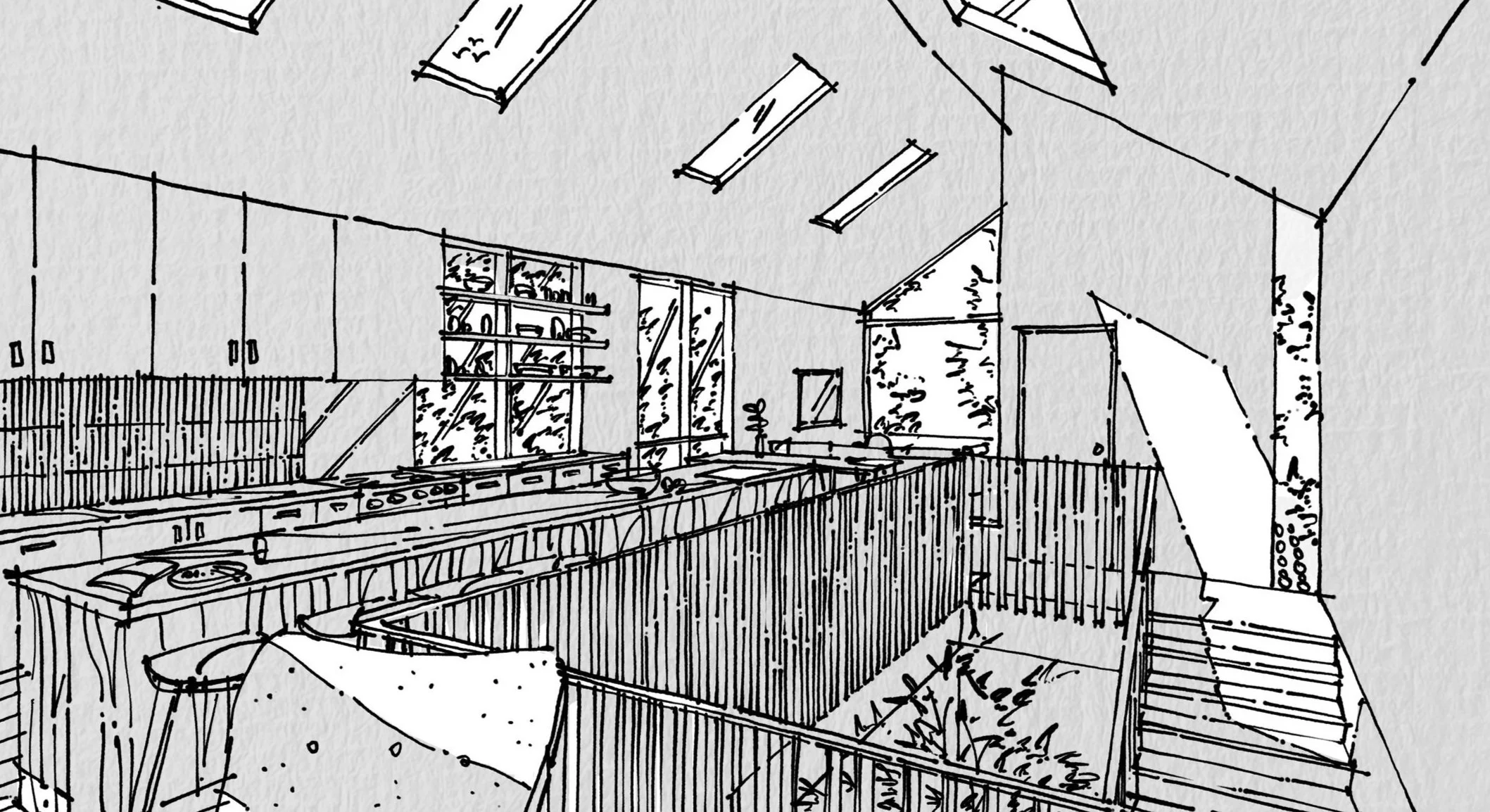
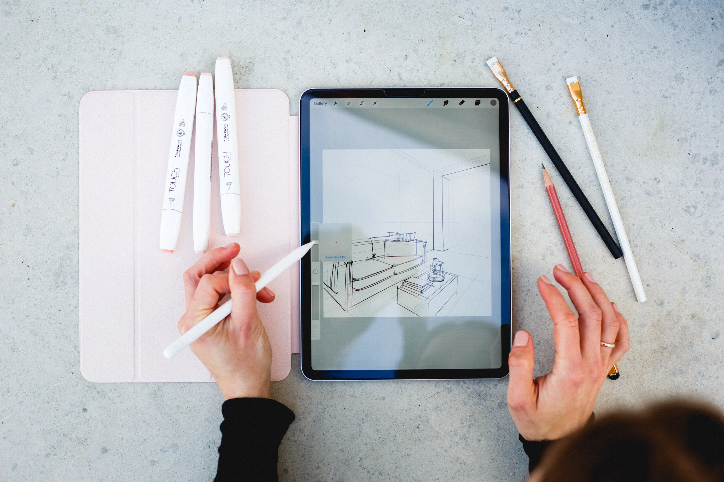
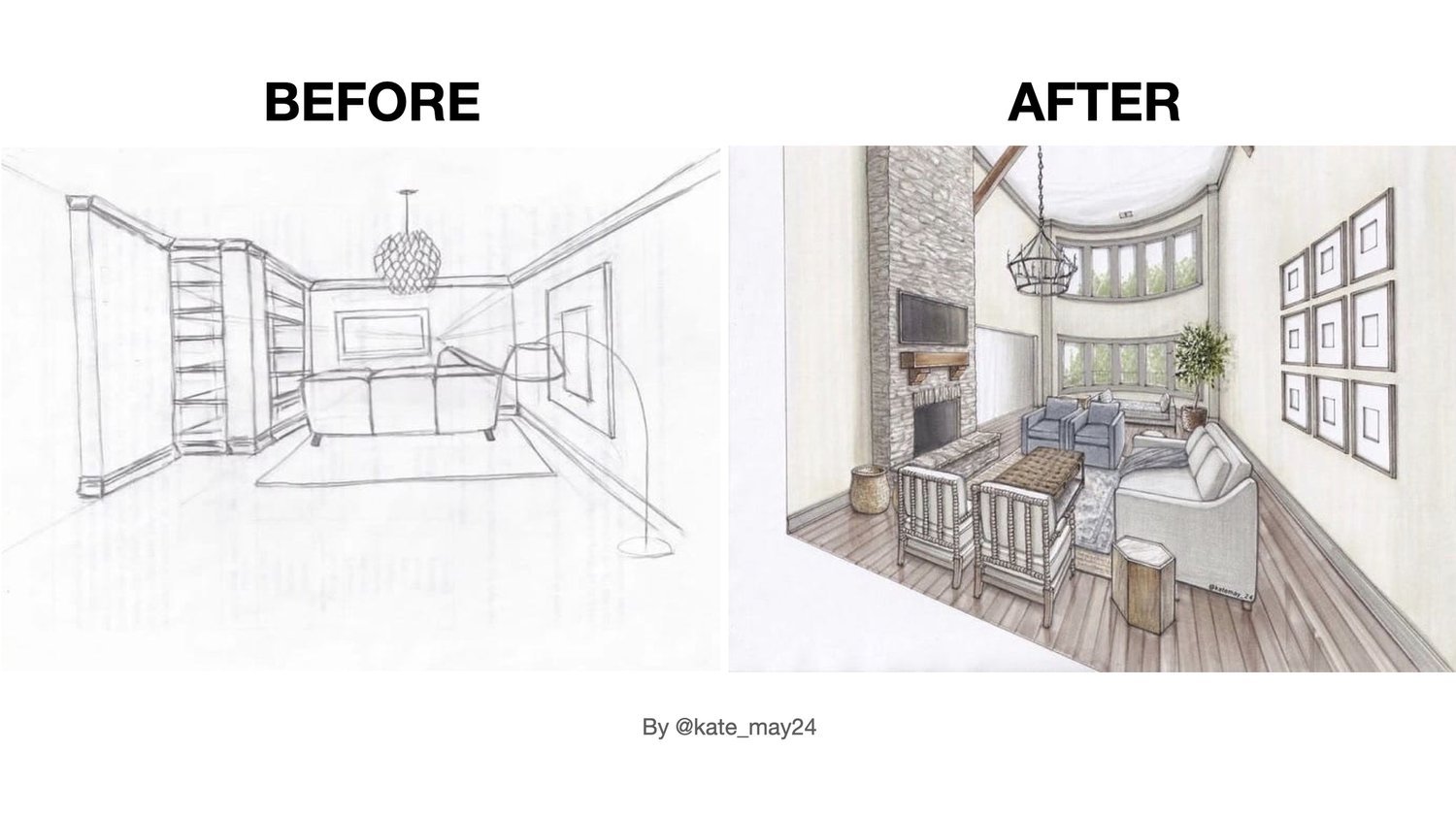
Hand rendering

What They Do Not Teach You in Architecture Schools| Interview with Eric Reinholdt

Welcome to another episode of my podcast!

Meaningful conversations with architects, artists, and designers.


Meet my today’s guest — Eric Reinholdt from the most popular architecture-focused YouTube channel with over 1 mln subscribers: 30X40 Design Workshop

Things always change and evolve in architecture…

Join us in this interview, where we delve into crucial topics for architects, such as why incorporating sketching into your design practice is vital, the role of an Architect in 2023, insights into the business for creative minds, and archipreneurship.

Eric also shares his 6-step process for working on a project and recommends books for aspiring architects.


Sketching is a part of my process, I use it from the very early stages: from site visits, all the way through construction. Standing on a job site with contractors trying to work out a detail in the field, if you can’t sketch out what you are thinking — you are less respected on the site… I’ll just put it that way.
— Eric Reinholdt
 

ABOUT ERIC:

Eric is an award-winning architect, entrepreneur and founder of 30X40 Design Workshop, a design studio located on Mount Desert Island, Maine. He is also author of the ”Architect + Entrepreneur” book series and creator of the most popular architecture-focused YouTube channel online. He has been designing simple, modern residential architecture for more than 27 years and a practitioner of all the novel, entrepreneurial business strategies he teaches in his courses.


QUESTIONS WE DISCUSSED IN THIS INTERVIEW:

(1) If we were to distill the essence of those 10 years in a blender, what key elements do you believe defined your success?

(2) What is your definition of being an architect in 2023?

(3) There is a saying “Hands are the wings of the heart”. How important do you believe sketching is in the life of a contemporary architect: from initial concepts to the completion of projects? Do you think digital production methods will ever replace hand-drawn sketches? Please more on alchemy that transforms initial ideas into finished projects.

(4) Eric, as far as I got from your videos, it appears your work routine on an architecture project is a systematic 6-step process, involving:

  • hand sketching, 

  • *detailed sketching on an iPad, 

  • layouts in AutoCAD, 

  • a 3D model in SketchUp, 

  • fine-tuning in Photoshop, 

  • and a paper model. 

Is this an accurate representation of your creative workflow, or do you incorporate any other tools/software, or steps?

(5) Eric, for aspiring architects, if you could recommend three books that have significantly influenced your perspective and growth in the field, what would they be?

(6) Your book 'Architect + Entrepreneur' encourages readers to 'think big, start small, and learn fast,' emphasizing personal brand creation over traditional business plans. 

In parallel, your online course, ‘A + E,’ seems like a comprehensive resource. Can you elaborate on whether this course encapsulates your professional life experience, providing a structured shortcut for others to achieve what you've accomplished?

(7) Looking ahead, what's on the horizon for you? Are there plans to expand your team significantly, and do you envision taking your teaching to in-person workshops or perhaps teaching at the university level, sharing the insights from your books and online courses? Can you please lift the veil for us?


RESOURCES MENTIONED IN THE VIDEO:

Books Eric talked about:

  • “Thinking Architecture” by Peter Zumtor: link

  • “The 4-Hour Work Week” by Tim Ferris: link

  • “As Little Design as Possible” by Dieter Rams: link

Amazon Block
Search for an Amazon product to display. Learn more
 

Watch also Eric’s short film about being an architect

“A Choice to Make”:


LEARN MORE FROM ERIC:

  • Book “Architect+Entrepreneur: A Field Guide to Building, Branding, and Marketing Your Startup Design Business”: link

  • Course “Architect+Entrepreneur”: link

  • Tools and templates: link


CONNECT:

Eric’s blog on all things architecture: link

Podcast on financial independence “2 Sides of FI”: link

Instagram: @30by40


Interview by Olga Sorokina

Instagram @schoolofsketching

P. S. Please share this interview with someone who might need to watch it.


CHECK MY OTHER PODCAST EPISODES:


MORE FROM MY BLOG:

What is the future of interior sketching? | Interview with Jessika visualisieren.koennen.alle

Welcome to Olga's podcast!

Meaningful conversations with architects, artists, and designers.

Meet my today’s guest — Jessika from Instagram @visualisieren.koennen.alle


We had such a sparkling and inspiring conversation with Jess about interior sketching, the best apps for sketch artists, AI in interior design, and we even came up with amazing insights on the future of interior sketching.

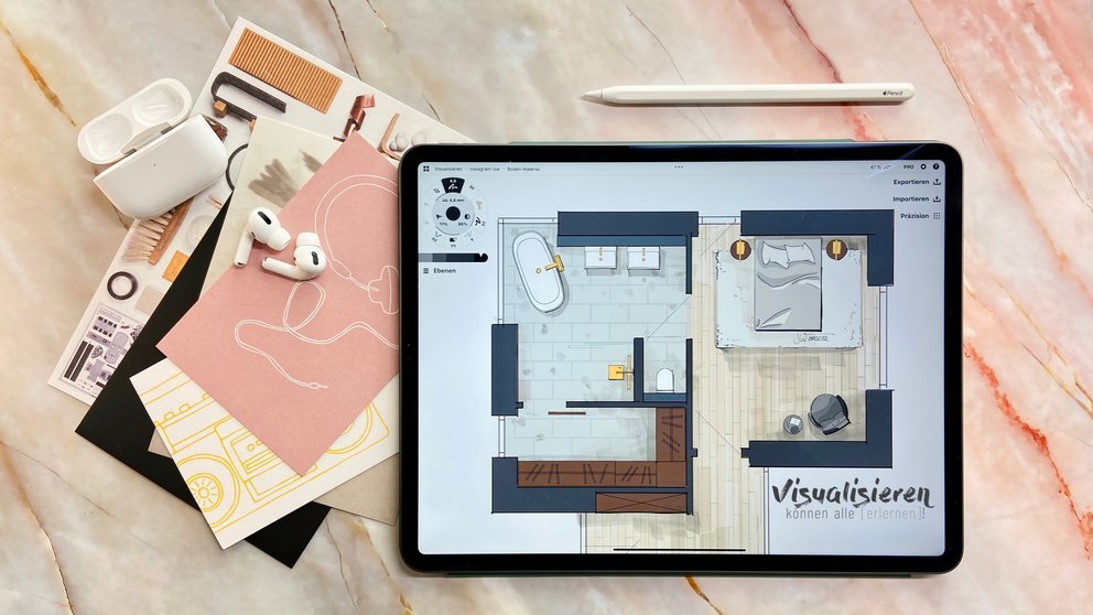
Floorplan by Jessika


About Jessika:

Miss Interior Architect (Frau Innenarchitektin) Jessika is an Interior architect from Germany, she has been drawing in the field of interior design since 2007. Jessika also teaches sketching techniques on iPad for interior design at technical school and with her online courses.

Here are a couple of questions we’ve discussed:

1 Jessika, I won’t ask you digital or analog. I will ask you digital BUT analog. How have visualizations changed? Which possibilities for sketch artists already exist or may be possible in the near future?

2 Jessika, you have started teaching interior sketching at school, right? What are your insights?

3 I know you love using mood boards for your sketches. Could you please tell us more about why it’s important?

4 Your advice for beginners: Morpholio? Procreate? Concepts? What would you recommend?

5 Jessika, what are your thoughts on AI in interior design?

6 What is the future of interior sketching? How does it look in your opinion?

7 Jessika, you have a couple of online courses on interior drawing, please tell us more about it.


P. S. Please share this interview with your friends.


CHECK MY OTHER PODCAST EPISODES:


CHECK LATEST ARTICLES ON MY BLOG:

Is Architectural Watercolour Illustration a "Dead Art"? | Interview with Joe Skibba

Welcome to another episode of my podcast! 

Meaningful conversations with architects, artists, and designers.


Meet my today's guest -- Joe Skibba!

Joe is an architectural illustrator from America, he runs his own illustration studio Depiction.

His work has received international acclaim in the form of over 20 awards of Excellence from the American Society of Architectural Illustrators.

Joe combines the traditional craft of illustration while also keeping up with the latest technological advances. He also teaches with his online tutorials, live classes, and guest lectures.


Some of the questions I asked Joe:

  • How you came to architectural illustration?

  • How it all started? What’s the Story?

  • What the process of illustration looks like? Draw by hand or on iPad then colour in Photoshop?

  • Could you please tell us more about the Charette working session you hosted?

  • How people can learn from you? Do you offer online trainings?

  • What would be your advice for beginners ?


architectural illustration watercolour

Drawing by Joe Skibba

Joe Skibba began his professional career in architectural rendering in Madison, Wisconsin in 1997, after which, in 2005, he was recruited by Urban Design Associates in Pittsburgh, Pennsylvania.

In 2013, he began his own illustration studio - Skibba Illustration, and later founded Depiction in 2017. His work has received international acclaim in the form of over 20 awards of Excellence with the American Society of Architectural Illustrators, a fairly substantial following on his educational channels in social media as well as promotion in Apple’s App Store following a collaboration with the mobile app Morpholio Trace.

Other projects outside of the traditional architectural rendering space also include illustrations for the motion picture film Where'd You Go Bernadette. As is evident in his career accomplishments, Joe is able to both honor the traditional craft of illustration while also keeping up with the latest technological advances. He is constantly innovating ways in which to share the craft through teaching, online tutorials, and guest lectures.

After 25 years in the field, hundreds of clients, and thousands of followers, Joe continues to hone his craft and fine-tune his skills.

Drawing by Joe Skibba


Keep in touch with Joe:

Website: link

Instagram: link

YouTube: link


Interview with Joe Skibba by Olga Sorokina.


P. S. Please share this interview with someone you know will benefit from it. Thanks in advance!


CHECK MY OTHER PODCAST EPISODES:


read my blog on sketching:

Interview #5 with Richard Chadwick, hand renderer from Manchester

Richard Chadwick sketches

With a background of over forty years working as a designer in the Leisure Industry, Richard is now concentrating on producing interior and exterior sketches for the leisure sector (bars, restaurants, coffee shops, branded outlets, corporate events).

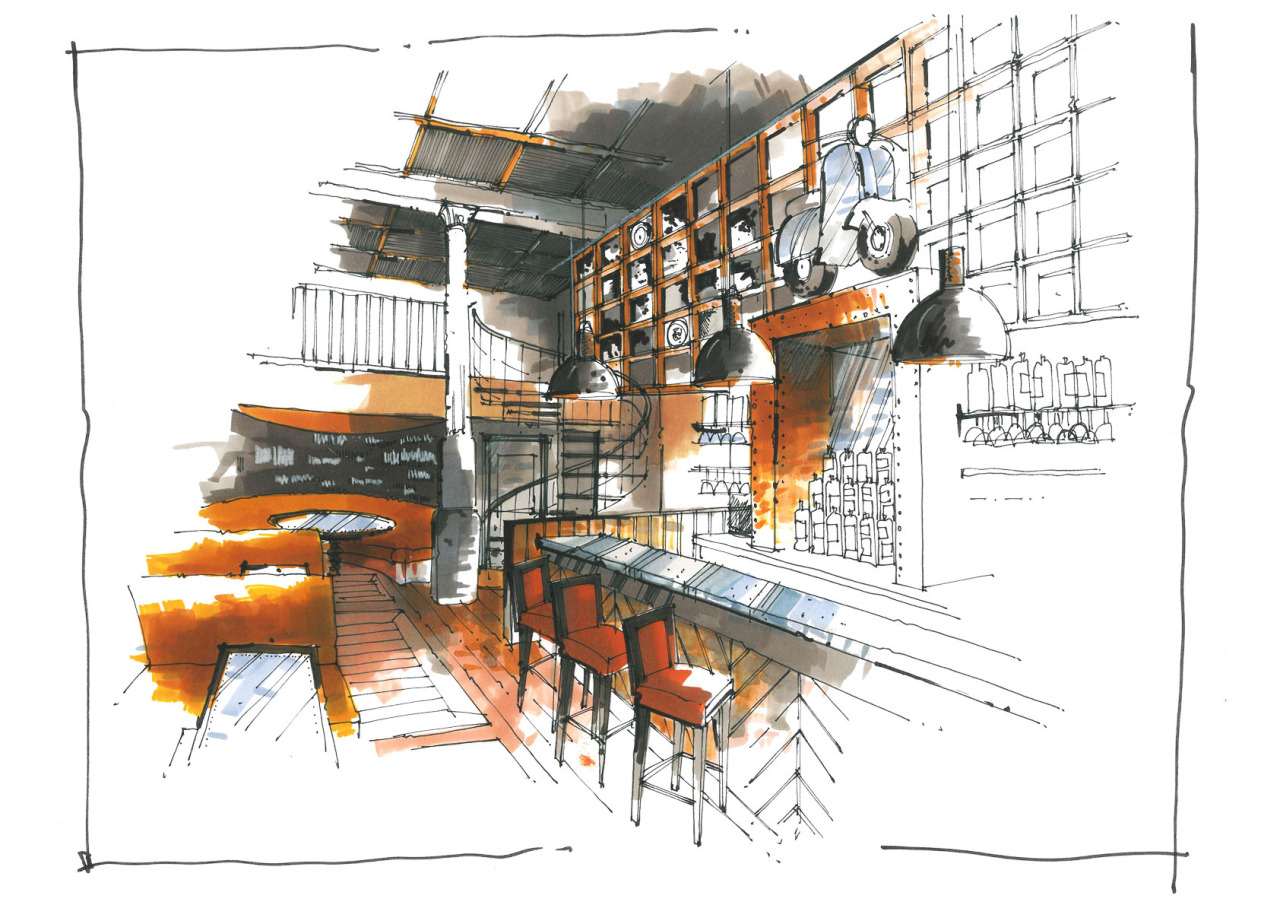
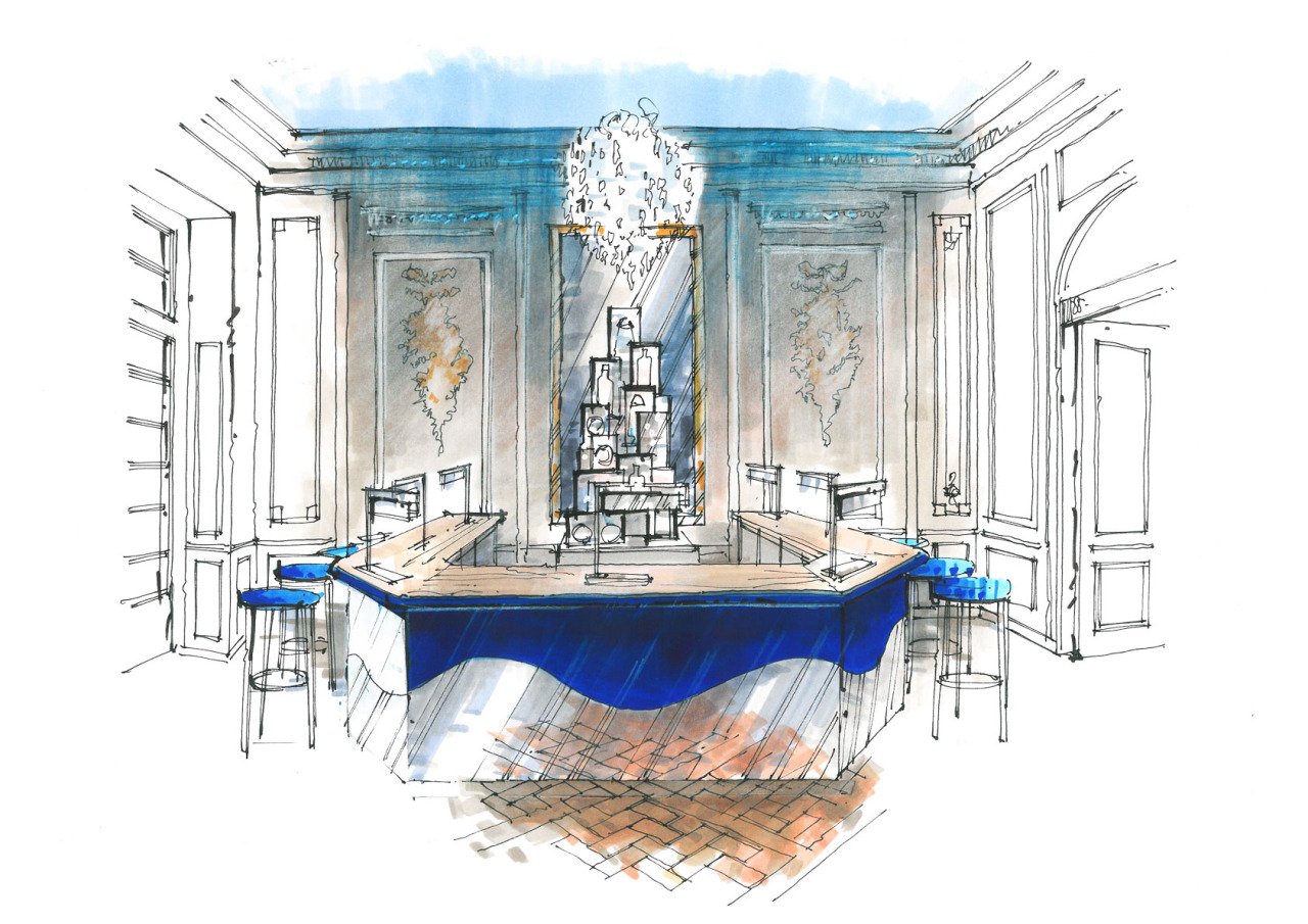
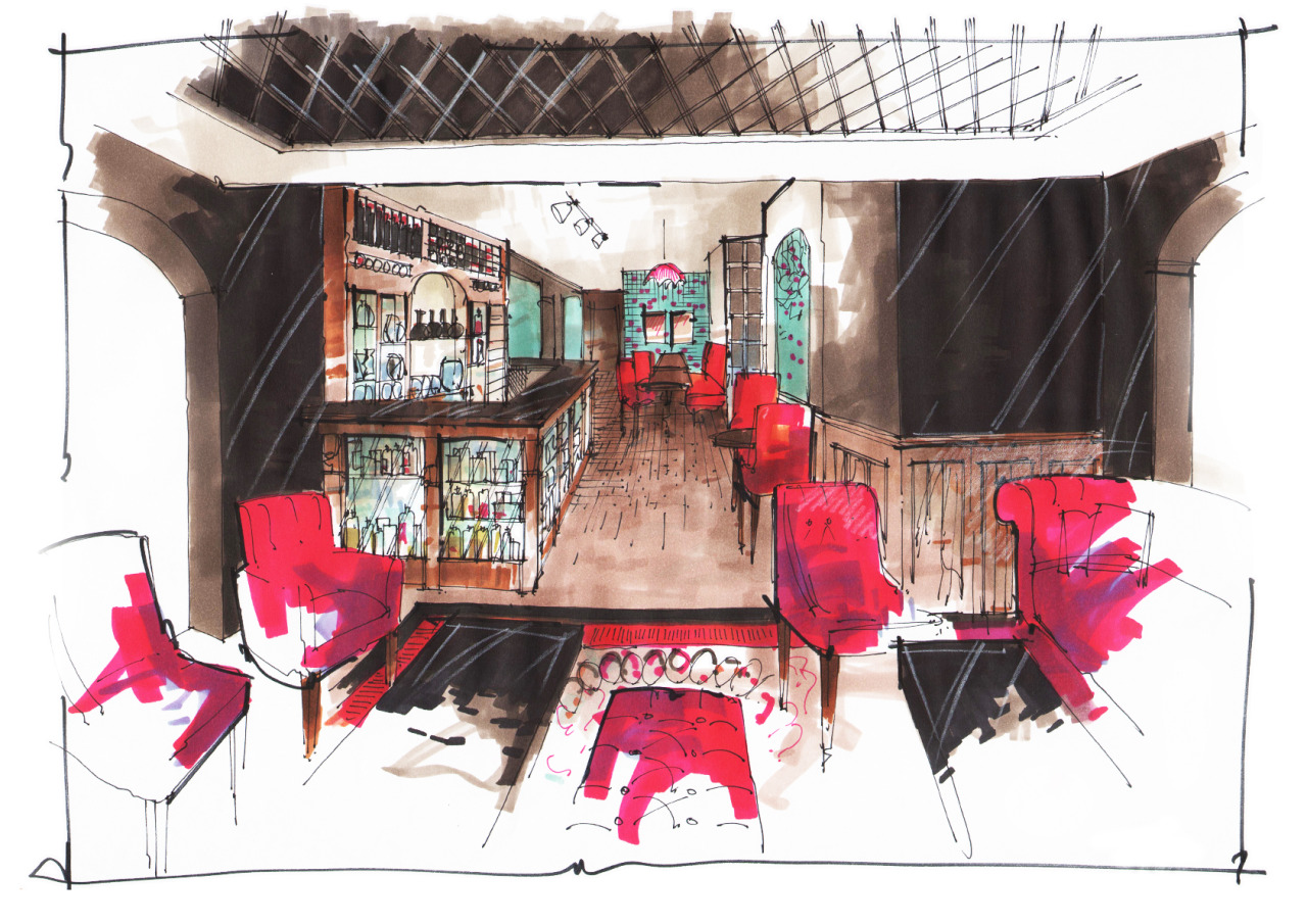
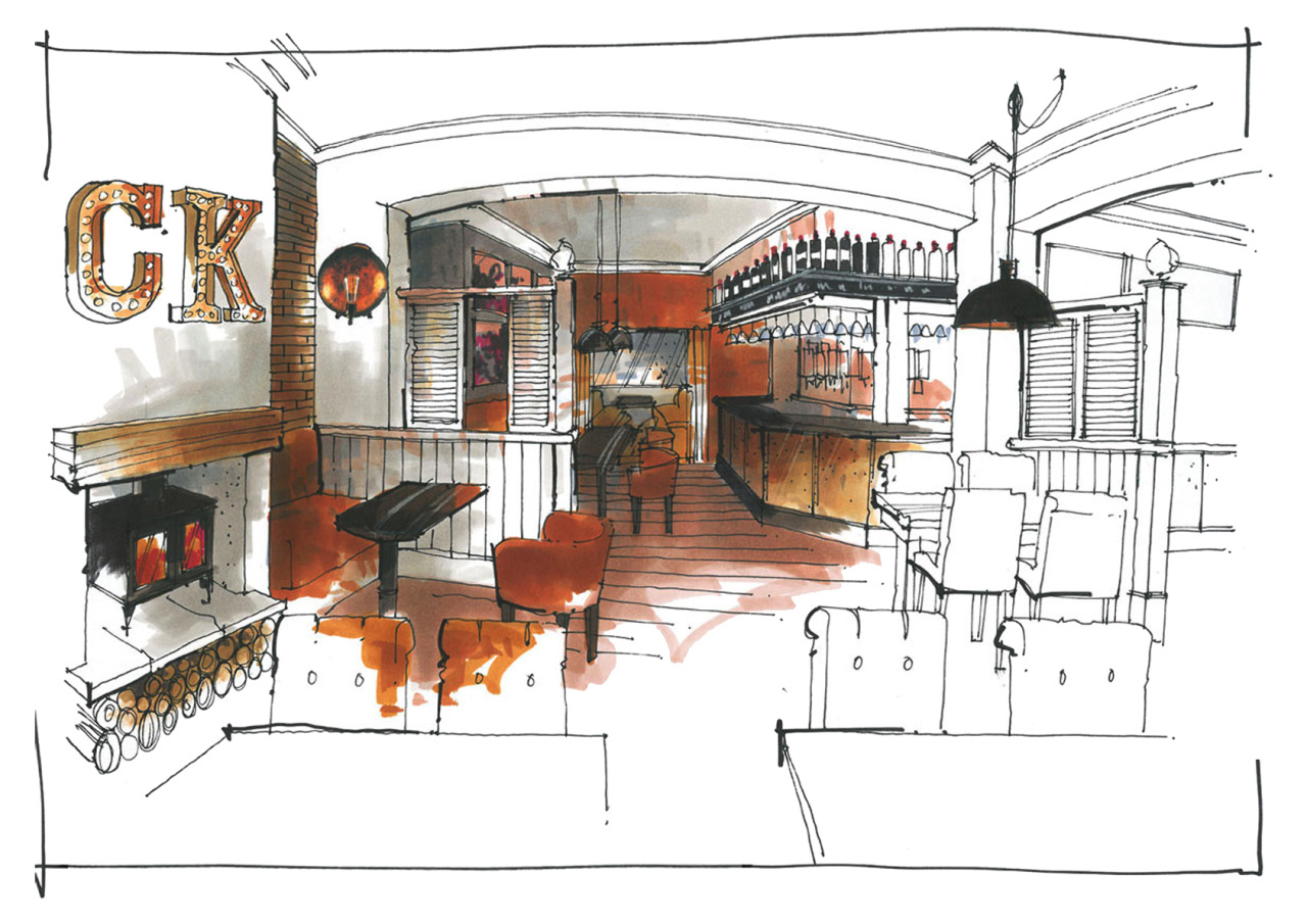
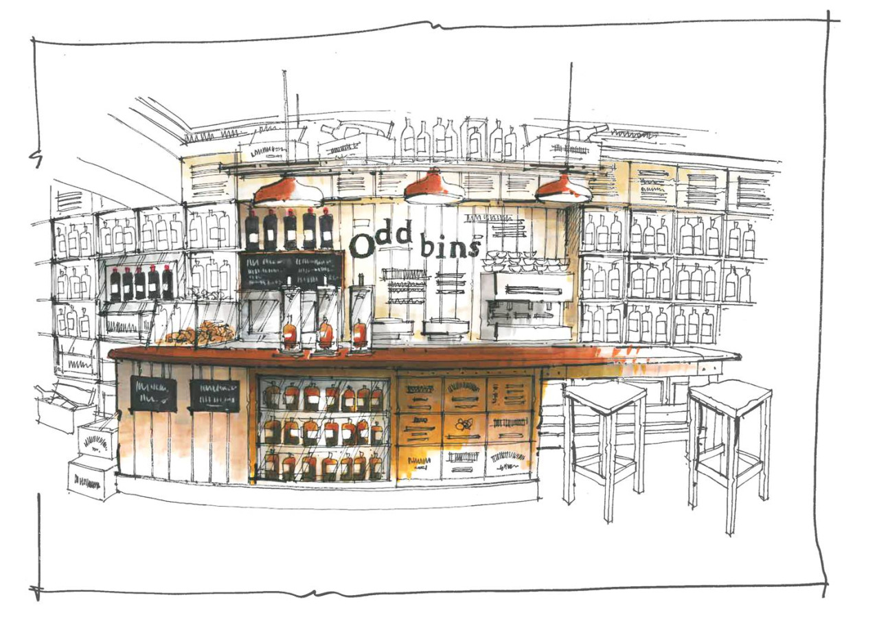
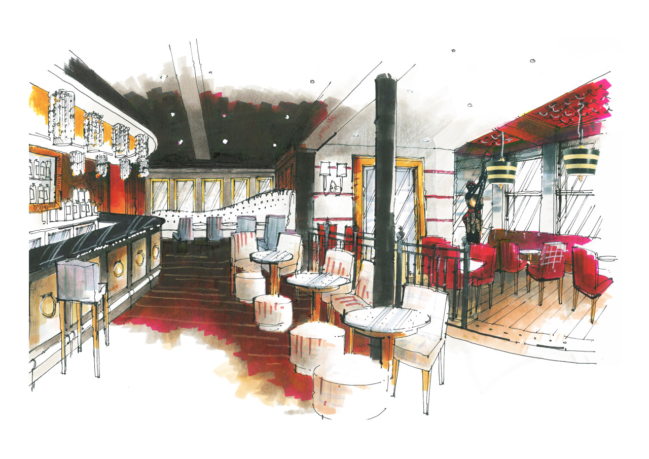
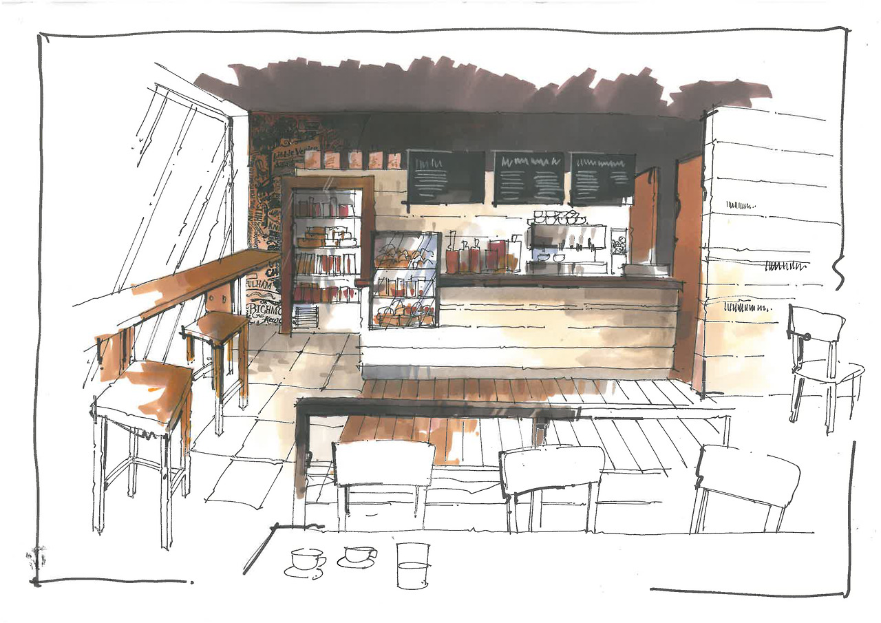
As an antidote to the ubiquitous – and to his mind anodyne – computer produced visual, Richard's are all drawn by hand, mainly pen and marker renderings, capturing the energy of the moment and generally looking far more dynamic than anything produced by a computer programme.


Richard's website: www.interiorsketches.co.uk

Richard Chadwick sketch

1. Olga Sorokina (O. S.): Richard, could you please tell us how did you come to interior design and what was your initial step in hand rendering?

Richard Chadwick (R. Ch.): I went to art college here in the UK in the 1960’s, when interior design was only just starting as a profession , and the Leisure Industry didn’t exist as such, so basically there were no road maps – we made it up as we went along. I was lucky enough to get in with a design practise my tutor was setting up, specialisingin pubs, so it went on from there, really. 

Set up by myself with a partner in 1980, and he couldn’t draw so I had to teach myself how to draw visuals. They were quite rough to begin with but for some reason I seemed to be good at it, and as I still do all the visuals for the practise I get to do a lot. It was just a question of sitting down and working it out.


A return to hand crafted values offers a way forward from an entirely technologically based society and the tactile feel of pencil on paper has its own reward.

2. O. S.: Your style is very bold and recognisable: partial colour filling, focusing on the central part of the composition, freehand lines, no rulers. Could you please tell us about media you use and how it affects your approach if it does.

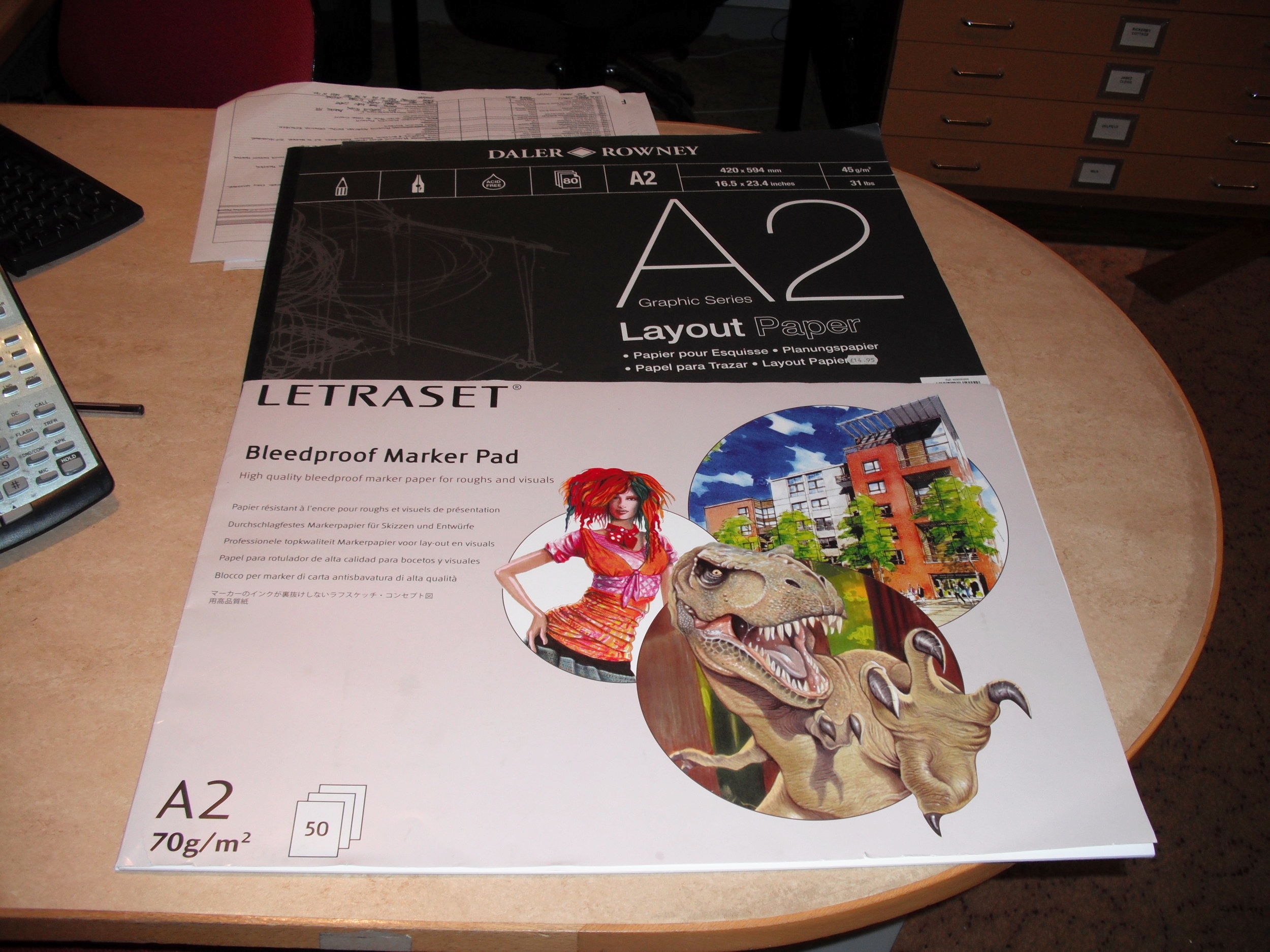
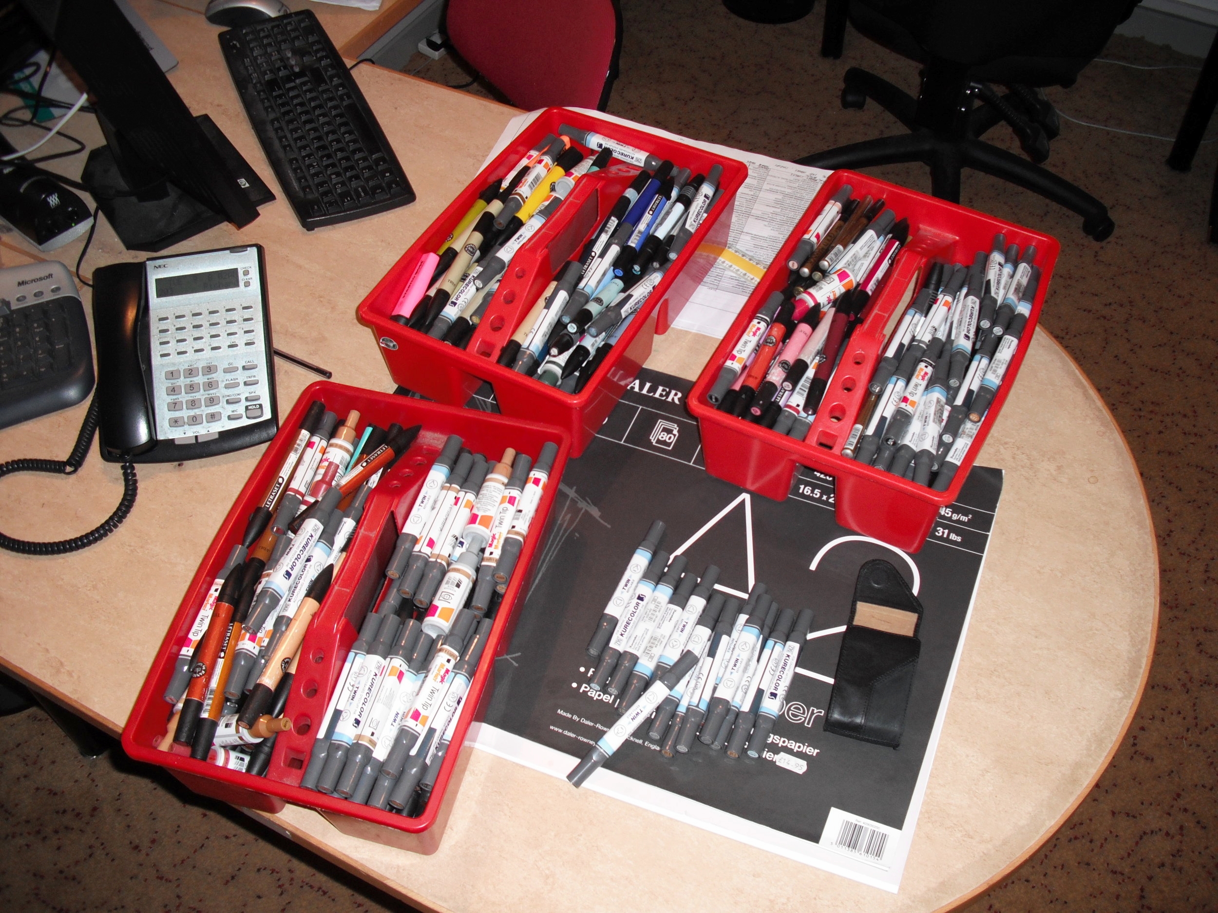
R. Ch.: Well, this has developed over the years, but I soon realised that there is no point in colouring the whole of the sketch, as it just looks too flat – better to get some depth in by focusing in… and colouring the whole sketch takes too much time. I use layout pads and markers, which are great as they are a dry colour but you can blend, they are not a flat colour but transparent to a degree so you can work over one colour on another, and they have their own distinctive ‘ shape ‘ to a mark… and they are quick. I use a lot – see attached pics.

3. O. S.: Could you please describe your process of creating sketches (and how long does it take), for example this one:

Richard Chadwick interior sketch

R. Ch.: Basically I use a thin layout paper, rough out the outline and then lay another sheet over it as you can see the fain marks through it, then i just start to draw in more detail, so I might end up with six sheets on top of each other, each one more detailed than the last. Then I put one sheet of bleedproof paper over the top, do the finished sketch and then colour. The process is pretty fast; the sketch you showed in your email probably took 2 hours to draw max and possibly an hour to colour? Say two and a half hours. Its important to work quickly as it captures the energy. 


As fewer and fewer students are taught to sketch, the ‘hand drawn‘ becomes a premium skill, providing that sense of the personal, the emotional response to a brief that a mechanical interpretation can’t.

4. O. S.: How do you structure your workday or your workweek? 

R. Ch.: Basically there is no structure. I just do what needs to be done next. We have quite a few jobs on as a design practise, so i am working currently on a pub with 10 bedrooms that has to be finished by April and another new hotel in Manchester with 20 bedrooms. I also have to produce in the next week four sketches of a wedding venue for a client in Los Angeles, and another designer wants a couple of sketches for a pizza restaurant in London. Apart from this, I have an exhibition of other artwork opening next week. Workload varies from day to day, week to week and there is no structure as such. For example, my next week structured as follows:

Monday – site meeting for hotel 8.00 am, then design studio, then back home sketching for a wedding venue

Tuesday – design studio and detailing for hotel, the afternoon putting up exhibition in gallery

Wednesday – design studio, then to a pub site to see furnishings contractor, then at home sketching

Thursday – home sketching, then hotel site, then collecting framed artworks, then more sketching

Friday – home sketching, then sketching in gallery

Saturday – home sketching finishing 4 wedding venue sketches, then in gallery doing coffee shop sketch

Sunday – finish coffee shop sketch for client for Monday. Sleep.


Its important to work quickly as it captures the energy.

5. O. S.: Richard, please tell us about your sources of inspiration. What helps you to be productive? 

R. Ch.: Tom Waits / Bob Dylan / magazines / films / long hill walks to clear my head / coffee / Chris Ware / Tiepolo / Rauschenburg/ Tatlin / Alan Moore… 

6. O. S.: How do you see the future of hand rendering in interior design?

R. Ch.: As fewer and fewer students are taught to sketch , the ‘ hand drawn‘ becomes a premium skill, providing that sense of the personal, the emotional response to a brief that a mechanical interpretation can’t. It might become a niche skill, but it will still be a sort-after niche skill.

7. O. S.: What one advise would you give for beginners in hand rendering?

R. Ch.: Look, really look. Practise. Find your own style. Practise. Don’t be precious, it’s only a visual.

Practise. Practise. Practise.


Interview with Richard Chadwick by Olga Sorokina.

P. S. Please share this inspiring interview with your friends, they will be glad you did. Thank you!


Read more interview:

Interview #4 with Reid Schlegel, industrial designer and artist from NYC

Reid Shclegel

MEET REID SCHLEGEL, A NYC BASED INDUSTRIAL DESIGNER AND ARTIST. HE LECTURES AND TEACHES AT UNIVERSITIES GLOBALLY TO SHARE HIS SKILLS AND EXPERIENCES TO HELP YOUNG CREATIVES TRANSITION INTO PROFESSIONAL DESIGN CAREERS.

Photos from Reid's Instagram: reid.schlegel

Reid on Behance: reidschlegel

Reid Schlegel interview

1. Olga Sorokina (O. S.): Reid, how did you come to industrial design?

Reid Schlegel (R. S.): I have drawn and built things for as long as I can remember. Growing up I spent time in my late grandfather’s art studio and my other grandfather started giving me power tools for my birthday when I was eight years old. Because of this I have always been very comfortable expressing my ideas in two as well as three dimensions. I did not know what industrial design was however until I visited Purdue University for a mechanical engineering tour. The graduate student who gave the tour asked what I liked to do and I said “draw, build and solve problems.” He took me to see the industrial design department and the rest is history.


Sketches exist to communicate ideas. A designer does not need to be an amazing sketcher to be successful. What is important is that each sketch clearly and concisely articulates the main ideas behind the concept.

2. O. S.: What was your initial step in hand rendering?

R. S.: Drawing has been a part of my life for so long that I cannot really remember an initial step. Growing up I loved drawing skateboarders, architectural schematics, logos, new inventions, etc. I began taking hand rendering much more seriously when I began my industrial design undergraduate studies at Virginia Tech. My style began to really mature when I was worked at "SMART Design NYC" however. It was here that I began sketching with a Cintiq very frequently and the tightness and control of this medium seeped into my hand rendering style over time.

Reid Schlegel

3. O. S.: Your style is very bold and recognizable: emphasized perspective, focus on textures and I also noticed you like to use tinted paper for your sketches. Could you please tell us about media you use and how it affects your style and approach if it does?

R. S.: Tan paper allows me to work from the middle out. When I render concept sketches I usually have fifty percent of the idea in my head and let the rest evolve as the sketch progresses. When I draw on white paper I have to be very careful where I put marker because once it is down it cannot be undone. This makes it difficult to quickly put an idea down because I have to think two steps ahead and leave the highlight areas blank so the white can emphasize the burn marks. When working with tan paper I treat each sketch as a coloring book and worry about highlights and shadows towards the end. This frees me up to get lost in the concept and not slow myself down with rendering details. Since tan is a mid-tone it is easy to add the highlights and shadows at the end saving time and making the work really pop off the page.

4. O. S.: Could you please describe your process of creating sketches.

R. S.: Sketches exist to communicate ideas. A designer does not need to be an amazing sketcher to be successful. What is important is that each sketch clearly and concisely articulates the main ideas behind the concept. With this in mind I approach every sketch with what I want to communicate. The perspective, layout, markering, line weight, callouts, etc all impact how someone reads the sketch so I think through each carefully before putting pen to paper. Making it beautiful is just a plus.

Industrial design drawing Reid Schlegel

5. O. S.: How do you structure your workday or your workweek, how do you stay productive?

R. S.: Working at "Frog" keeps me very busy. Productivity is all about wanting something badly enough. All of my work on Behance and Instagram, freelance work, teaching engagements happen in my free time after work and on weekends. I try and dedicate two hours every evening to work on personal work and opportunities that I set up for myself. It is important to give yourself time off to do not design related things however to stay inspired and not burn out.


Design is an amalgamation of all the eclectic experiences that we each have and I love seeing those random events blend into new products and experiences.

6. O. S.: I have noticed in your Instagram some photos from your sketching workshops for students, what does it mean to you to share your knowledge?

R. S.: I graduated from undergrad in 2012 so I still understand how hard it can be to land your first full time job. I find it very rewarding sharing my experiences with students to help them transition into professional design positions. Speaking in front of large auditoriums full of people also helps me articulate my point of view on design succinctly and the questions that students ask prepare me to for questions clients will inevitably ask me in the future. It is also refreshing to work with students because they have not been told "no" yet so their ideas are wild and exciting.

Reid Schlegel Instagram

7. O. S.: Please tell us about your sources of inspiration. May be it’s calligraphy, nature, your puppy or objects and textures by themselves?

R. S.: Inspiration seems to come from the places that I least expect. My favorite inspiration comes from random memories that I never thought would be useful. Design is an amalgamation of all the eclectic experiences that we each have and I love seeing those random events blend into new products and experiences.


Design is a competitive field and it always shows when someone has put the time and energy into improving their skills.

8. O. S.: How do you see the future of sketching, particularly in industrial design?

R. S.: Sketching will never go away. As my career progresses I see myself jumping into CAD and computer rendering much earlier in my process but there is still no substitute for quick and dirty iteration sketches throughout the process. As a designer we are usually expected to work very quickly. I can generate twenty concept sketches in the same time that I can create a solidworks model. I see sketching as the glue that holds each part of the process together.

9. O. S.: What advises would you give for beginners in industrial sketching?

R. S.: Put a lot of time in early and always be open to new things. Design is a competitive field and it always shows when someone has put the time and energy into improving their skills. Traditional design is also evolving and designers are expected more and more to be fluent in many design languages. Having strong T-level skills will go a long way and make you a much more attractive hire.

Reid Schlegel Behance

Interview with Reid Schlegel by Olga Sorokina.

P. S. Please share this inspiring interview with your friends, they will be glad you did. Thank you!


check my podcast episodes

(MEANINGFUL CONVERSATIONS WITH ARCHITECTS, ARTISTS, AND DESIGNERs)

Interview #3 with Tami Faulkner, interior designer and instructor from Northern California

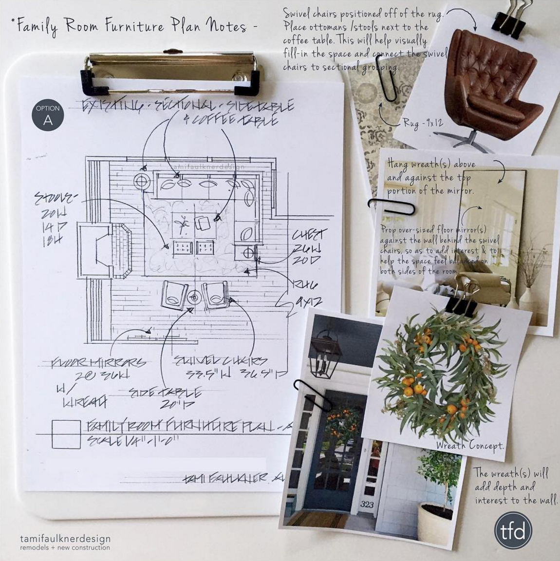
Hand rendering interior design space planning

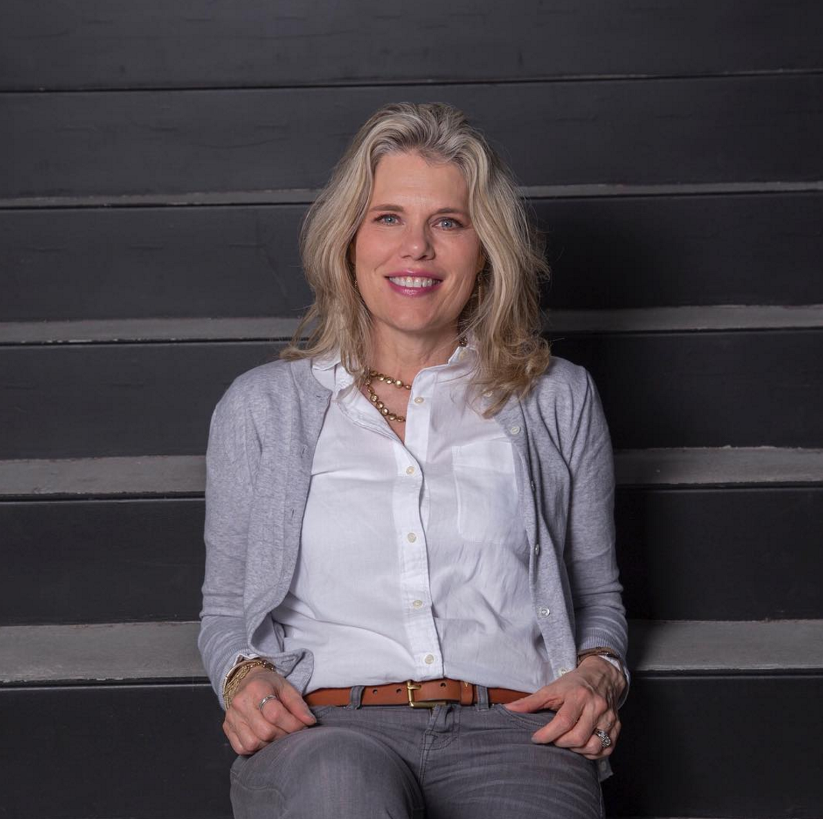
Meet Tami Faulkner, a Northern California based Interior Designer. She began assisting clients with their design needs in 2000 after graduating with a Bachelor of Fine Arts in Interior Design from California State University, Chico. Her work experience includes commercial, corporate, healthcare, and residential design projects. Tami's speciality is residential remodels: particularly kitchen and bath design. She also designs furniture and does some graphic design. Currently Tami teaches hand rendering seminars for both professional and student designers.

Tami Faulkner

1. Olga Sorokina (O. S.): Tami, could you please tell us how did you come to interior design and rendering and what was your initial step in hand rendering?

Tami Faulkner (T. F.): Drawings and renderings are just a part of the design process. As a design student it was the means in which I learned to design, problem-solve and communicate ideas and so naturally those skills became critical to my design approach as a professional.

2. O. S.: According to your Instagram it looks like your favorite part of design work is ideation on paper using furniture plan and concept board, so what does hand rendering and space planning mean to you?

T. F.: The way I see it, space planning is the foundation of any successful design project. It’s critical to understand and know the existing space and the potential for new space, to be able to offer valuable solutions for the client.

space planning interior design

3. O. S.: How do you structure your workday or your workweek?

T. F.: My work days and work weeks are a careful balance between client appointments, onsite visits, research outside of the studio and time in my studio. Although all of these steps are essential to moving a design projects along, I always feel like my time is more productive while in my studio, when I’m actually producing and designing.

4. O. S.: Please tell us about your sources of inspiration. What helps you to be productive?

T. F.: My initial source of inspiration is the client themselves. Along with knowing the space, I try to understand how the client thinks, how they live and what inspires and pleases them. And from there I set to work to come up with creative, yet practical solutions.

Hand renderings add polish and warmth, making the design presentations more appealing to the clients. That appeal helps as a selling tool too, with being able to present design ideas in a pleasing way.

5. O. S.: I have noticed in your Instagram some photos from your Rendering Workshops for creatives, what does it mean to you to share your knowledge?

T. F.: Yes, spending time teaching and mentoring other designers is a highlight for me. I love spending time with creatives and for the energy, enthusiasm and renewal of spirit that I get from other designers.

6. O. S.: How do you see the future of hand rendering in interior design?

T. F.: Interesting question... How do I see the influence of hand rendering in the future of design? Honestly, I have been surprised by the interest designers have in learning a skill that is hardly taught in design school today. That said, there seems to be a push and a rekindled interest in including an artful, hand produced feel to otherwise computer-aided presentations. There is a sense of authenticity that hand rendering adds to a design presentation that is hard to match by using a computer. Hand renderings add polish and warmth, making the design presentations more appealing to the clients. That appeal helps as a selling tool too, with being able to present design ideas in a pleasing way.

Space planning is the foundation of any successful design project. It’s critical to understand and know the existing space and the potential for new space, to be able to offer valuable solutions for the client.

7. O. S.: What one advise would you give for beginners in hand rendering?

T. F.: To those who want to learn hand rendering, I would say to start by following other designers who’s hand rendering styles are admired. Analysis, look at it carefully and consider how they do what they do, and then try to implement the same approach while putting a unique spin on it.

Interview with Tami Faulkner by Olga Sorokina.

P. S. Please share this inspiring interview with your friends. Thank you!


To learn more please visit Tami's website: tamifaulknerdesign.com

Tami's Instagram: tamifaulknerdesign

Interview #2 with Apisit Chuldecha, hand renderer from Hong Kong

Hand Rendering interview Apisit Chuldecha

FIRST IMPRESSION FROM his HAND RENDERINGS IS «WOW», AND AFTER IT COME QUESTIONS «HOW ON EARTH HE DID IT?», «IS IT HAND RENDERING ONLY OR DOES HE USE ANY COMPUTER PROGRAMS FOR GENERATING PERSPECTIVE AND LIGHT EFFECTS?», «IS IT WATERCOLOR AND WHITE TEMPERA FOR DETAILS OR MAY BE COLORED INK?», «HOW LONG DOES IT TAKE TO CREATE ONE PIECE?», «AND HOW LONG DOES IT TAKE TO LEARN TO DRAW LIKE THIS? LOOKS LIKE THIS MAN HAVE BEEN DRAWING AAAALLL HIS LIFE…» SO YOU SEE MANY QUESTIONS ARISE, AND I BELIEVE THIS INTERVIEW WILL REVEAL SOME SECRETS OF apisit Chuldecha's HAND RENDERING «MAGIC KITCHEN».

Apisit Chuldecha hand rendering

Name: Apisit Chuldecha

Born: 30 July 1978 in Bangkok, Thailand 

Education: 2004, B. S. degree Fine Art (interior design), Silpakorn University Bangkok Thailand

Work: Design Basis Ltd. Singapore. Interior Designer, 2003-2004

           Wilson Associates Singapore. Senior Interior Designer, 2004-2008

           Bilkey Llinas Design Hong Kong. Senior Interior Designer, 2009 - present 

Instagram: @chuladecha

Website: www.bilkeyllinas.com


1. Olga Sorokina (O. S.): My first question is all about your technique and materials that you use. I guess a lot of people (and I noticed it in your Instagram) ask you similar questions. Could you please tell us in this interview and answer this kind of question once and for all. What color ink or may be watercolor do you prefer, which brushes are your favorites, which liners, what kind of paper and its size do you select?

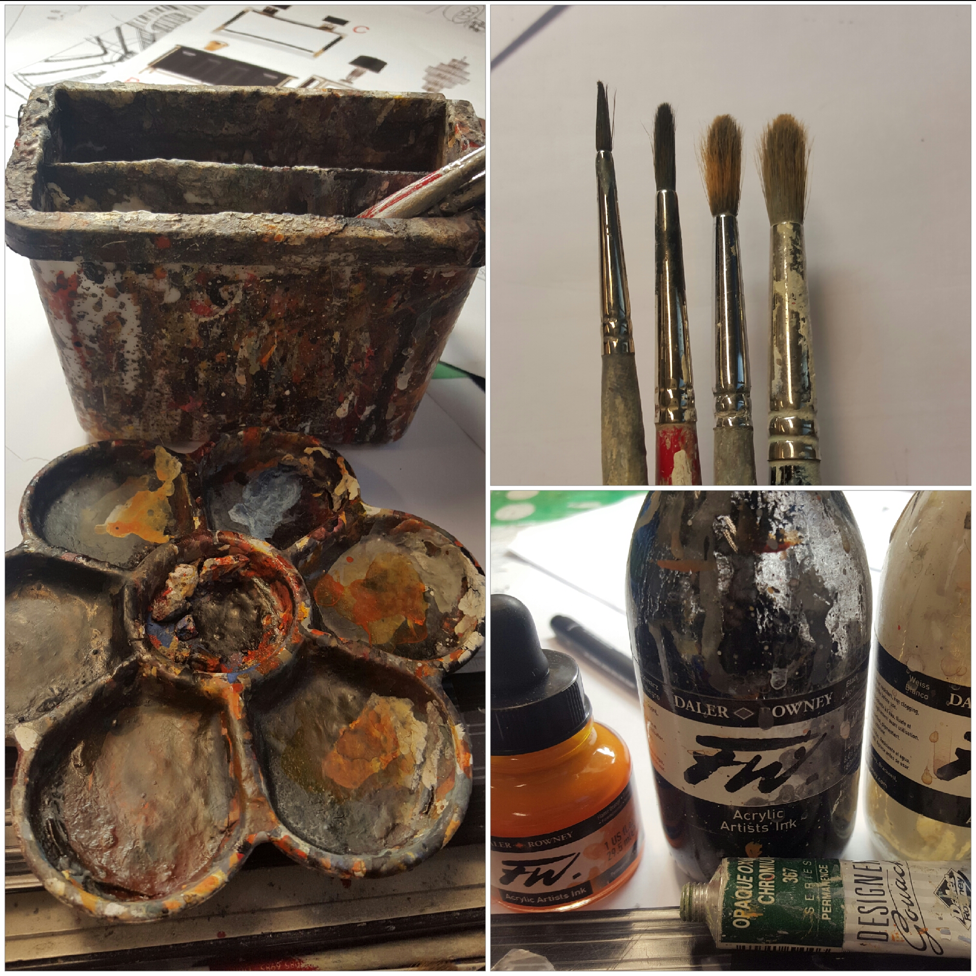
Apisit Chuldecha (A. C.): Basically for almost all of my works I use «DALLER ROWNEY FW. Acrylic Artists Ink», and sometimes I use Watercolor. Acrylic Ink and Watercolor imply painting by brush, both of them are water-techniques, but the difference between them is the time they consume. 

When you are painting by «Acrylic Artists Ink», it dries very slowly, and once it dried the color drops one tone down, so that you may need to paint it again adding the next layer until you feel it is the right color. You can paint Ink color over and over again, as many layers as you need, but make sure it has already dried before painting the next layer. It is very slow and time-consuming process in comparison with Watercolor technique, but it is very easy to fix or change the tone or even alter the color itself after finishing your work.

As for the Watercolor, it is not as waterproof as Ink color, but it gives the right color from the beginning, I mean the color you get before painting will look exactly the same way on paper after it has dried (moreover it’s not as time-consuming as Ink and it could be one short paint to finish). But it is impossible to change anything at all after Watercolor has dried on the paper, and also you have to always take care that your work is away from water.

The point is that both techniques have their own advantages and disadvantages. At the same time, it depends on what kind of work you are doing, what style you are using and how much time do you have. So my works are finished by Ink Color mainly because this technique is more appropriate for interior design industry where you have to take into account many things and it is usually rather long process to change design. Ink Color can give you more possibilities to change things that matter in design.

The brush for me is not a big deal, I concern only about the fix number of sizes that I always must have, typically I need for my work at least 4 sizes: No 1,  No 3,  No 6, and No 10. I can use any Brand, so I prefer cheap ones for they can replace an old set after finishing a rendering (one set of brushes per one rendering).

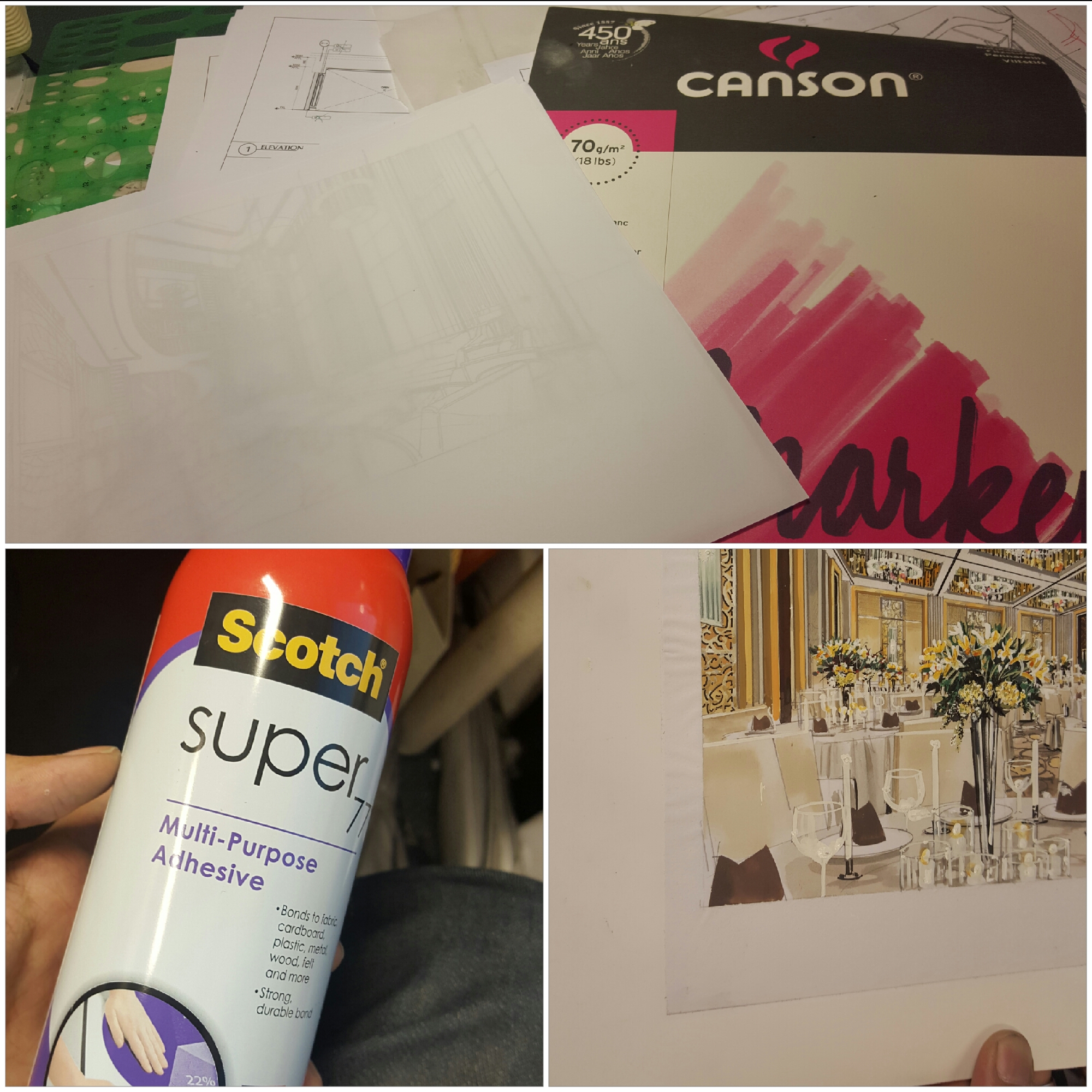
Paper: I use marker paper which is very thin and a bit transparent. The reason is mainly because this marker paper can be seen through so that I can draw a line by pencil using the rough ink sketch by placing the marker paper on it. After finish drawing lines with details by pencil, I stick my sketch on a cardboard by using spray glue. This can make your marker paper become very strong and ready to deal with water during painting process.

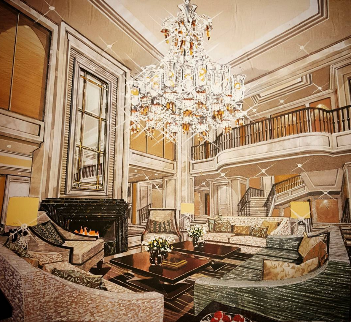
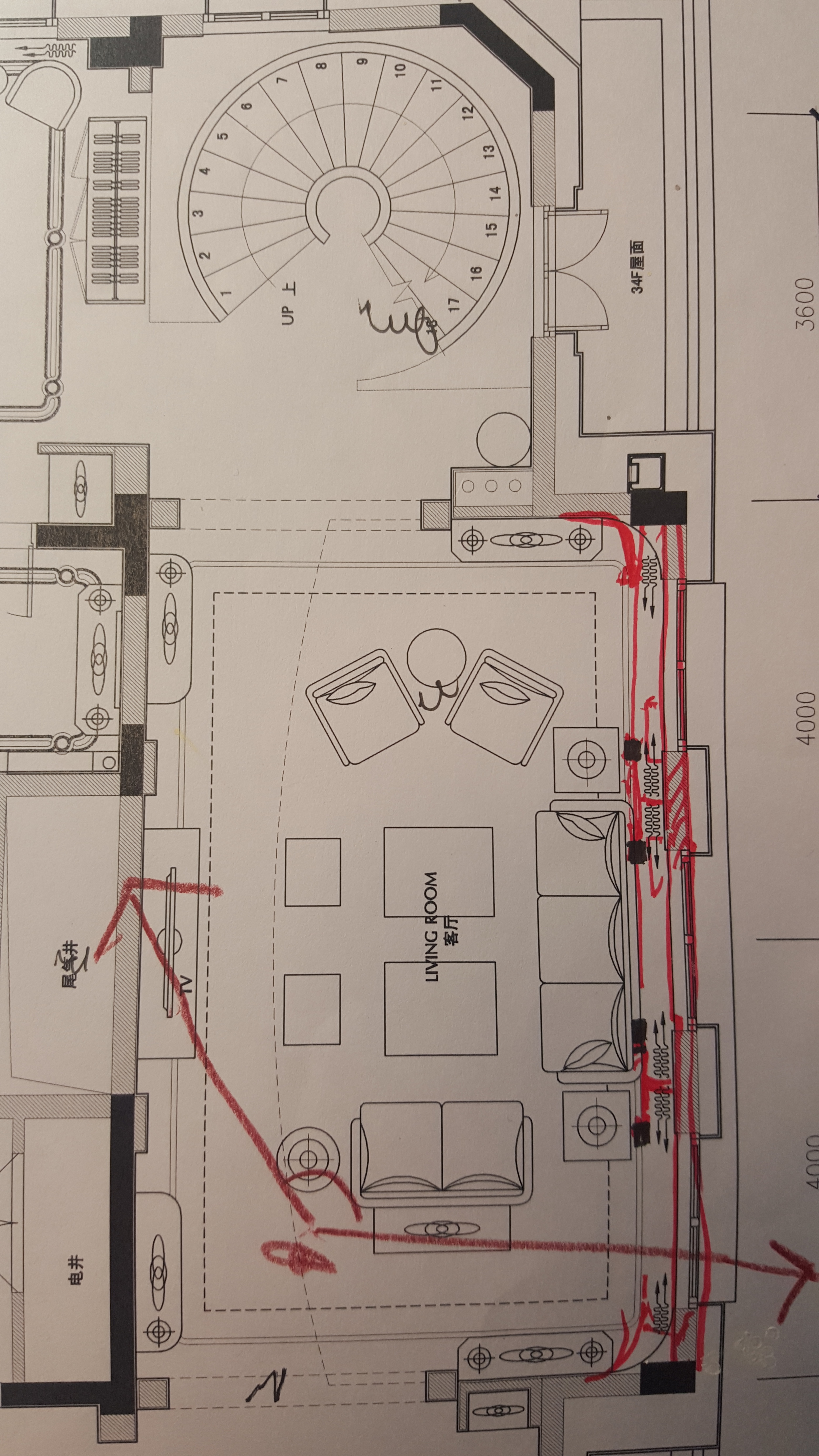
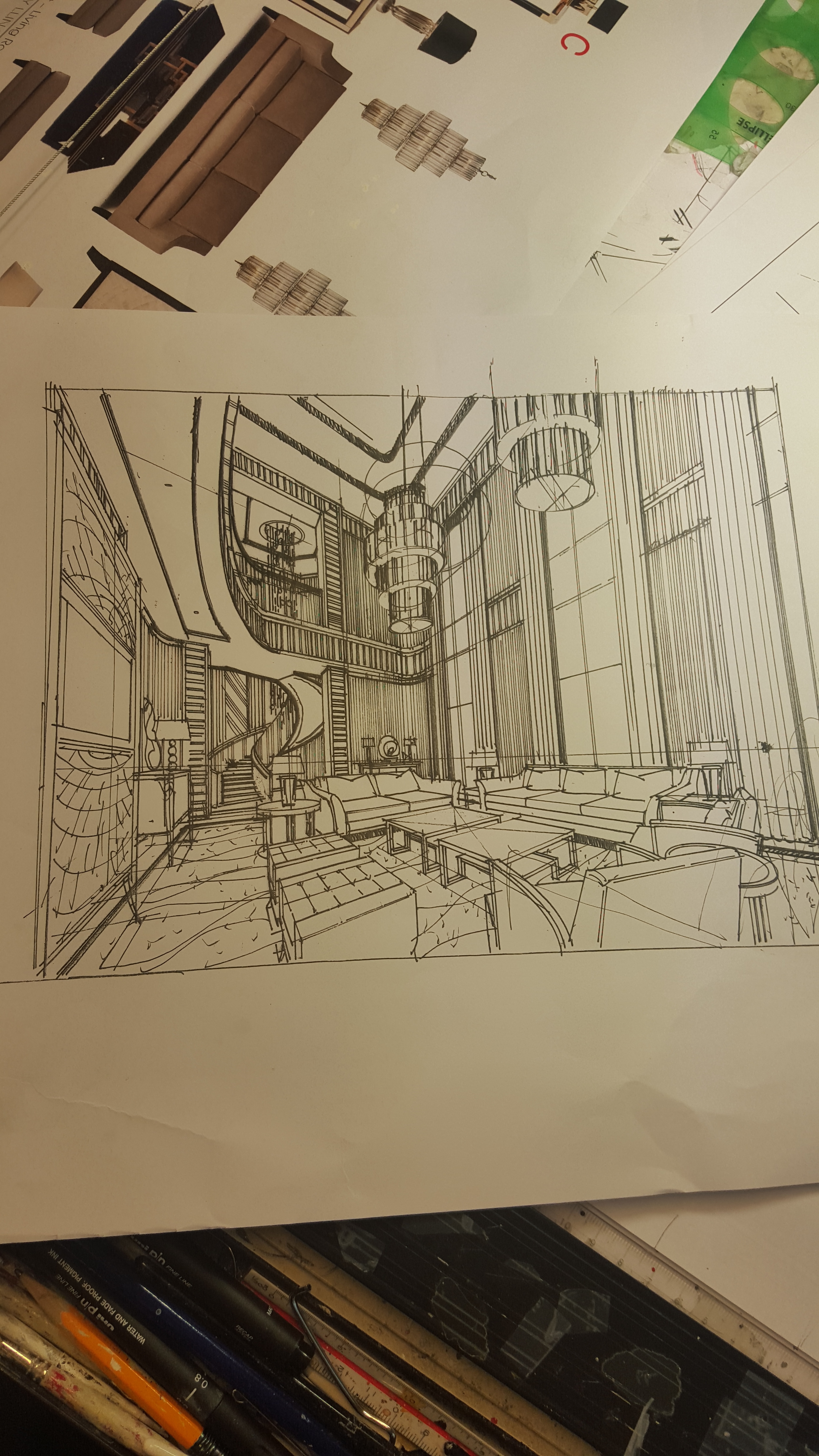
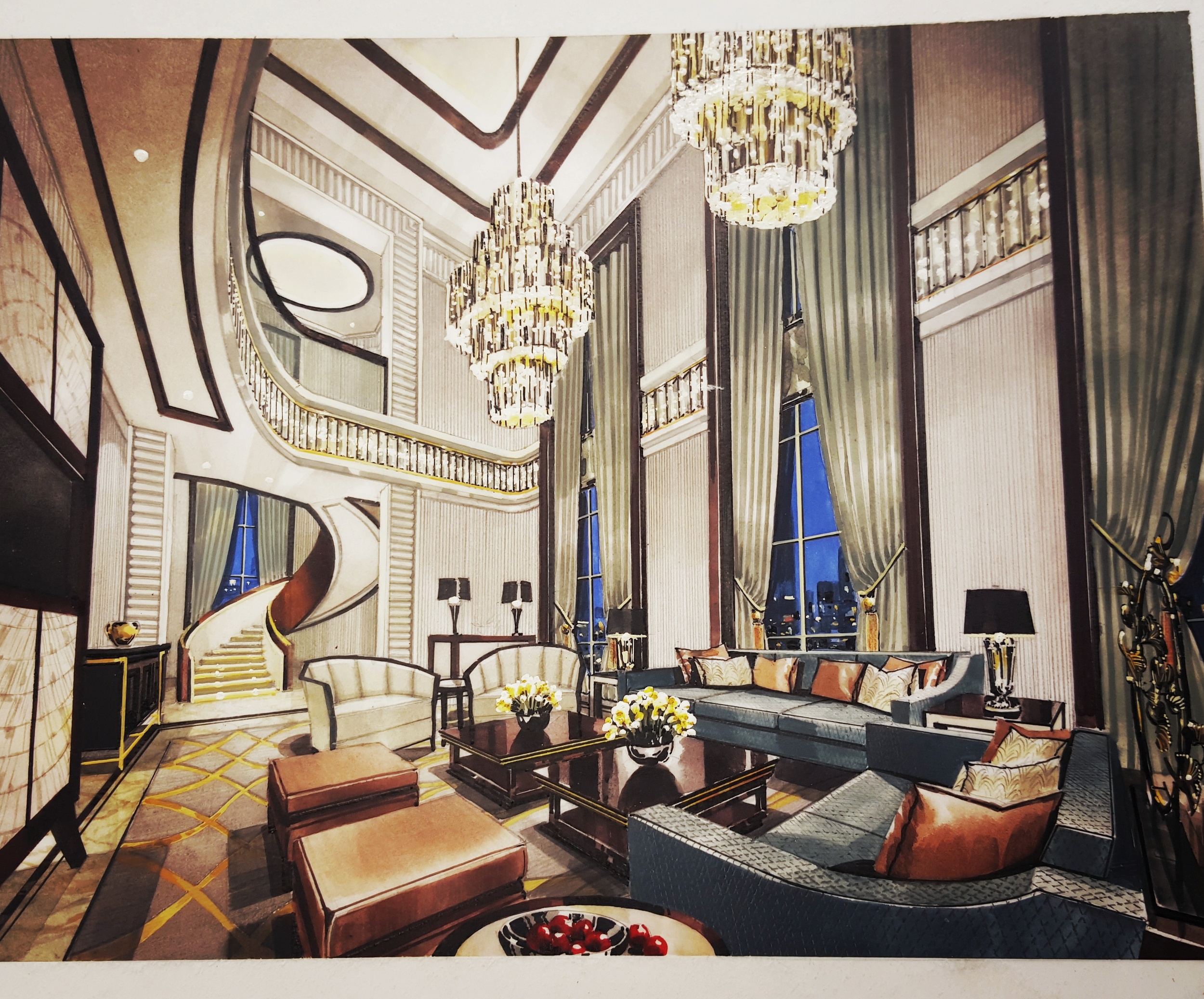
2. O. S.: Please briefly describe your process of creating hand rendering from the very beginning to the end (and how long does it take), for example this one:

Hand Rendering Interior Design Chuladecha

A. C.: Starting from the beginning the process takes about 3 to 4 days if everything is ready and nothing changes about design and material; this example took 4 days of rendering.

The process starts once you have enough design information (at least Layout Plan and the Ceiling Hight). 

My steps in hand rendering:

Select the best view based on the Layout Plan by marking the standing point. Set up the sketch showing the view based on the right proportions and standard sizes of furniture plus the hight of the space based on the Ceiling Hight information. So you have the right view on the sketch with the positioned furniture (I call this Black and White Block Out sketch). 

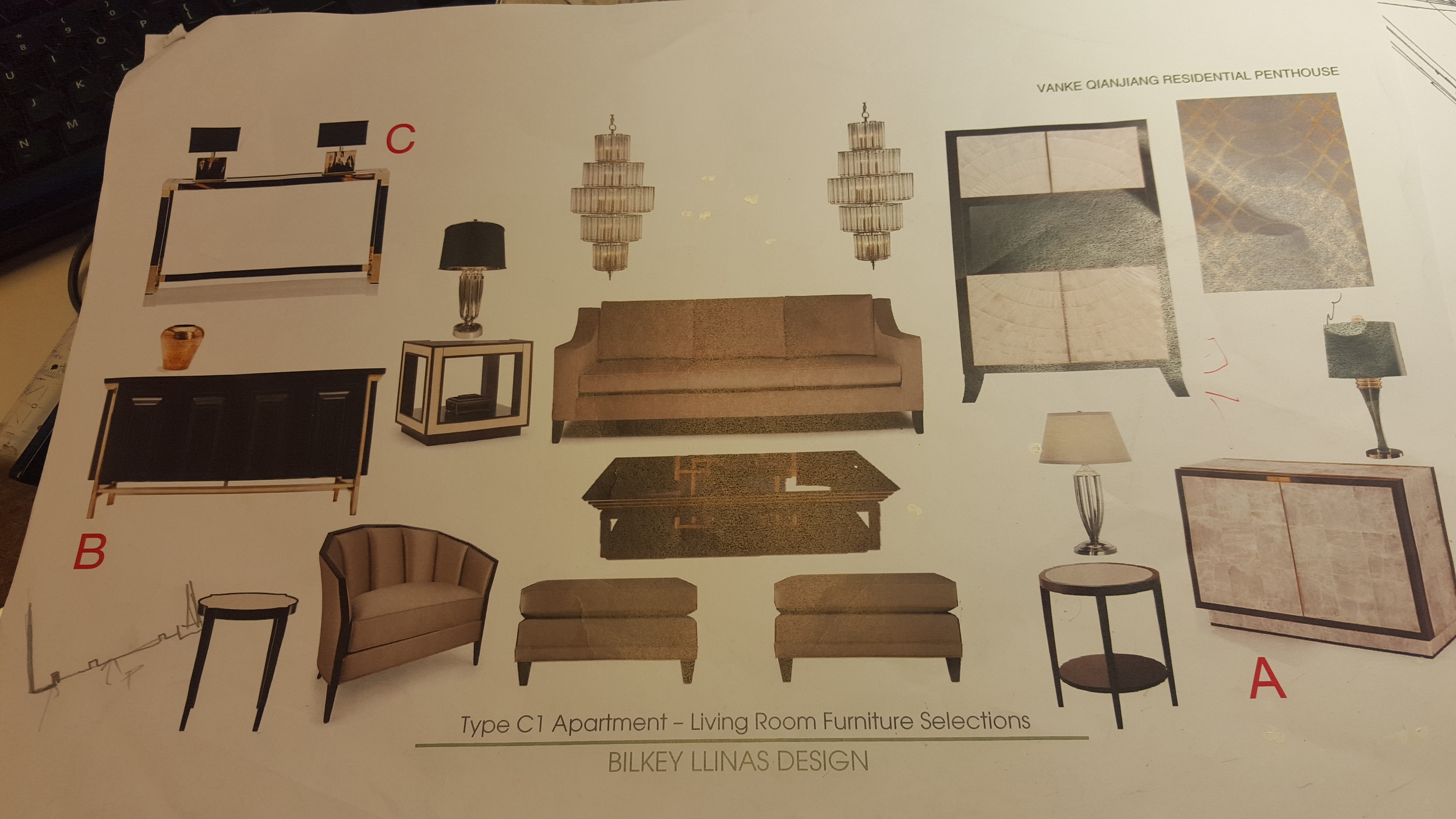
Next step: you should go ahead with more details, as much as it should be according to the design (furniture selected, floor, wall, ceiling, design pattern, lighting, elevation). Then use the Block Out sketch as the basic framework by placing it on the table, then place maker paper on it. Now you can see the Block Out sketch through the marker paper and able to draw more details by pencil (I call this Pencil Line Work Details).

This process should take about 8 hours.

So we have:

1. Black and White Block Out sketch

2. Pencil Line Work Details

The next step is all about the color and the materials. I use Pencil Line Work Details as a basis and then insert on it all information about materials and colors. Once this step is done we can start painting. The painting process usually takes around 2 more days up to finish.

Interior sketching Hand Rendering Freehand sketch Design

3. O. S.: I noticed that you create primarily night views with electric source of light and I have seen only few drawings in daylight on your Instagram. Why is that? Do hand renderings with night illumination look more effective?

A. C.: The reason to do rendering with night time scene is based on the reality of interior design purpose, moreover almost all of my works are about hospitality style (read «hotels») and dealing with light fixture. Night time scene is the easiest way to bring out the potential from each light fixture and to emphasize lighting design for the whole space. This allows to provide the feeling of elegancy from each object and materials such as diamond, crystal, gold, polish steel or any source of sparkle that needs light to increase its value. The reason to do rendering with daylight is based on the design purpose as well. Some projects need to get the benefit of daylight as it helps to present better their design, for example the view of exterior such as beautiful landscape, garden, beach, sea or sky. These are always important elements for the open spaces of interior-architecture projects such as resorts, open restaurants, interior gardens. So daylight or night time, what to select depends on the purpose of the design, not on rendering.

4. O. S.: If you finished your hand rendering and client wants to make some changes in the design - how do you deal with it? Do you use Photoshop, make changes in the finished drawing or start it again?

A. C.: This always happens so it is not a big deal and no need to redo from the zero again. So the way to introduce changes is to draw only the part you have to change by pencil on the marker paper and then spray the glue on this part to stick it where you want it on the sketch and after paint it over again.

Start to collect pictures of the places you like and copy them on paper whatever way you like by hand. A lot of new techniques are waiting for you to be discovered.

5. O. S.: Could you please share your inspiration sources, what are they?  I’ve noticed your passion to the bonsai art, cats and watches, please tell more about it.

A. C.: Bonsai Art for me is some kind of long-term class to learn how to be patient and how to accept unexpectable things that can happen due to the random essence of nature.

Cat is my friend. The watches keep reminding me of the reason why the world doesn't want things to be too perfect; if it wanted it, the majority of us would use digital watches.

6. O. S.: How do you see the future of hand rendering in interior design?

A. C.: Since the digital rendering has become the convenient way to support design industry it seems like it is pushing hand rendering into the frame of «silent art». However, I still think that if the most important point for all renderings is to represent something in the most realistic way, then the hand renderers (why not?) should pay more attention to make their renderings look more realistic in comparison with digital renderings. In my opinion, the main focus of rendering is to present something that is going to be the reality in the future, not now, so this is the crucial difference between renderer and illustrator.

Regarding the future of hand rendering: both types of rendering (hand and digital) are trying to do the same thing - to mirror the reality in the best way. But I think that in the future both rendering types will be undoubtedly more and more different. So this is the main question: how hand rendering can be more realistic than digital one? In reality every pattern in Nature is inherently not perfect, there are always some random errors without purpose. For example if you take a look at the marble grains, they all have something random inside, but still look like a pattern in general. Each piece of marble is unique and unrepeatable just like our finger prints can never be completely the same. Hand rendering reflects this essential concept of the Nature - there will be all kinds of random small errors in your drawing (sometime I call these «good mistakes»), we just need to skillfully control them and correct them if necessary. 

The digital renderings seem too perfect due to 3D programs we use, for instance those patterns look unnatural in them. From the other hand, digital rendering can introduce some random errors with purpose to try to copy the error things in Nature, but that seems harder to make in comparison with hand rendering. But here is the point: if hand rendering will not progress and change during the next 20 years, it might fade away and be completely replaced by digital rendering for the interior design industry. However its value from artistic point of view will always be high.

7. O. S.: What one advise would you give for beginners in hand rendering?

A. C.: Start to collect pictures of the places you like and copy them on paper whatever way you like by hand. A lot of new techniques are waiting for you to be discovered.


Interview with Apisit Chuldecha by Olga Sorokina.

P. S. Please share this inspiring interview with your friends. Thank you!


Interview #1 with Masoud Farhad, architect and freehand sketcher

Hand rendering interview freehand sketch
I try to pioneer new drawing tools and find out unusual substances to paint with, for instance I coated handful amount of my sketches by using coffee and beet syrup.
— Masoud Farhad
Masoud Farhad architect

1. Olga Sorokina: How did you come to sketching and what was your initial step in sketching?

Masoud Farhad: My field of study is architecture and definitely, it is the most adventurous profession amongst all skills. Architecture can be categorized into different separated parts. One part is the theory of architecture and at the beginning it focuses on the history of classical art and architecture in the world and continues to contemporary theories. The other parts are more practical and architect picks up a pen to design a building. The procedure of design is a complicated process and must be carried out correctly. To develop and Idea, it’s necessary for architect to draw primitive simple shapes. Those simple sketches develop toward final design. It’s highly important for each architect to know how to sketch. I figured out the importance of the issue when I was green at the university. I realized that good sketchers can be good architectural designers. Since then, I made my mind to become a good sketcher. Although I was good at drawing by heart, I seriously tried to improve my abilities. Now, architectural sketching is my main profession.

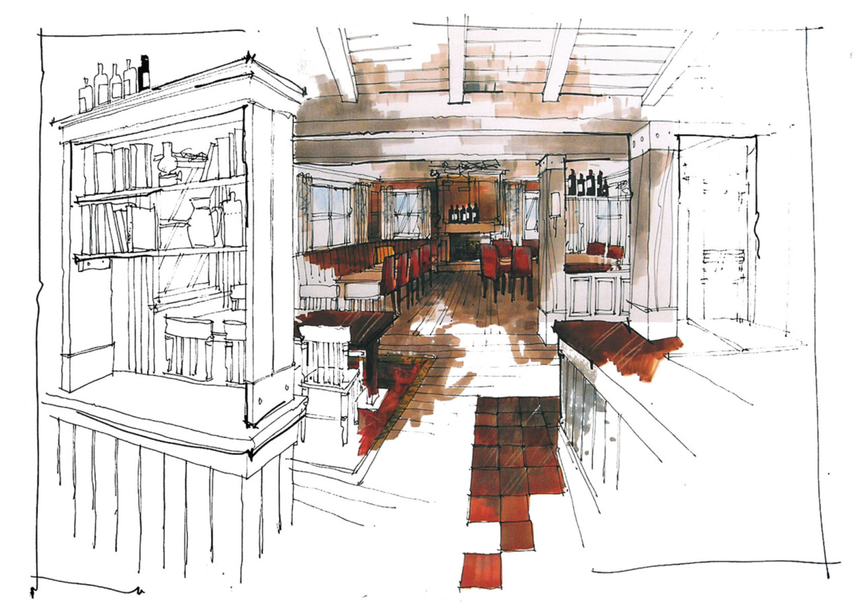
2. O. S.: Could you please describe your process of creating sketches (and how long does it take), for example this one:

M. F.: A good sketcher should be equipped with simple but important drawing tools. A proper surface to work on and a good pen to work with and also a nice atmosphere to work in. Primitively I evaluate the size of the sketch according to the size of the page. Then I draw principal lines of the sketch in a fast way. Details are not included at this stage. Afterward, I add other components like furniture in details. The direction of light shows how to cope with shadows. A good sketch has a good lighting. Then I put the color on the sketch on aesthetic regulations using colorful markers and brushes. A little less or more, it takes half an hour to complete one work.

3. O. S.: You have very beautiful technique for your architecture sketches, it looks like combination of markers for a building and watercolor for the sky and background, or maybe it is waterbrush?

M. F.: Each sketcher is good at one or two drawing and painting methods, I prefer to use the combination of techniques for rendering. The main part is painted with different colors of markers and the rest is coated with ink. Every method has its advantages and disadvantages, for encircled areas it is easier and faster for me to use markers, mostly for trees and sky I can deal with ink much easier. It gives me the ability to work with fading colors in perspective. I use brushes to put the color on the surface. There are possibilities to easily mix colors to achieve new ones. Undoubtedly, the density of the ink and strength of color can be controlled by mixing it with water. I can quickly obtain variety of color tones from each tint by adding pure water. It is controllable and easy to manipulate. For a beginner, it is a sort of trial and error and with practicing it becomes an interesting hobby. It makes me feel like a boss and my tools are loyal employees. The achievement always sounds satisfying.

4. O. S.: How do you make perspective for your interior sketches, do you use computer programs or do you make it by yourself?

M. F.: I personally believe in architectural computer software and applications in this technologically improving century. It is undeniable to take the advantages of computer sciences. It is neat and accurate. I have to clarify that I have never worked with software to draw. I do call my works as freehand sketches. All of them have been done by hand. Interior and exterior perspectives are created by drawing correct composition of lines and putting the colors aftermath. The only way I am enjoying the computer is using software to balance the strength of lines and to slightly modify the contrast among colors. The original colors of the works are in logical order but when it comes to screen looks a little darker and in sum, software edits seems unavoidable.

No matter how many modern applications and computer utilities come to the market, freehand sketches illustrate new designs effectively faster.

5. O. S.: What are you currently working on?

M. F.: It is commonplace to draw things by using fountain pens and other common drawing pens and pencils, I try to pioneer new drawing tools and find out unusual substances to paint with, for instance I coated handful amount of my sketches by using coffee and beet syrup. I have checked substantial number of colorful food stuff and chemical liquid substances to use them in sketching just as water-color and ink. In addition, I am doing my best to publish my book which is about sketching techniques in at least three languages. The result is amazing.

6. O. S.: Please tell us about your sources of inspiration. What helps you to be productive in sketching? One thing is coffee I suppose, according to your Instagram :-)

M. F.: To be honest I am crazy about going through intact nature, seeing mountains, clouds, trees and rivers. It makes me feel like I am eager to create works. Also I like rural wooden cottages standing in the middle of a rain forest. I like to sip a cup of coffee sitting on a bank of a river. It makes me feel like I am alive and my hand must create artworks. I figured out that some sorts of natural colors could paint my sketch as I painted handful numbers of my perspectives with a coat of coffee. Anonymous natural powers push me toward notable innovations. It inspires me to wake up and shine. Natural compositions are the source of all arts. No matter it is a piece of music or visual arts.

It’s highly important for each architect to know how to sketch.

7. O. S.: How do you see the future of sketching, particularly in interior design?

M. F.: The universe is always in motion and it never stops even for a second. It is necessary to keep up with it. As the world and attitudes are changing, interior and even exterior architecture changes too. Architect has to design new patterns and designs according to new attitudes and actualize it on a piece of paper via fast freehand sketches. Sketch matters and will never lose its workability. No matter how many modern applications and computer utilities come to the market, freehand sketches illustrate new designs effectively faster.
8. O. S.: What advises would you give for beginners in sketching?

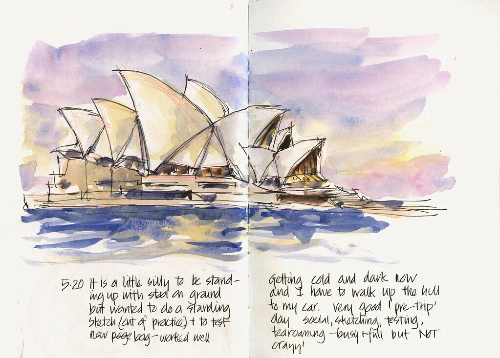
M. F.: I suggest the beginners to study relevant books and see variety of good sketches. They have to learn step by step. It is impossible for a person to become a perfect artist overnight. At the beginning, they should get to know sketching tools and then learn how to use them effectively. They should learn basic concepts of illustration rules appropriately, then practice to draw interior and exterior perspectives. They should get familiar with shadowing process which seems a little perplexing. Shadows make the third dimension easier to understand. At the end, it is necessary to learn how to use colors and relevant tools properly to make a good composition of lines and colors. I strongly suggest to beginners to believe their potentials. It is necessary to study and revise sketchbooks or take part at sketch courses to learn techniques, but avoid making replicas from other works and try to create personalized one. I bid green students to compile their works to compare primitive ones with recently done works and by this way the quality of learning process can be easily assessed. The collection can be kept as a personal worthy treasure. The process of learning should be under accurate control.
Interview with Masoud Farhad by Olga Sorokina.

P. S. Please share this inspiring interview with your friends. Thank you!


To contact Masoud please use information below:

Email: freeehandsketches@gmail.com

Instagram: masoudfarhad

Facebook: Msd Fhd

Linked in: Masoud Farhad

Twitter: masoudfarhad


Whom do you wish me to interview next?

Mail me at olgaart888@gmail.com

Next interview is coming soon!

Subscribe below to be the first who read it!

Olga Sorokina