
So many questions arise when you start sketching, my students most often ask me:
What materials do I need for interior design drawing?
Which brands of markers would be the best choice?
In this article, you will get the answers. Plus, I will share what I love to use in my everyday sketching routine, what my favourites are, and how lucky we are to have these types of markers!
“Telling yourself you have all the time in the world, all the money in the world, all the colours in the palette, anything you want — that just kills creativity.”

You can tell a story on paper even with very limited colour palette.
It’s actually even good in interior sketching to start with 7-10 colours if you are a beginner. Why? Because you don’t get overwhelmed with such a variety of choices (“Analysis paralysis” as they call it ), and really focus on what’s most important in drawing:
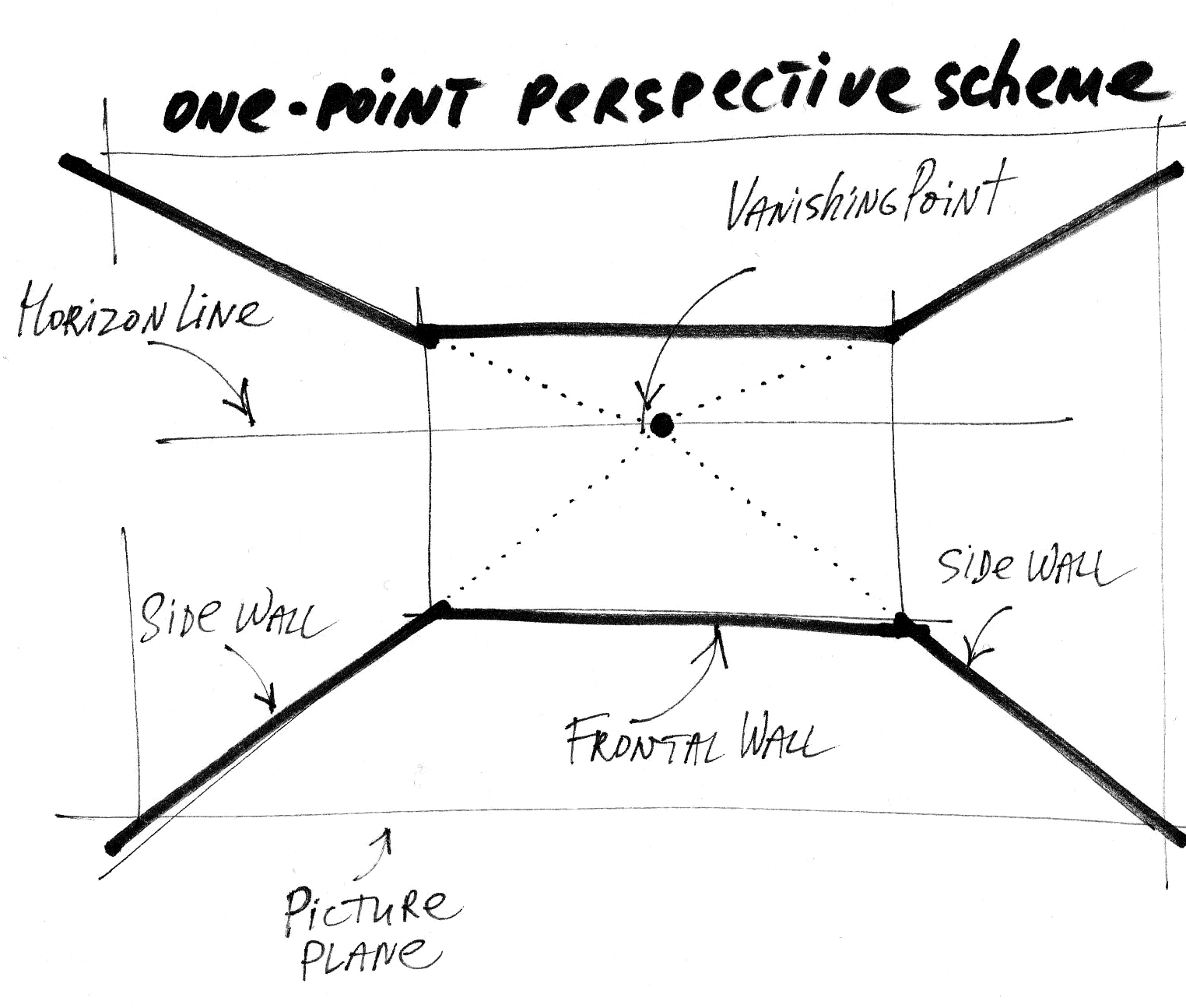
Perspective
Composition
Light
Volumes
Colours only close this list, beautifully though, but they go last.
I remember back in the days when I did my very first interior sketch commissions (it was 2007) clients asked me to do linear sketches. Pen on paper. No colour. That’s right.
If you are reading this blog post, the chances are that you are a newbie in sketching and hand rendering, or maybe you are a pro and simply want to learn more about the marker technique. In case you are going to buy your first set of markers, and now you’re asking yourself a question: Where do I start with so many options and offers?
Well, here is my strategy: Less is More.

Which colours?
First and foremost, buy basic colours, as you will need them the most. For interior sketching, it is better not to use pure, bright colours, but rather tones that are a bit ‘dusty’, ’noble‘ tones. What does that mean? With interiors, it is better to choose colours that people would feel comfortable living in. A typical interior sketching palette would include beige, grey, blue, olive, and woody tones.
You can buy the markers individually or in sets. There are even sets of ready-to-go colour combinations for architects and designers, which consist of marker colours that work well with one another.
“Less is More. A typical interior sketching palette would include beige, grey, blue, olive, and woody tones. That is 7-10 markers in total to start.”
Your first marker selection might be as follows:
Light gray (NG 2, Neutral Grey #2)
Mid-gray (NG 4)
Dark gray (NG 7)
Light beige (or vanilla)
Olive
Dark brown (chocolate)
Black
As you can see, there are seven colours in all, of which three are grey shades. Greys occupy a special place in interior sketching. Firstly, they are used to give background colour to the entire sketch. Grey markers differ not only in tone, but also in warmth and coldness: there are Neutral Greys, Cool Greys, and Warm Greys. To start with, you will need a Neutral Greys. Usually, they are marked by ‘N’ with a number: the higher the number, the darker the tone.
What brand of markers to buy?
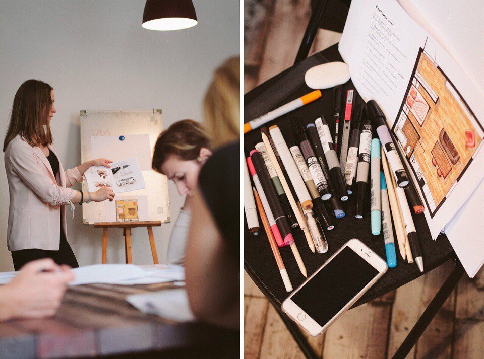
One of the first questions people often ask in my online sketching classes is about which materials they should use. What brand of markers is the best? How do various brands of pens differ from one another?
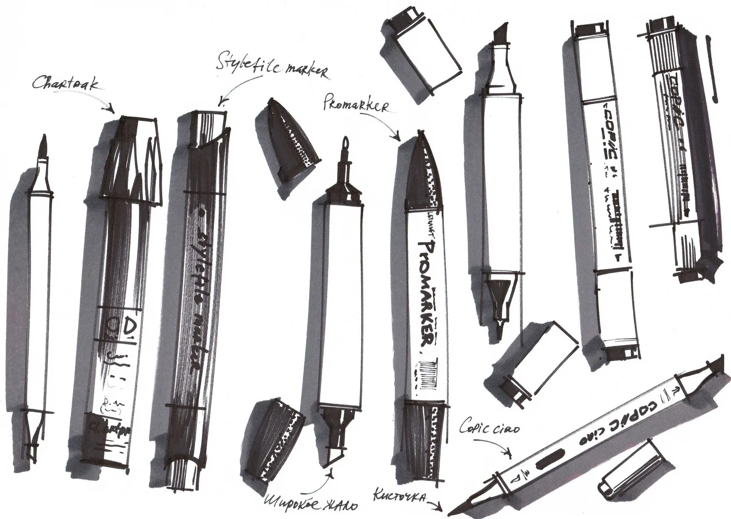
Up until now, I have tested five brands: Promarker, Copic, TOUCH, Stylefile markers, and Chartpak. All of them are good. These firms make professional quality markers that are perfect for drawing and are non-toxic.
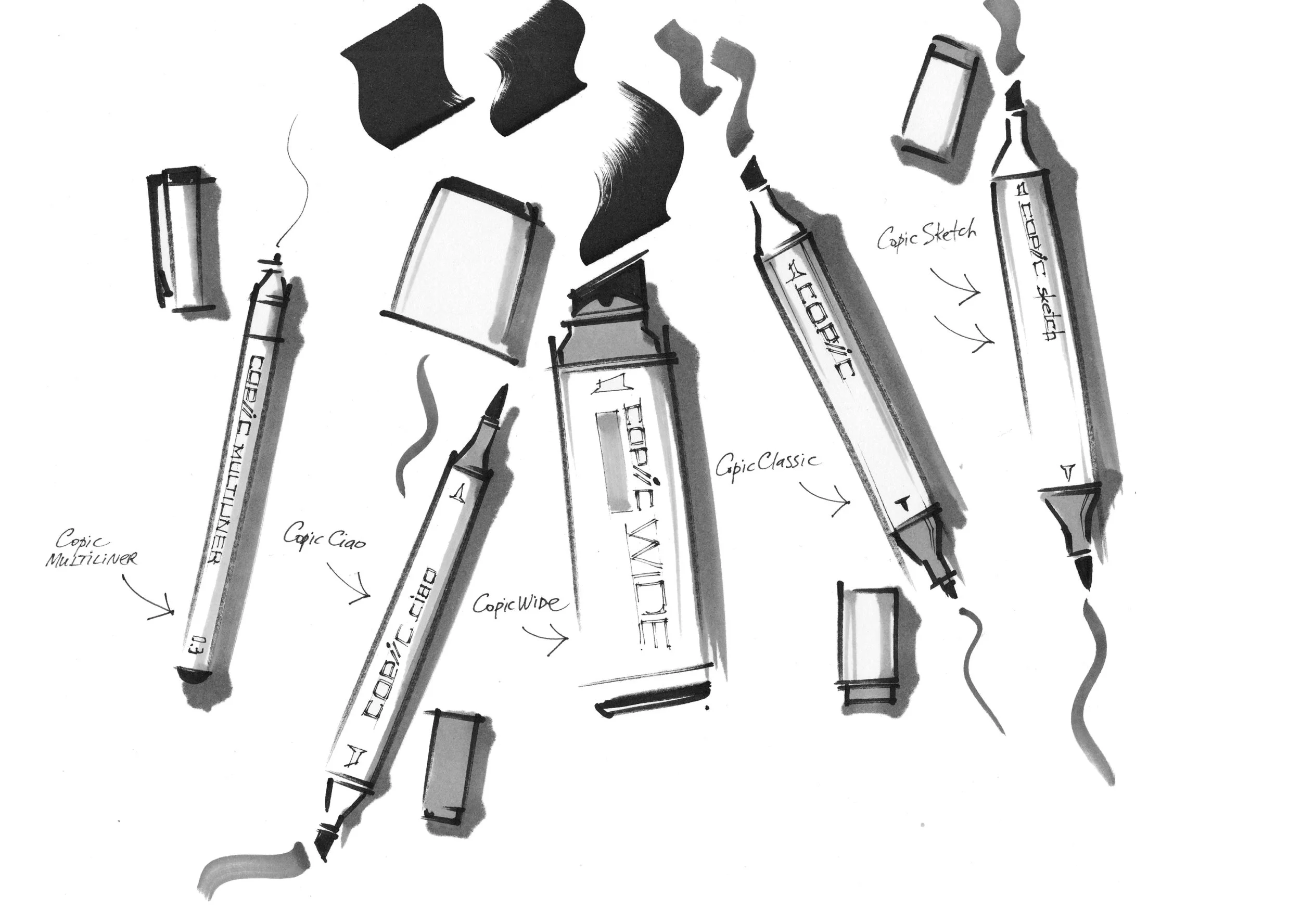
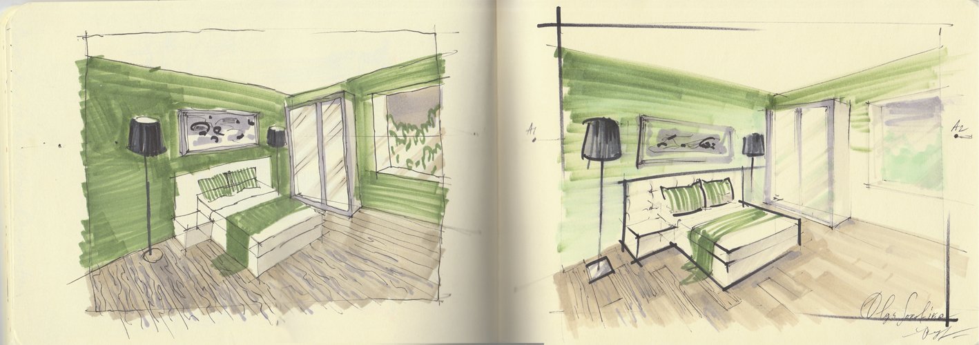
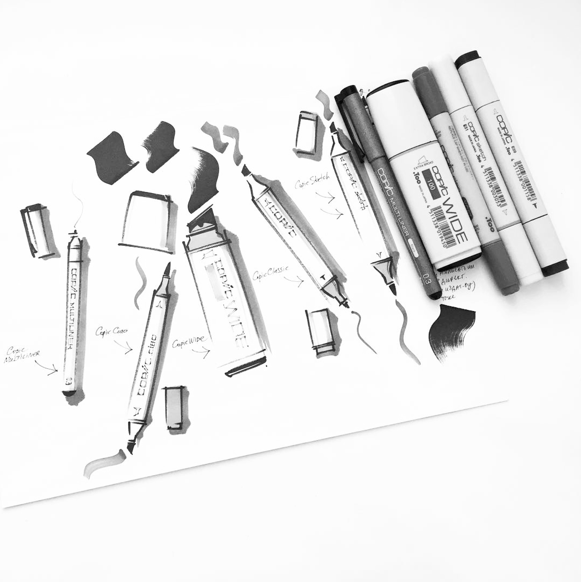
If I were to pick a favourite, it would be Copic. They have a vast array not only of colours but also of marker tips. These include ‘Classic’ markers, ‘Extra Wide’ ones, the thin ‘Ciao’ markers, and remarkable ‘Sketch’ (the last two have brush points). Maybe it is Copic Сiao that has influenced my technique most of all.
Here are my favourite Copic sets on Amazon: https://schoolofsketching.com/resources
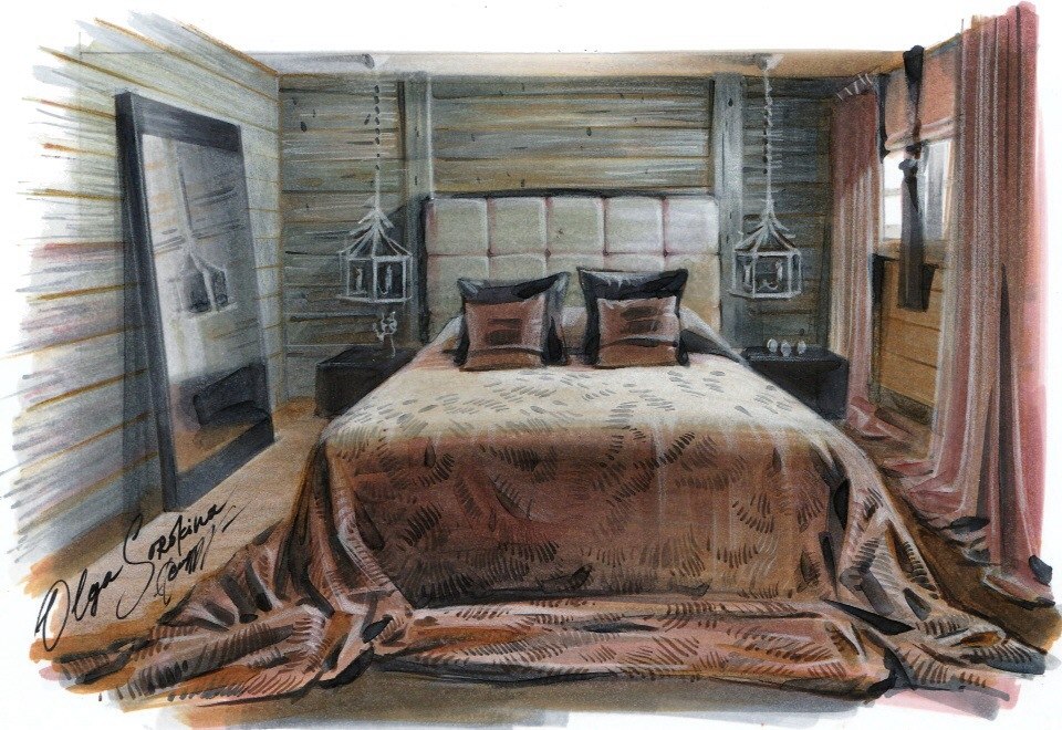
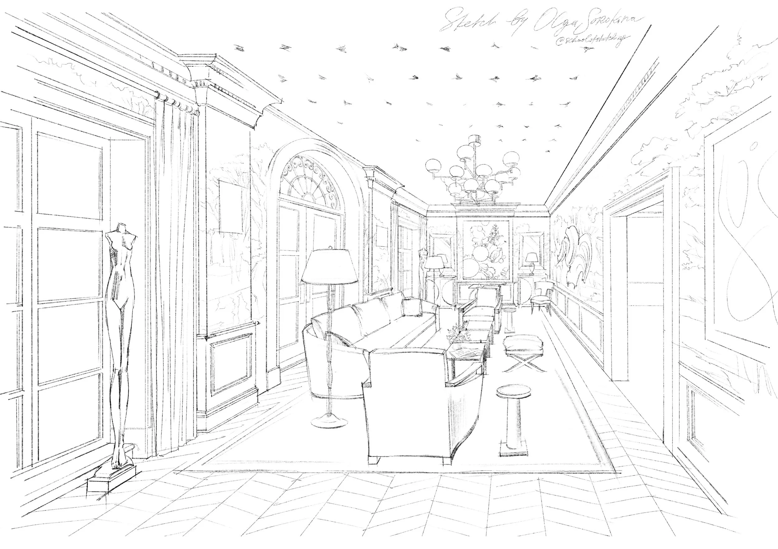
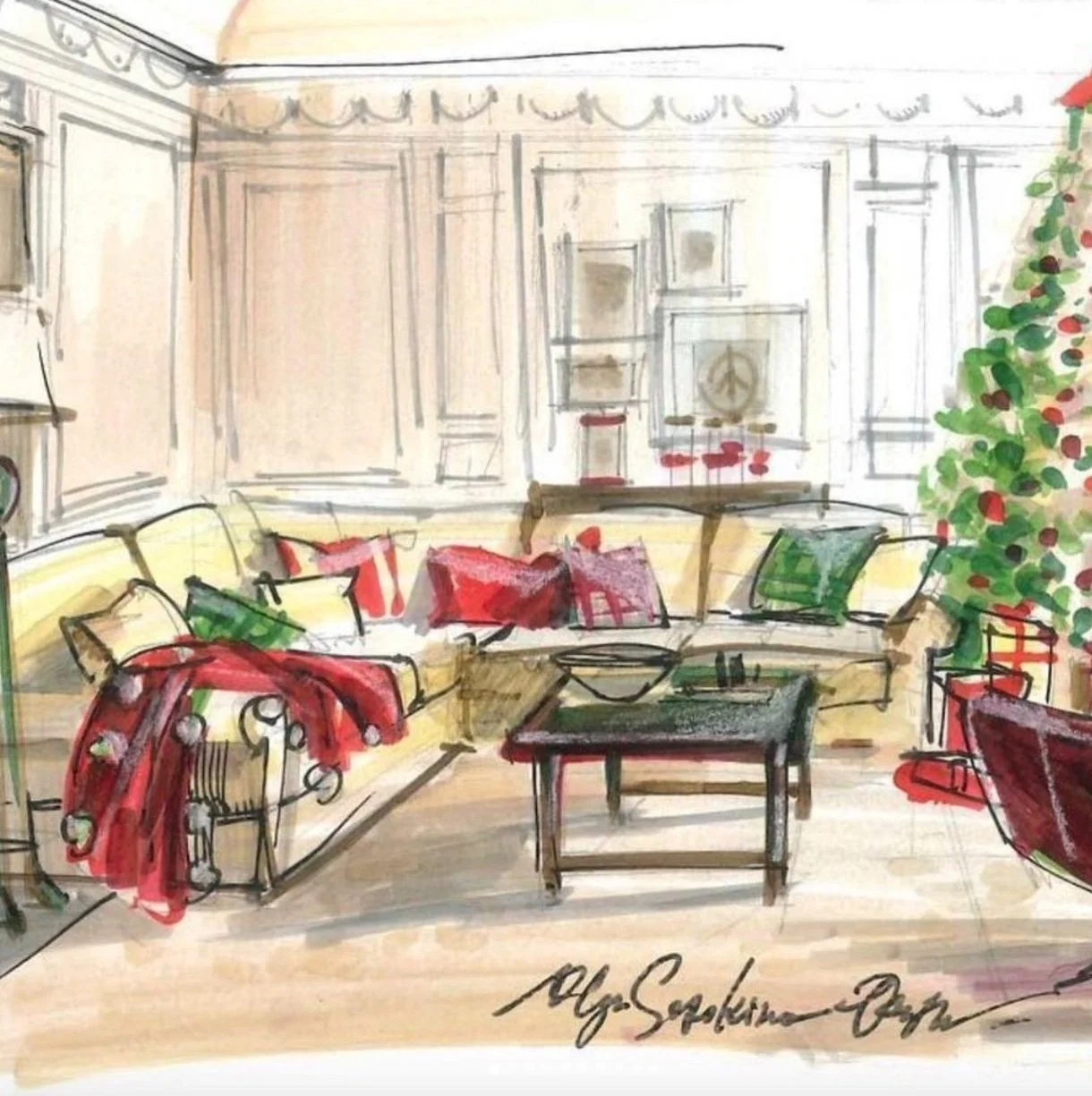
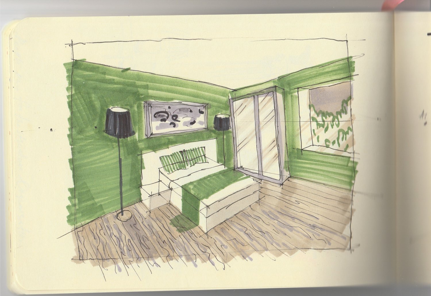
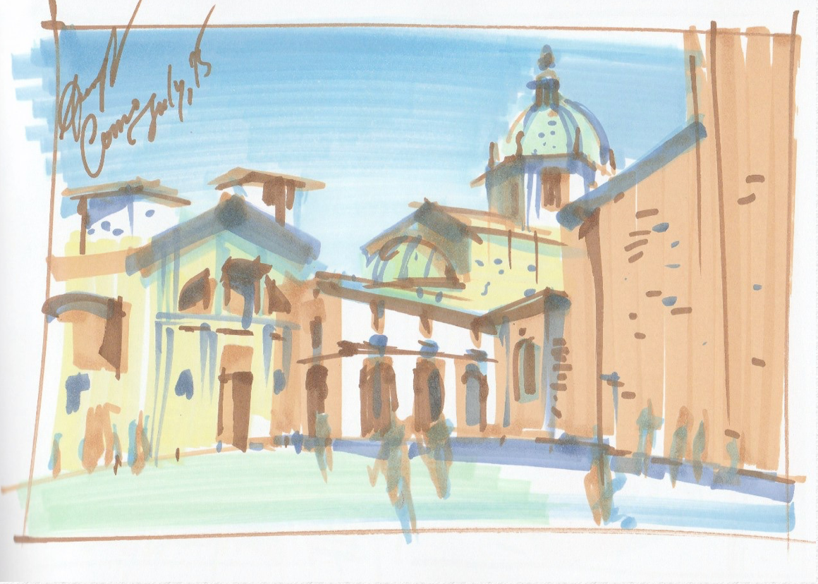
For example, I did this drawing by using Copic Ciao markers. I’ve included this set in the list in “Best marker sets from Amazon for interior sketching” article on my blog.
Let’s talk more about Copic Сiao. Firstly, they have a thin body that is very convenient to hold in your hand; you will simply feel it instantly. However, the main difference is that on one side there is a wide/chisel tip (incidentally, a bit narrower than a Copic Sketch, Promarker or Stylefile). At the other end, there is a brush tip, also known as the ‘super brush’, which truly lives up to its name! It is the brush that lets you make photo-realistic effects and fantastic not only for sketching but also for landscape drawings, abstract painting, portraits, architectural sketches, and even for calligraphy. Copic markers can be refilled, that is their tremendous advantage over the majority of other brands. Although they are currently one of the most expensive markers available on the art market, in the long term, Copics are the most cost-efficient.
Promarker is also very good. They are quite similar to Stylefile, ZIG, and Copic Classic. But these are single-use markers, which are not refillable.
Chartpak is markedly different from the markers mentioned above. These markers have one very wide tip with bevels, that is highly convenient for interior sketching. The only disadvantage is that these markers have a rather strong smell of solvent.
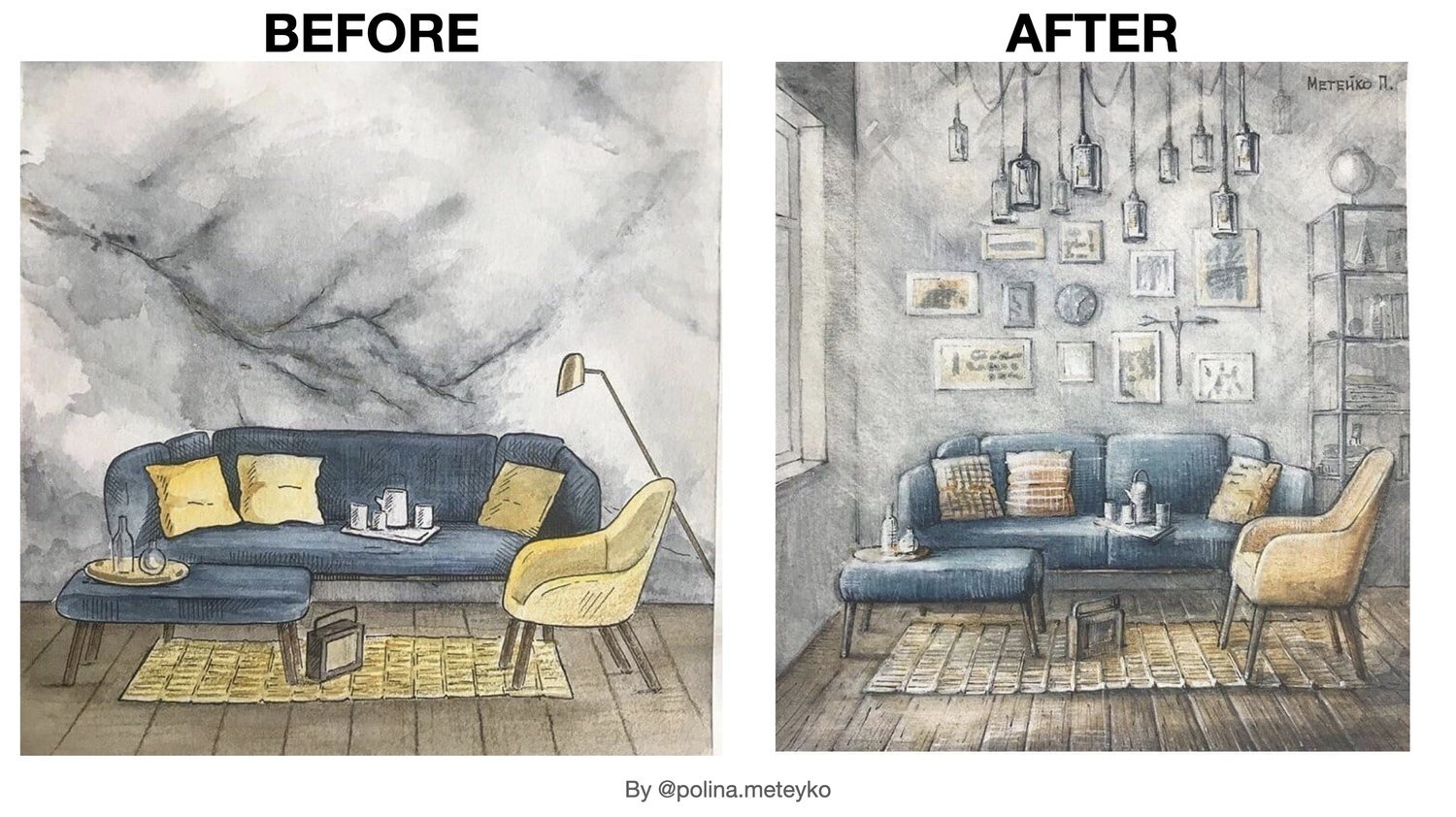
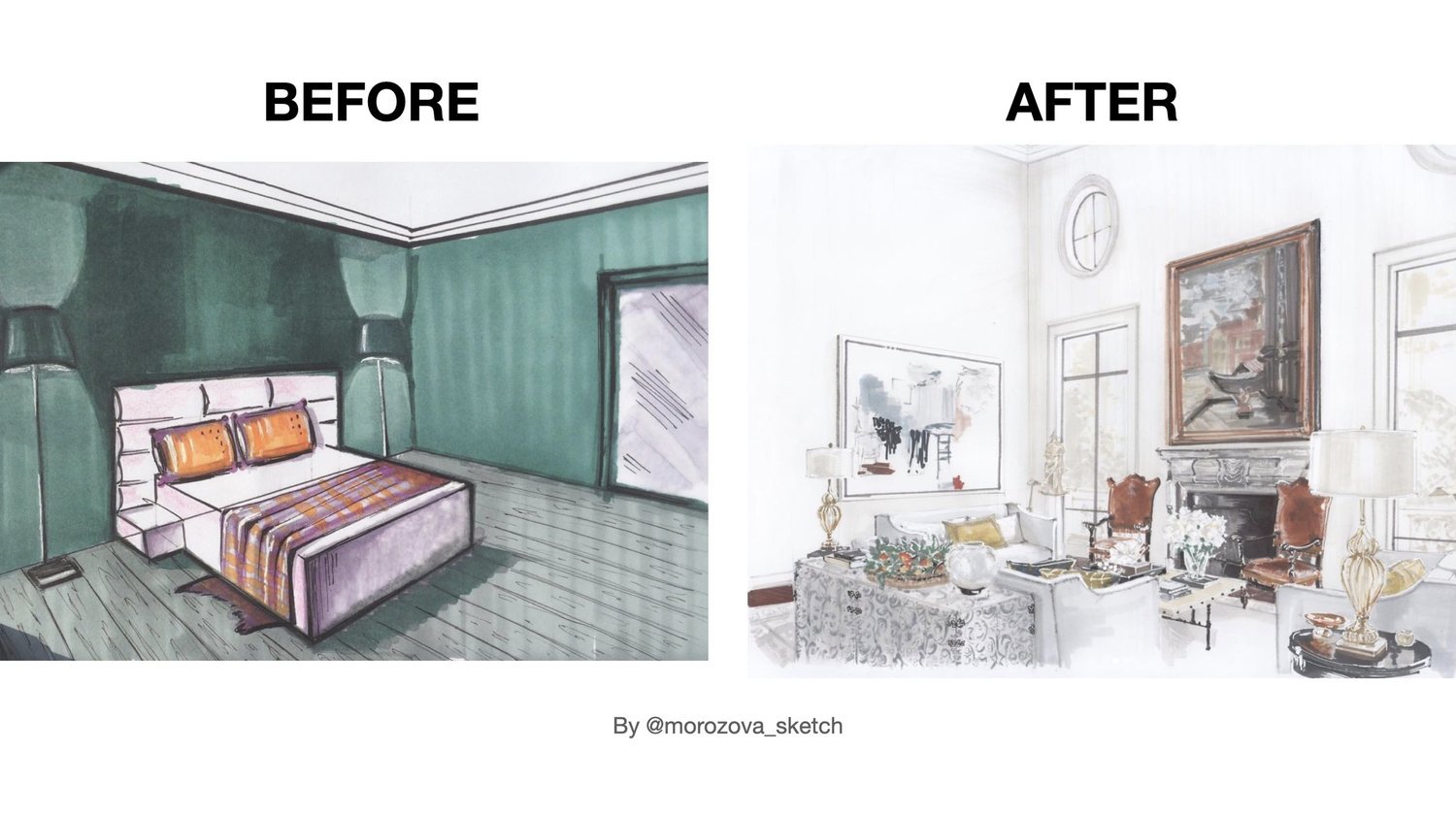
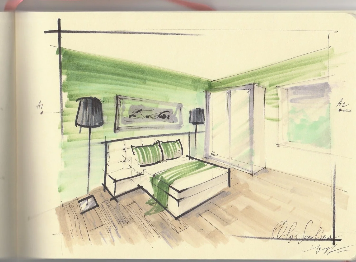
Check more of my interior drawings in marker technique on this section on the website.
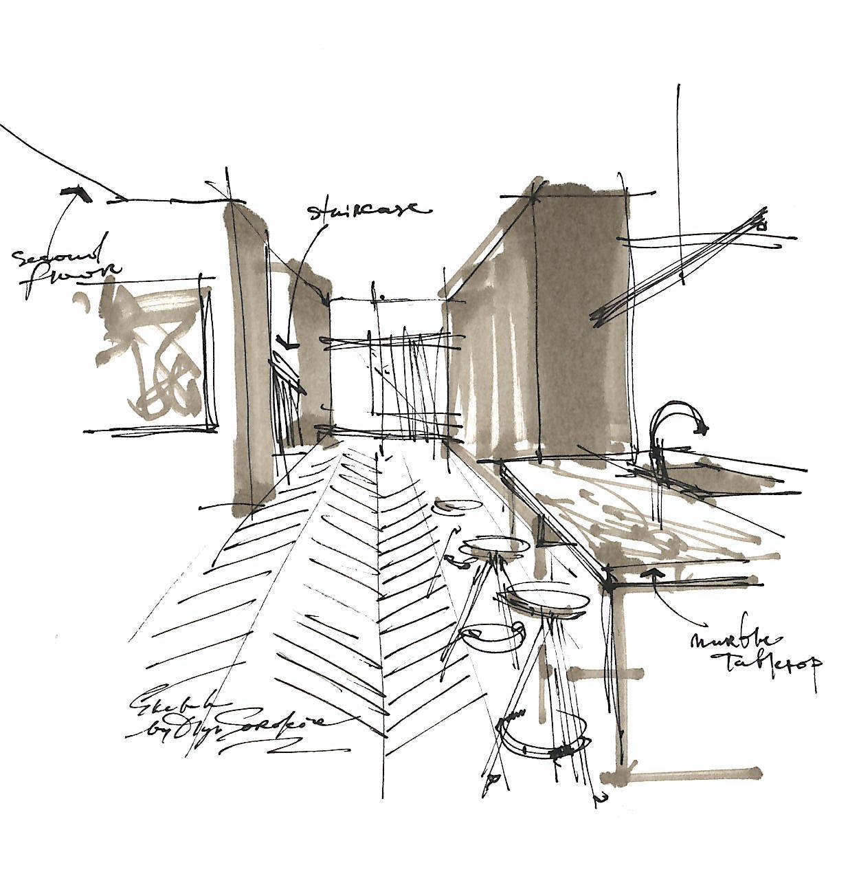
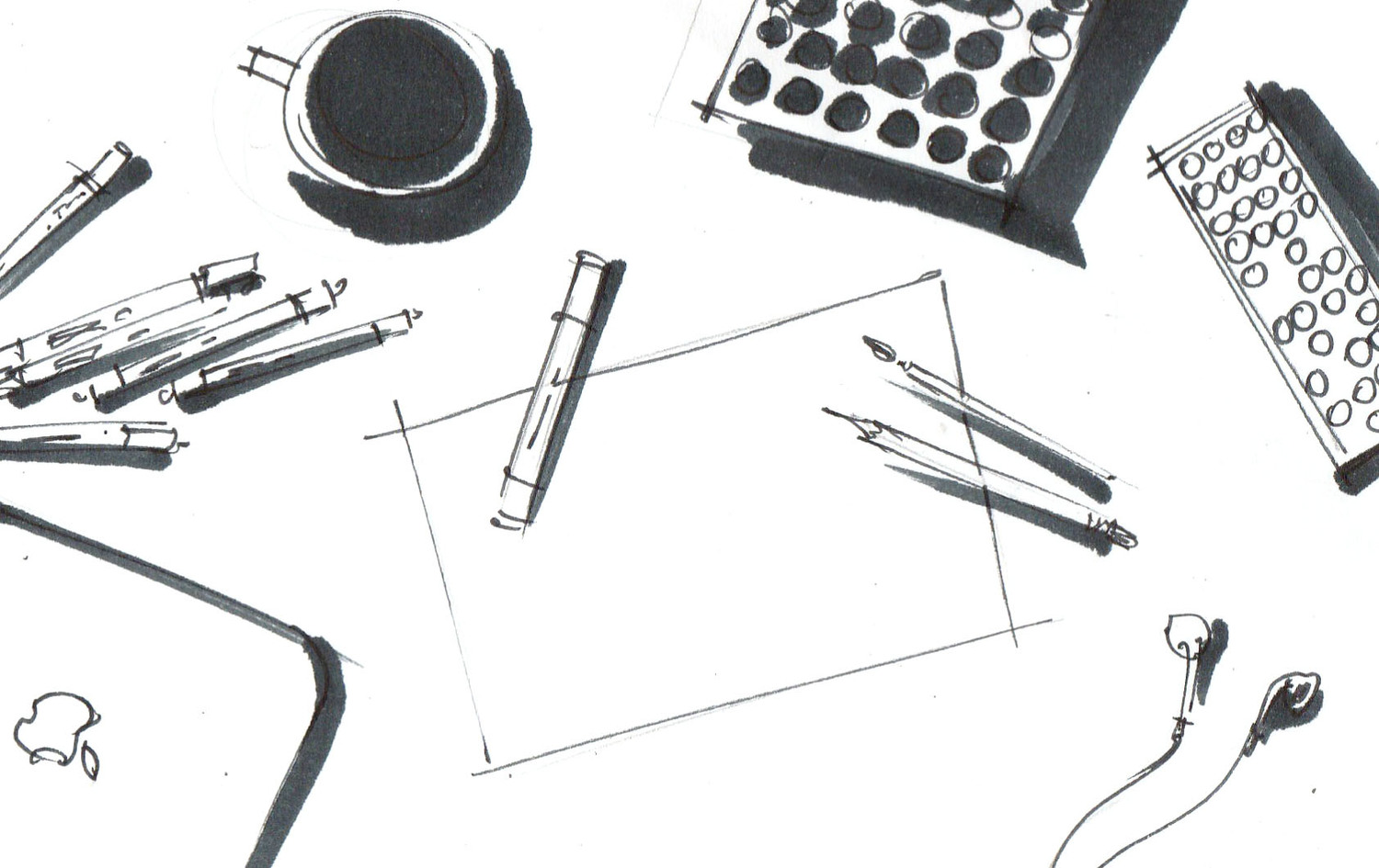
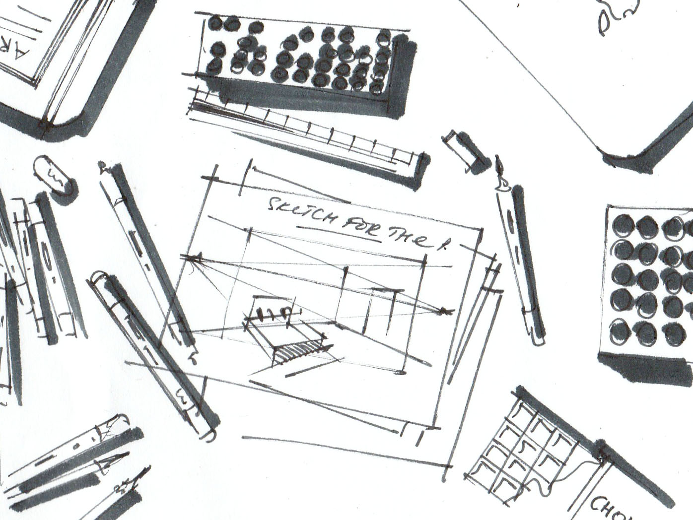
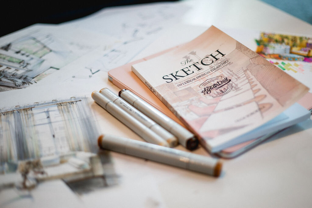
Behind the scenes of creating a new illustration for my book “The SKETCH. Interior Design Drawing“
A couple of more useful tips on markers
Before buying a marker, test it in the art supplies shop and find the marker that suits you best. If you don’t have this opportunity, watch videos on marker brands on YouTube (f. ex mine is «schoolofsketching») – this will help you make a decision about which materials are most suitable for you.
When you realize that sketching is ‘your thing’, be ready to invest in quality materials, training courses, and books. This way, you can develop your skills to become very good at sketching, and this will happen quite fast with regular practice. Sketching will be of great use in your work and will raise your professional skills level.
It is recommended that you store markers horizontally – this will extend their service life.
Storage and transportation: keep your markers away from the sun. If you are going on a trip, pack them into your hand-carried baggage because the low temperatures in the baggage compartment will have an adverse effect on the pigments inside the markers.
Learn more about markers from my book «The SKETCH», available on Amazon now. Here is the PDF version of the book: link.
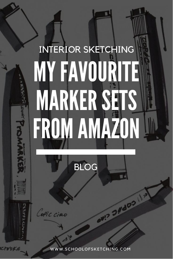
Check my other favourite marker sets from Amazon in this article on my blog.
P.S. Please share this blog article with your creative friends.
© Olga Sorokina
WATCH MY VIDEO ON MARKERS ON YOUTUBE:
YOU CAN GET MY 5-PAGES PDF "FAVOURITE MATERIALS FOR INTERIOR SKETCHING",
I SPENT 10+ HOURS SELECTING & COMPARING THE BEST MATERIALS FOR MYSELF.
YOU CAN ENJOY IT NOW,
JUST ENTER YOUR NAME AND EMAIL HERE:

You can learn sketching from me with my top-rated online course on technical drawing and interior sketching.
"BASE": a Course Which Teaches All the Basic Techniques You Need to Implement Sketching in Your Interior Design Practice
(For Interior Designers & Architects)
Read other articles on my blog: