Which brands and colours of markers are the best choice for interior sketching?

best markers for sketching

So many questions arise when you start sketching, my students most often ask me:

  • What materials do I need for interior design drawing?

  • Which brands of markers would be the best choice?

In this article, you will get the answers. Plus, I will share what I love to use in my everyday sketching routine, what my favourites are, and how lucky we are to have these types of markers!

 
Telling yourself you have all the time in the world, all the money in the world, all the colours in the palette, anything you want — that just kills creativity.
— Jack White
 
markers for interior sketching

You can listen to this blog article in audio format as a podcast

(6 min)


You can tell a story on paper even with very limited colour palette.

It’s actually even good in interior sketching to start with 7-10 colours if you are a beginner. Why? Because you don’t get overwhelmed with such a variety of choices (“Analysis paralysis” as they call it ), and really focus on what’s most important in drawing:

  • Perspective

  • Composition

  • Light

  • Volumes

Colours only close this list, beautifully though, but they go last.

I remember back in the days when I did my very first interior sketch commissions (it was 2007) clients asked me to do linear sketches. Pen on paper. No colour. That’s right.

If you are reading this blog post, the chances are that you are a newbie in sketching and hand rendering, or maybe you are a pro and simply want to learn more about the marker technique. In case you are going to buy your first set of markers, and now you’re asking yourself a question: Where do I start with so many options and offers?

Well, here is my strategy: Less is More.

markers for sketching blog.jpg
 

Which colours?

First and foremost, buy basic colours, as you will need them the most. For interior sketching, it is better not to use pure, bright colours, but rather tones that are a bit ‘dusty’, ’noble‘ tones. What does that mean? With interiors, it is better to choose colours that people would feel comfortable living in. A typical interior sketching palette would include beige, grey, blue, olive, and woody tones.

You can buy the markers individually or in sets. There are even sets of ready-to-go colour combinations for architects and designers, which consist of marker colours that work well with one another.

Less is More. A typical interior sketching palette would include beige, grey, blue, olive, and woody tones. That is 7-10 markers in total to start.
 
markers for interior sketching
 

Your first marker selection might be as follows:

  • Light gray (NG 2, Neutral Grey #2)

  • Mid-gray (NG 4)

  • Dark gray (NG 7)

  • Light beige (or vanilla)

  • Olive

  • Dark brown (chocolate)

  • Black


As you can see, there are seven colours in all, of which three are grey shades. Greys occupy a special place in interior sketching. Firstly, they are used to give background colour to the entire sketch. Grey markers differ not only in tone, but also in warmth and coldness: there are Neutral Greys, Cool Greys, and Warm Greys. To start with, you will need a Neutral Greys. Usually, they are marked by ‘N’ with a number: the higher the number, the darker the tone.

materials for interior sketching
 

What brand of markers to buy?

One of the first questions people often ask in my online sketching classes is about which materials they should use. What brand of markers is the best? How do various brands of pens differ from one another? 

Up until now, I have tested five brands: Promarker, Copic, TOUCH, Stylefile markers, and Chartpak. All of them are good. These firms make professional quality markers that are perfect for drawing and are non-toxic.

interior sketch markers
 

If I were to pick a favourite, it would be Copic. They have a vast array not only of colours but also of marker tips. These include ‘Classic’ markers, ‘Extra Wide’ ones, the thin ‘Ciao’ markers, and remarkable ‘Sketch’ (the last two have brush points). Maybe it is Copic Сiao that has influenced my technique most of all.

Here is one of my favourite Copic sets on Amazon, this is an affiliate link, if you use it, I make a small commission at no extra cost to you, so thanks in advance if you use it or share with someone. As an Amazon Associate I earn from qualifying purchases.

Check my other favourite marker sets from Amazon in this article on my blog.


For example, I did this drawing by using Copic Ciao markers. I’ve included this set in the list in “Best marker sets from Amazon for interior sketching” article on my blog.

For example, I did this drawing by using Copic Ciao markers. I’ve included this set in the list in “Best marker sets from Amazon for interior sketching” article on my blog.


Let’s talk more about Copic Сiao. Firstly, they have a thin body that is very convenient to hold in your hand; you will simply feel it instantly. However, the main difference is that on one side there is a wide/chisel tip (incidentally, a bit narrower than a Copic Sketch, Promarker or Stylefile). At the other end, there is a brush tip, also known as the ‘super brush’, which truly lives up to its name! It is the brush that lets you make photo-realistic effects and fantastic not only for sketching but also for landscape drawings, abstract painting, portraits, architectural sketches, and even for calligraphy. Copic markers can be refilled, that is their tremendous advantage over the majority of other brands. Although they are currently one of the most expensive markers available on the art market, in the long term, Copics are the most cost-efficient.

Promarker is also very good. They are quite similar to Stylefile, ZIG, and Copic Classic. But these are single-use markers, which are not refillable.

Chartpak is markedly different from the markers mentioned above. These markers have one very wide tip with bevels, that is highly convenient for interior sketching. The only disadvantage is that these markers have a rather strong smell of solvent.

Check more of my interior drawings in marker technique on this section on the website.

Behind the scenes of creating a new illustration for my book “The SKETCH. Interior Design Drawing“

Behind the scenes of creating a new illustration for my book “The SKETCH. Interior Design Drawing“


A couple of more useful tips on markers

  • Before buying a marker, test it in the art supplies shop and find the marker that suits you best. If you don’t have this opportunity, watch videos on marker brands on YouTube (f. ex mine is «schoolofsketching») – this will help you make a decision about which materials are most suitable for you.

  • When you realize that sketching is ‘your thing’, be ready to invest in quality materials, training courses, and books. This way, you can develop your skills to become very good at sketching, and this will happen quite fast with regular practice. Sketching will be of great use in your work and will raise your professional skills level.

  • It is recommended that you store markers horizontally – this will extend their service life.

  • Storage and transportation: keep your markers away from the sun. If you are going on a trip, pack them into your hand-carried baggage because the low temperatures in the baggage compartment will have an adverse effect on the pigments inside the markers.

Learn more about markers from my book «The SKETCH», available on Amazon now.


P.S. Please share this blog-post with your friends. They would be glad you did. Thanks in advance, you're awesome!

© Olga Sorokina

book the sketch interior design drawing olga sorokina

WATCH MY VIDEO ON MARKERS ON YOUTUBE:


YOU CAN GET MY 5-PAGES PDF "FAVOURITE MATERIALS FOR INTERIOR SKETCHING",

I SPENT 10+ HOURS SELECTING & COMPARING THE BEST MATERIALS FOR MYSELF.

YOU CAN ENJOY IT NOW,

JUST ENTER YOUR NAME AND EMAIL HERE:

interior design drawing.jpg

You can learn sketching from me with my top-rated online course on technical drawing and interior sketching.

"BASE": a Course Which Teaches All the Basic Techniques You Need to Implement Sketching in Your Interior Design Practice

(For Interior Designers & Architects)


Read other articles on my blog:

Creativity process: how I painted an art wall in my house (time-lapsed video)

"The wall was like a huge white canvas so I painted on it; here is the process".

Olga Sorokina


You told me you love to see my process of drawing, so here is how I painted an art wall in my house.

...Magic and wonder of New Zealand bush, the flight of a tui bird, disk of the sun — I brought all of these to live in my home.

This wall painting was a project for the birth of my baby; I aimed to create something unique.

I decided to dedicate 10-15 min a day every morning. Before everything else took off, I was in pure bliss, creativity, special moments. Felt so happy while drawing this art piece.

I didn’t know how to finish it for a week and went for a yoga retreat in Coromandel, New Zealand.

After spending 3 days in nature, filling my eyes with one of the most stunning landscape views on our planet, practicing hours of yoga and meditations, waking up before dawn, sitting next to a fireplace at 6 am while sipping my ginger-lemon-mint tea, while waiting for my morning yoga class to start.

Hiking in the bush accompanied by birds, kereru clunky flight, and pheasants in the background. Making new connections, having great deep conversations — all of it reset have my system. 

When I was back home, I knew how to finish the wall.

Each time I look at the painting — it gives me energy; it grounds me, not to say that it creates a focal point in my living room in terms of interior design.

Artist: Olga Sorokina 

Media: acryl paint

Date of completion: October 2020

Video editing: Fiverr

You can find more videos like this in my playlist on YouTube schoolofsketching ”ART VLOGS”

If you live in NZ and want me to create an art wall in your place — you can contact me at olgaart888@gmail.com


read more from my blog:

The 9 principles of one-point perspective in interior sketching

one-point perspective in interior drawing
what is a 1 point perspective

One-point perspective (also referred to as frontal view) appears when we look at the object, interior, building, or street straight on, we face it.

It is the simplest type of perspective since we have only one vanishing point and one of the most used in interior drawing.


So, these nine principles of one-point perspective in interior sketching are: 

  1. All the lines in your drawing are either horizontal, vertical, or recede to the vanishing point.

  2. All horizontal lines are parallel to each other.

  3. All vertical lines are parallel to each other.

  4. The horizon line runs at your eye level, which is usually 1,5-1,7 m high.

  5. All horizontal lines are parallel to the horizon line, and all vertical lines are perpendicular to the horizon line.

  6. All diagonal lines to recede to the vanishing point, these are referred to as converging lines.

  7. The closer the objects to us, the more details we can see.

  8. All objects get smaller and smaller the farther away they are from us.

  9. All objects along the converging lines (or the lines of convergence) become foreshortened, and their lines will reach the vanishing point if we prolong them.

Perspective is the key to what you see in our 3D world. Mastering perspective will improve your sketching skills and make your drawings look professional.
— Olga Sorokina
 
one point perspective interior drawing
 

With the last 3 principles, think about the railway: rails will recede to the vanishing point on the horizon line, and the space between sleepers will get smaller as they recede into the distance.

Perspective is the key to what you see in our 3D world. Mastering perspective will improve your sketching skills and make your drawings look professional.


Resources:

  • I covered the basics of one, and two-point perspectives in my free course, learn more about it here.

  • If you want to dive deeper and become a professional in interior drawing, join my online course BASE.

  • In this lesson of my educational membership platform for interior designers THE CLUB, I cover one-point perspective: link

My interior drawing in one-point perspective and frontal view grid from THE CLUB

My interior drawing in one-point perspective and frontal view grid from THE CLUB


P.S. My dear Creative, I hope you enjoyed this article, please share it on your social media so more people can learn about perspective drawing. Thanks in advance!


© Olga Sorokina


Check this 1-min time-lapsed video of a one-point perspective drawing:


Check my live stream on YouTube schoolofsketching:


"BASE": a Course Which Teaches All the Basic Techniques You Need to Implement Sketching in Your Interior Design Practice

(For Interior Designers & Architects)


Read other articles on my blog:

What is sketching and the 4 most popular types of it

Your # 1 Online Course Which Teaches

All the Basic Techniques You Need to Implement Sketching in Your Interior Design Practice

what is sketching in drawing
what are the different types of sketch

In this blog post, I will explain what sketching is and what are its five most popular types.

P.S. I took this text from my book “The SKETCH“.


You can listen to this article in audio format

(12 min)


What is sketching?

Basically, it is about making a quick drawing, a study, which helps you to represent a design idea. And it has a plethora of applications:

Travel sketching (or sometimes city or urban sketching): expressive, energetic, and usually speedy drawings of architectural details, city views, restaurants, etc.

It can be made both in the open air (“pleinair” in French) and working from your memory – recollections of your trip when you are back at home, or using photos and creating compositions out of them. It includes “cafe sketching” as well.

Fashion sketching: people, fashion-looks, and accessories. It is used mainly for illustrations or magazines, e.g., for brand promotion. It helps designers during the first stages of the creation of their collections and helps to introduce changes.

Industrial Design sketching: probably the most known and popular branch of sketching. Obviously, it was created by industrial designers; a good example is car sketching. In this case, all sketches are made with great speed and confidence.

The type of sketching I teach my students via online courses, Instagram Lives, and YouTube tutorials is a little different, it’s an interior design sketching, and we usually start by creating a precise measured perspective with the help of scale rulers. This is followed by freehand rendering, which may take 1-2 hours, and for this stage, we will be using markers. Once you have mastered the construction technique, you will develop the ability to produce quick freehand sketches of interiors.

1 point perspective drawing
Sketching is a fantastic skill that lets you transfer your design idea onto paper in the most fun, fast and effective way.
 
marker interior sketch restaurant
 

Sketching is a fantastic skill that lets you transfer your design idea onto paper in the most fun, fast and effective way. In other words, sketching is a unique instrument for visualizing your concepts. Nowadays, it is associated mostly with such media as specialized professional markers, for example, Copic, Stylefile, Chartpak, Promarkers, ZIG, etc. Sketching “palette” is vast and versatile: you can start from scratch by using a pencil, charcoal, or black liner and end up by using different types of colouring techniques, for instance, watercolour, coloured ink and pastel or watercolour pencils. It is possible to mix various media, for example, markers + pastel or watercolour + coloured pencils. There are so many creative opportunities for you to test and explore! It is a good idea to try several and pick a couple of “favourites”.

Illustration from my book “The SKETCH. Interior Design Drawing“
 

A range of this kind of media in the art-shops can impress and confuse at the same time. But don’t worry, my friends, in this article on my blog I recommend you a nice and compact set of marker colours, which I use most of the time. But why do I recommend markers? In my opinion, markers are the most easy-to-learn-how-to-use and easy to implement technique for beginners (especially in comparison to watercolour) and, at the same time, sketches which are done with markers usually look more vibrant. As a matter of fact, in my interior design practice, I used to use watercolour and coloured pencils for my drawings, whereas now I opted for markers only because I simply see how much better they perform on paper for interior design purposes.

How do I start sketching with markers

GET MY FREE PDF "MUST-HAVE MATERIALS FOR INTERIOR SKETCHING",

ENTER YOUR NAME AND EMAIL HERE:


The reason why sketching became so popular today among designers of all kinds not only in Russia, Europe, the USA, Asia, and the rest of the world is that artists nowadays tend to be overwhelmed by computer programs such as CAD, Revit, Sketchup, 3D Max, and Maya. In the old days, artists were earning their bread by, literally, their hands, and now they are desperately wishing to go back in time when ideas were transferred through hand drawing, which is far more natural and organic way of doing it.

Take a look at what is happening right now in our creative lives: we rarely, if ever, write with a pen, and mostly type on a computer, iPad or iPhone. We do not send handwritten letters and cards anymore – the epistolary genre is almost gone for good – and even our thoughts and ideas we capture in “Notes” on our iPhones. It seems that we have forgotten the meaning of “handmade”, handcrafted, which is precious because in creating it, you include a piece of your heart, love, and memories. Do you remember what we were told as children: “The best present is the one that is made by hands”. There is a profound meaning in that.

Just observe that we no longer “create” on paper but “work” on a computer, in Photoshop, Word, or AutoCAD. The words we use, especially verbs, bear deep meaning. With that in mind, ask yourself, is it better to render or to hand-render; to work or to create? They say that 3D Max was invented by those who can not draw. Clearly, there is a number of advantages in using 3D and computer-generated imagery, I used it myself a lot back in the days, but let us not lose the command of our hands and the link between the brain and the heart that hand drawing fosters.


4 main types of sketching 

As I mentioned before, there are different types of sketching, and here I would like to talk about each one in a little bit more depths. Let’s take a quick look at the main features of the most popular of them by splitting them into key concepts and keywords.

1. Interior sketching

For this kind of sketching, it is highly important to understand the laws of perspective and train your eye to judge scale and proportion. It is always good to be able to execute your drawings within different time frames because sometimes you will need to draw your idea quickly in front of your customer. As an interior designer, you should have an eye for beauty, a feeling for harmonious colours, and a perfect palette. And, as in other types of sketching, you should be able to render a variety of materials such as fabric, wood, stone, and glass. Check my video courses on interior design drawing.

Interior drawing from my ecourse PRO. Check other sketches here.

Interior drawing from my ecourse PRO. Check other sketches here.


2. Fashion sketching

For this type of sketching, it is crucial to have a good understanding of human proportions (face and body). You should know how to stylize figures in your drawings. More often than not, body proportions are elongated in fashion sketching. For example, the total height of the human body in fashion sketching is 10, 11, or even 12 times the height of a human head as opposed to real-life proportions of only 7.5 to 8 heights of a human head. The most important aspect of fashion sketching is to be able to capture a design idea in the best possible light. Hence a facial-portrayal of a human figure is usually not significant. In this case, it is critical to be able to deliver the idea of the designed collection to the best advantage. In fashion sketching, it is essential to bring the clothing design into focus, and a life-like portrayal of the figure is usually unimportant. You will also need to know how to convey through hand-render the look and feel of such materials and textures as skin, hair, different types of fabric, metal, etc.

top fashion sketch artist.png
 

3. Industrial sketching

You will need the ability to draw objects in 3D, clearly showing their structural design and volume. To be able to render a professionally looking arrangement of component part on a piece of paper, you will need a firm grasp of the principles of composition. You will also need to perfect your technique and speed in order to develop an assured line and confident hand. The most common materials that need rendering in industrial sketching are metal, plastic, and glass.

What are the different types of sketch car sketching
 

4. Travel sketching

In this type of sketching, the most crucial skill is to manage to convey the feel, the ambience of a place, to capture the flitting moment and, at the same time, to deliver the correct scale and proportions of the object. More often than not, you will also need to be able to perform at high speed, as you will be sketching while travelling, while on the road, when you do not have several hours at your disposal the way it would have been the case with "plein air" sketching. In this type of sketching, it is important to grasp the intrinsic traits of the place you are observing and afterwards graphically stylize it in your drawing.

Check the process of creation of this sketch on my YouTube here.

Check the process of creation of this sketch on my YouTube here.


P.S. I hope you enjoyed this article, let me know what is your favourite type of sketching in the comments below. Please share this article with your friends on social media. Thanks in advance!


© Olga Sorokina, 2021


"BASE": a Course Which Teaches All the Basic Techniques You Need to Implement Sketching in Your Interior Design Practice

(For Interior Designers & Architects)

 
interior sketching olga sorokina.jpg

Continue reading:


check my podcast episodes

(MEANINGFUL CONVERSATIONS WITH ARCHITECTS, ARTISTS, AND DESIGNERs)

What is perspective in drawing, and 2 most important types of perspectives in interior design. (Perspective basics for interior designers)

what is perspective in drawing

Here, we will familiarize ourselves with the most extraordinary and most exciting field of descriptive geometry and will discover two main types of perspective – the most important skill in interior sketching.


Fundamentals/Basics

Perspective is an area of descriptive geometry. Not many people are keen on learning descriptive geometry at school, and for many, it is synonymous with tedious technical tasks and dull routine. Perspective is an intriguing subject, full of surprising secrets, and is essential for interior designers. It is this knowledge that will let you work wonders on paper, allowing you to create impressive views of interiors and to reflect your ideas in the most effective way.

Perspective is the basic and most fundamental knowledge for sketching. It will help you deliver your projects expertly. Without it you will get nowhere – if you don’t know the laws of perspective, then you lack the foundations, which means you cannot move on, and no rendering technique or stylistic device will help you out if you don’t have a clear understanding of how to plot a space. The eye of a man has an admirable organization, and it is thanks to the laws of geometry that we can put down on paper or visualize the real world in the way our brain perceives it.

2 point perspective interior
 

Types of perspective

What types of perspective are there, and which ones are of the most significant importance to interior sketching?

There are many types of perspective, to name but a few: aerial perspective, frontal perspective (or 1-point perspective), angular perspective (or 2-points perspective or oblique view), perspectives with three, four, five, and even six vanishing points. So, which ones are of the greatest value to interior designers?

First of all, it is the frontal perspective (it is sometimes called a perspective with one vanishing point). Secondly, there is an oblique view or angular perspective (with two vanishing points) and, finally, an aerial perspective (or tonal perspective). If the first two allow us to draw an interior correctly, the last one will enable you to fill your drawing with air and convey three-dimensionality of space. Once we master the basics, we can address more complex types of combined perspective – with three vanishing points and various three-dimensional effects. Latest are exciting perspective techniques that add more expression to a drawing.


GET MY FREE PDF "MATERIALS FOR INTERIOR SKETCHING",

ENTER YOUR NAME AND EMAIL HERE:


There is one artist that I want to point your attention to whose mastery of perspective I particularly admire. I am talking about Dutch graphic artist Maurits C. Escher. His work is simply mind-boggling! My favourite is his extraordinary self-portrait (check it here), where he is drawing himself while looking in the mirror sphere, which also reflects the interior. If you remove the ball, the room appears in a 1-point perspective; interestingly, the interior is reflected in the spherical mirror surface of the ball, it causes incredible effects and distortions of the space.

Escher’s art is one of the brightest examples of mathematical laws of perspective, coupled with the author’s imagination. Escher published a book, “Impossible Worlds”, where he plays with geometric rules, planes, creating inconceivable spaces. Scientists are well-versed in the beauty of mathematics, and Escher shows all of us that beauty.

We adore chaos because we love to produce order.          
— Maurits Cornelis Escher

Once you grasp the rules of construction of geometry of a space, you can start experimenting with them. I call it ‘playing with perspective’. All sketching masters have an excellent command of this knowledge. So let’s get going and discover it for ourselves!

1 point perspective interior sketch
 

1-Point Perspective (Frontal View)

In this type of perspective, we have a vanishing point, which is always on the horizon line. This vanishing point is where all the lines converge to (that’s why it is called a 1-point perspective). When we draw an interior, we see three walls: one that is parallel to the picture plane (frontal wall) and two side walls.

It is a linear perspective, and it comes into play when your line of sight is parallel to the horizontal set of lines that converge upon a single point in the distance and perpendicular to the other set of lines in the view. It is the simplest type of perspective because we deal with only one vanishing point.


We are forever indebted for this knowledge to the Italian Renaissance. In the second half of the XVth century, Renaissance artists and mathematicians developed the linear perspective theory and brought precision and mathematics into mainstream art. Viva Italia!

Before that, artists drew ‘by eye’ or used Inverted Perspective (Byzantine Perspective), which is an art form unique to pre-renaissance religious art and is full of embedded meaning. As an example, look at Andrey Rublev’s “Trinity” and observe how the space appears flat and converges towards the viewer.

Thanks to Renaissance and its masters, who were not only prolific artists, sculptors, architects, but also prodigious mathematicians, the laws of perspective were discovered. Brunelleschi, Alberti, Masaccio, Ghiberti, Piero della Francesca introduced the use of perspective, and, in doing so, forever changed further development of art.

Renaissance masters were so fluent in the complexities of geometric construction that they were able to apply their knowledge of perspective to perform most complicated tasks and solve quite challenging problems. For example, painting of a ceiling of a dome has to take into account a variety of factors: first, people look at frescos from below, which significantly alters their perception. They also had to take into account the curved shape of the dome and correct for distortions that arise. Apart from that, there is a host of technical aspects such as the erection of scaffolding, working at a high altitude, temperature, humidity. In the case of frescos, the humidity levels are very high, as painting is performed over damp plaster). The frescos technique of mixing colours, a problem of lighting, and even the position of a painter’s body, all these are challenging factors for a painter. For instance, Michelangelo almost completely lost his sight while painting the Sistine Chapel.

My drawing for the book “The SKETCH“

My drawing for the book “The SKETCH“


When should we use a 1-point perspective?

1-point perspective is an ideal choice for depicting public spaces: bars, cafes, restaurants, hotel lobbies, as well as spacious residential interiors: sitting rooms, dining rooms, halls, and lounges, etc. This view lets you represent your idea on a drawing by showing the maximum amount of space. Suppose, we have a restaurant layout, with a rectangular shell: it would be sufficient to draw two 1-point perspective views – in one direction as you enter and one in the opposite. If we were to use a 2-point perspective view to demonstrate the design idea, we would have to draw all four corners of the space, plus a general view, a view from above, or even make a model (at least five sketches in total). In contrast, the 1-point perspective view allows you to show the idea with only two drawings.

We can change the position of the vanishing point in relation to the centre of the picture plane, placing it anywhere on the horizon line. It can be right in the centre, or it can be shifted to the right or to the left. This will make the picture asymmetric, which adds dynamism to the composition and allows you to reveal one of the walls to a greater extent. However, when the vanishing point is right in the centre, both walls are shown to the same degree, and, thus, appear balanced. It is this placement of the vanishing point that is often used in classical drawings of interiors. Classics loves symmetry.

Classics loves symmetry.
 
1 point perspective interior
 

2-Point Perspective (Oblique View)

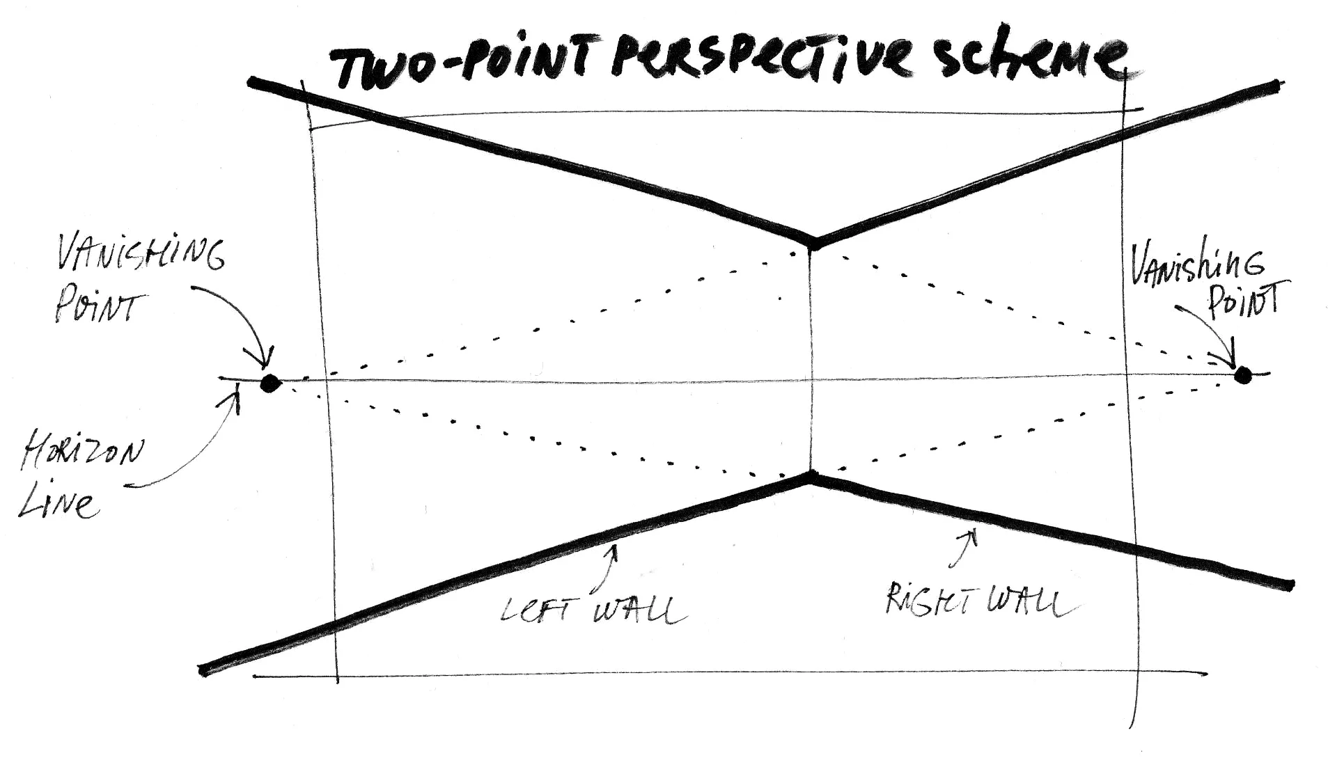
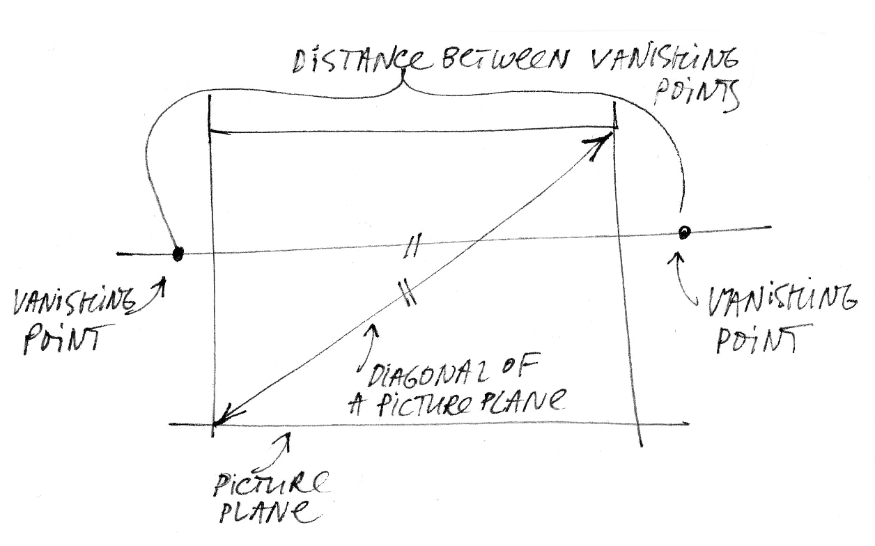
Another type of perspective important for designers is the perspective with two vanishing points. It is often called an «Oblique View». In this view, the horizon contains two vanishing points, and the picture reveals two walls of a space. You can move these points on the horizon line, but it is important that the distance between them should remain the same fixed value (usually this distance equals to the diagonal of the picture plane). When you have understood all the most critical basic laws of perspective, you will be able to experiment with them, creating drawings with the most effective angles.

2-point perspective is a linear perspective in which there are two vanishing points on the horizon line. This type of perspective appears when your line of sight is at an angle to the horizontal sets of lines that converge upon points in the distance. Simply said, you are at an angle to the wall. In a case with a 1-point perspective, you face the frontal wall. That is why its second name is "frontal view", remember?

2-point is usually visually more dynamic compare to 1-point because we can see the volumes of objects.

My drawing for the book “The SKETCH“

My drawing for the book “The SKETCH“


In which case 2-point perspective is the best choice?

It is indispensable when we want to show a space containing one main object, a dominant feature. Easy example: in the bedroom, it is a bed; in the study, it is a desk; in the nursery, it is a cot. And so on.

This perspective is ideal for small spaces, or when we want to draw in detail a specific corner of an interior. Also, it is the oblique view that allows us to show furnishings and other separate objects. I often use it to specify upholstery. A picture is worth a thousand words, and it is way easier to send an image along with an order for a piece of furniture depicting exactly what I had in mind.

My drawing for the book “The SKETCH“

My drawing for the book “The SKETCH“


Resources

Read also related articles on my blog:

  • “Top books on perspective drawing: my personal choice“: here

  • “The 6 principles of two-point perspective in interior sketching “: here

Learn more about perspective drawing in my book “The SKETCH“ (Amazon paper-based version or PDF).


Well, my creative friend, I hope you enjoyed this article, please let me know your thoughts on perspective drawing in the comments below. Is it a tricky subject for you?

P.S. Please help me grow my blog by sharing this article on your social media. Thank you in advance!


© Olga Sorokina


CHECK PROGRAM AND DRAWINGS FROM MY ONLINE COURSE ON INTERIOR SKETCHING WITH MARKERS FOR BEGINNERS "BASE".

A Course Which Teaches All the Basic Techniques You Need to Implement Sketching in Your Interior Design Practice:


Read other articles on the blog:


check my podcast episodes

(MEANINGFUL CONVERSATIONS WITH ARCHITECTS, ARTISTS, AND DESIGNERs)

What they do not teach you at Interior Design Schools or myths about an interior designer

best interior design schools.jpg

Some of you may get upset when I dispel the myth that the interior design profession is only about beauty and romantic appeal, but you better know the truth if you want to avoid a “blind date” disappointment.


Part of this blog article I took from the text of my best-selling book,

“The SKETCH. Interior Design Drawing”.


Who is an interior designer?  

Let's uncover the truth, interior design is not about pleasant meetings with customers in glamorous restaurants and elegant offices, reflecting on the subject of interior styles, choosing that ideal shade of taupe for the tiling in the bathroom, artistic inspiration, and perpetual joy of creation. Well, some of it is, but it sums up to no more than 5% of the overall project scope. The rest of it, 95% is hard work.

The rest of it is the arduous daily routine: designer supervision at a construction site, bare concrete walls, breathing all this cement dust hanging in the air, speaking to builders, managing orders, dealing with everyday challenges, chasing suppliers — all these generally putting out fires on a daily basis.

Interior design is only 5% about pleasant meetings with customers in glamorous restaurants and elegant offices, reflecting on the subject of interior styles, artistic inspiration, and perpetual joy of creation. The rest of it, 95% is hard work.
 

To give a complete image: an interior designer is an all-round craftsman, multi-armed, multi-legged, and multi-brained. He/she has to bear in mind plethora of diverse information: starting with yesterday’s conversation with the customer, requests from his wife, children and his dog, visits to a tile store, sanitary equipment showroom, lighting shop, negotiating with construction supervisors, and rows about missed deadlines. One other aspect that is rarely mentioned is the futile struggle to foster a good taste in some of their customers trying to persuade them that rhinestone and crimson velvet from a luxurious Italian palazzo look like unabashed kitsch in the context of a city apartment.

interior drawing online course.jpg

At the same time, you will need to find time and energy to visit a great many interior design exhibitions, many of which take place at least twice a year, in order to be well-versed in new technologies and materials. As you can see, it is a very vibrant and eventful life. The most exhausting part of it all is constant multitasking, and we now know that it is the least efficient way of getting things done and by far the most draining. Creativity was supposed to fit in all this somehow and be the essence of the designer’s occupation, given that he/she is an “Artist of an Interior” (as it is inscribed in my diploma).

The fact of life is: a designer is often a project manager, a director, an author, a supervisor, and a diplomat, all rolled into one. This definition also applies to self-employed designers, owners of a small design studio, freelancers, or any other professionals who work for themselves, rather than a company.

An interior designer is often a project manager, a director, an author, a supervisor, and a diplomat, all rolled into one.
 

In the midst of the hustle and bustle, when you have this, that or the other place to rush to, dozens of appointments to keep, panicking clients to calm down and meetings with a builder, your energy dissipates very quickly and your stamina very soon wanes, days are slipping away imperceptibly, and almost nothing is done. Does that sound like the way things are sometimes in your case? Cheers! This means it is the right time for you to get away from it all, take it easy, recharge your batteries and discover a new way to spur your creativity and awaken your inspiration.

In fact, this is precisely where perspective drawing and my online interior sketching courses will help you. Concentrate on your creativity, and you will see the progress straight away along with rapid professional growths. Being a creative person, a designer wants to always feel that he or she is continually developing and growing professionally.

I think it is of paramount importance to a designer or an architect — the ability to express ideas on paper using just a pencil. Having graduated from the best Arts Academy in St. Petersburg, Russia, I was astonished to find out that some designers were utterly incapable of drawing, and many of them have never even tried to, commenting that the main thing was the ability to use appropriate computer programs, knowledge of building principles, regulations, and materials. It is beyond doubt that it is essential to be an expert in your craft, a professional in your field. And in real life, it is also vital to be good at maintaining relations with customers and construction workers and to have a leadership talent.

There is nothing that proofs your professionalism and creativity further than if you draw a sketch right in front of the client during a meeting.
 

You gain respect in your clients’ eyes when he or she sees a complex interior being artfully created by you and there is nothing that proofs your professionalism and creativity further than if you draw a sketch right in front of the client during a meeting. It does the trick 100% of the time!

Ask yourself: what is it precisely that I want to do? What is missing from my creative process? What would be my ideal creative process? If you are a computer geek — there’s no problem. However, if you are perturbed by the feeling that something is missing, that you are disconnected from your work, that you no longer enjoy coming to the office and that everything became a routine, it means you need to discover a new way and acquire new knowledge and skills. You need to find a way to re-introduce elegance spontaneity and joy back into your profession.

So welcome to my online courses for beginners and advanced, I can’t wait to see you on the inside!


P.S. My dear Creative, may I ask you to share this article on your social media so more people can learn about interior sketching. Thanks in advance!


© Olga Sorokina, 2020


An online course which teaches all the basic techniques you need to implement sketching in your interior design practice:

online education for interior designers

Read other articles from my blog:

Learn top drawing secrets from 4 masters of interior sketching which can instantly improve your sketch (plus, get why all Art Academies teach their students to copy works of old masters?)

interior sketch marker ipad liner

In this article, I will tell you about four world gurus of sketching and will acquaint you with their techniques. You will also learn why Art Academies insist that their students do copies of the masters and of what use this may be to us. This text I took from my best-selling book “The SKETCH“.

P.S. Exceptional gift at the end of the article.


Gurus of sketching 

When you are starting to learn something, it is of key importance that you learn from the best in the field – this way, you will set yourself a good benchmark from the outset to strive towards. In this book, I would like to tell you about four world-class masters. Each one of them has his unique style, expression and techniques, which can be identified, analysed, and deployed in your practice.


Always ask yourself: What is it that I like so much about this sketch/drawing/artist/project?

Be observant and attentive, be the constant questioner, look beyond the first impressions, pay attention to details, always try to get to the heart of the matter. Ask yourself: “ What is so special about this work?” Is it the well-chosen palette, or delightful light effects, or, maybe, unconventional drawing techniques? Always study, train your brain to analyse, and your eyes to observe. Having figured out the technique, use it in your drawing, play with it, find out how much it is to your liking, whether it is your thing or not. In this case, the goal is not to copy the style of an artist, and not to imitate the technique thoughtlessly and indiscriminately in your drawing; the goal is to experiment with a technique, try your hand at it, reveal your personality through it. This is how a new technique will eventually emerge, which will be inimitable and entirely your own. We are all different, and drawing reflects our personalities. Freehand drawing vividly reveals and brings out the unique character of a person. No other human being thinks, feels, analyses, and draws in absolutely the same way.


Why all Art Academies teach their students to copy works of old masters?

Talking about copying: why do you think all Art Academies teach their students to copy works of old masters (e.g., Rubens, Leonardo, and Michelangelo)? Moreover, copying is an essential part of their curriculum. This is the reason: the most amazing thing happens when a student copes a work of a great master – he comes into contact with the way of thinking of the genius. In imitating the strokes of the master, your hand sends signals to your brain, and you start to understand the thought process that went into creating a particular painting. You follow the movements of his pencil, and, therefore, of his thought. Automatically, your hand starts to memorize effective techniques and methods. You start getting a better grasp of proportions, a well-chosen angle view, and well-arranged compositions. By doing so, you are developing the so-called “body memory”. Your hand gives the brain a whole new picture of the world, and that’s how your unique n technique evolves, it starts developing times and times faster, it becomes very confident because it acquires a great capacity of old masters. 

We are going to try the same thing. Let’s examine a few works by sketch masters from various countries, who are undoubtedly the gurus of sketching and who have spent years developing their skills. Let us examine the works of these masters coming from different parts of the world.

Interior drawing course.jpeg
 

1. Richard Chadwick

Here comes the first master that I want to introduce you to, Richard Chadwick. He comes from Manchester. I would like to quote here his words about the art of sketching:

As an antidote to the ubiquitous – and to my mind anodyne – computer-produced visuals, these are all drawn by hand, mainly pen and marker renderings, capturing the energy of the moment and generally looking far more dynamic than anything produced by a computer programme. A return to handcrafted values offers a way forward from an entirely technologically based society, and the tactile feel of pencil on paper has its own reward.

Chadwick has been in the profession for many years. He worked both as an architect and as an interior designer. Now Richard mostly focuses on freehand visuals. In his interviews, he says that he usually uses A3 sheets of paper for drawings and spends 2 to 3 hours on a drawing on average. You can see that this is extremely quick as compared to a rather lengthy process of 3D visualization. His sketches are so very full of life and energy! His portrayal of the feel, the ambience of a place is splendid.

What is special about Chadwick’s technique? Markers, partial colour filling, focusing on the central part of the composition, freehand lines, no rulers. No less important is the speed. His lines are very free, never perfectly straight, and sometimes, even they are slightly bent, give the overall composition the “fish eye lens effect”. 

Chadwick’s knowledge of perspective principles is so profound that he does not hesitate to break them to achieve his vision. Sometimes you will find several horizon lines in his drawings, and the diagonals often do not meet at the vanishing point; despite all that, his drawings always feel correctly constructed and full of emotionality, liveliness, and dynamism.

What can you try to do the way  Chadwick does? As a rule, it is the focal point of a drawing (its background) that he fills with colour, whereas the foreground could be executed in thin lines. Try to identify one sort of your overall composition and focus on colouring only the central part. By applying colour only to certain parts of a drawing, you will save both time and markers. An attractive trait of his drawing is that when Richard Chadwick makes textures and works over detail, he shows only fragments of them (for example, only fragments of tiling on the floor). This is the most effective application of the ‘understatement’ technique, and lots of areas in his drawings are only marked with thin lines. The master uses a minimal colour palette in one sketch, which is usually 5 to 7 markers. More about Chadwick here.

Here are Chadwick’s favourite subjects: bars, restaurants, cafes.

Homework: do a copy of 1-2 of Chadwick’s interior sketches as this will help you to acquire a quick and impressive drawing technique. Carefully observe and analyse everything that he does as go along.

Richard+Chadwick+interior sketch.jpeg
 

2. Sergio Rodrigues 

Our second master is a furniture designer and architect Sergio Rodrigues. He is a legend in Brazil, and his work is recognised all over the world. More about Rodrigues here.

Technique, practical training: favourite materials of the master are liners, black Chinese ink, sometimes watercolour. His drawings are very expressive, and their energetic graphics fall into the category of interior illustrations. His technique very much resembles ‘the wirework’ method, where all objects are carefully inked over contour and detailed.

Contributions to your collection of techniques: notice how Rodrigue’s drawings have distinct foreground and background. The lines of the objects in the foreground are thick and rich in colour, whereas in the background lines are lighter. Notice how he applies flat colour to the floo (check the drawing below), and by doing so, he accentuates the contrast and graphic feel of his sketches.

Favourite subjects: restaurants, bars, residential, furniture.

Homework: analyze the master’s technique, do a copy of one of his works.

Sergio Rodrigues chair
 

3. Albert Hadley 

One of the best-known American decorators of all time, Hadley worked for such celebrity clients as Jacqueline Kennedy, Oscar de la Renta, as well as vice-presidents and ambassadors. Hadley played an exceptional role and made a significant contribution to the XX-th century American interior design. More about Hadley here.

The technique, practical training: sketches made by the master are, for the most part, very graphic in style and are executed in pencil, Chinese ink, and stylus. Albert Hadley usually used toned drawing paper and was famous for his incredible speed of drawing. He had his sketches finished in a matter of seconds; this proves his great mastery – speed and accuracy of performance. Have a look at his drawings. How vigorous, energetic, fluent and lucid they are, and, at the same time, how exceptionally well he renders an idea and feel of a prospective interior, the ambiance of a space.

Contributions to your collection of techniques: Albert Hadley never used rulers or rubbers when drawing. This can teach us a good lesson – try and learn to render your idea on paper in the quickest, clear-cut, articulate, and expressive way, almost with one stroke of a pen.

Favourite subjects of sketches: interiors of Victorian houses, libraries.

Homework: do a copy of one of the drawings by the master using a liner or pen.

Albert+Hadley sketch.png
 

4. Michelle Morelan 

And to finish our list of gurus for this article, let me introduce to you a Canadian woman-designer Michelle Morelan. She grew up on the West Coast of Vancouver Island, and early on, she understood how the aesthetics of nature and architecture intertwine in harmony to a profoundly satisfying effect. This is the reason why peace and tranquility of natural way of living have found their way into all of her drawings with accentuated textures, natural materials, open spaces, and enjoyable colour palette, mostly consisting of sandy, earthy and woody shades. More about Morelan here.

Technique, practical training: the master uses a combination of techniques to create "hybrid" sketches. As a rule, she constructs a space in a 3D programme (such as “Sketch Up”), and then she hand-sketches and colours interesting angles of perspective with markers.

Contributions to your collection of techniques: like Chadwick, Michelle Morelan has a very restrained colour palette. I would call her technique “minimalistic sketching”: often, only one or two materials are accentuated (frequently these are wood and stone).

Favourite subjects of sketches: spacious interiors of countryside houses.

Homework: do a copy of one of Morelan’s sketches.

Michelle+Morelan+sketch.png

P.S. Well, my dear creative, I hope you enjoyed this article, please share it on your social media. Thanks in advance and good luck with your drawings!

© Olga Sorokina, 2019

interior design drawing .jpg

Dream to draw interior sketches like a professional? Watch this tutorial on my YouTube and master some basics today:


Here is your very special gift!

Now you can get this 15+ pages Sketch-plan PDF workbook for free and master 10 easy steps of creating such a beautiful layout plan:

interior layout drawing .jpeg

Read other articles on my blog:

My 10 rules of interior sketching

sketch like an architect

You can listen to this blog-post in audio format

(5 min podcast)


1. Foundations of everything

Without solid knowledge of the principles of perspective, nothing will ever work out. Study the method, refer to my book often and make sure you understand it completely. For the moment, concentrate on the frontal perspective – it is a very powerful and hugely useful technique. Check this blog article on the frontal perspective to learn more about it.

2. Horizon line

Remember that the horizon line level has an effect on the general impression of your sketch. Whether the horizon is at the eye level of a seated person or at a two-meter level above the floor, it is a critical decision for the whole of the drawing and for how different planes are revealed.

3. Composition

A well-chosen view angle and the knowledge of composition are most crucial! They will contribute greatly to your sketch; by making your project look elegant and allowing you to present it to the best effect.

4. 3D Effect

To be sure, knowledge and application of the rules of light and shadows, the aerial perspective, tonal gradations, and mastering textures are essential. It is these things that give volume and expressiveness to a drawing.

5. The Trained Eye

Examine as many works and drawings as possible, learn wherever you can: YouTube tutorials or Skillshare classes, drawing exhibitions, read books about design, drawing, and illustration. You have to become satiated with visual references for your own new and unique style to emerge.

interior sketching markers.jpeg
 

6. Materials

Use quality materials. You don’t need a great number, but make sure they are top quality. For a successful start, you will need 7-10 colours of professional markers (with 3-4 of them being tones of grey), a pencil, a black liner, a white pen, an eraser, and paper. Later on, when you start becoming more involved with sketching, don’t pinch pennies and buy Copic sets (they are my favourites). For other great marker sets options read this article on my blog.

7. Techniques

The classic techniques of sketching will always be in high esteem: these are watercolours, Chinese ink, coloured pencils, and pastel. But experience tells me that the easiest, quickest, and most effective tool in interior sketching is markers: they give wonderful results, even when you use them for the first time.

8. Masters

If you want to become proficient at sketching as quickly as possible, learn from the masters of the craft: take note of the materials they use, you can even copy their techniques to understand their approach better. Use this rich foundation of knowledge to develop your own unique and inimitable style.

9. Customers

Remember that all customers are guided by their emotions when they make decisions, which is why your portfolio and sketches must be “savoury to the eye”. Assess your portfolio one more time and ask yourself: «Would I buy it?» If the answer is «No», burn it and make something spectacular instead! Check this article to make your portfolio even better.

10. Everyday practice

Draw every day and train your eye and hand as much as possible. If you start practicing every day for approximately 30 minutes, it will take you about three weeks to achieve a pretty high level of mastery of your hand. Practice makes progress; it is even better than perfect, agree? Your pictures will start showing confidence, which is the main quality of a professional since you can always tell a pro from a beginner by the spirit of their lines and hatchings, which are attractive and bold. That confidence of line and technique only comes with experience.

Learn more about interior design drawing from my book «The SKETCH» (available on Amazon.com)

Practice makes progress.


P.S. Please share this article with your friends, they would be glad you did. Thank you in advance!

© Olga Sorokina, 2017


"BASE": an Online Course Which Teaches All the Basic Techniques You Need to Implement Sketching in Your Interior Design Practice

(For Interior Designers & Architects)


Subscribe to my newsletter,

and get this 15+ pages “How to draw your layout with markers“ PDF workbook as a bonus:

layout markers .jpeg

Continue reading:

Privacy Policy

Welcome to Online School of Sketching by Olga Sorokina Ltd. The website and service including (without limitation) www.olgaart888.com (the “Site”) and other all websites, mobile applications and other interactive properties through which the service is delivered (collectively, the “Services”) are owned, operated and distributed by Online School of Sketching by Olga Sorokina Ltd (referred to in this Privacy Policy as “School” or “we” and through similar words such as “us,” “our,” etc.). By accessing any part of the Services, you are agreeing to the terms and conditions described below (this “Privacy Policy”) and the terms and conditions of our terms of service (the “Terms of Service”). If you do not agree to any of these terms, you should not use the Services. This Privacy Policy applies to all users, including both users who are simply viewing content available via the Services and users who have registered as members of the School.

We may, at our sole discretion, modify this Privacy Policy at any time. Use of information we collect now is subject to the Privacy Policy in effect at the time such information is used. If we make material changes in the way we collect or use information, we will notify you by posting an announcement on the Services or sending you an email. By accessing the Services at any time after such modifications, you are agreeing to be bound by the updated policy. This Privacy Policy was last modified as of March 27, 2019.

General

Your privacy is very important to us. Accordingly, we have developed this Privacy Policy in order for you to understand how we collect, use, communicate and disclose and make use of Personal Data (as defined below). The following outlines our privacy policy.

EU Personal Data

If you are located in the European Union (“EU”), United Kingdom, Lichtenstein, Norway, or Iceland, you may have additional rights under the EU General Data Protection Regulation (the “GDPR”) with respect to your Personal Data.

Personal Data

When your register with us and become a School Member, when you choose to attend a class, we will ask you for Personal Data. “Personal Data” refers to information about you that can be used to contact or individually identify you. This includes, but is not limited to, your name, email address. Transactions on School involving your billing and payment information are processed by PayPal , credit cards and Stripe (via Teachable) and are subject to their privacy policies. 

In order to send you email from School, we need your email address. To provide you with additional services, we may also request your name, general location, and telephone number. We will not give your name, email, or other Personal Data to unaffiliated third parties except with your consent or as otherwise set forth in this privacy policy. Though we employ industry standard measures to preserve user privacy, we may need to disclose Personal Data when required by law or when we have a good faith belief that such action is necessary to comply with a current judicial proceeding, a court order or legal process that we receive or to protect our interests or the safety of others. In addition, we may provide Personal Data to employees, consultants or other business or persons for the purpose of processing such information on our behalf. In such circumstances, we require that these parties agree to protect the confidentiality of such information and to comply with the terms of this Privacy Policy. We may use your Personal Data to operate, improve, understand and personalize our Services.

Voluntary Disclosure

Any Personal Data or content that you voluntarily disclose in public areas becomes publicly available and can be collected and used by other users for any reason. Your profile pages (“Profile”) and any online classrooms you participate in are typically publicly available. You have the ability to change your account settings to limit access to your profile, and may delete content you post to public classrooms. You should exercise caution before disclosing your Personal Data via these or any other public venues.

For example, if you choose to sign up for a School account, you may have a Profile on the site, containing your full name and some basic information including your location and bio. You may also add additional optional information to your Profile. You may control what type of Profile information is shown to others through your Account Settings. Any information you choose to provide as part of your Profile should reflect how much you want other School users to know about you. We recommend that you guard your anonymity and sensitive information and we encourage members to think carefully about what information about themselves they disclose in their profile pages. You can review and revise your profile information at any time.

Children’s Privacy

As noted in our Terms of Service, we do not knowingly collect or solicit Personal Data from anyone under the age of 16. If you are under 16, please do not attempt to register for the Services or send any Personal Data about yourself to us. If we learn that we have collected Personal Data from a child under age 16, we will delete that information as quickly as possible. If you believe that a child under 16 may have provided us Personal Data, please contact us at olgaart888@gmail.com.

Information About Cookies

We use your IP address to help diagnose problems with our server, to administer our Services, and to analyze traffic patterns on the Services. The Services also use cookies and similar technologies (collectively, “Cookies”) to enable our servers to recognize your web browser and tell us how and when you visit and use our Site and Services, to analyze trends, learn about our user base and operate and improve our Services. Cookies are small files – usually consisting of letters and numbers – placed on your computer, tablet, phone, or similar device when you use that device to visit our Site. We sometimes combine information collected through Cookies that is not Personal Data with Personal Data that we have about you, for example, to tell us who you are or whether you have an account with us. We may also supplement the information we collect from you with information received from third parties.

Some Cookies are placed by a third party on your device and may provide information to us and third parties about your browsing habits (such as your visits to our Site or Services, the pages you have visited and the links and advertisements you have clicked). 

Other Sites

The Services may contain links to other websites or services. We are not responsible for the privacy practices or the content of such websites or services, and you should review the privacy policy of each such website or service to make sure that you are comfortable with it before providing any Personal Data. 

Business Transfers

In the event that we are acquired by or merged with a third party entity, we reserve the right to transfer or assign the information we have collected from users, including without limitation Personal Data, as part of such merger, acquisition, sale, or other change of control. In the unlikely event of our bankruptcy, insolvency, reorganization, receivership, or assignment for the benefit of creditors, or the application of laws or equitable principles affecting creditors' rights generally, we may not be able to control how your Personal Data is treated, transferred, or used.

Transfers to the United States

The Services are hosted in the United States. If you are accessing the Services from the European Union or from any other region with laws or regulations governing personal data collection, use, and disclosure that differ from United States laws, please be advised that through your continued use of the Services, which is governed by United States law, this Privacy Policy, and our Terms of Service, you are transferring your Personal Data to the United States and you consent to that transfer.

EU Privacy Notice

If you are located in the European Union (“EU”), United Kingdom, Lichtenstein, Norway, or Iceland, you may have additional rights under the EU General Data Protection Regulation (the “GDPR”) with respect to your Personal Data, as outlined below.

For this EU Privacy Notice section, we use the terms “Personal Data” and “processing” as they are defined in the GDPR, but, in addition to the information identified in the Privacy Policy as Personal Data above, “Personal Data” generally means information that can be used to individually identify a person, and “processing” generally covers actions that can be performed in connection with data such as collection, use, storage and disclosure. School will be the controller of your Personal Data processed in connection with the Services.

If there are any conflicts between this section and any other provision of this Privacy Policy, the policy or portion that is more protective of Personal Data shall control to the extent of such conflict. If you have any questions about this section or whether any of the following applies to you, please contact us at olgaart888@gmail.com


Information we collect directly from you: We receive Personal Data directly from you when you provide us with such Personal Data, including without limitation the following:

  • First and last name

  • Email address

  • Any other information you choose to share publicly on the Services, for example, anything you post to a public part of your Profile or an online classroom on the Services

Information we receive from third party sources: Some third parties such as our business partners and service providers provide us with Personal Data about you, such as the following:

  • Account information for third party services: If you interact with a third party service when using our Services, such as if you use a third party service to log-in to our Services (e.g., Facebook Connect), or if you share content from our Services through a third party social media service, the third party service will send us information about you, such as information from your public profile, if the third party service and your account settings allow such sharing. The information we receive will depend on the policies and your account settings with the third party service.


Information we automatically collect when you use our Services: Some Personal Data is automatically collected when you use our Services, such as the following:

  • IP address

  • Your activity on the Services. This includes class usage information such as class enrollment and which classes you’ve watched. It also includes community interaction data, such as which members you’re following, your comments.

  • Device identifiers

  • Web browser information

  • Page view statistics

  • Browsing history

  • Transaction information (e.g. transaction amount, date and time such transaction occurred)

  • Cookies and other tracking technologies

  • Location information (e.g. IP address)

  • Log data (e.g. access times, hardware and software information)

How Do We Use Your Personal Data? We process Personal Data to operate, improve, understand and personalize our Services. For example, we use Personal Data to:

  • Create and manage user accounts and profiles

  • Personalize content on the Services. This includes showing users their saved classes and class watch history, and providing class recommendations.

  • Communicate with you about the Services

  • Contact you with announcements, updates or offers regarding the Services

  • Process orders

  • Provide support and assistance for the Services

  • Analyze and improve the Services

  • Meet contract or legal obligations

  • Respond and fulfill user inquiries and requests

  • Resolve disputes

  • Protect against or deter fraudulent, illegal or harmful actions

  • Enforce our Terms of Service

  • Contractual Necessity: We process the following categories of Personal Data as a matter of “contractual necessity”, meaning that we need to process the data to perform under our Terms of Service with you, which enables us to provide you with the Services. When we process data due to contractual necessity, failure to provide such Personal Data will result in your inability to use some or all portions of the Services that require such data.

    • First and last name

    • Email address

    • Password

  • Legitimate Interest: We process the following categories of Personal Data when we believe it furthers the legitimate interest of us or third parties.

    • First and last name

    • Email address

    • Location information

    • IP address

    • Your activity on the Services, including class usage information and community interaction data

  • Examples of these legitimate interests include:

    • Operation and improvement of our business, products and services

    • Personalization of web content on the Service

    • Analyzing the use of the Services

    • Marketing of our products and services

    • Provision of customer support

    • Protection from fraud or security threats

    • Compliance with legal obligations

    • Completion of corporate transactions

  • Consent: In some cases, we process Personal Data based on the consent you expressly grant to us at the time we collect such data. When we process Personal Data based on your consent, it will be expressly indicated to you at the point and time of collection.

  • Other Processing Grounds: From time to time we may also need to process Personal Data to comply with a legal obligation, if it is necessary to protect the vital interests of you or other data subjects, or if it is necessary for a task carried out in the public interest.

How and With Whom Do We Share Your Data? We share Personal Data with vendors, third party service providers and agents who work on our behalf and provide us with services related to the purposes described in this Privacy Policy or our Terms of Service. These parties include:

  • Payment processors

  • Fraud prevention service providers

  • Ad networks and marketing tools

  • Analytics service providers

  • Engineering and development tools

  • Staff augmentation and contract personnel

  • Hosting service providers

We also share Personal Data when necessary to complete a transaction initiated or authorized by you or provide you with a product or service you have requested. In addition to those set forth above, these parties also include:

  • Other users (where you post information publicly or as otherwise necessary to effect a transaction initiated or authorized by you through the Services), such as when users and Teachers interact through the Services

  • Social media services (if you interact with them through your use of the Services)

  • Third party business partners who you access through the Services

We also share Personal Data when we believe it is necessary to:

  • Comply with applicable law or respond to valid legal process, including from law enforcement or other government agencies

  • Protect us, our business or our users, for example to enforce our terms of service, prevent spam or other unwanted communications and investigate or protect against fraud

  • Maintain the security of our products and services


What If You Have Questions Regarding Your Personal Data? If you have any questions about this EU Privacy Notice or our data practices generally, please contact us using the following information:

Email address for contact:
olgaart888@gmail.com