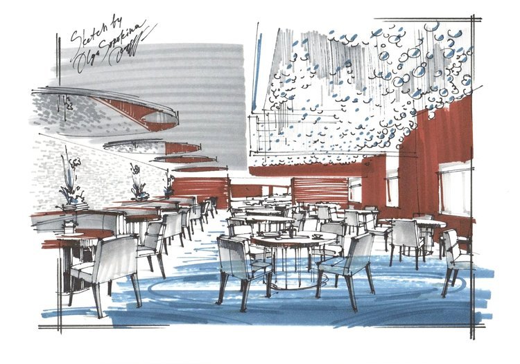
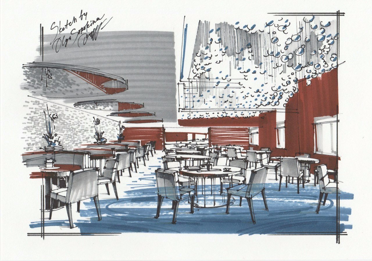
Mistake #8: "Oops, some problems with textures"
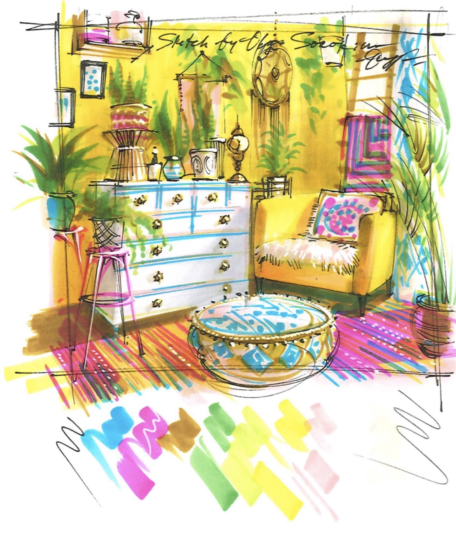
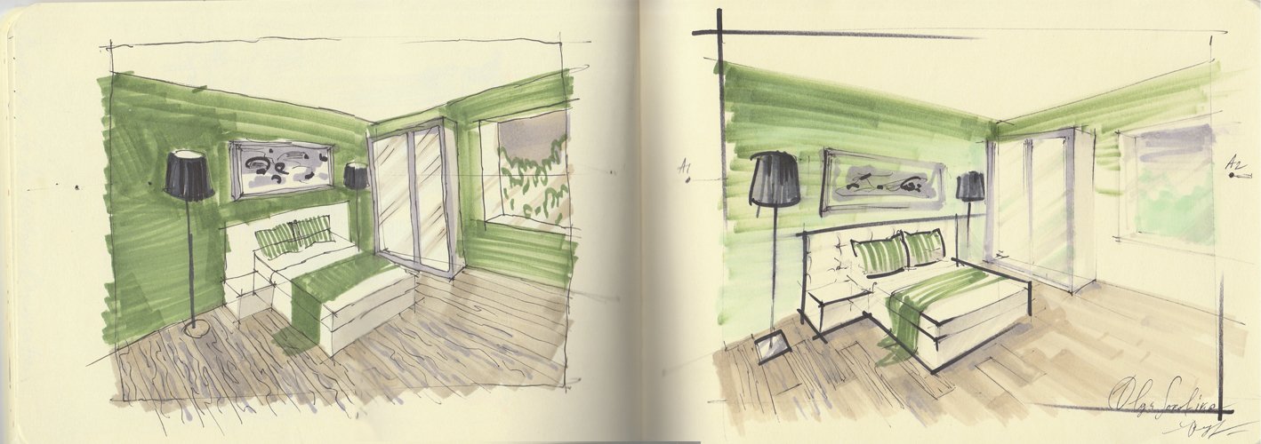
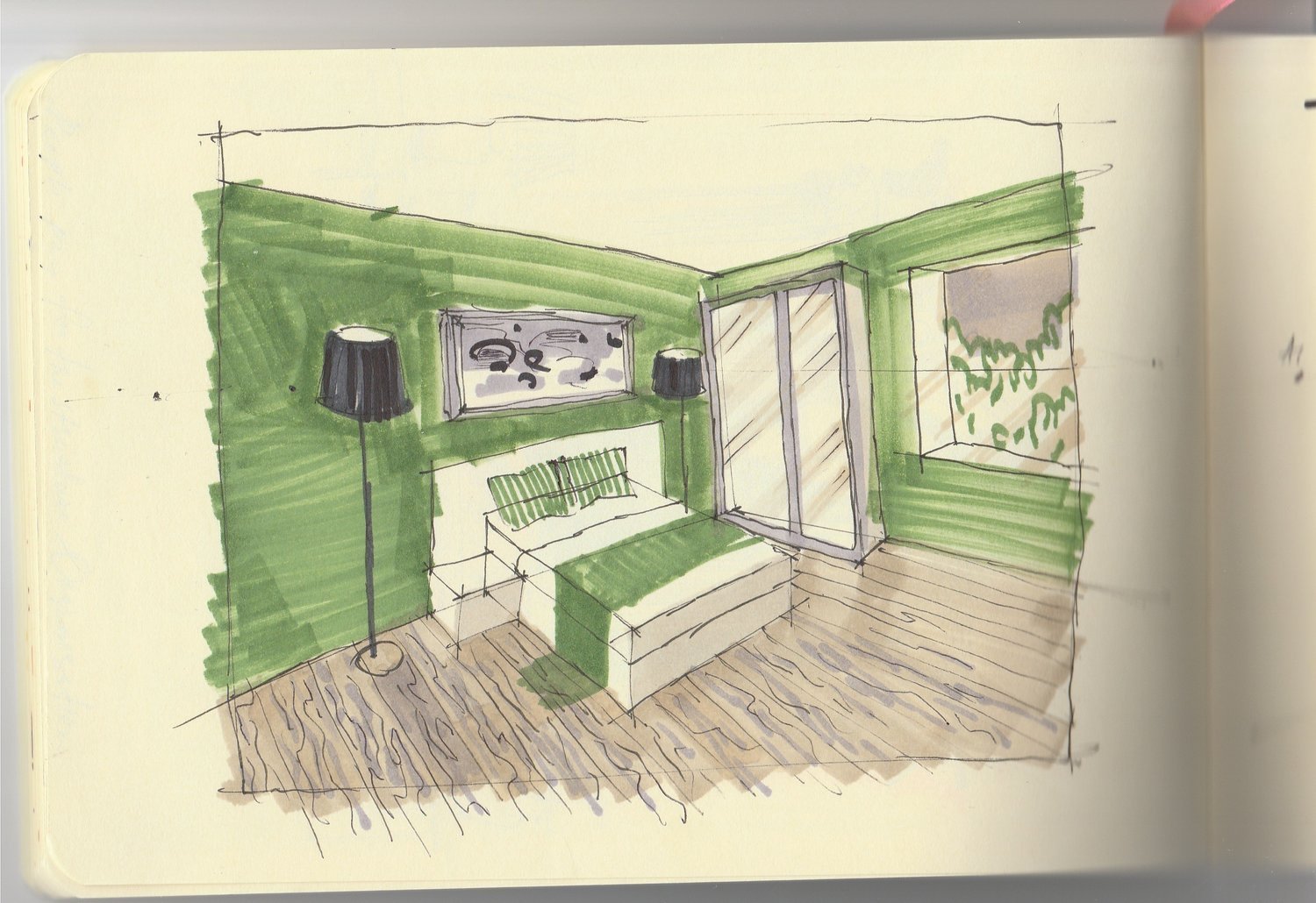
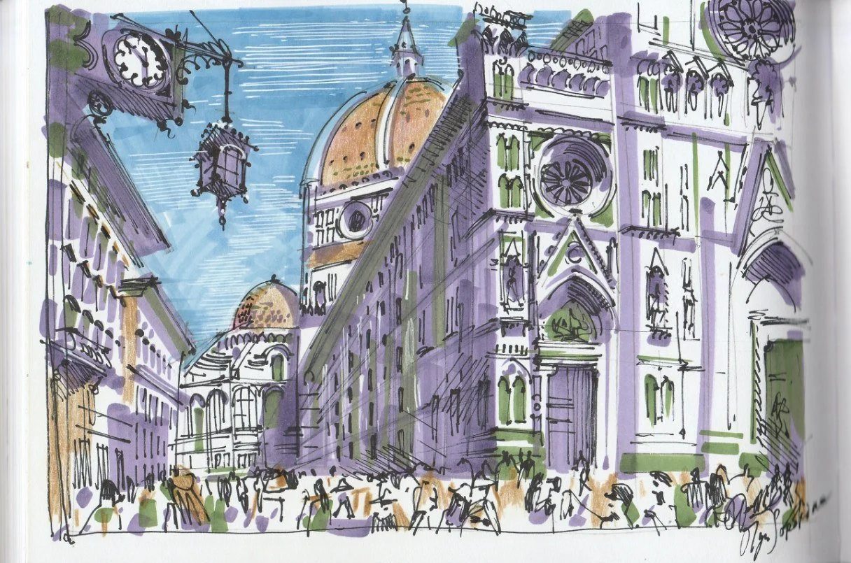
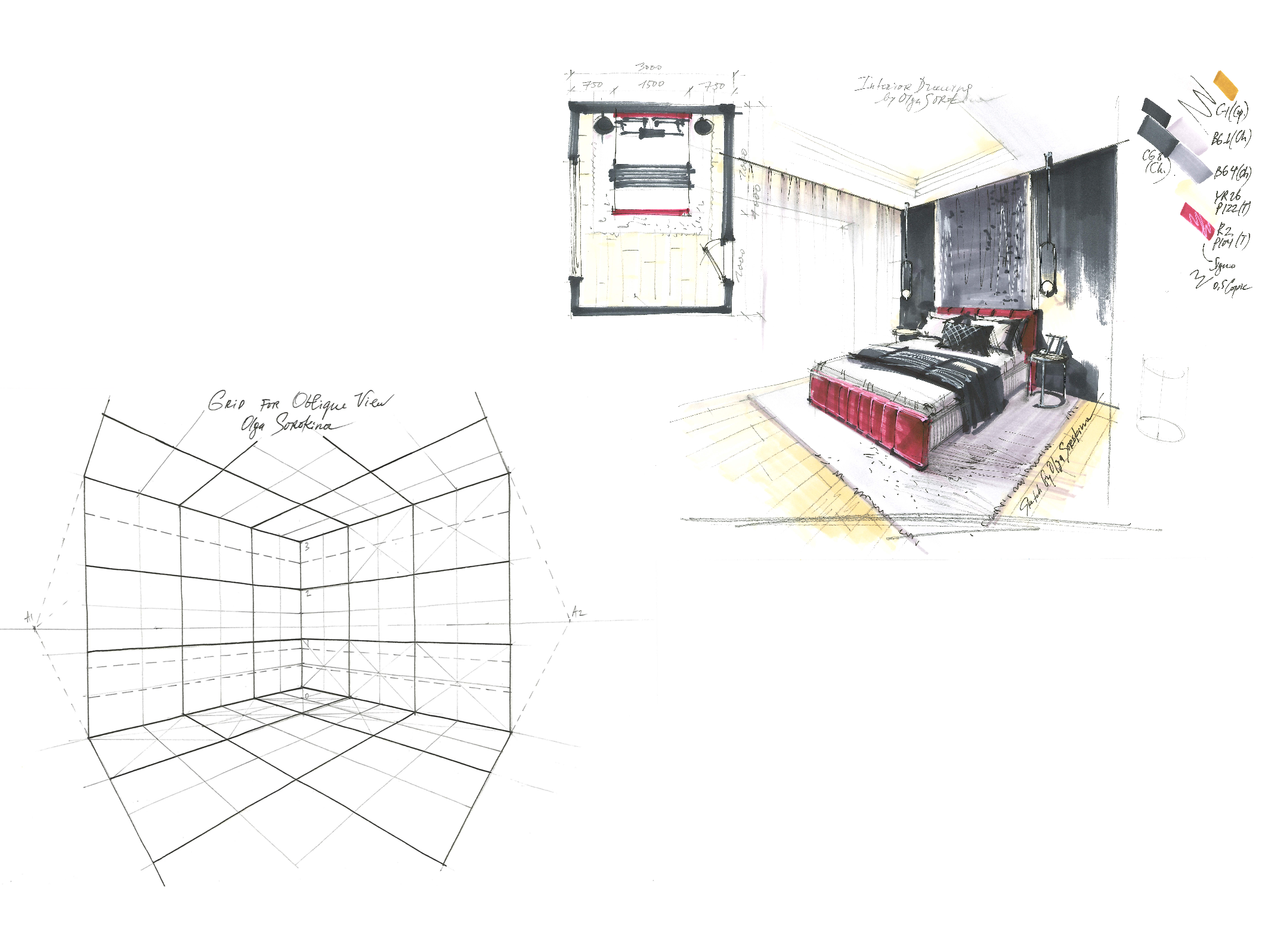
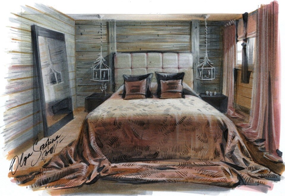
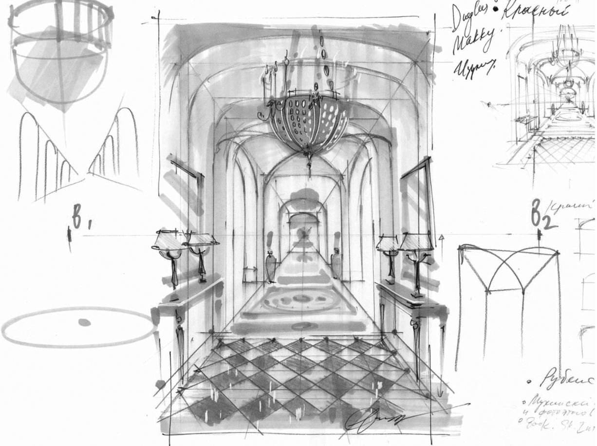
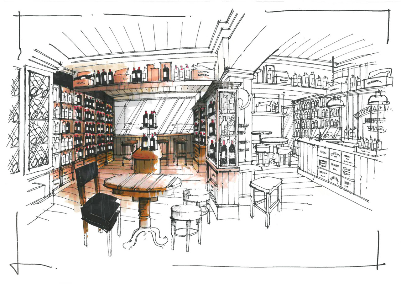
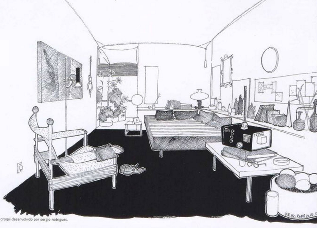
A common problem for beginners in sketching is having difficulty rendering textures (especially wood, glass, and stone): they either work too intensely in this case, ignoring the source and relying on their imagination or depict the texture pattern out of scale, usually by making it very large (see my "wrong" drawing for the parquet as an example: I have depicted a too large wood pattern for this room, in comparison to the "right" drawing). In addition, beginners often draw textures that look unrealistic. For example, a person wants to depict a tree, but it looks more like marble veins or even "ragged worms". In such cases, it's necessary to develop observation skills, do some research on the Internet, and get inspiration. It's essential to have a visual experience. So instead of taking textures from your head and drawing using your imagination at the beginning, use pictures (Pinterest is a good choice) as they can be really helpful. You can find the most popular textures in interior sketching here.
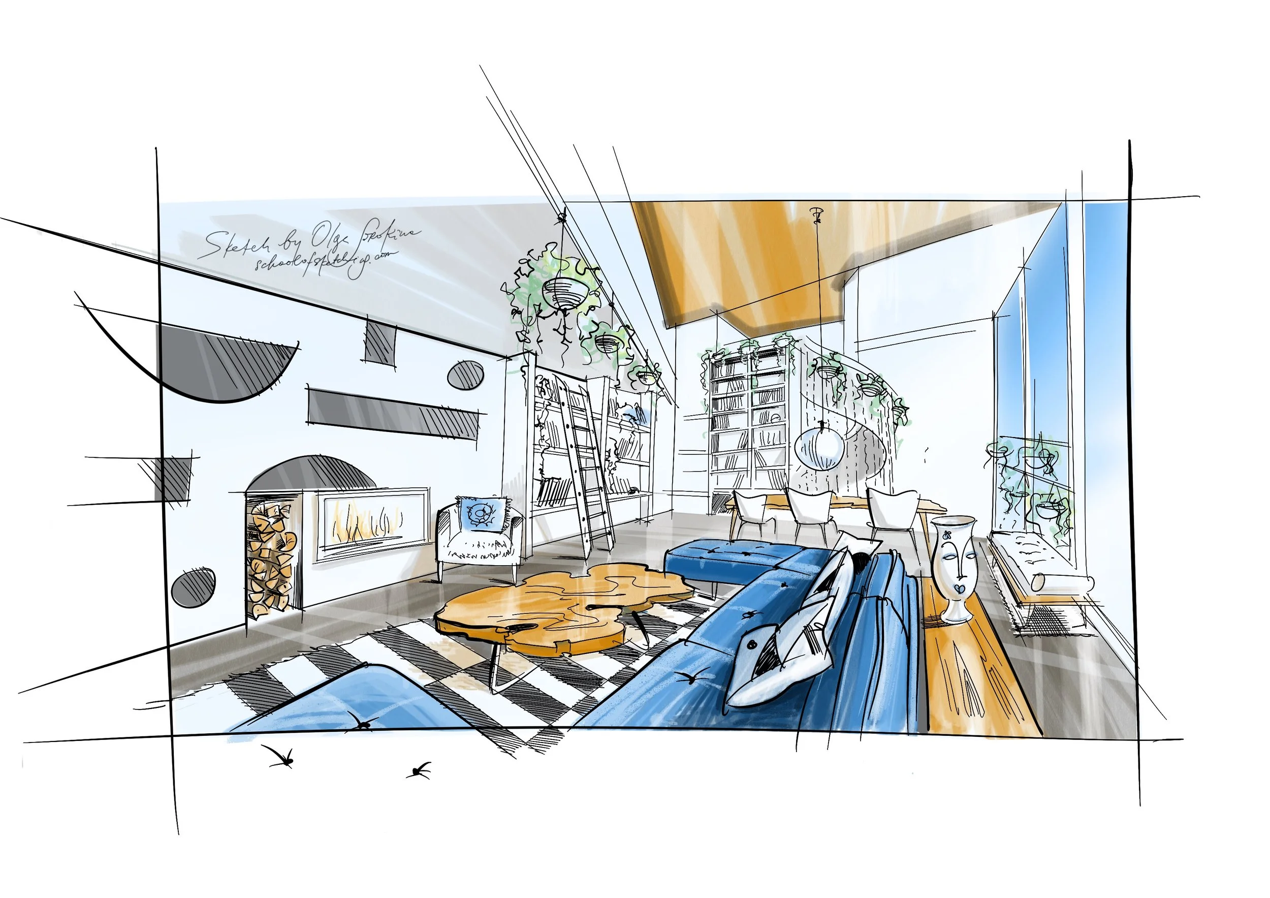
Mistake #9: "The view outside the window in the drawing seems more important than the drawing itself"
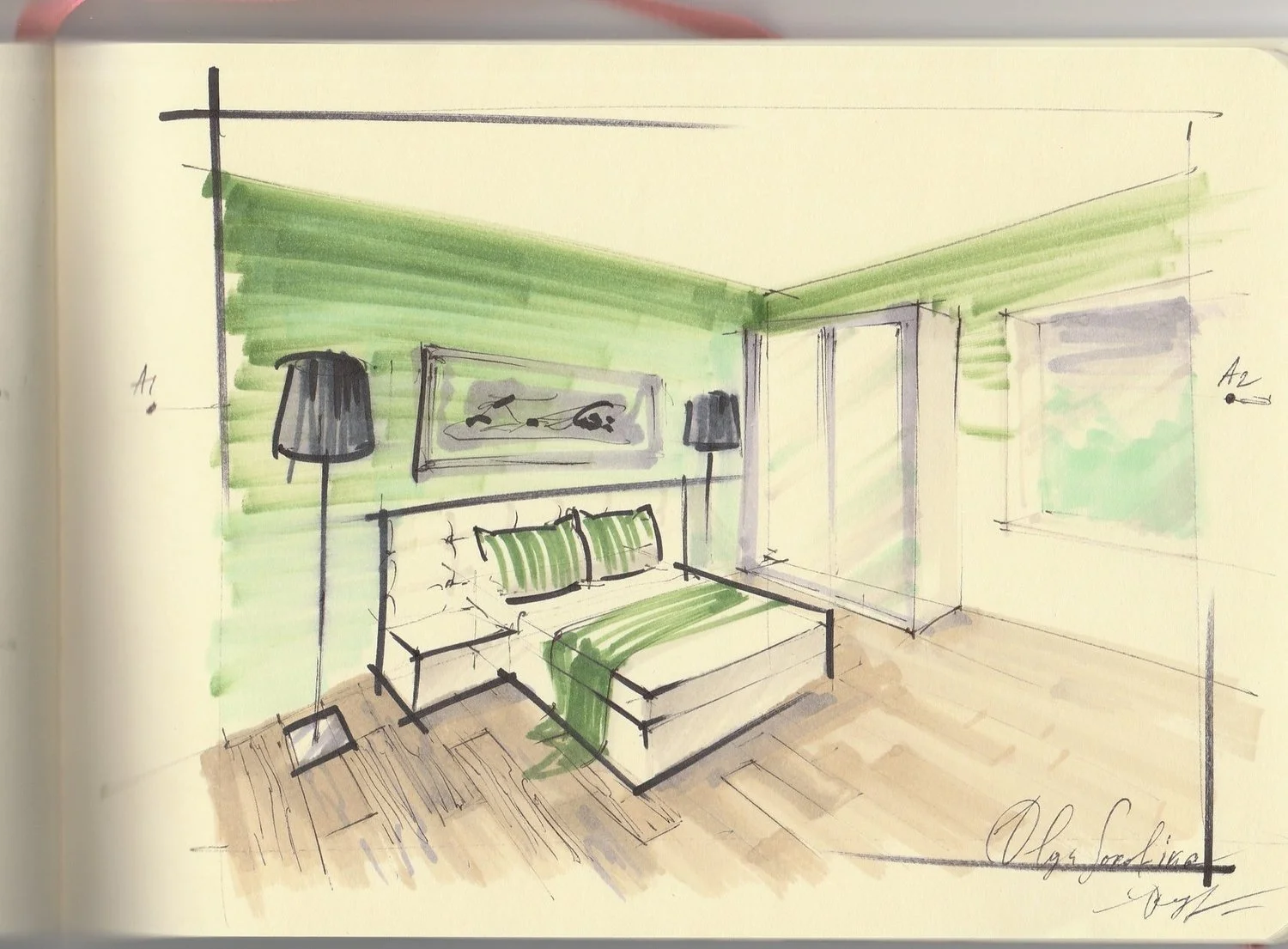
If there is a window in the sketch, newbies often start to draw actively the crown of trees using a bright grass color marker so that when someone looks at the drawing, they see nothing but "garish" trees. In such cases, we should remember that what's outside the window is in the far-far background, and in our sketch, we must focus on the foreground subjects. In addition, the thickness of the air outside the window softens all colors and makes them translucent, pale, with a cold grey shade.
Mistake #10: "Your tonality fades: everything is equally grey"
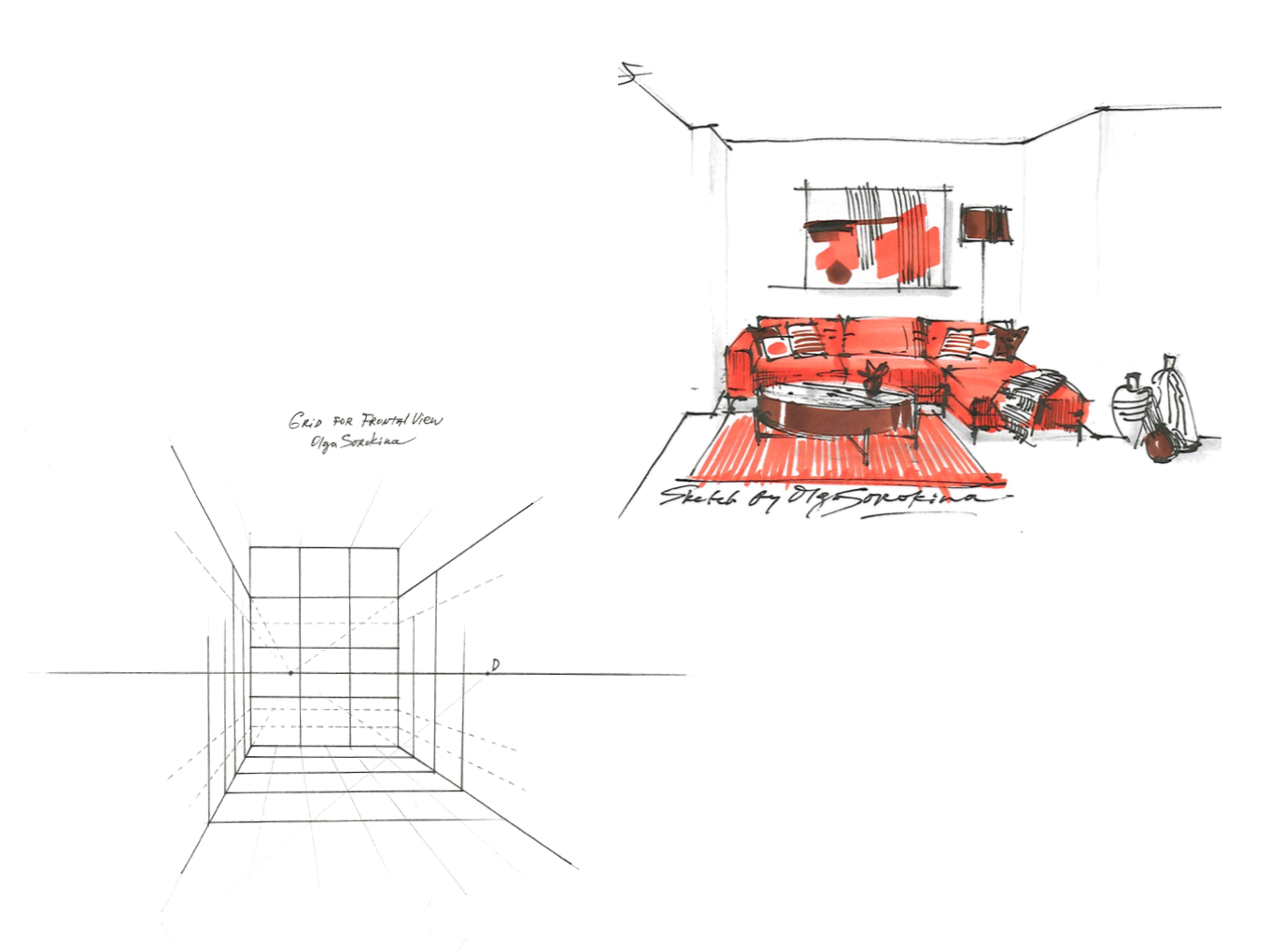
Here it is required to highlight the lightest, darkest, and most middle objects according to the tone in the sketch. It is called "tonal parsing" of the sketch. In this case, it is advisable to train on the monochrome sketches, for example, the ones which are drawn exclusively with grey markers (you can just use three of them: light gray, medium gray, and dark gray). Thus, you will get used to distinguishing the tonality of the scene, for example, a color drawing can turn out bright, all markers will have different colors but the same tone, and as a result, there will be no contrast in the drawing, as if everything is blended into a single spot.
What should you do?
Here are my Top 5 free tips for detecting and fixing your mistakes:
1) A good idea is to print out your sketch in shades of grey using only a black cartridge and see if you have this problem. If yes, everything will be equally gray on the printout.
2) You can also take a photo of your sketch and judge the result, as this mistake is pretty visible in the pictures in a small format.
3) You can stand in front of the mirror with your sketch, and the reflection always reveals mistakes better.
4) Alternatively, you can turn the sketch upside down. The thing is to change the point or angle of view at the sketch since while you are drawing, your eyes "get blurry", and you become blind to your mistakes, repeating them from one sketch to another.
5) You can squint and look at your sketch, and if everything looks like one single spot, equal in tone, then it's high time you fixed the situation.
By the way, these five tips will work for almost all mistakes since it's just easier to notice them using these techniques.