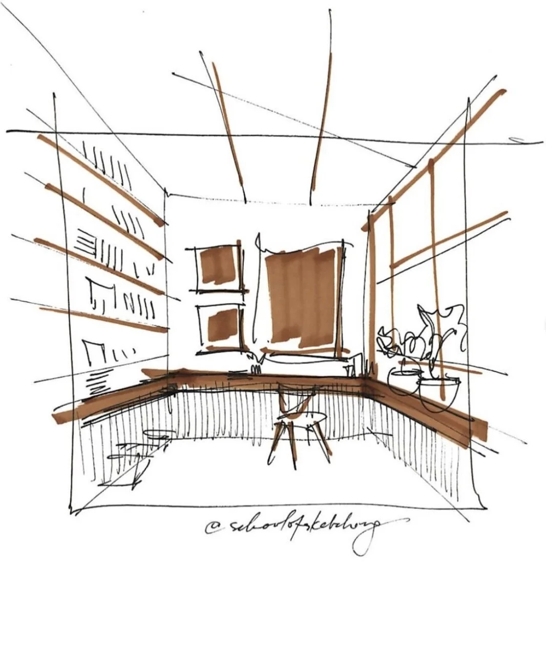
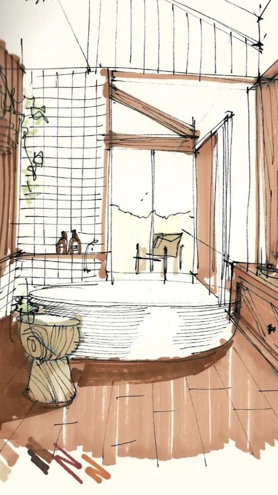
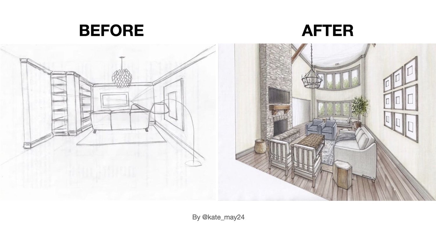
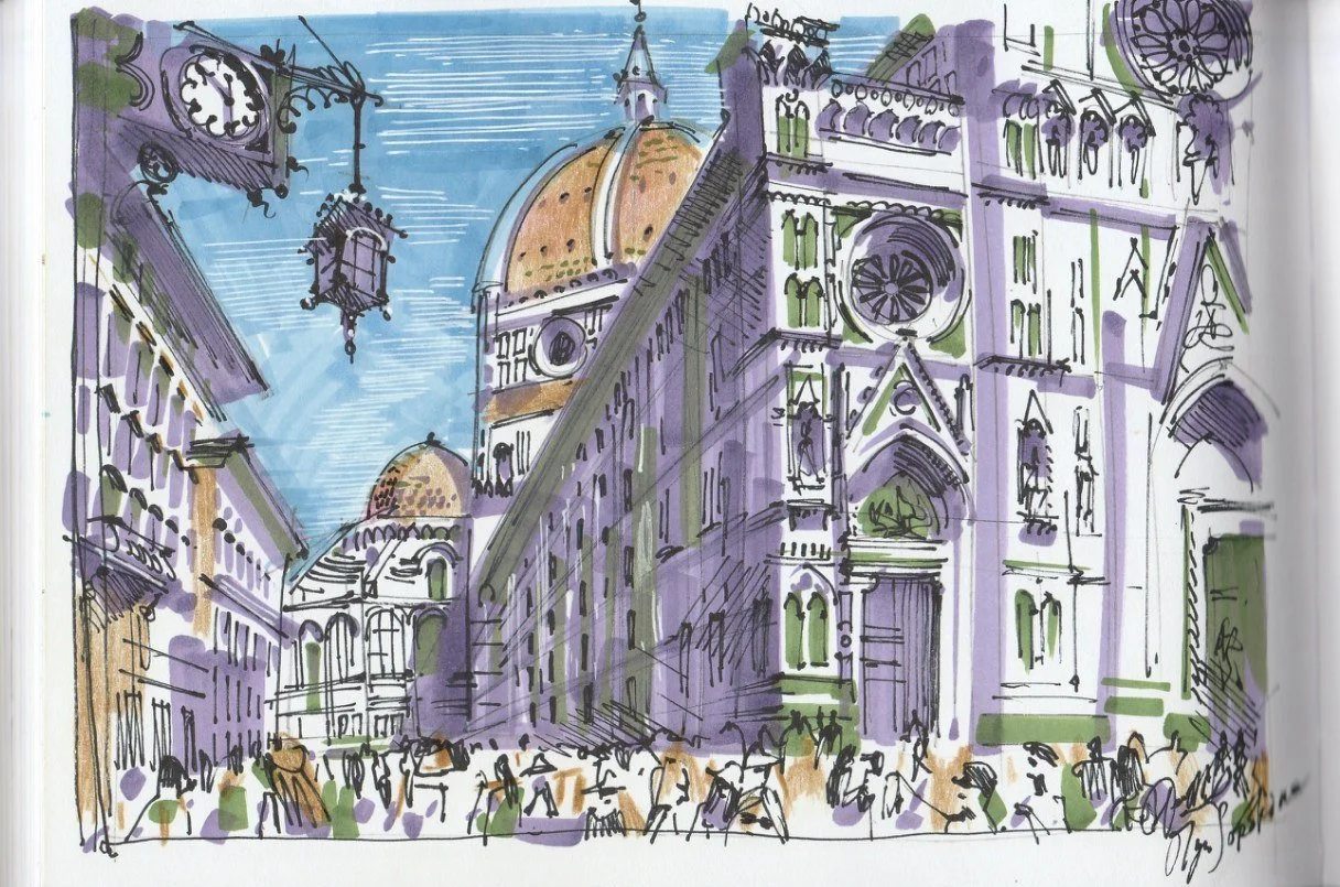
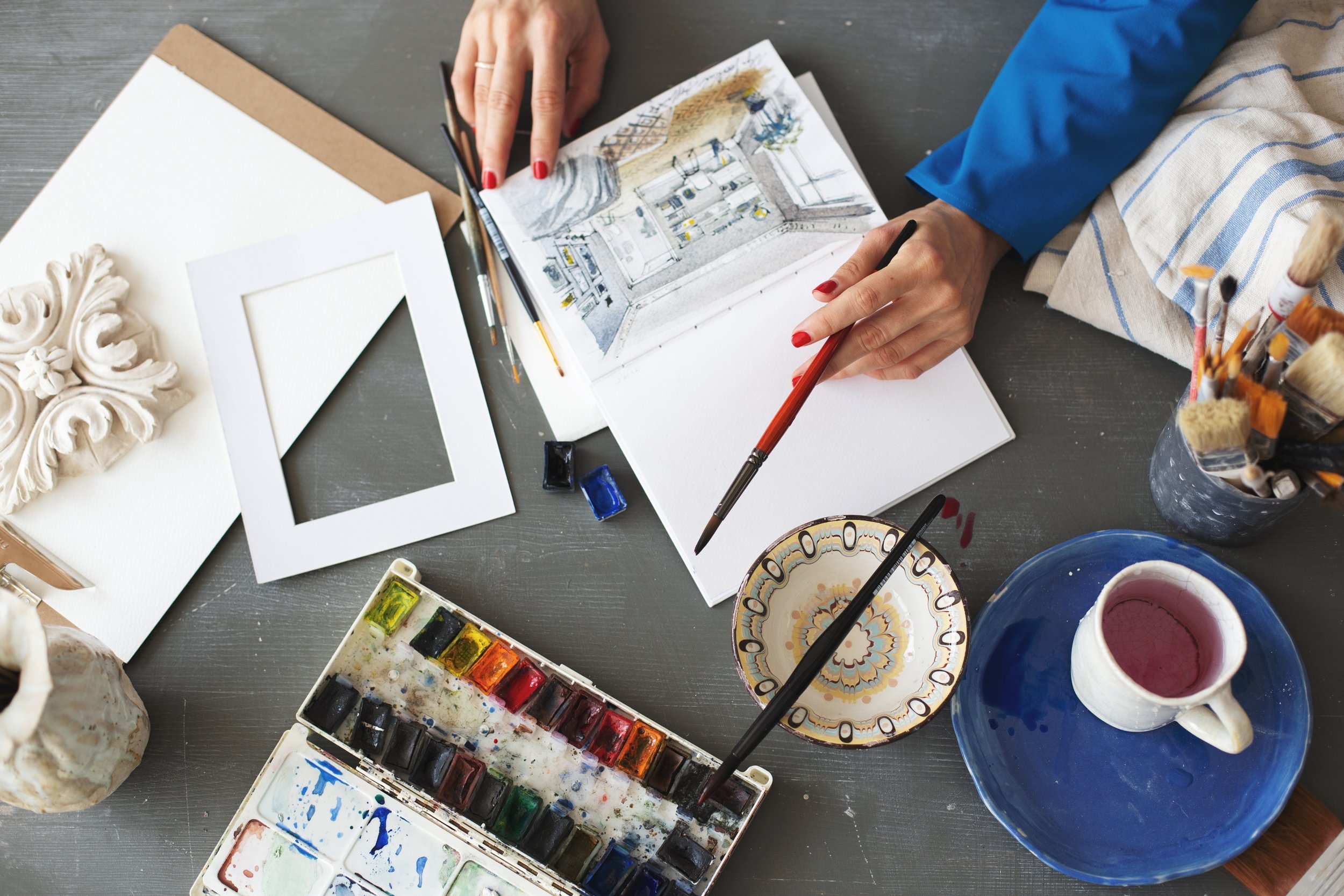
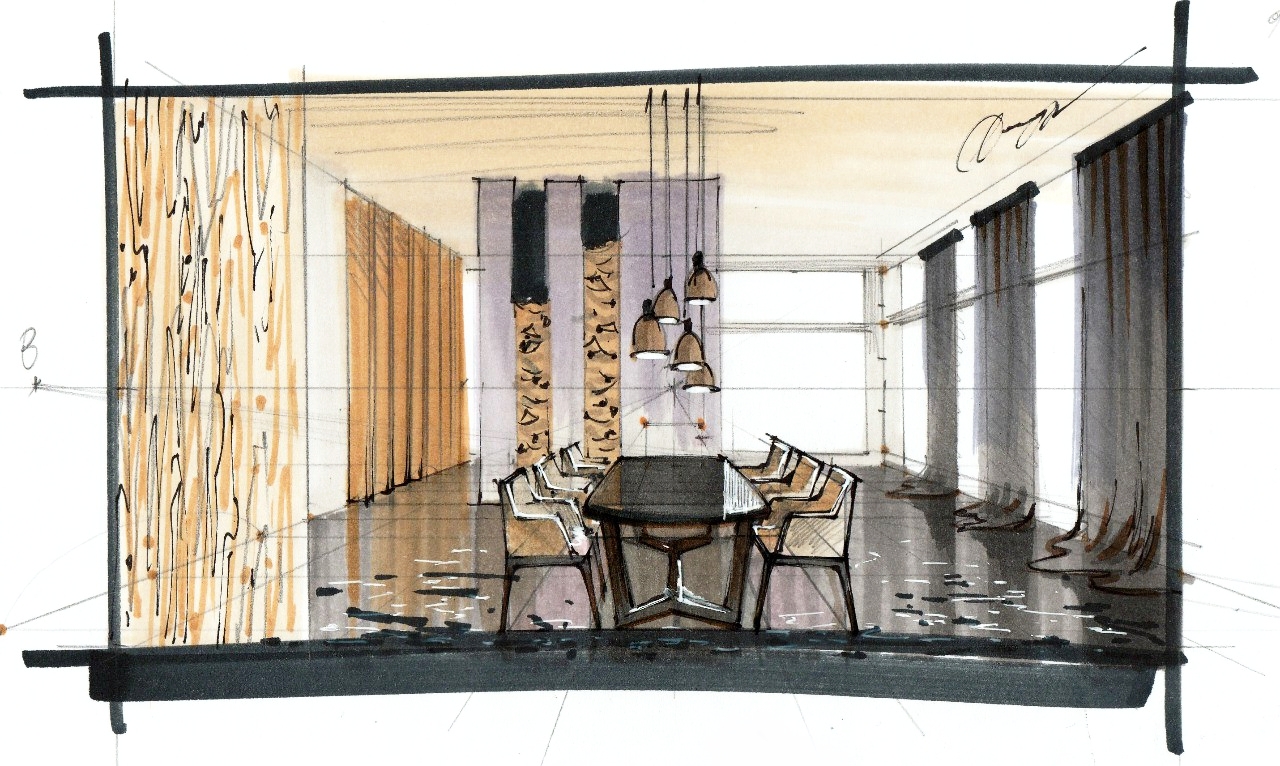
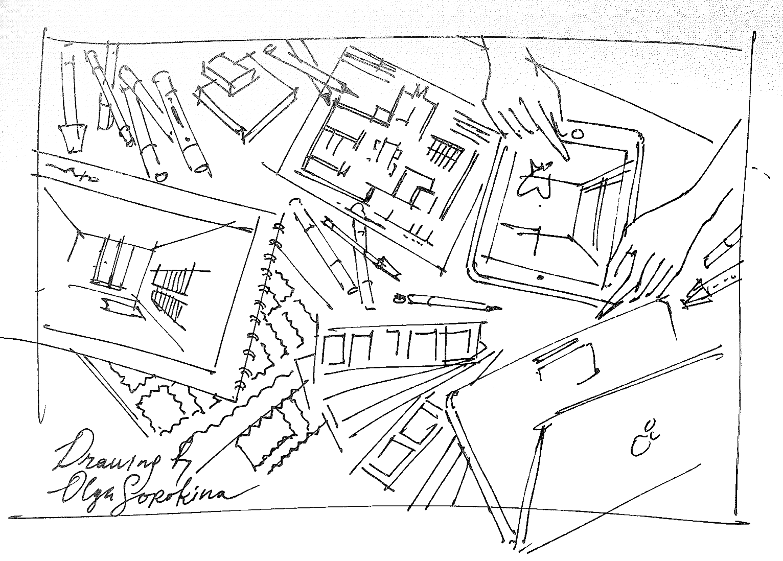
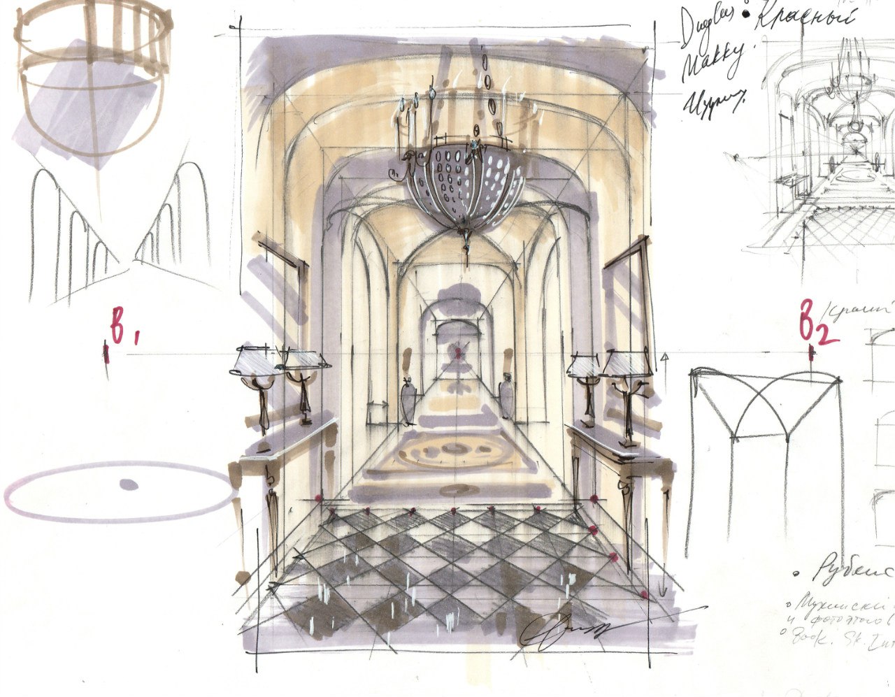
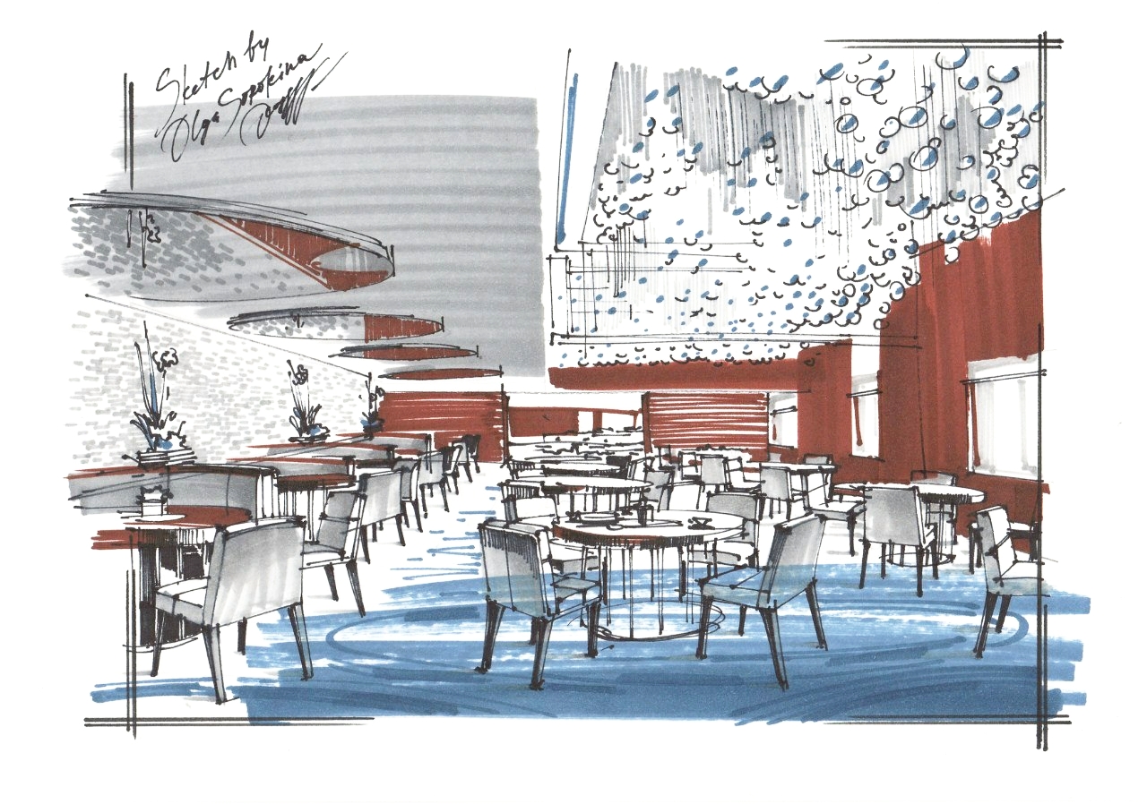
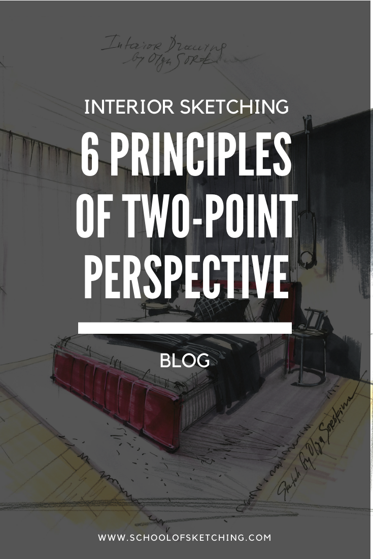
11 Reasons Why Interior Designers and Architects Should Sketch

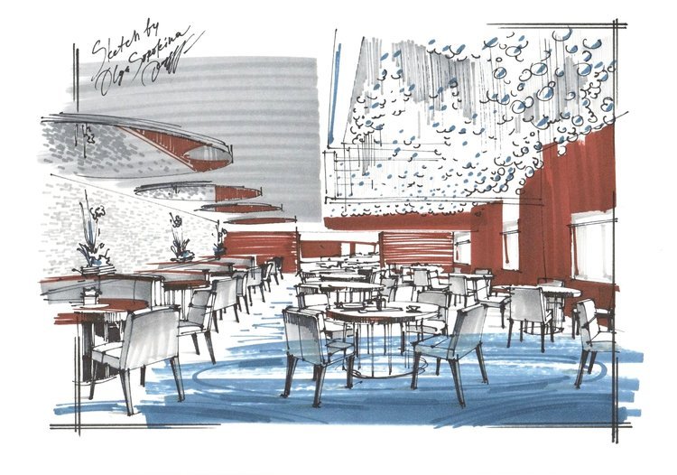
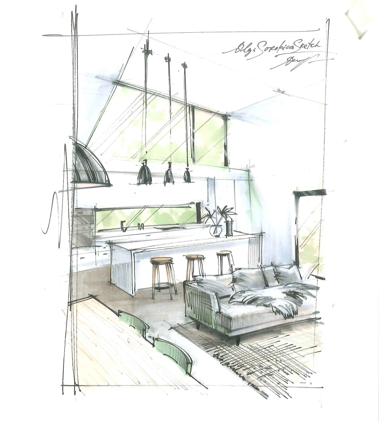
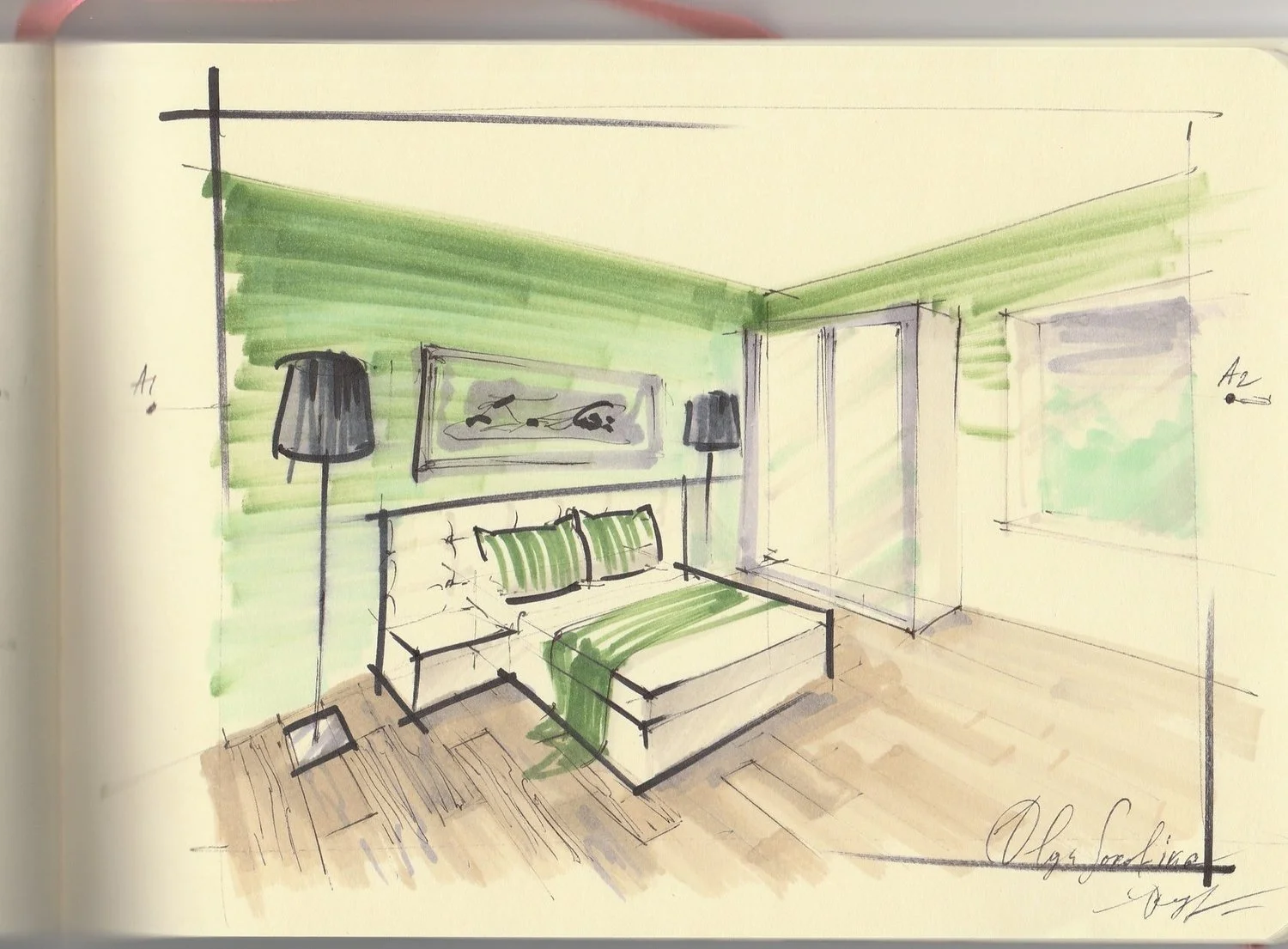
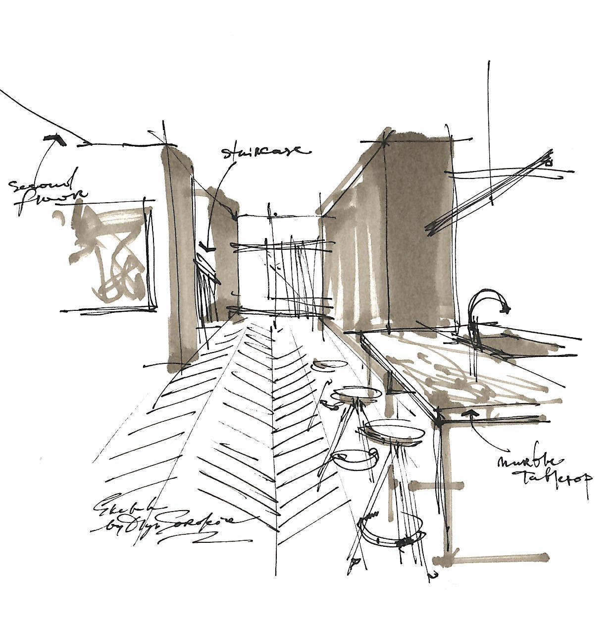
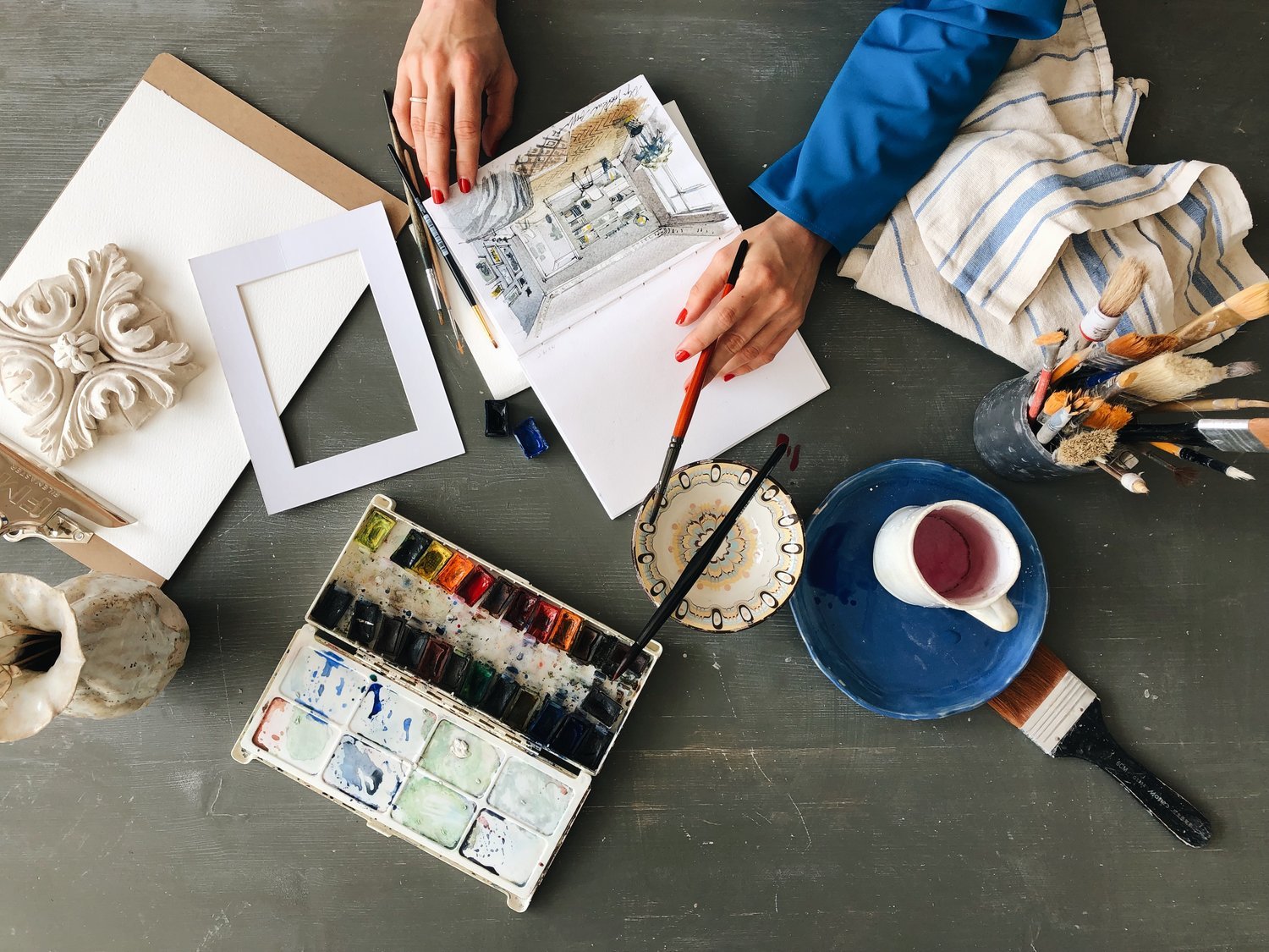
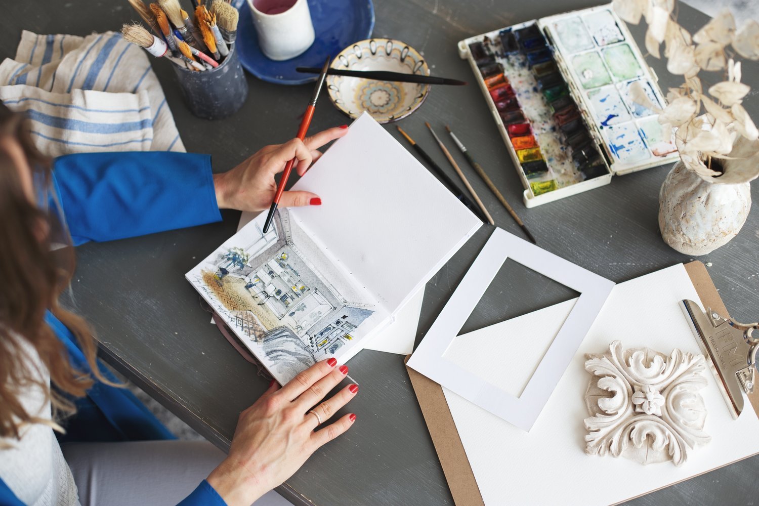
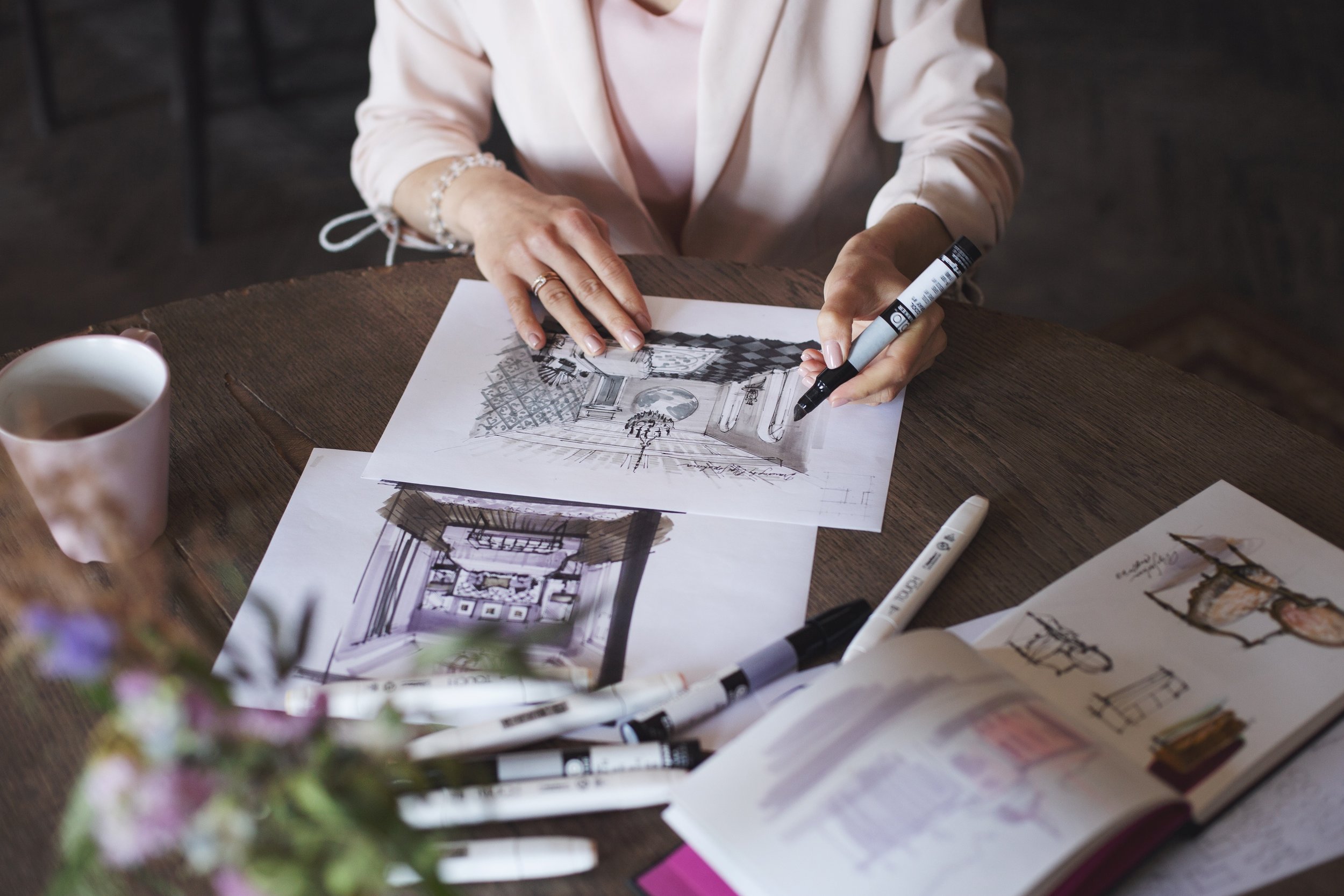
When architects draw, they experience architecture, they are walking through the space in their minds.
 

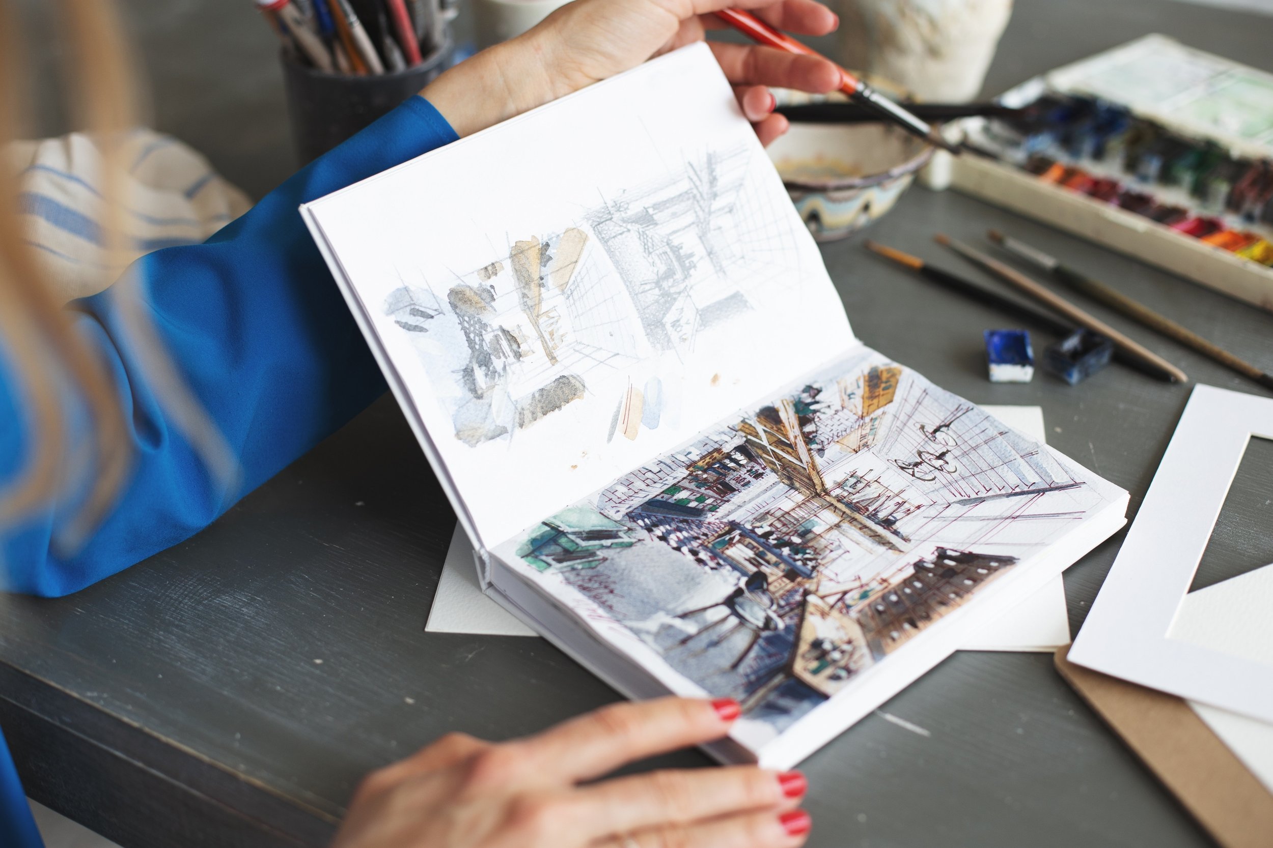
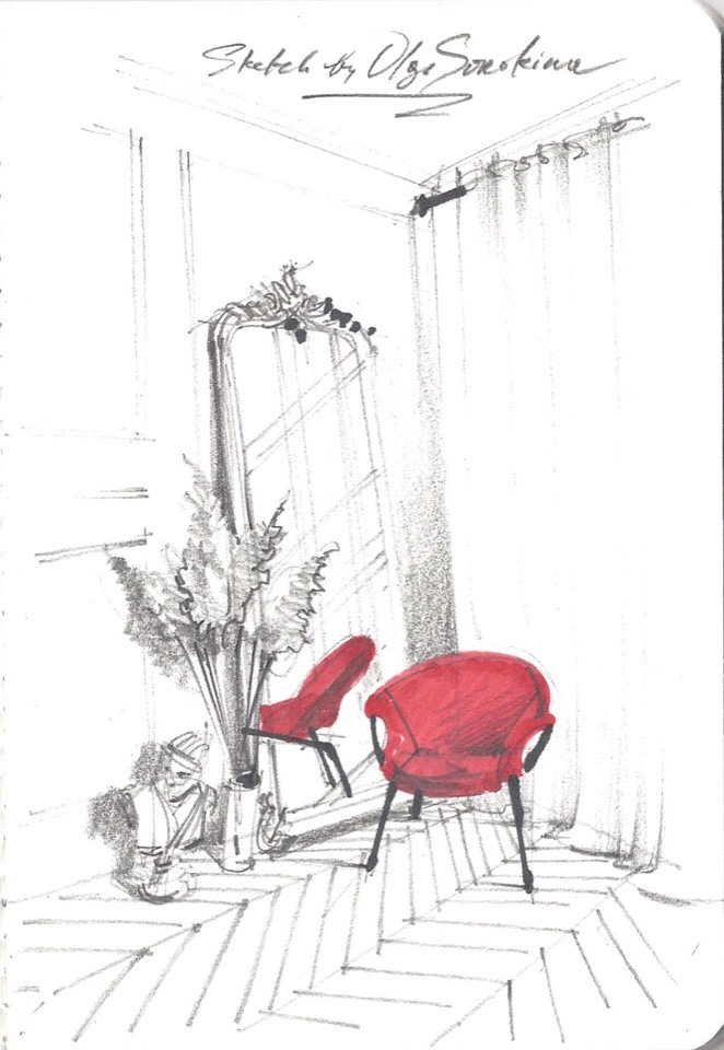
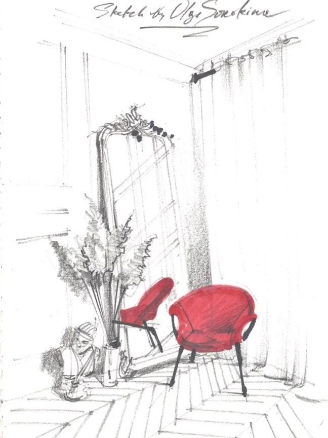
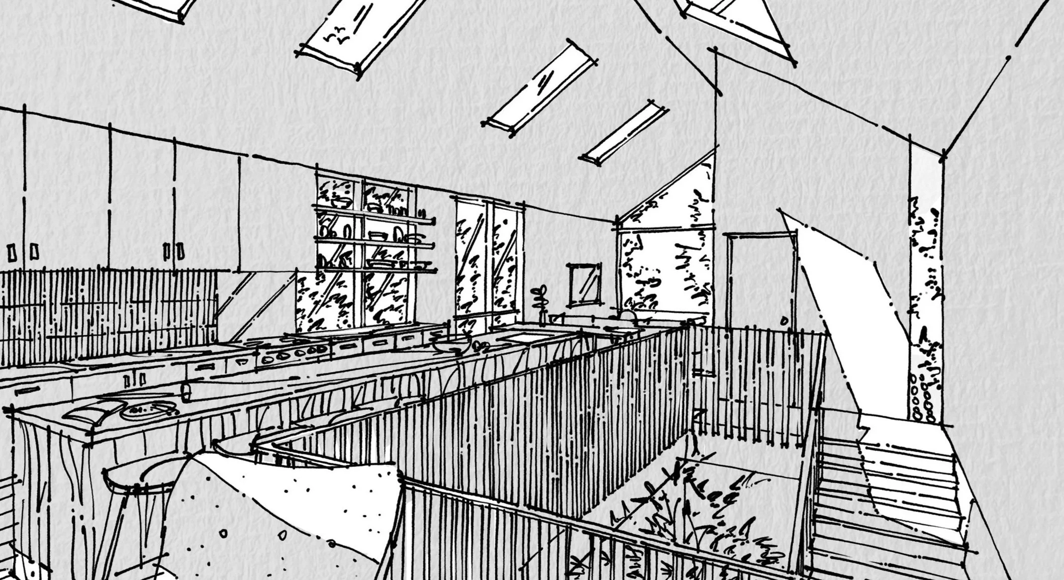
Interior design and architecture begins with an idea, and drawing is a fantastic tool to define it, to give form to this abstract concept that exists only in the designer's head for a while. Based on my experience, I can ensure you that sketching is the fastest way to design, yes, even though you've mastered all the design soft like 3DS Max, AutoCAD, ArchiCAD, Revit, and all other programs. Sketching is natural for designers.


11 reasons why we do it:

  • to think,

  • to discover,

  • to express & manifest

  • to understand ideas in our heads,

  • to give form to something,

  • to structure thinking,

  • to communicate ideas and examine them,

  • to present,

  • to record and document, 

  • to understand the world,

  • to understand oneself (yes, I know it sounds quite philosophical, but that's true)


Sketching is the process of discovery; it is like breathing, meditating, or exercising, just let it flow
 

Most important, in my opinion, we do it to think, to evolve ideas during that process of freehand sketching. You transfer and translate your ideas into our world through the visuals. An experienced architect or interior designer make a drawing first thing almost automatically, instinctively. Well-made drawing establishes credibility with clients from the first meeting.


A professional dancer thinks through the act of dancing. His/her body literally «thinks» during that beautiful process, and creates choreography. It's thinking in motion. That can't be more true, that we, as designers, and architects think through the act of drawing to uncover and reveal and to draw something out that sits inside of our brains. 

A good idea will generate a good drawing.
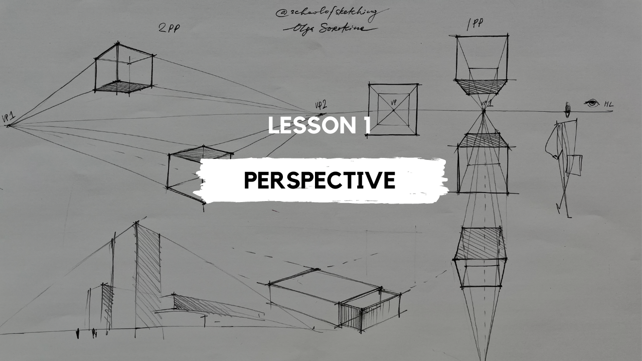
perspective drawing for designers course.jpg
 

What is the best drawing form for you?

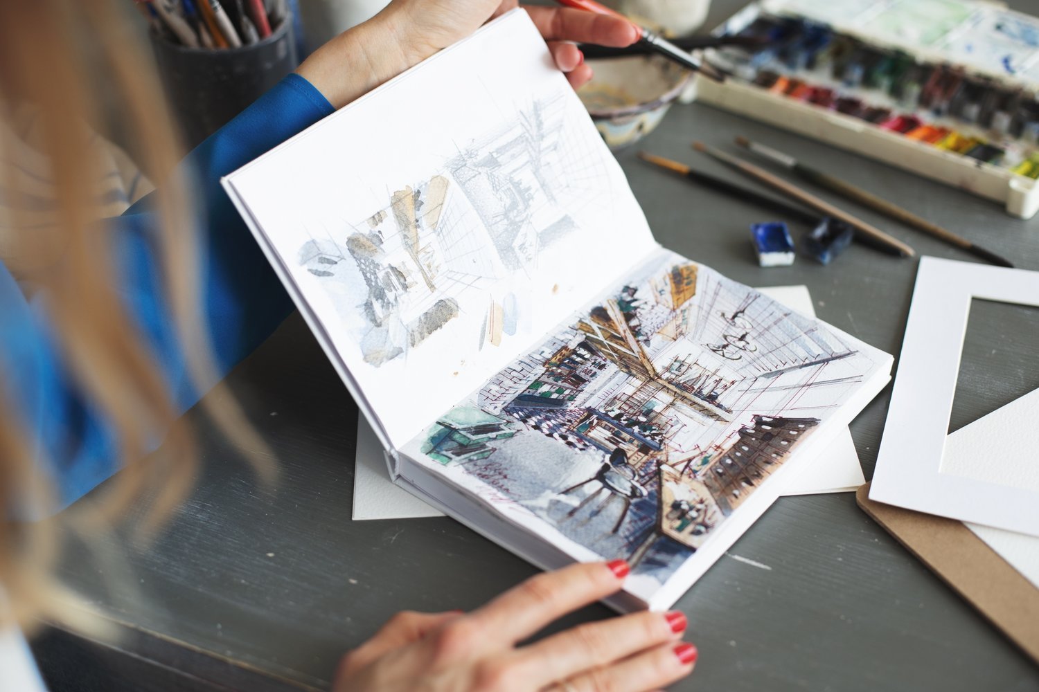
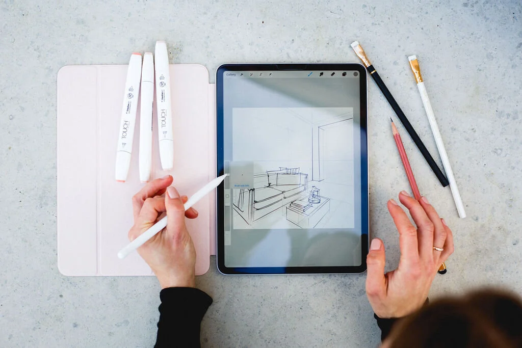
Drawing may take many forms, and it's important you find your favourite, the most comfortable for you. It can be a freehand sketch on a piece of paper or digital drawing on the iPad in Procreate. Maybe it's a quick Photoshop concept sketch or a mixed technique that suits you best. For example, I noticed that very often interior design students create a hand drawing, then scan it and colour on a computer later. As one architect said: “Drawing is the first visible thing of the form of the thought, the changing point from the invisible powers to the visible thing. It's a special kind of thought, brought down onto a surface”.

Drawing is the first visible thing of the form of the thought, the changing point from the invisible powers to the visible thing. It is a special kind of thought, brought down onto a surface
 

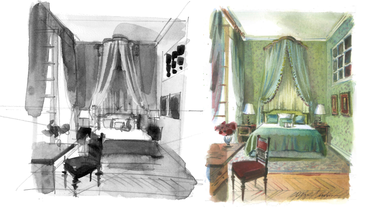
Different stages in the interior design process require different kinds of drawing: expressive and quick early sketches are followed by more precise perspective views, layouts, and sections to scale. It all starts with a sketch first, even though very often these early, nearly abstract, exploratory drawings hold meaning only for its maker. It's the beginning of everything.

Remember, the best way to make good interior sketches by hand is to make a lot of them, quickly and spontaneously, until it becomes natural for you. Do you want to master interior drawing from scratch? Welcome to my Online School of Sketching.


P.S. Hope you enjoyed this article, please share it on your social media so more people can learn about perspective drawing and freehand sketching. Thanks in advance and good luck with your sketches!


© Olga Sorokina, 2023


"BASE": a Course Which Teaches All the Basic Techniques You Need to Implement Sketching in Your Interior Design Practice

(For Interior Designers & Architects)

interior sketching course.jpg

Featured in:

Check out the recent Redfin article we were featured in:

11 Timeless Beige and Neutral Home Decor Ideas | Redfin


Read other articles on my blog:

How to Gain Admission to Your Dream Design University, Elevate Your ID Diploma or Become a Sketch Artist?

Exciting news awaits you at my Online School of Sketching today! 

As a sketch artist and experienced educator in sketching since 2015, I am thrilled to offer you my personalized coaching sessions to unlock your design potential and achieve unparalleled success.

In a nutshell, with my 1-1 coaching, you could gain admission to your dream Design University, elevate your interior design diploma project or become a professional sketch artist.​​


Here are the benefits:

  1. Gain Admission to Your Dream Design University: With my personalized guidance and refined interior sketching and perspective drawing skills you'll acquire through the coaching, you can confidently apply to prestigious design universities and secure admission to the institution of your dreams. Let's turn your aspirations into reality!

  2. Elevate Your Diploma Project: Enrich your interior design diploma project with breathtaking sketches that captivate and impress. With this one-on-one coaching, you'll master the art of hand rendering, enabling you to create outstanding presentations and set yourself apart from your peers.

  3. Enhance Professional Opportunities: As you refine your sketching skills under my tutelage, you'll be equipped to pursue exciting career paths. Imagine becoming a professional sketch artist, collaborating with renowned brands, or even sharing your expertise by teaching interior sketching to others in your community.

  4. Boost Confidence and Express Your Ideas: My coaching sessions will nurture your sketching abilities, allowing you to confidently express your design concepts and ideas. Develop a unique artistic voice that resonates with clients, colleagues, and collaborators, making your mark in the interior design and architecture world.

  5. Unleash Your Creativity: Through personalized coaching, you'll gain the tools, techniques, and inspiration to unleash your full creative potential. Break free from limitations and explore new horizons in sketching, enabling you to craft even more beautiful, sustainable, and aesthetically pleasing environments for people to live in.


What people say:

​​

​Here's what you will get from my 1-1 coaching:

1. Confidence and Guidance:  Gain the confidence to express your creative vision and receive expert guidance tailored to your needs. I will provide personalized feedback on your sketches or design projects, allowing you to showcase your design concepts with clarity and artistic flair.

2. Insights from a Pro:  Benefit from my extensive professional experience in interior design and architecture. I have collaborated with renowned brands, worked on award-winning projects, and shared my expertise at international events. With my guidance, you'll gain invaluable insights and industry-relevant techniques.

3. Accelerated Skill Development:  Experience rapid interior sketching skill development with practical exercises and personalized recommendations. Refine your sketching abilities and elevate the quality of your work.

4. Professional Perspectives and Tips:  Tap into my wealth of professional perspectives and insider tips. Learn sketching techniques, presentation strategies, and industry best practices to impress clients and colleagues.


​Pricing

Secure your spot in my coaching program today:

- Single Zoom Session: For those enrolled in my online courses ("BASE," "PRO," "Watercolour," or "Procreate"), a one-hour Zoom coaching session is $190 USD. For non-enrolled individuals, the price is $290 USD.

- Five Sessions Package: Dive deeper with a comprehensive package of five one-hour Zoom coaching sessions for $760 USD. The fifth session is complimentary. Receive continuous support to achieve your design goals. For those enrolled in the online courses I’ve mentioned above, a one-hour Zoom coaching session is $760 USD. For non-enrolled individuals, the price is $1160 USD.​

Spots are limited, so please complete this form to secure your spot asap.


​Wishing you boundless inspiration and, as always... Happy sketching!

Olga Sorokina

Founder, Online School of Sketching Ltd

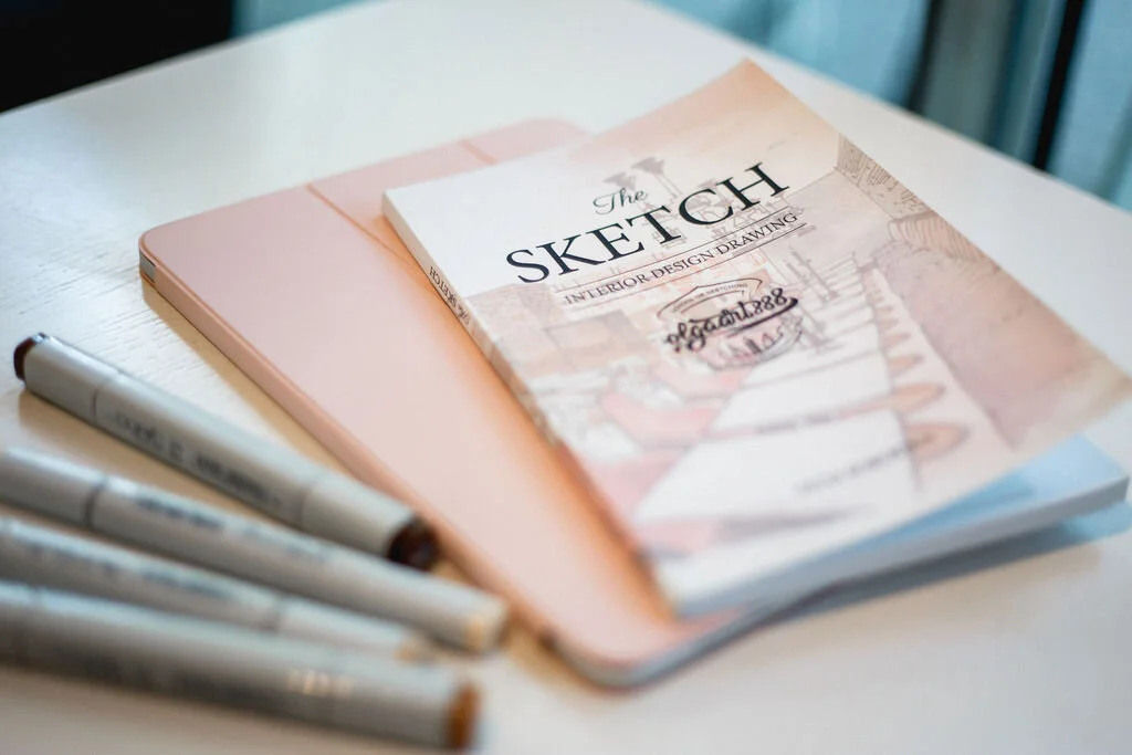
Author of "The SKETCH. Interior Design Drawing"

My blog: https://schoolofsketching.com/blog-in-english​​

From Pencil to Palace: My Fashion Illustrations for Danish Royal and Celebrity Couture

In this blog post, I'm thrilled to present my sketches depicting the exquisite custom wedding and evening dresses crafted by the talented Danish designer, Rikke Goodnitz.

These dresses grace not only the wardrobes of the Danish royal family but also find their elegance embraced by stars of Danish television.

The focus of this article centers around the remarkable outcome of my collaborative venture with a distinguished fashion designer based in Copenhagen.

Rikke, the visionary behind these exquisite creations, entrusted me with a special opportunity. She commissioned a series of illustrations for her upcoming collection, enriching her catalog with my artistic renditions. Moreover, my drawings will adorn her showroom, infusing it with the essence of my creative perspective. This collaboration has not only allowed me to delve into the world of Danish design but also to contribute a unique touch to Rikke's artistic vision.

For an extended glimpse into my fashion illustrations, explore my Fashion Sketching Instagram page: @olgaart888fashion


In this video, I share some behind the scenes of working on this commission + my secrets in fashion sketching:


Check out my online course on fashion sketching for beginners


Join my free 3-day fashion sketching challenge

"Your Dream House Project": Guided Meditation for Architects & Interior Designers

In this guided meditation for architects and designers, I invite you to close your eyes, relax, and explore the depths of your imagination as I lead you through a transformation. It is not your regular meditation, it is rather an experience, a creative visualization, which you can do not only sitting or lying down, but even while walking somewhere in nature.


What this meditation is about?

Join me as I transport you to a world where your architectural visions come to life. Imagine yourself driving to meet a photographer at your recently completed project, a house that embodies your deepest creativity and expertise. With the tenants away for a long weekend, the space is yours to explore, appreciate, and bask in the glow of accomplishment.

As you walk through the rooms, you'll touch the textures, feel the materials, and envision every meticulously designed detail that makes this project exceptional. With each step, you'll rediscover the passion that led you to this point in your architectural journey.

But it's not just about the physical space. Along the way, you'll also reconnect with your inner child, that part of you that loved to create, to build, and to dream. Feel gratitude for the path that has brought you here, honoring the mentors, teachers, and all those who have influenced your growth.

As you embrace the journey that led you to this remarkable project, you'll also reflect on the serendipitous moments and coincidences that shaped your path. Acknowledge the interconnectedness of life's twists and turns, and how they have contributed to your success.

So, whether you're an architect, a designer, or simply someone seeking inspiration, this meditation is an opportunity to immerse yourself in the power of your own creativity, to express gratitude for your journey, and to connect with the joy that comes from bringing dreams to life.


Check also my "Meditation for Creativity: Overcoming Creative Blocks & Fear of Judgement"


I welcome you to check out my YouTube channel, where I invite architects, interior designers, and creatives to embark on a journey of inspiration, sketching, and creative manifestation: here.


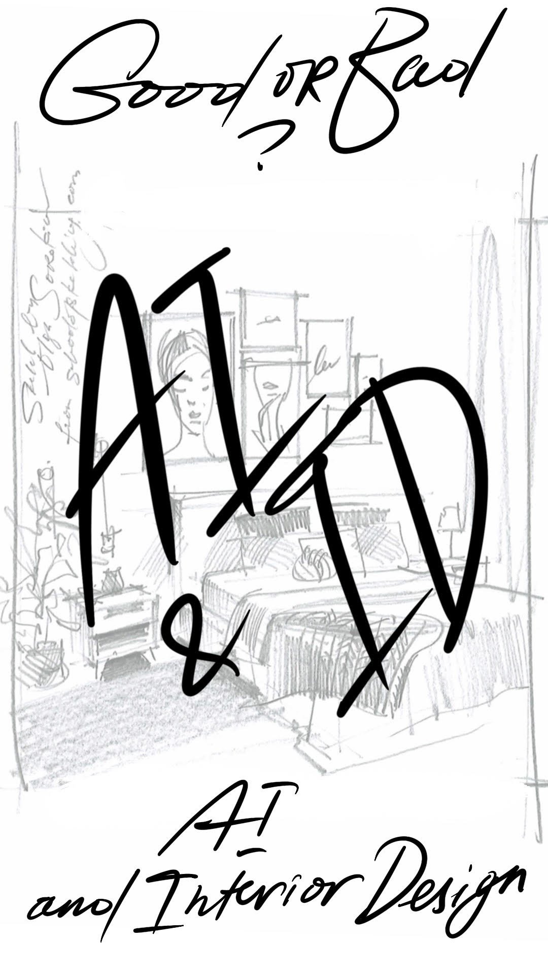
Artificial Intelligence and Interior Design: Good or Bad? What is the future of sketch artists and interior designers as AI rapidly advances?


AI and ID: good or bad?

OK, let’s address today that “elephant in the room”. 


Recently, a question came up from one of my students enrolled in my online course “BASE”:

“Olga, what is the future of sketch artists and interior designers as AI rapidly advances?"


Since this question concerns many people, I'll share my point of view here.


You are very welcome to share your ideas and insights on AI in the comments below. What are your thoughts? Please share them below. I’m really excited to read your comments.


Alright… Typically, professional interior designers study design for 4-6 years (in my case it was 6 years, year 6 was entirely dedicated to the diploma project).


Historically, the profession of an interior designer requires:


 Stage 1. Copying

Almost all art education starts with copying the works of masters: we learn by attempting to replicate what is already known. This is our nature. The initial stage is learning the history of interior design and architecture, and providing “recipes” for popular canonical styles, like classicism, modernism, minimalism, etc., allowing us to assemble them piece by piece.


Stage 2. Blending

After mastering the history and understanding the basics, future interior designers can blend the knowledge they have acquired and mix it with other known elements to create new, more complex, and contrasting solutions that maintain a coherent and harmonious appearance. This is for instant, how some of the styles in interior design have emerged: fusion, boho, and contemporary classic, to name a few. You can break the rules when you know them, right? In other words, the educational system significantly expands on the range of interior designs that can be created.


Stage 3. Creativity

After mastering both canonical styles and the ability to break the rules of their formation, resulting in more intriguing visual outcomes, can we explore creativity. This means completely freeing up from the restrictive rules of specific styles and creating without being bound by existing conventions, while still adhering to the fundamental principles of design. This approach pushes the boundaries in every way.


Alongside with all that, there is a 1-1 work with clients, work with real three-dimensional spaces, sketching, considering dimensions, proportions, technical nuances, ergonomics, etc. By the way, clients in the majority of cases do not know exactly what they want. They see a picture on Pinterest — they want that feeling, ambiance, and emotion, they can imagine how they live in that interior. But they don’t know “How To”, this is our job as an interior designer.


In terms of visual work, AI learns from what is already known and created before 2021, specifically from publicly available images. However, it cannot distinguish between a good and a bad interior design or identify mistakes. You should give it very precise commands and prompts to receive proper feedback.


Interior design involves too many variables that exist in different planes. For AI to progress further, extensive training would be required. Moreover, the person responsible for training it would need to possess impeccable knowledge and understanding of these concepts. Therefore, achieving even the first stage is certainly not something that can be accomplished in just a few years.


However, even if we imagine a scenario where AI perfectly masters the first stage, not to mention the extensive work needed to go beyond standardised solutions, it would not pose a threat to skilled designers. 


The initial stage where AI enters the life of an interior designer is as a tool that can handle certain routine technical tasks to enhance efficiency. In my opinion, AI speeders things up, it saves time, it gives you more options and you can accomplish more in less time.


Even if we hypothetically consider the perspective of complete substitution, we can draw parallels with the fact that all work was initially done manually. However, the mechanization of labor and the subsequent industrial revolution with the transition to assembly line production led to the term 'handmade' being used as an advantage even after two centuries.


Therefore, it is unwise to rely on AI 100%. 


 However, my online course “BASE” can help you gain a deeper understanding of interior sketching and perspective drawing.


“BASE": a Course Which Teaches All the Basic Techniques You Need to Implement Sketching in Your Interior Design Practice.

(Perfect if you are a novice in drawing interiors, interior designer, id/architecture student)


The Limitations of AI in Interior Design:

AI has made significant advancements in various industries, but it also has inherent limitations when it comes to interior design. Let's explore these limitations:


1. Lack of Subjective Judgment:

While AI excels at analyzing patterns and replicating existing designs, it struggles to grasp the human touch in design decisions. Interior design often involves subjective judgment, cultural context, and individual preferences, which can be challenging for AI to comprehend.


2. Inability to Identify Mistakes:

AI's training is based on existing designs, making it difficult for it to differentiate between good and bad design choices or identify potential errors. The keen eye of an experienced interior designer is crucial in ensuring functional and aesthetically pleasing spaces.


3. Complexities of Three-Dimensional Space:

Designing interior spaces requires a deep understanding of spatial relationships, proportions, and technical nuances. AI's current capabilities fall short when it comes to working with real three-dimensional spaces, considering dimensions, and addressing ergonomic considerations.


The Synergy Between AI and Interior Designers:

Rather than viewing AI as a threat, interior designers can embrace it as a powerful tool that enhances their creative process and efficiency. Here's how AI can be beneficial:


1. Time-saving Efficiency:

AI can handle routine technical tasks, freeing up designers to focus on ideation, conceptualization, and personal interactions with clients. It expedites the design process, giving designers more time to delve into their creativity.


2. Enhanced Inspiration:

AI-generated design inspirations can serve as valuable references, helping designers explore new ideas and expand their creative horizons. By incorporating AI-powered tools, designers can access an extensive database of design elements and styles, enriching their design process.


The evolution of interior designers is a testament to their artistic growth and creative problem-solving skills acquired throughout their education and careers. While AI offers powerful tools and possibilities, it cannot replace the nuanced judgment, creativity, and expertise that interior designers bring to the table. By embracing AI as a collaborative tool, designers can harness its benefits while preserving the irreplaceable human touch in their craft.


So, if you're passionate about interior design or aspiring to be an interior designer, remember that your artistic intuition, ability to blend styles, and capacity for creative thinking make you an indispensable force in shaping remarkable spaces that resonate with people's lives.


You are very welcome to share your ideas and insights on AI in the comments below. What are your thoughts? Please share them below. I’m really excited to read your comments.

P.S. Hope you’ve enjoyed reading please share this article with your friend.


Watercolour Interior Drawing: Overcoming 3 Common Mistakes Beginners Make

Mastering Watercolor Interior Drawing:

Conquering 3 Common Beginner Mistakes


In this blog article, we will explore three common mistakes that beginner artists often make in watercolour, with a focus on interior sketching. By understanding these mistakes, you will gain valuable insights and learn how to avoid them. Additionally, we'll address the main fear beginners face and provide guidance on overcoming it. So, get ready for an enjoyable and inspiring read!


Watercolour - A Captivating Medium

The allure of watercolour lies in its ethereal qualities, its lightness, and the semi-transparency of colours. It can evoke various moods, from introspection and melancholy to vibrancy and joy. Watercolour resides on the boundary between drawing and painting, combining the best of both worlds. Even Leonardo da Vinci recognized its unique attributes and utilized it for his sketches.

Watercolour can be likened to an actress – spontaneous, free-flowing, and light, yet also capable of achieving balance and realism through techniques like glazing. It has captivated me and I consider it superior to other mediums such as oil, acrylic, tempera, pastel, and even markers.

Watercolor, a captivating actress, dances between chaos and serenity, embodying both untamed spontaneity and balanced realism.
— Olga Sorokina


Choosing Between Watercolour and Markers

A common question I receive is whether I prefer watercolour or markers. The answer depends on the purpose. Markers are excellent for quick interior sketches and are beginner-friendly due to their ease of use and control. They offer transparency and layering capabilities, similar to watercolours.

For travel and convenience, markers are my go-to choice. I always carry a couple in my bag for sketching on the go, whether in cafes, parks or during dance classes. However, when it comes to plein-air painting and more extensive academic drawings, watercolour excels. It is my preferred medium for courses like "Watercolour in Interior Sketching."

It is worth noting that my journey with watercolour began in childhood, whereas markers gained popularity relatively recently. So, consider your purpose and experience when selecting between these mediums.


Conquering the Fear of Water

One of the main fears beginners face in watercolour is the fear of water itself. The uncertainty of how to control water and achieve the right paint-water ratio can lead to frustration. However, it is essential not to let this fear discourage you. Let me share a valuable tip to help you befriend watercolour.

Embrace water and approach it with curiosity and openness. Fall in love with water! Often, beginners set high expectations for their initial watercolour attempts, and any setbacks can lead them to abandon the technique. Remember, nobody expects to effortlessly ride a bicycle without practice. Similarly, watercolour requires patience and practice.

Mistakes are not something to be avoided; they are gifts from the divine. Instead of striving for perfection, seek to understand your mistakes, learn from them, and grow. As Salvador Dali wisely said, "Mistake - a gift from the divine. Therefore, do not strive to correct your mistakes. Instead, try to understand them, delve into their meaning, endure them. And liberation shall follow."

 
Mistake is a gift from the divine. Therefore, do not strive to correct your mistakes. Instead, try to understand them, delve into their meaning, endure them. And liberation shall follow
— Salvador Dali
 

Drawing from my online course “Interior Sketching in Watercolour“


Let's Explore the Three Common Mistakes

Now, let's delve into the three common mistakes that often arise. By recognizing and addressing these mistakes, you can enhance your artistic abilities and improve your watercolour interior drawings.


Mistake #1: Fear of Water and Embracing Mistakes

This mistake stems precisely from the fear of water that I mentioned earlier. Let me emphasize that mistakes are wonderful! The more mistakes you make, the faster your growth and progress will be! It sounds strange, doesn't it? But consider this: the best way to learn something is to actually do it, isn't it? The same applies to watercolor. You just need to engage in regular practice without giving up at the first sign of failure. Embrace the process, let the colors flow if they wish to, and experiment fearlessly. Be open to making mistakes because you are learning! Find joy in the process, for you have embarked on watercolor to explore something new and infuse more creativity and happiness into your life. The most important thing is that through regular practice, you will reach a level where you can smile at your early works and see those mistakes, understanding that without them, you wouldn't have grown creatively. Art is a process, so enjoy it and stop judging yourself or constantly comparing yourself to others.


Mistake #2: The Colour Conundrum - Embracing the Artistic Sweet Spot

When it comes to colour, novice painters often find themselves caught in two extremes: oversimplification or overcomplication. The former group tends to rely on bright, unadulterated hues straight from the tube or palette, while the latter muddle their creations with an excessive mix of colours, resulting in muddy tones. These polar opposites can hinder your watercolour journey. But fear not, for there lies a glorious middle ground, a harmonious balance to be discovered.

In watercolour, finding the "golden mean" is paramount. It can be achieved by following two essential rules:

  1. "Don't settle for colours straight from the tube; instead, mix them on the palette" - this rule applies to those who tend to oversimplify, helping you infuse depth and nuance into your artwork.

  2. "Limit your palette to three or four colours at most" - this rule guides those who tend to overcomplicate, allowing you to maintain clarity and coherence in your creations.

By embracing this delicate equilibrium of colour, you unlock the true potential of watercolour and set your imagination free.


Mistake #3: The Power of Water - Embrace Its Essence

One common mistake arises from a fear of embracing water in watercolour. This fear can lead to artworks that resemble gouache or tempera paintings, lacking the translucency and vitality that watercolour is renowned for. When the paint is applied too heavily, the paper loses its breath, resulting in a lifeless piece that yearns for the touch of water's magic. Remember, watercolour is the embodiment of its name, a celebration of water's fluidity and grace.

Let go of your inhibitions and allow the water to dance upon your canvas. Embrace its essence and infuse your artwork with life, air, and vibrancy. Grant yourself the freedom to explore the boundless possibilities that watercolour offers.

Now I'm eager to hear your thoughts: Have you encountered these mistakes and fears in your artistic journey? Do you recognize them in your own work? How does working with watercolour make you feel? Have you ventured into its captivating realm before? Share your experiences and insights in the comments below!


P.S. If this blog post has ignited your creative spirit and provided valuable insights, please spread the inspiration by sharing it with your fellow artists and friends on social media. Let's embark on this artistic adventure together! Thank you!


© Olga Sorokina, 2023


Check out the program and sketches from my online course 'Interior Sketching in Watercolor'


My YouTube was awarded "Essential Design Voice" by @morpholio

Famous Morpholio announced the top YouTube creators for Architecture and Design, so honored my channel was also on that list.

You can read more about “12 Essential Design Voices“ on their blog: here.


Let me share with you my top three playlists from the channel:

  1. Interior sketching with markers

  2. Architecture sketching

  3. Perspective drawing


Top 11 struggles in interior sketching beginners usually have 

Here are the most common struggles I’ve noticed throughout my teaching practice:

+ Perspective basics is definitely high on your "struggles list”, perspective drawing seems to look very complicated

+ You are totally new to sketching and need to learn about it to be comfortable where to begin with; you really just need some helping hand

+ Your biggest issue is the proportion of the furniture to the size of the room

+ Just getting started and know what to draw when you finally sit to draw

+ Scared of hand rendering textures and reflective surfaces, like glass, mirror, metal, etc.

+ Not sure if you are using the right materials for sketching

+ Struggle mostly with shading, highlights, and cast shadows in particular

+ Wish you are being able to use the right materials to highlight the differences in tonal variation

+ Feel very rigid while sketching structure and resistance while approaching 2-point perspective, despite practicing and following along the lessons


Maybe you are more experienced and have made rendered drawings you are proud of, but they were very time-consuming, so:

+ Getting in the habit of sketching project ideas quickly is your biggest weakness, and you feel the need to jump to Revit/AutoCAD/3DSMAX to get yourself started on ideating a plan, and you wish you could just grab a sketchbook to do the same (probably you even think it is a purely psychological issue :-)

+ Biggest issue is that you don’t know how to put multiple drawings on an A4/A3 page to present an idea. When using markers, it can be hard to plan out where everything will go and how the overall look of the page/s might be. Single drawings are easier, but when combining floor plans and a 2-point perspective interior and exterior plus a 1-point interior on the same page, you want to make it all look aesthetically similar

Let me know if you resonate with any of these or have your own struggles in the comments below this video on my YouTube, please.


Resources:

Check my free perspective course  and blog articles archive, it can really help.


© Olga Sorokina


If you want to dive deep into interior sketching and address those struggles, I welcome you to join my online course

"BASE": a Course Which Teaches All the Basic Techniques You Need to Implement Sketching in Your Interior Design Practice:


7 signs of "imposter syndrome" in sketch artists and interior designers

“Imposter syndrome” very often refers to women and over-achievers, who doubt their accomplishments or fear being discovered as a fraud. It is when you have a strong feeling that you do not deserve the success that you have achieved, and everyone around you is mistaken about you and sooner or later will realise that you are an “imposter”.


Funnily, “imposter syndrome“ is rarely associated with a real lack of knowledge and skills, much more often an incompetent person does not feel that he is doing something wrong. It usually goes hand in hand with perfectionism and/or lack of self-confidence.


I have noticed some particular signs-indicators that show that a creative person might have “imposter syndrome“.


7 SIGNS OF “IMPOSTER SYNDROME” IN INTERIOR DESIGNERS & SKETCH ARTISTS:

  1. You find it hard to accept praise and/or criticism about your drawings/interior projects (even if the criticism is constructive)

  2. You are nervous if you don’t know the topic at 100+ % and scared to make a mistake

  3. You constantly feel like you lack some knowledge and you can’t pursue your dreams before you get through one more online course, and another one, and another… You see what I mean here :-)

  4. You feel like you don't deserve your professional success and you think your success is just a fluke

  5. You are constantly afraid that the “real you” are about to be discovered as a fraud

  6. It seems to you that others would do the same things you do but quicker and more effortlessly 

  7. Just the thought of you making a mistake (or worst, failure!) is simply unbearable for you and makes your stomach move


To be true, I had a very strong “imposter syndrome” when I had just graduated from St Petersburg Stieglitz State Academy of Art and Design, after studying Interior Architecture for 6 years, and #2, #6, and #7 used to be really strong in me back then.


If you can relate to two or more of those “signs” above, then probably it’s your thing. It does NOT mean that you are sick or anything like that, no! I see it more as a “social sensitivity”. We were conditioned to feel like that, and society incepted that thing in our minds (I hope my terminology makes sense to you). The good news is that you can work with it and change it if you are aware of it.

Surprisingly, statistics say that two out of five successful people feel like “imposters.” Can you believe it?! And stats show nearly 70% (I think it should be 99%) felt like an imposter at some point in their lives. So actually, it is quite normal :-) The thing is, it is not normal if you feel like it affects your life here and now.

A lot of people who go through my online courses or live workshops tell me something along these lines:

“I would love to take sketch commissions, though I am not entirely sure how to do that other than to plunge straight in! I have completed a course last year in Interior Design but I have no practical / “on-the-job” experience so am nervous that my knowledge of materials, lighting, fabrics, furnishings, wall, and window coverings, etc - the intricacies of interior architecture - are lacking even for sketch commissions. So a lot of exciting reading, exploring, viewing of interior sketches lies ahead.”


Well, I can tell you that some of my students became sketch artists without ANY interior design education or even any creative background at all. And the fact a person had completed an id course already puts her/him in the leading position. That is a great advantage for a sketch artist to be.

So you see, for some people, it is more of a mindset work. For some, it is more of a work with their emotions, and their past. For instance, if your parents over-praised or over-criticised you (or both), you may be more likely to have feelings of being a fraud later in life. But please do not criticise your parents for it, they did the best they could. Society's pressures add to that for sure.

In case you might be interested, I have two extra spaces for the coming month for my personal 1-1 zoom consultations where I help my students to pursue their creative goals and dreams. Also, I can give detailed feedback on your drawings and answer your questions. Please email me here schoolofsketching.com/contact-me


P.S. If you liked and found this blog post useful, please share it with your friends on Instagram or Facebook. Thanks a lot!


© Olga Sorokina, 2023


Want to become a professional sketch artist?

Check out my “BASE+PRO“ Bundle


Read other articles on my blog:

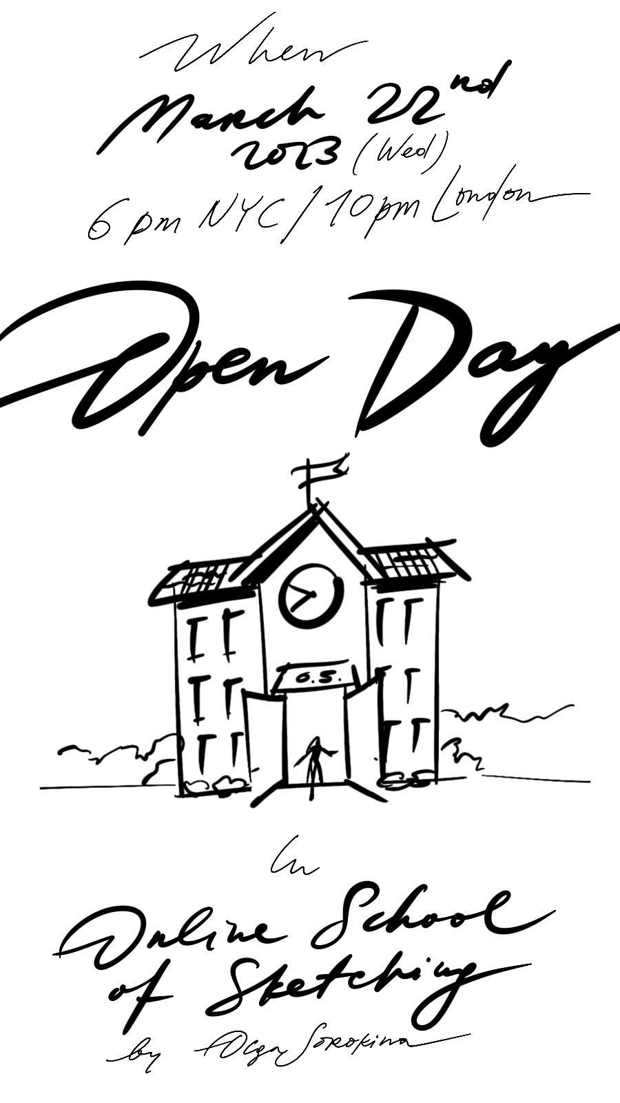
Open Doors Day in Online School of Sketching by Olga Sorokina


Welcome you to a very special day for me — an Open Doors Day in my Online School of Sketching!

So you could get a taste of what it’s like — to study interior sketching with me.


What the program of the day looks like:

Q&A live stream on Instagram @schoolofsketching

Where I will be:

  • Answering your questions

  • Reading a chapter from my book “The SKETCH. Interior Design Drawing” (Amazon link

  • Plus you will be able to watch free previews from my online courses on interior sketching


SAMPLE LESSONS FROM MY ONLINE COURSES:

From Online course “BASE”: click

From Online course “Procreate”: click

From Online course "TEXTURES": Essentials of Texturing with Markers in Interior Sketching: click

From Online course “Watercolour in Interior Sketching”: click


DIRECT LINKS TO MY COURSES ON INTERIOR SKETCHING:

“BASE": a Course Which Teaches All the Basic Techniques You Need to Implement Sketching in Your Interior Design Practice
(Perfect if you are a novice in drawing interiors, interior designer, id/architecture student):

click

"PRO": a Deep-Dive into Advanced Sketching Techniques
(For interior designers, architects, or if you've already mastered the basics of interior sketching in my course BASE):

click

“Interior Drawing Magic “: Master Perspective Drawing for Interior Design from Scratch:

click

"TEXTURES": Essentials of Texturing with Markers in Interior Sketching
(For Interior Designers, ID Students, and Those New to Sketching):

click

“PROCREATE“: Basics of Interior Sketching in Procreate in This All-in-One Online Course:

click

”WATERCOLOUR”: Master Watercolour Techniques for Your Interior Design Drawings:

click


Here are some of the drawings made by my students from my online course “Interior Drawing Magic”:


Blog Archive

3 most common fears novice artists have and how to overcome those struggles

Many beginners in drawing in general and interior sketching in particular have certain fears and concerns related to drawing.

Obviously, everyone has their own fears, but they are basically very similar to each other.

My next blog post is going to be about these problems of beginners in sketching, painting and drawing and how to cope with them.

Have inspiring and useful reading!


GET MY PDF LIST OF MATERIALS FOR SKETCHING,

PLEASE ENTER YOUR NAME AND EMAIL IN THE FORM:


Many students write to me that they have never drawn before, so they are afraid to start. Some of them are nervous because they have no art education, while others were drawing 10 years ago and now they think it is too late, that they have forgotten everything, lost their talent, etc. In general, people who are creative by nature are often afraid to start, afraid to go back to drawing, afraid that nothing will work out.

On the other hand, they realize that time flies by without action being taken. It is also common for someone to think that they are not creative at all, but they draw, paint, create and design in their dreams.

What to do with all this and how to get things moving? Let's take it in order.


1. “I am afraid to start drawing as I have no art education”

This is the number one fear, based on my students' letters. Actually, this fear is one of the most popular and most paralyzing fears I've come across among beginners. Speaking specifically to it, I have a very strong and powerful argument. Have you ever heard of the fact that most famous artists didn't go to art schools when they were children, and many of them simply failed to enter the Academy of Arts at the first, second or even third attempt, while many who did enter were expelled from the same Academy for being “untalented” or “unsuitable”?

Most famous artists didn’t go to art schools when they were children, and many of them simply failed to enter the Academy of Arts at the first, second or even third attempt.
 

Names, surnames? How about these, for example: Salvador Dali, Ivan Kramskoy, Vasily Surikov, Konstantin Savitsky, Pavel Filonov, Mikhail Shemyakin... All these brilliant and genius artists were once expelled from the Art Academies. The list can go on and on, if you look deeply into the biographies of the famous artists.

And do you know the story of Auguste Rodin, for instance? He tried three times, three times (!) to enter the École des Beaux-Arts in Paris, but each time he failed, which made his father furious and shouting that Auguste was completely untalented and would never achieve anything in art.

Auguste Rodin tried three times to enter the École des Beaux-Arts in Paris, but each time he failed, which made his father furious and shouting that Auguste was completely untalented and would never achieve anything in art.
 

Do you really think that art school would have made an artist out of you if you had studied there as a child? That's not a fact. The fact is, you're the one who makes the artist out of yourself. That's all. Definitely art school gives you some basic knowledge and skills in using various materials, but it also depends on the teachers: some can inspire a child to create more, while others simply discourage them from drawing. Fortunately, I have been mostly lucky with teachers: at art school (Children's Art School No. 4 “Alexandrino”), at the Art and Aesthetic Lyceum No. 190 on Fontanka, at the Academy (Saint Petersburg Stieglitz State Academy of Art and Design).

To me, the most important thing about art school is that you practice, that you are surrounded by creativity and people who share your interests from an early age, and that is strength. What subjects did we have in art school?

Painting, drawing, sculpture and art history. By the way, at children's art school (I studied at the Children's Art School No. 4 “Alexandrino”), we only drew in watercolor. I remember that I first tried tempera, gouache and acrylic paint in grade 8 of the Art Lyceum No. 190. I did my first oil painting in 2011, after graduating from Stieglitz Academy, and I tried professional markers for the first time in 2012 (it was Copic and Promarker, as I still recall).

Do you really think that art school would have made an artist out of you if you had studied there as a child? That’s not a fact. The fact is, you’re the one who makes the artist out of yourself. That’s all.
 

Do you know what talents are revealed without any art schools? What bright personalities and amazing styles they have! You can start revealing yourself at 30 or even 40/50/80! I recall now how at my Lyceum (Art and Aesthetic Lyceum No. 190 on Fontanka Street 22) there was a termly review of drawing and painting and how everyone gathered around one girl's drawings and everyone was impressed by her work for its originality, creativity and strength, and our drawing teacher, who said: “This is what a child who is not spoiled by art school is like”. By the way, she is now a successful graphic artist and book illustrator.


2. “I'm afraid it's too late for me to start.”

This is probably the number two fear in terms of frequency. It's a waste of time to think, “Oh, my time is gone, my parents didn't send me to art school as I was a child, now it's too late, I'm already 30/40/70 (insert your own) years old and time is lost, opportunities are lost...”

Of course, it's late, you're not 7 years old enough to enter a children's art school (by the way, I was accepted at 6; as always, I was the youngest everywhere: in art school, school, lyceum, university). Many of today's most famous artists started their careers in their 30s, 40s and later. Take Van Gogh for example, he started at almost 30 and created an incredible number of paintings in less than 10 years, a real legacy to the entire art world. And you're still wondering, "Is it too late to start?"

It’s never too late to learn, it’s never too late to start drawing.
 

I'm a little surprised by the comments "You draw so beautifully, I wish I could draw like you" or "I'll never learn to draw like you", and there are always ellipses at the end. I can't really understand people like that, why should they draw like me when they can express their individuality? Sure, copying is useful (especially the old masters) for training your hand and mastering your technique, but you have your own style, which you need to reveal and develop. Perhaps, sometimes you're just too lazy to spend time drawing and fill those minutes and hours when you could have been drawing by falling down the rabbit hole of social media, losing an hour or so there every day. Start drawing instead, you won't miss anything crucial if you don't look at the newsfeed. The key is to devote your time to drawing, you know? Take your time. Regularly.

You should take a sheet of paper and a pencil and immerse yourself in a different state, a state of art and creativity, rather than consuming an endless stream of information. Why draw like any other artist? Why be like him or her? It feels like something out of adolescence when you want to be like a certain actress or singer. Being yourself is the most interesting thing. Anyway, one day you will miss the real you and “come back” to yourself.

The key is to devote your time to drawing, you know? Take your time. Regularly.
 

I started drawing before I could talk. Just imagine what it would be like if you drew so much. For as long as I can remember, I have been drawing all the time, drawing when I felt bad or sad, drawing when I felt good or happy, drawing at art school, drawing in chemistry and physics classes, drawing when I was on the road. And there have been times in my life when I haven't touched a pencil or paper for a month or even two or three months (which happened, by the way, only after I graduated from Saint Petersburg Stieglitz State Academy of Art and Design) and I have focused entirely on interior design, on drafting or on 3D MAX. It used to literally get me down, physically and emotionally. However, when I feel really down, I start drawing and things gradually get better, that's the magic.


3. “I'm afraid I've forgotten how to draw.”

It is even harder mentally to go back to drawing than to start. The beginner's advantage is that they progress quickly and see their instant growth. But coming back is much more difficult because you used to draw really well, perhaps even went to art school, you were praised, admired and applauded as a talented child, and then, when you come back to drawing after such a "long break" (sometimes several decades), of course, you get enormous self-doubt. Trust me, all artists have a “fear of coming back” to drawing, and I am no exception. And the longer the period of "not drawing", the harder it is.

And you have that chill all over the skin and a thought flashes through your mind: “Oh, is my talent really lost?!”
 

Here's a vivid example from my life, which I would call "The triumphant comeback after summer to painting classes at the Saint Petersburg Stieglitz State Academy of Art and Design”:

Oh, those summer days, the long summer holidays, two whole months, during which not many of students took up paints and brushes, except for pencil sketches and the occasional “scribble”.

And then, in early autumn, you go to your first painting class, confident, satisfied, full of energy, rested and tanned. They put on a beautiful performance with a model and draperies; you take up the brush to create a masterpiece and in the first minute you realize that the brush is somehow strange to hold and you get scared, scared of the feeling that you have forgotten how to paint. And you have that chill all over the skin and a thought flashes through your mind: “Oh, is my talent really lost over the summer?!” And such a chill runs down your spine and a thought flashes through your head: “Oh, is my talent lost over the summer?!” You start to panic, lose your heart in frustration, and nothing seems to be working out. You can barely draw before the break and as the new class starts, you muster up the courage to ask your groupmates, “Guys, am I the only one who feels like I've lost the painting skills over the summer?” And you hear the relieved exclamations and giggles around you: “Huh, I thought it was just me!”, “Yeah, it's me too!” It makes you feel better immediately, and by the end of the second class the brush is running faster and faster across the sheet, the strokes are becoming more agile and confident; the ‘talent seems to be returning”.


What is the lesson here? Well, it is important to go back, it is important to start drawing again, to just start, to take the first step and to do it without criticism, without self-condemnation. Indeed, this is always the hardest part, but afterwards it will immediately get easier and you will be surprised to notice how quickly your rusty wheel of creativity speeds up.

All artists have a fear of coming back to drawing. And the longer the period of “not drawing”, the harder it is.
 

My God, there are so many fears and doubts like this:

The fear that ‘it's not time yet”, the fear-excuse “later, later, when we move in / when my daughter passes her exams / when summer comes and I start drawing”, etc. Fear of comparison and judgment from others is also highly popular. There's one answer to all these fears, and it's both simple and complex - just start drawing and never stop at the first failure. Just keep doing it all the time.

It's really dangerous to put creativity “on hold”, to put your interests and yourself on hold because the further and longer you put it off, the weaker your belief in yourself gets, but the stronger your fear becomes and the harder it will be to overcome later.

There’s one answer to all these fears, and it’s both simple and complex - just start drawing and never stop at the first failure. Just keep doing it all the time.
 

One last point I want to make in this blog post:

Every aspiring sketcher has his or her strengths. Everyone does. The challenge is to develop them. One has a natural talent for painting in watercolor. How many times have I noticed among my students that even if a person has never painted in watercolor before, when they do their first work in watercolor, it is obvious that they have a good feel for the proportions of water and paint and feel this technique instinctively. In others, I've often noticed an amazing sense of color and coloristics. Perhaps you have a special talent for composition, don't you? And what about your innate sense of proportion? Otherwise, you may be a hidden master of watercolor or markers. 

You will never know until you try! Reveal yourself, explore yourself! If you're afraid that you don't have any of that and still suffer from not having an academic education, try to look at your situation from a new perspective: you are not "spoiled" by art school or any other educational system, you are an individual, you are a natural genius. Not having an academic education can also be a strength, depending on how you look at it.

I just recalled the words of my favorite Dali: 

Even at an early age, I acquired the vicious habit of thinking of myself as different from everyone else and behaving differently from other mortals. It turned out to be a gold mine!
— Salvador Dali
 

Creativity shows your identity, your uniqueness. No one will ever draw like you. It's definitely good to copy the masters, to know the techniques, to be surrounded by other creative individuals - that's what classical art education is all about, and that's its strength. The most important thing is not to think about what you've missed or what opportunities you've lost in your life at the moment, but to focus on all the wonderful things you have to discover and learn! Especially nowadays it's so easy to do and you are well aware of it: how many courses both offline and online exist, how many master classes, drawing challenges and contests are held! Get involved in all this! Immerse yourself in creativity.

By the way, join my Free Perspective Drawing Challenge: here

Every aspiring sketcher has his or her strengths. Everyone does. The challenge is to reveal them.
 

It’s important for you to discover your uniqueness, to be who you are by nature, to develop the things that are in you and above all you need to stop focusing on this thought that keeps replaying in your head: “Why didn't I start studying earlier? Why didn't my parents enroll me in an art school? Why did I decide to enter the wrong university? Why? Why? Why?” Just change your mind and allow for another thought: "Maybe it's all for the best? Is it even better for me?" And once you have that idea and mindset, attend courses, read art books, join marathons and master classes. Certainly, you don't want to find yourself at the end of your life as someone who has buried their talents in the ground and never used them.

What fears do you have about drawing? What do you think about this post, was it relevant to you, what ideas and thoughts have you come up with? Please share in the comments below, it will be useful to all of us.


P.S. If you liked and found this blog post useful, please share it with your friends on Instagram or Facebook. Thanks a lot!


© Olga Sorokina


Check my online drawing courses:


Read other articles on my blog:

Top 10 factors that affect the cost of an interior sketch

I often got asked by novice sketch artists how much to charge for a sketch, what affects the cost of the sketch, and so on?

In this article, I will share with you ten factors that I see as important when pricing your interior drawing.

Happy reading!

My 5-hour long interior drawing. If you want to learn more about the drawing process, watch this video on my YouTube.


I have highlighted for you the top ten factors that I think about before starting on a new commission:

 
  1. If a client orders a series of sketches VS only one sketch (I usually offer a 30% discount if there are more than 3 sketches in one order)

  2. Format (most popular are A4 and A3 if you draw analog), the bigger — the more expensive.

  3. Sketch in pencil or sketch in colour (to me, colouring part is the easiest since the perspective is done in the drawing part)

  4. Drawing from a reference photo/3D model image or the need to build perspective from using furniture layouts/sections/any drafts with dimensions (as it takes quite a while!)

  5. More than 3 major edits (that's why it is very important to correctly discuss brief so in a hand rendering nothing will be missed)

  6. Interior style: it depends if we’re talking about minimalism/high-tech or Italian classics as the latest consumes more time due to profound details.

  7. Urgency, if your customer needs the sketch «yesterday» or in 24 hours then you can add 30-50% to the cost of your sketch

  8. Drawing of a fragment of an interior (for ex: a free-standing piece of furniture, curtains design) or a sketch of an entire interior in perspective

  9. If your customer does not allow the publication of the final sketch on your social media or portfolio

  10. Commercial use of the sketch: whether the designer will use the drawing for commercial purposes (for ex, booklets, magazine cover, etc); this is usually negotiated with each client individually.

Plus, I highly recommend jumping on a zoom/Skype call with your client (even a quick 15 min call will work!) to make sure you understand each other correctly, plus it builds beautiful personal relationships.

Please keep in mind these factors next time you do a sketch commission, Clients differ, with some the work is a piece of cake and with some, it might take too much of your time and energy. Know your hourly rate and never under-charge your services!


I dive deeper on the topic and showing you some examples of my analog and digital sketch commissions in my latest Instagram live stream, worth checking out: here


P.S. I hope these tips were of help to you, my dear creatives. May I ask you to share this blog article on your social media, please? Thanks in advance and good luck with your sketch commissions!


© Olga Sorokina


Want to become a professional sketch artist?

Check out my “BASE+PRO“ Bundle


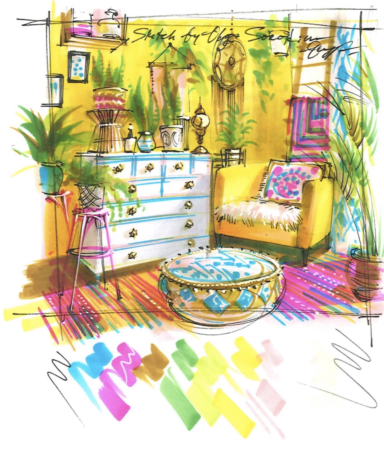
In this video, I share with you the steps of how I created that yellow interior drawing:


Read other articles on my blog:


check my podcast episodes

(MEANINGFUL CONVERSATIONS WITH ARCHITECTS, ARTISTS, AND DESIGNERs)

8 ideas to sketch more often and make your 2023 even more creative

Happy New Year, my dear Creatives!

I know a lot of you wrote your goals and aspirations for the New Year.

But have you set your goals in Sketching?

As for me, I plan to upgrade my skills in watercolour portraits and oil painting.


Here are a couple of sketch ideas to enrich your (and mine!) 2023:

  1. Get yourself a new tiny sketchbook (appx the size of your hand) and make a new habit to take it wherever you go (with a pencil of cause!). You never know when inspiration will find you

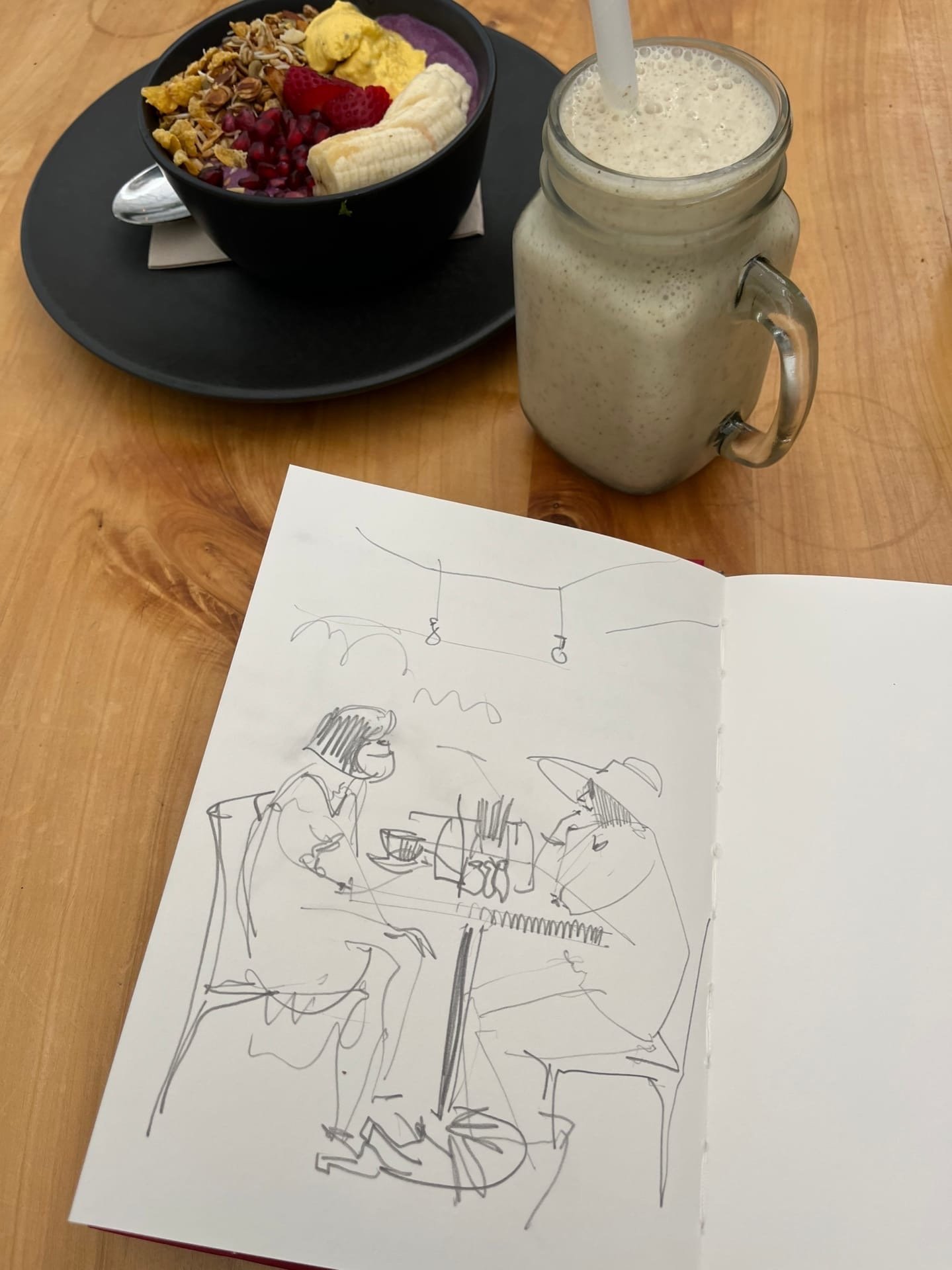
  2. Take your sketchbook and draw from a cafe

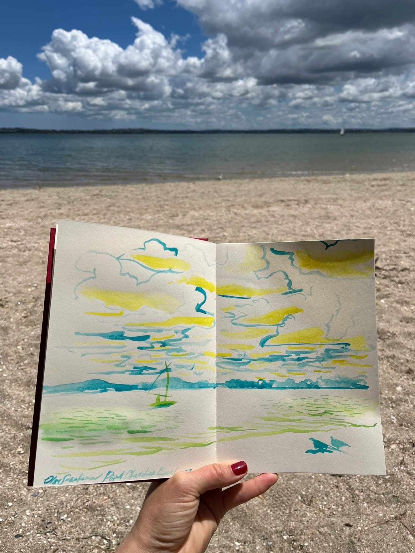
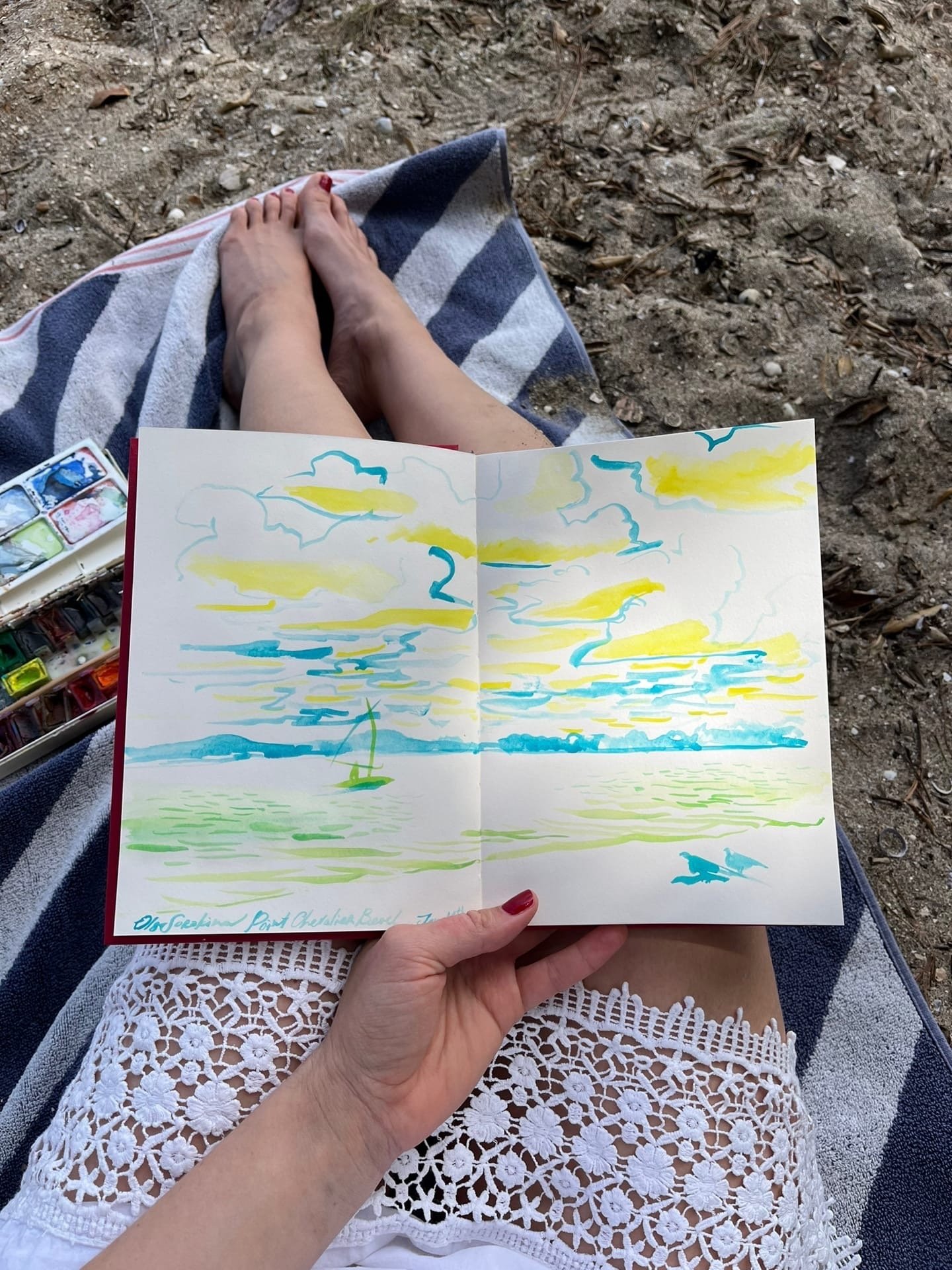
  3. Draw from a new place for you and optionally experiment with your technique (for me it was drawing from a beach today)

  4. Join any free sketching challenge or set it up yourself (Wanna try "sketch a day" for 30 days?) Here for instance you can draw your life for 5 min a day: be that a cup of tea, a car, your hand, or anything that surrounds you

  5. Read a book on sketching/drawing (here is my blog article on top 5 books on perspective drawing)

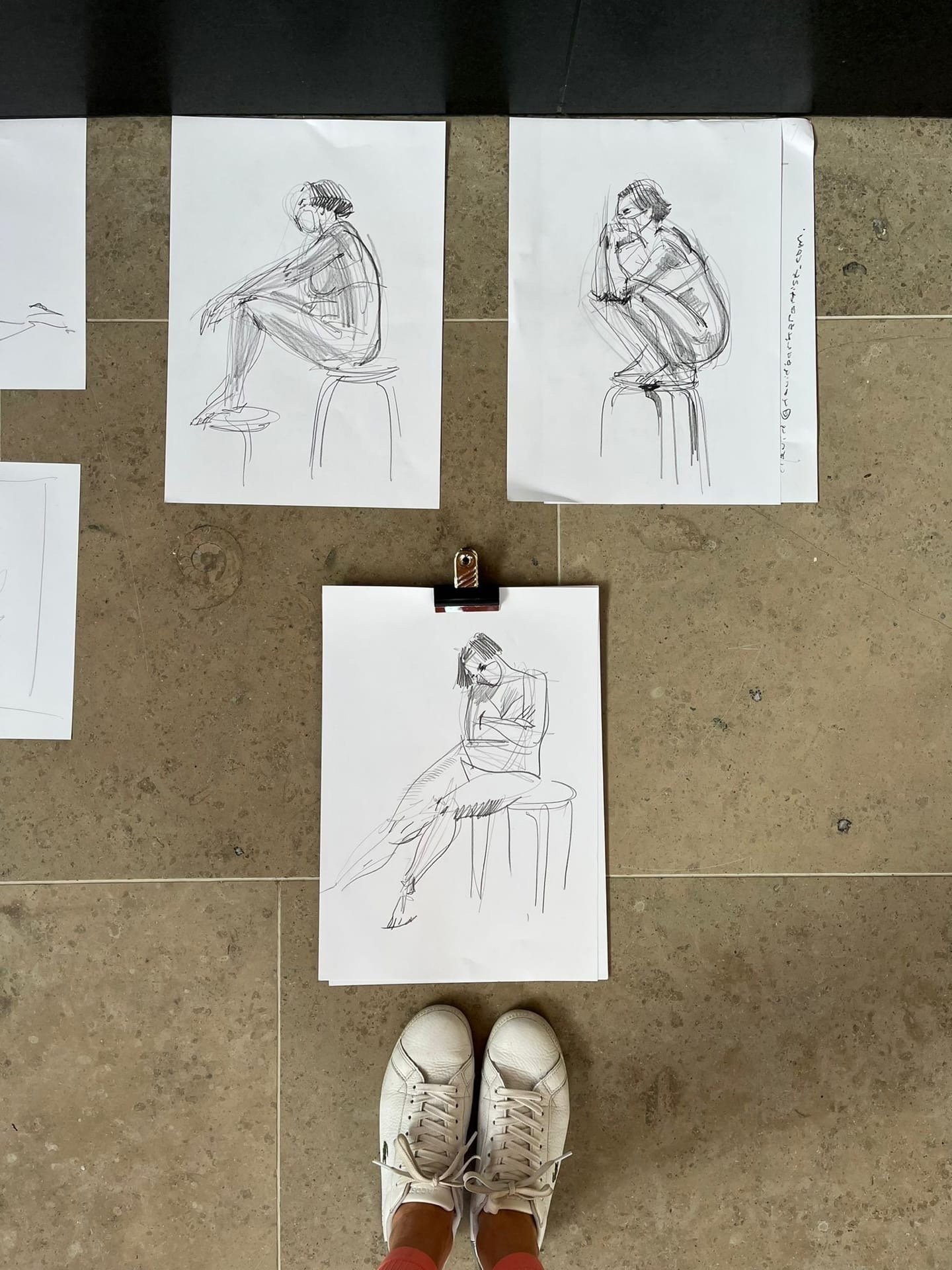
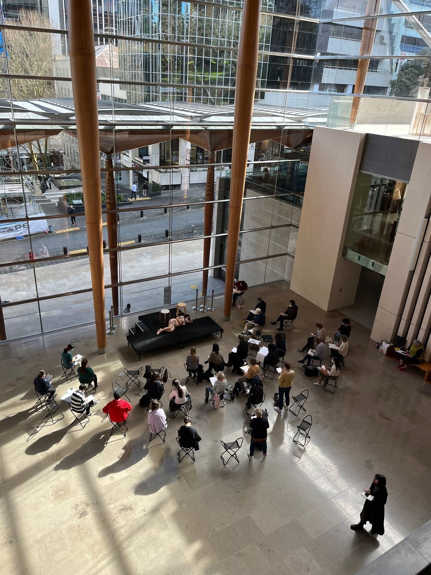
  6. Go to a class on drawing from a live model

  7. Go en pleinair

  8. Take a course on sketching


I talk more about introducing more creativity and sketching into your daily life in my latest Instagram live stream: link

P.S. If you enjoyed this article, please share it, that would mean the world to me.


© Olga Sorokina


read more from my blog:

How to create a great interior design portfolio: 4 cases, top tips, and inspiration

How+to+create+an+interior+design+portfolio

Watch my interior drawing tutorials and tips on id portfolios on YouTube:


Check my latest interior sketches and behind the scenes on Instagram Stories:

Whether you are a beginner in the design world or a mature interior designer, this article can help you with some basic steps in creating your first portfolio; also, you may find here some fresh and exciting ideas for an existing one. Some paragraphs here I took from my best-selling book “The SKETCH“. Enjoy!

P.S. Special “perspective sketh“ gift is waiting for you at the end of the article.


In this article, I will cover:

  • Interior design student’s portfolio

  • Interior designer’s portfolio

  • Interior decorator’s portfolio

  • Portfolio for you to apply for interior design school/college/university

  • Portfolio formats

  • Importance of hand rendering for interior designers

  • Resources (books, examples)


You need a portfolio to show people so that they can see what your design skills are and what your expertise is. It should be professional looking and attractive from a design perspective, yes, but the content is king, never forget about this. That’s why I’m going to be covering here necessary things to include in your interior design portfolio.

To begin with, let’s define your «target audience» as that will affect the content. Who will see your portfolio? Is it an employer, a potential client, or maybe people from interior design college you want to apply? Think about it, and then you can create a killer portfolio that will blow their minds! Remember, your interior design portfolio can actually prove you are a professional without you saying a word! Your portfolio can also set you apart from other designers and present your work in the best possible light. Visuals speak loud, design speaks even louder.

Visuals speak loud, design speaks even louder.
 

1 case: Interior design student’s portfolio

Are you a beginner in the design world? Do you lack experiences? Then in your portfolio, you can show off your school/university assignments that you like, select your best projects that you are most proud of, show your best work. Five to seven projects are usually enough.

Now decide who is your «target audience»? Design School, potential employer, or are you preparing your work for online resources like Behance? Let’s assume that your «target audience» is an employer, here is how the layout and the flow of your portfolio may look like:

  • On the first page of your portfolio, it’s a good idea to include your photo with a resume, and this is a great way to start your portfolio as it gives a great overview of your skills. Make sure to keep your resume to the point and relatively short. Plus, your resume should be visually attractive, take your time and check some design resume templates online (like this one) or create one yourself.

  • Next, continue with your projects (commercial design, hospitality industry, residential projects), then you can include paid projects you did on the side if you have ones. Make sure you have the correct categories displayed. The important thing is to keep everything clean and crisp as it will make your portfolio look professional. You should prove with your beautiful presentation that you are a skillful interior designer.

  • Include pictures of some design boards you have had created because it’s a lot easier to carry around pictures as it shows the work well enough, plus it gives your future employer an excellent overview of your skills.

  • Be sure to demonstrate your technical skills, include your CAD drawings, show that you can draw out and design a plan, add a couple of electrical drawings, and any other special drawings or special skills you may have.

  • Another great idea is to demonstrate the progression of a project from the initial concept to the final design. Here you can show your very first sketches, mood boards, AutoCAD floor plans, and any other mechanical plans, elevations, and 3D renderings. At the very end of the portfolio, you can have your references.

  • If you can sketch and make perspective drawings and hand renderings, include them as well. Clients love hand drafts as this ability to draw makes them think that you’re an Artist. Show your wide range of talents.

Remember, 5 to 7 projects are usually enough for your portfolio, focus on the quantity over quality.
 

TIP 1: If you struggle with hand rendering and want to master interior sketching and perspective drawing, check out my online courses for beginners and for pros.

TIP 2: You might also want to download the list of my favourite marker sets for interior drawing at my Resources page here.


Check my 5-min tutorial to enrich your portfolio with hand rendered furniture plans:


You can get each step of this sketch plan in PDF directly to your email now, simply complete the form below:

 
Interior sketches dramatically enrich your portfolio. Hand drawings are what attract instant attention and sell to your client. Why? Because they appeal to the emotional intellect of your customer.
— Olga Sorokina
Drawing in 1-point perspective from my online course “BASE": a Course Which Teaches All the Basic Techniques You Need to Implement Sketching in Your Interior Design Practice(For Interior Designers & Architects)

Drawing in 1-point perspective from my online course

“BASE": a Course Which Teaches All the Basic Techniques You Need to Implement Sketching in Your Interior Design Practice

(For Interior Designers & Architects)


2 case: Interior designer’s portfolio

Please remember that interior design is not the same as interior decorating, that is the one big mistake people make all the time. Some customers really think that we just select pillow cushions, and blankets, and picking wall colours all day long. To be true, that is about 10% of what we actually do. Interior design is essentially like architecture, in some countries, it’s even called «interior architecture». You can get your diploma in interior decorating in 2-3 years, whereas interior design typically is a four to six-year degree program.

In interior design, you learn about constructions, floor plans, history of interior design, styles, functionality, ergonomics, lighting, colour theory, client communication, building codes, mechanical systems. It’s a lot more than just designing a room. In this article, I will cover the decorator’s portfolio as well, so keep reading.

Well, here, in an interior designer’s portfolio, your «target audience» can be both a potential employer or a client.


First, let’s talk if it is an employer:

Looking for a position in interior design or architecture firm? Your resume, in that case, should cover your educational background, experience, and qualifications. My recommendation is to focus on your professional skills in this type of portfolio.

For example, you can list your skills, such as:

  • AutoCAD/ArchiCAD/Revit/Google SketchUp drafting and rendering

  • 3DS MAX rendering + Vray

  • Sketching and hand rendering

  • Construction management, etc

It’s also a good idea to demonstrate a progression of a project from the concept to the final design, show your sketches, sample design boards, floor plans, and any other mechanical plans, elevations, and final 3D renderings.

interior design portfolio blog

Now, let’s talk if it is a client and if you already have some experience:

Your resume here can cover not only your experience, educational background, and qualifications but also your design philosophy. Remember to add contacts or your business card.

Include client recommendations if you have any, remember, that testimonials work better than anything.

Show what your customer wants, if he came to you for a residential project, show him your completed projects of apartments, studios, duplexes, houses, etc. I mean, at least 80% of your portfolio should be residential, the other 20% you can make commercial if you wish.

Try to include real photos, not only 3D renderings, layouts, mood boards, and drawings, as photos of completed projects will dramatically enrich your portfolio and gain the trust of the customer. Every time you finish a project, hire a photographer or a friend of yours who can take professional photos of your accomplished interior.

Focus on visuals: photos, 3D views, hand renderings, and sketches; clients love it. Try not to overwhelm your customer with technical drawings and AutoCAD layouts; the majority of them won’t understand all that stuff.

Include project location with its start and completion dates, describe the client’s directive. Keep it short and sweet. You can use here «before» and «after» photos.

If you have any publications in interior design magazines, design awards — wonderful, include them as well. Add certificates and any other documents that show your accomplishments.

Focus on visuals: photos, 3D views, hand renderings, and sketches; clients love it.
 
Here I used Chartpak and Copic markers. Learn about my online course “TEXTURES“: a Beginner Course on Essentials of Sketching with Markers(For Interior Design Students and Those New to Sketching)

Here I used Chartpak and Copic markers. Learn about my online course

“TEXTURES“: a Beginner Course on Essentials of Sketching with Markers

(For Interior Design Students and Those New to Sketching)


You want to sell with your portfolio your creative services and your expertise. Remember that the best interior designer with the worst sales skills will never have as much business as the worst interior designer with the best sales skills. Think about what your client really wants and needs and how you are going to be able to deliver on those wants and needs. How will he benefit from you rather than the other interior designer? What value do you bring to the table?

Another important thing is to keep your portfolio up-to-date, so check it once a year or every other year and delete some outdated projects and include your new designs. If you don’t want to offer it, don’t show it, let it be your mantra for the portfolio creation process. I mean, if your goal is to work on restaurants and hotels in a contemporary style, don’t show your clients examples of residentials in classic.

The best interior designer with the worst sales skills will never have as much business as the worst interior designer with the best sales skills.
 

3 case: Interior decorator’s portfolio

So you are a brand new interior decorator, and you don’t have a portfolio built up yet. Let’s assume that your «target audience» is a potential customer. If you have not yet been able to do your first real design project, my advice is to create an imaginary one, but following all the steps of a real project.

You can include some educational projects you’ve done, such as private, commercial, hospitality interiors. The simplest and fastest way to fill in your portfolio with projects is to create mood boards. It’s not the most sustainable option, but if you are on a deadline, it can be the most effective solution for you. Visuals speak loudly, they really do, people love to see visuals! Why do you think Instagram and Pinterest are so popular these days?

If you don’t want to offer it, don’t show it.

Spend a couple of days and create mood boards for imaginary clients; for example, dream up a studio apartment for a young couple, a living room for an architect, an apartment for fashion designer, and so on. Create all sorts of rooms and spaces for whoever you can dream up. Take it seriously, think about these people and what their lives are. What you envision their space to be? Create a bunch of mood boards and put those on your portfolio.

A great idea would be to accompany those mood boards with floor plans to show your technical skills and knowledge of ergonomics. A huge benefit to doing that is that you can nail down your process so you can know how much time it takes you, so in a situation with a real and not fake client, you know how to charge properly for your expertise.


Dream to draw interior sketches like a pro?

Watch sample tutorial from my online course “BASE“:


4 case: Portfolio for you to apply for interior design school/college/university

You need a good portfolio to get accepted into interior design school or university. Usually, you have to have good grades as well because it’s a competitive program.

In this case, your «target audience» is, as you can probably guess, the selection committee. First, I would recommend checking their website; most programs will have a list of requirements that they would like to see.

They want it clean and simple, just show your artistic abilities so that these people know that you do have some sort of design background. The main thing here is to practice your perspective drawing (especially one and two-point perspective), floor plan drafting. Check my free online challenge where I cover the basics of a one and two-point perspective.

My marker drawing on A4 format

My marker drawing on A4 format


Usually, you had to go for an interview and show them pieces of artwork, life drawings, classic still-life drawings, maybe Photoshop collages, you have to show your artistic abilities and that you could drop. Just collect your art pieces, take photos of them. You can simply create a digital portfolio in Word or PowerPoint by labelling your art pieces, add sizing and description, for example, 50x60 cm, oil on canvas, name, etc. When entering an interior design school, it is a great advantage that you have those drawing skills.

Remember that each design school’s committee wants the best possible students to study in that school because their successful graduates and their testimonials are their best ads and marketing tools.

Good luck to you if you are currently applying for colleges or universities!


Portfolio format

There are all sorts of portfolio formats:

  • Wire-bound presentations

  • Foam core/foamboard mounted prints

  • Video presentations

  • Digital version (link to iCloud or Google Drive doc, PDF version)

  • Online portfolio on your website (check these examples)

If you choose a printed version, I would recommend horizontal A3 format (it is portfolio classic) as in square, A4, or vertically oriented format you will find that it’s harder to make a good composition and show your projects properly. Make sure you use high-quality images for your portfolio, so they look nice when printed. Use high-quality paper, the feeling even the texture, the feeling in the hands of your portfolio, fonts, and colour brightness matters.

Online or PDF format is so accessible now, it’s eco-friendly, and it’s most significant advantage is that colours look so much deeper and brighter in comparison with the printed version.

You can create your portfolio in Adobe Photoshop, Corel Draw, InDesign, Apple Pages, Keynote, PowerPoint. Select the program you love and feel familiar with it.

Check also Instagram @letsshowitbetter, where Steven shares his tips on presentation boards. Steven and I both were speakers at ArchiMentors Summit, which took place October-November, 2020.


Extra Resources & Inspiration

You might find these links helpful to create the best possible portfolio:

  • Book «Design Portfolios»: link

  • Portfolio examples on Pinterest: link

  • Inspirational examples on issue.com: link

  • Some examples from Behance: link

I believe we, as creatives, can find inspiration pretty much from any sources; it might be a well-design magazine, nice typography, a good book on graphic design, even old-school posters — just look around!


P.S. Well, my creative friend, I hope you enjoyed this article. May I ask you to share it on your social media, please. Thanks in advance and good luck with your portfolio! I’m sure it will look amazing!


© Olga Sorokina


Your # 1 Online Course Which Teaches

All the Basic Techniques You Need to Implement Sketching in Your Interior Design Practice:


HERE IS YOUR SPECIAL GIFT:

MY FREE ONLINE CHALLENGE ON PERSPECTIVE BASICS FOR INTERIOR DESIGNERS

(10K+ PARTICIPANTS)

 
interior sketching olga sorokina.jpg

Read other articles on my blog:


check my podcast episodes

(MEANINGFUL CONVERSATIONS WITH ARCHITECTS, ARTISTS, AND DESIGNERs)


Check new interior drawings on my Instagram:

 @schoolofsketching

Instagram interior design drawing.png

Become a profitable sketch artist: my effective Instagram strategy for client search

Are you are an artist who loves making interior design sketches and wants to make a profit from it, or want to become one? In this article on my blog, I`m going to suggest you my Instagram strategy for client search.

interior drawing markers online course.JPG


Instagram

The number one thing is the great and mighty Instagram. Interior sketching is a visual content, it`s something that people see with their eyes. What platform is usually used for posting beautiful photos? Instagram and Pinterest, of course. This post refers to the first one.

Well, I`ve prepared for you a good strategy and a firm plan of actions:

A new profile

You make a new Instagram account especially for interior sketches and you never post anything else there: no lovely kittens, no food, landscape pictures, or photos of you lying on the beach. There should be only your sketches. Sometimes you can post your photos, but they must be on-topic photos. I mean in those photos you should be drawing your sketches, or for example, attending an interior presentation. All photos in this account must show that you are a professional sketcher but not a hot and beautiful girl or a young mother or an animal lover. You should focus on only one subject: interior sketching and you designing your interior sketches.

Profile description

Here is an example I made for you. Write something like this in your profile:

Profile name: sketchnazakaz ( I don`t know if there is any profile like this on Instagram)

Profile description: I draw make-to-order interior design sketches with markers. Price for a sketch: starting from USD 100. Lead time: 2 workdays. You can write your questions in the direct messages or via Whats up. Contact me today: +7921 1234567

Posts frequency

Post frequency in this account: 1 photo a day. Your stories and live streaming must be about one and the only subject: interior sketching. Tell about your make-to-order designs, your recent works, and what designs you made before, tell what project you are working on now. Tell your followers about your orders and clients and your favorite sketching styles, show your works, etc. I think you got the idea.

Posting Schedule

In a perfect world, schedule your posts at least for the next three days. However, it`s better to make a plan for the whole week. I know, it isn`t easy to make yourself do it, but it`s very important. It doesn`t matter how many followers you have. Even if there are only 16 people and 10 of them are your relatives, you shouldn`t give up. By the way, your posts should appear at weekends as well. Remember, there are no weekends on Instagram. Seven days = seven photos of your sketches. 

Posts with sketches and prices

As soon as you finish one or more make-to-order sketches, post photos or scanned copies of them in your Instagram profile, and don`t forget to mention the price in the description. I think it`s clear that it isn`t a good idea to draw make-to-order sketches for free. And still, if you are a kind and generous one, let me remind you once again: please don`t go altruistic, your time, work, talents, and knowledge must be paid and show a profit. Drawing interior design sketches for free is a discredit to all visual artists.
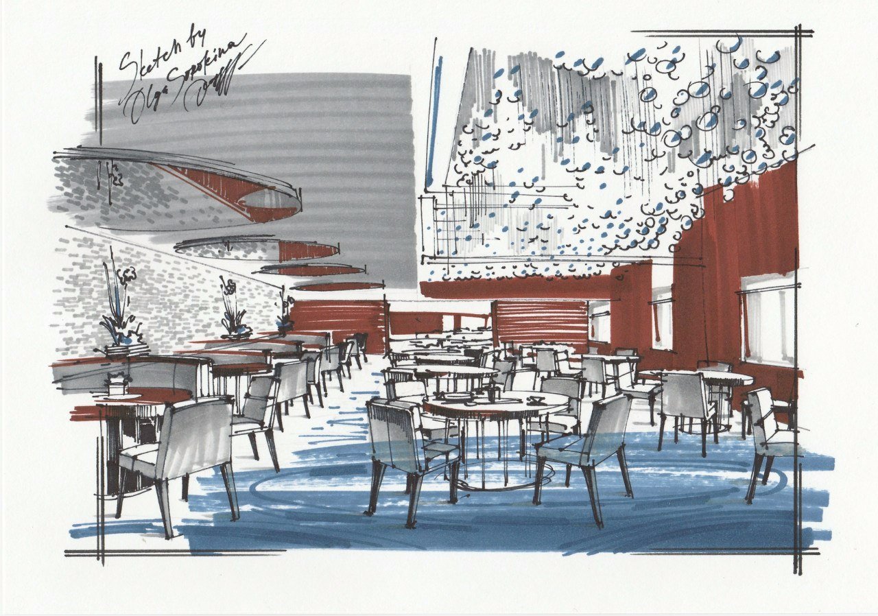
Light in the photo

One more helpful piece of advice: the photos of your works should be taken in daylight at the window or outside or you can scan them for better results. Use Instagram filters to add some brightness and contrast, but don`t overdo with them. 

Hashtags                                                 

If you want to get more eyes on your Instagram posts, I strongly suggest you to use sketching hashtags. Analyze the most popular ones and use from 10 to 20 hashtags with every post. The best 

Hashtags for you could be #sketches #interiorsketches #markerdrawing #maketoordersketching  #interiordesign

Your new profile should be focused on only one thing: sketching and you working on your sketches.
— Olga Sorokina from @schoolofsketching
 

And yes, obviously your Instagram profile must be set to public. Honestly, I was surprised to see too many private accounts where it was written “make-to-order designs” in their bio.  

What then? Who is going to work with those people if nobody can see their drawings?

Is everything clear about Instagram? Did you get inspired? Then go for it, and do it today, right now, don`t lose your longing or you will never get anywhere. As A.S. Pushkin said “the noble promptings of the spirit”. 

In the end, I want to wish you further creative success, new interesting projects, and a long queue of clients! Good luck!

Please let me know if this blog post was useful for you, share your thoughts and ideas in the comments. 

P. S. And what's the main, if this blog post was useful for you and you liked it, please share it with your friends on your social media. Many thanks in advance!

Olga Sorokina


In my online course on interior sketching for beginners (“BASE“, Bonus section) I go over two other magnificent and never-ending sources of eventual clients:

Check the course, click the button:
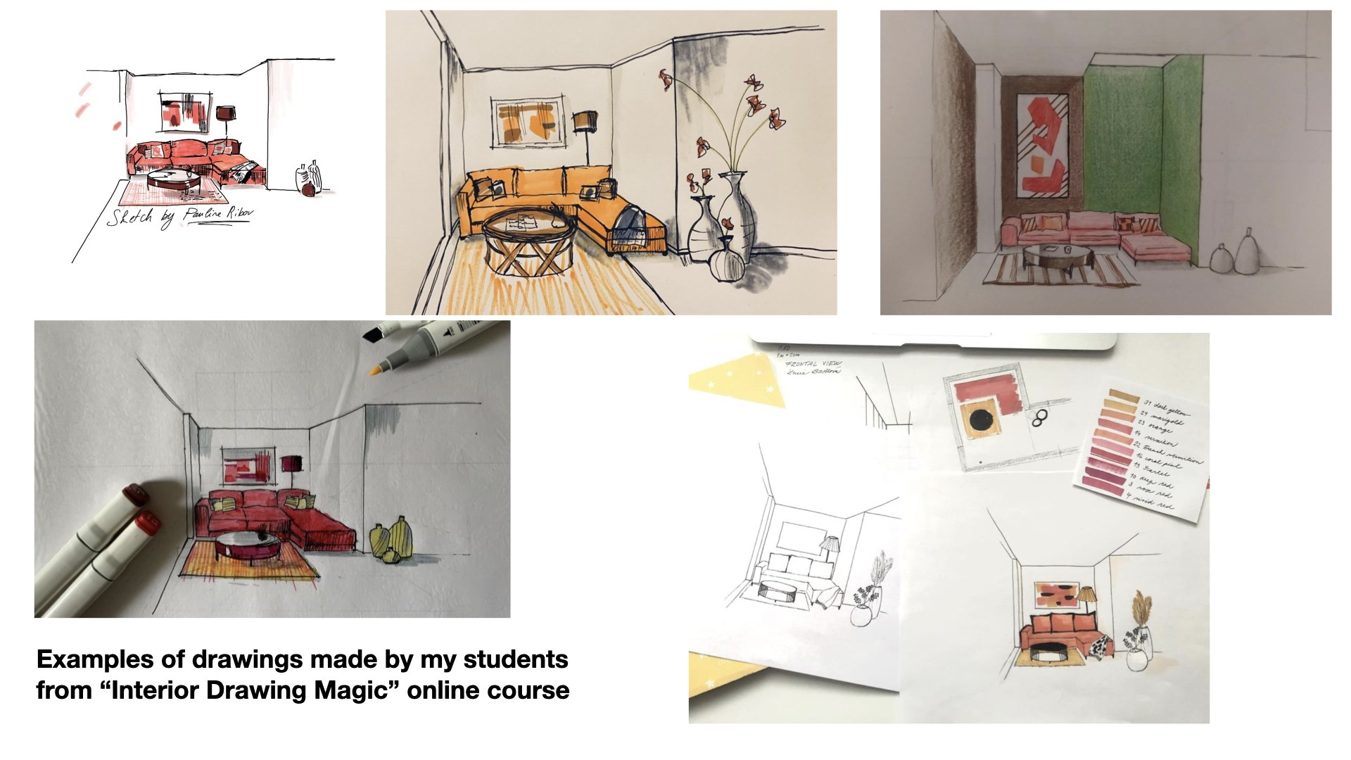

Learn more about my online courses on interior drawing with markers and on iPad:

interior drawing procreate course
 

Top 10 mistakes in interior sketching that can make your drawing look unprofessional


After more than 6 years of teaching interior sketching, I can tell you that I notice the top 10 common mistakes that beginners make that can ruin their sketches, and I’d like to teach you how to avoid every single one of them.

Please take a look at the image below. This is a drawing that I created specifically for this article to illustrate all of the ideas I’m about to share. Sketch to the right is OK; sketch to the left contains all of those 10 mistakes. Surprised? Keep reading and learn more.


I’ve been teaching interior sketching and perspective drawing since 2014, and I can tell you that I can see certain mistakes that not only beginners in sketching but also experienced interior designers make in theirs drawings. These mistakes compromise their professionalism, and I’d love to teach you how to avoid them in this article.

These are basic and very common mistakes that not only beginners in sketching but also interior designers make. Unfortunately, these mistakes can make your sketch look flat and unprofessional or even jeopardize your reputation as a designer.

As a bonus, at the end of this article, I will share my Top 5 free tips for detecting and fixing your mistakes and the biggest secret of interior sketching.

Olga Sorokina


Top 10 mistakes in interior sketching:


Mistake #1: "I like everything equally"

That is when you draw all the elements in your sketch equally detailed and with due diligence. You can thoroughly draw the things that are farther away just as carefully as the foreground objects. And this is a big mistake in interior sketching, as this approach neglects the aerial perspective, and, consequently, the sense of space and air in the sketch is missing. Such drawings can often look plain, "tortured", and overloaded.


Mistake #2: "Focusing on details"

It is especially typical for girls. We can depict, for instance, the texture of velvet with markers so perfectly that it seems realistic. Meanwhile, all the proportions in the drawing go wrong, the composition is far from perfect, and the perspective is completely distorted. But we stubbornly refuse to see the overall picture and continue to draw beautiful copper rivets on the back of our velvet chair.


Mistake #3: "I don't get along with Her Majesty Perspective"

I have already mentioned the critical importance of proper perspective in sketching in my "10 Rules of Sketching", where it even takes the first place.

Distorted perspective works well only for cubists, while in interior sketching, you must know its basics (at least frontal and angular ones) "like the back of your hand". Look here, the lines of the bed, closet, and walls in the "wrong" sketch now converge at some completely different vanishing points, while all the lines in the "right" sketch converge at the vanishing point either on the left (A1) or on the right (A2), or they are just vertical to the heights of the objects. 

In interior sketching, everything depends on the fidelity of construction, so if you were good at perspective and shadow projections at school, it is a great virtue. But if you did not like or study it, I invite you to my free challenge on the basics of perspective for interior designers available here: click.

Please, analyze how the ovals open towards the horizon line in the scene. You can compare the lampshade ovals in both sketches.

In addition, keep an eye out for perspective reduction, as shown in the sketch by the cushions and the middle of the cabinet: the farther the object is, the smaller or narrower it should be.

“Wrong“ sketch with all 10 mistakes in it


Mistake #4: "Drawing on the wrong side of the marker paper without realizing it"

It is a purely technical mistake that is very easy to avoid. Before you start drawing another sketch, try to draw a line with a light gray or any soft beige marker somewhere on the side of the sheet and immediately run your finger over it. If the paint gets smeared, this is the wrong side of the marker paper; if the color is absorbed instantly without being smeared, this is the right side. Why is it so? Manufacturers of marker paper put a special coating on one of the sides, which keeps the marker from seeping through that paper and, thus, saves the consumption of the markers themselves.


Mistake #5: "I'm so terrible at this, please, go easy on me, it's my first time”

This mistake lies in the person's approach to learning new things. And who managed to create something brilliant for the first time? Perhaps it could be Pushkin or Mozart. Oh, how often have I heard that phrase, particularly, by the way, when I held a marathon on the basics of perspective for designers (Instagram hashtag #marafon_olgaart888). Guys, but where is this coming from?! It is so great that you decided to learn something new and were not afraid to "take your first lumps". In such cases, you have to encourage yourself and realize that you'll certainly succeed in it, but not immediately. Far from “immediately”. Be persistent and keep learning.


Mistake #6: "Drawing with ragged lines"

It's a very common mistake. Because of insecurity, the hand trembles, the pencil barely touches the paper making the outline of objects broken, with one long line made up of dozens of shorter ones if you take a closer look. Such sketches just scream: "I'm not a confident sketch! I was drawn by a beginner with a fear of drawing!" What should you do? Develop your skills. This 10-minute video on hand placement exercises can be useful to you: watch.

Have you ever noticed how kids are drawing? They press down very hard on the pencil and draw confident, albeit curved, lines. They're the ones you can learn from for being fearless in learning new things!


Mistake #7: "Applying marker inappropriately"

For the interior sketch to look more realistic, the marker (or any other material, such as a pencil or crayon) should be applied "in shape". For example, in the "right" sketch, the green marker is applied to the walls as if each line tends to a vanishing point (A1 or A2). In the "wrong" sketch, the marker is "hit or miss" which immediately makes the sketch look cut-out, collage, and unnatural. This mistake of hatching "at sixes and sevens" or "in a straw-witted manner" is one of the most common ones made by beginners, many of whom have not yet learned the advantages of a wide marker tip and fail to use its strengths hatching large areas of the drawing with a thin tip.

“Right“ sketch without those mistakes


Mistake #8: "Oops, some problems with textures"

A common problem for beginners in sketching is having difficulty rendering textures (especially wood, glass, and stone): they either work too intensely in this case, ignoring the source and relying on their imagination or depict the texture pattern out of scale, usually by making it very large (see my "wrong" drawing for the parquet as an example: I have depicted a too large wood pattern for this room, in comparison to the "right" drawing). In addition, beginners often draw textures that look unrealistic. For example, a person wants to depict a tree, but it looks more like marble veins or even "ragged worms". In such cases, it's necessary to develop observation skills, do some research on the Internet, and get inspiration. It's essential to have a visual experience. So instead of taking textures from your head and drawing using your imagination at the beginning, use pictures (Pinterest is a good choice) as they can be really helpful. You can find the most popular textures in interior sketching here.


Mistake #9: "The view outside the window in the drawing seems more important than the drawing itself"

If there is a window in the sketch, newbies often start to draw actively the crown of trees using a bright grass color marker so that when someone looks at the drawing, they see nothing but "garish" trees. In such cases, we should remember that what's outside the window is in the far-far background, and in our sketch, we must focus on the foreground subjects. In addition, the thickness of the air outside the window softens all colors and makes them translucent, pale, with a cold grey shade.


Mistake #10: "Your tonality fades: everything is equally grey"

Here it is required to highlight the lightest, darkest, and most middle objects according to the tone in the sketch. It is called "tonal parsing" of the sketch. In this case, it is advisable to train on the monochrome sketches, for example, the ones which are drawn exclusively with grey markers (you can just use three of them: light gray, medium gray, and dark gray). Thus, you will get used to distinguishing the tonality of the scene, for example, a color drawing can turn out bright, all markers will have different colors but the same tone, and as a result, there will be no contrast in the drawing, as if everything is blended into a single spot.


What should you do? 

Here are my Top 5 free tips for detecting and fixing your mistakes:


1) A good idea is to print out your sketch in shades of grey using only a black cartridge and see if you have this problem. If yes, everything will be equally gray on the printout.

2) You can also take a photo of your sketch and judge the result, as this mistake is pretty visible in the pictures in a small format. 

3) You can stand in front of the mirror with your sketch, and the reflection always reveals mistakes better. 

4) Alternatively, you can turn the sketch upside down. The thing is to change the point or angle of view at the sketch since while you are drawing, your eyes "get blurry", and you become blind to your mistakes, repeating them from one sketch to another. 

5) You can squint and look at your sketch, and if everything looks like one single spot, equal in tone, then it's high time you fixed the situation.


By the way, these five tips will work for almost all mistakes since it's just easier to notice them using these techniques.


The biggest secret

Top secret of interior sketching revealed…


The moment you know about all those mistakes, guess what? You can break them!

Take a look at my sketch above. It took me about 5 min to make it; I was drawing almost unconsciously while knowing that I was breaking the rules of perspective. If you take a closer look, you might notice that the convergence lines do not meet in one vanishing point, which would be correct. This is more of a freestyle sketch to quickly express an idea.

Learn the rules like a pro, so you can break them like an artist.
— Pablo Picasso


Finally, one more piece of advice: 

Try to gradually move away from the ruler and eraser and focus on drawing by hand. You should train your hand, while the ruler and eraser are like "crutches" you get used to very quickly and develop a habit of constantly drawing with the ruler. Hand sketches look incomparably more attractive, professional, and lively.


What was your biggest take-away from this blog?

Did you notice any of these mistakes in your sketches?

Let me know in the comments below.


P.S. If you enjoyed this article, please share it, that would mean the world to me.


© Olga Sorokina


Check this video, where I go over 7 of those mistakes which I mentioned here:

Free resources I mention in the video:

  • MY FREE PERSPECTIVE CHALLENGE: here

  • 10 EXERCISES TO TRAIN YOUR HAND: here

  • MY 10 RULES OF SKETCHING: here


SUBSCRIBE TO MY NEWSLETTER

Join the 20,000+ readers who get my most popular blog articles on interior sketching, art, and interesting links delivered to their inboxes every week.

AND GET MY 15+ PAGES SKETCH-PLAN PDF WORKBOOK AS A BONUS:


If you wish to deepen your interior drawing practice, you might be interested in this online course:

"BASE": a Course Which Teaches All the Basic Techniques You Need to Implement Sketching in Your Interior Design Practice


read more from my blog:

Top 5 interior design schools in Europe

Where to study interior design in Europe?

In this article, I will cover top 5 design schools to become a professional interior designer.

  • Do you want to become an interior designer but have no idea which school to choose?

  • Wondering what are the best interior design schools in Europe?

  • Do you want to avoid making the wrong choice of school?

  • Maybe you are over 25 and have decided to change your life direction?

  • Do you dream to make your own conscious choice and follow the path you have always longed for but did not dare (by the way, very often just because of the inability to draw)?

  • Are you worried about making the wrong choice of school?

  • Wondering what are the most prestigious art schools for interior design?

Keep reading to find all the answers.


Interior drawing form one of my online courses, learn more here

I will gladly share my findings on this issue here. I’ve decided to discuss this hot-button topic because a few years ago it also was relevant for me. As many of you know, I moved to Denmark in 2014 and lived there for almost 3 years. One day I got the idea to study for a Ph.D. (this is an analog of our postgraduate studies in Russia) at one of the universities in Copenhagen. In addition, I considered various options of studying in other European cities since in Old Europe everything is relatively close.


In Copenhagen, there is the Royal Danish Academy of Fine Arts, and I was lucky to have there an excursion. I had such an opportunity thanks to my friend’s friend Kai who got there a bachelor's degree in Furniture Design and after 4 years of studying founded his own company where he is successfully engaged in furniture design. I have 6 years of interior design training at Saint Petersburg Stieglitz State Academy of Art and Design. So I asked Kai for an excursion around his alma mater. We walked around the Royal Academy of Fine Arts and looked at the classes. At that time I didn’t know for sure whether I wanted to do a postgraduate course in architecture or art history, therefore, so to say, I was testing the waters. The first thing that caught my eye in the Academy was the gigantic white, neutral and huge spaces of the workshops that differed from ours so much (for example, in Saint Petersburg Stieglitz State Academy of Art and Design there are luxurious interiors in the eclectic style). On analyzing it, I came to the conclusion that that option wasn’t my cup of tea (but despite it I’d also like to note the excellent equipment from projectors and MacBooks to 3D printers – in general, it applies to all universities in Europe). After the excursion, I began to look for options in England and the Netherlands.


By the way, as a rule, everywhere in Europe you will see exactly such academies of art with similar light and minimalist interiors having lots of air and zero decor (perhaps, Italy and France are the only exceptions). There is an expression “walls can teach” which exactly reflects our Russian universities and above all my Stieglitz Academy since we studied being surrounded by incredible interiors, so all this beauty and harmonious proportions were perceived and stored on a subconscious level. Our academy is just our Russian Hogwarts.


Here is a selection of schools I have kept since 2014:

1. England. Central Saint Martins College of Arts and Design in London / CSM (website)

In England, there is a well-known Central Saint Martins College of Arts and Design. Don’t be afraid of the word “college”, it’s a traditional historical name but, in fact, it’s a university. The College is known mainly in the field of fashion design but interior design is studied there as well. An interesting fact is that even those who study interiors are taught topics related to fashion, for example, the creation of a podium and space for holding fashion houses’ fashion shows, salons, and boutiques, i.e., everything that is about the fashion industry, indeed. It is typical for interior designers who graduate from College to stay in the fashion industry. You may also have noticed that interior designers are often interested in clothing design. Sometimes these professions overlap: fashion designers become engaged in the interior and vice versa. I observe such cases all the time. By the way, lots of Russian furniture and interior designers, whose names are often heard, studied at this London College.


2. France. National School of Fine Arts in Paris / Les Beaux-Arts de Paris (website)

Oh, Paris and its École des Beaux-Arts! It’s a famous and one of the oldest Parisian schools of art. It’s perfect, but the only thing that may cause problems is that students are taught exclusively in French. That’s why I had to reject it at once. Although I do love languages and learn them with pleasure, I speak English, some Danish (I studied Danish for a couple of years when I lived in Copenhagen), a little Spanish and French, but I wasn’t ready to learn the language for another few years to do a Ph.D. course. Sure, it would be great to know the language of the French enlighteners perfectly, but it takes a great deal of time and effort and needs great motivation. For those lucky ones who speak French, this option is undoubtedly perfect.


3. Italy. Marangoni Institute in Milan / Istituto Marangoni (website)

This institution is the largest private Italian school of fashion and design. It’s based in Milan and is known all over the world. Admission to the Marangoni Institute is a unique opportunity for students from all over the world to get a design education within the walls of a world-renowned educational institution, from where such celebrities as Franco Moschino and Domenico Dolce graduated. By the way, in general, in all Italian universities, senior students are taught in English. Marangoni Institute is an exception: the same education program is provided in both Italian and English. It's amazing, isn’t it?


4. Bergen Academy of Art and Design (website)

Talking about the Nordic countries, Bergen Academy of Art and Design is worth mentioning. It’s much larger and more famous than the one in Copenhagen which I was going to enter. The Academy has high standards of education and is quoted all over the world. So if you prefer Northern Europe, you should consider this option.


5. Design Academy Eindhoven (website)

This is a famous Dutch Academy of Design. In comparison with a lot of major cities in Europe, Eindhoven is a tiny town but it has a huge number of world-class universities. In general, the town is quite popular for any field of study. It is astonishing how such a small country has had such an enormous impact on the world of art – it has created pleiads of artists and left a great mark on the history of art. A huge advantage of this Academy is that the education programs are run by renowned modern designers who directly share their experience and professionalism. 

Interior sketch form one of my online courses, learn more here


SOME ASPECTS REGARDING TUITION FEES IN EUROPE

Concerning payment, there are some interesting nuances. In some universities, foreigners may study for free. It is possible, for example, in German universities, even despite the large entry. But all the options I’ve listed here offer paid education and the price varies from 4,000 to 17,000 euros (for the year 2014 when I did this study, now prices may vary).


Thank you so much for reading the article!

Do you have something to add to my list? Please let me know in the comments below.

If you enjoyed this article, please share it with your friend.

© Olga Sorokina


HAVE YOU READ THESE ARTICLES ON MY BLOG?

My story: how and why I came to interior sketching?

Olga Sorokina designer artist

In this article, I would like to share with you my story on how I came to interior design drawing and what is the main aim of this blog.


How I came to sketching?

In fact, I have never parted ways with it. Drawings, plain-airs, designs, sketches, outlines, drafts – all these have been my close companions all my life. Throughout my education first at the Arts School for Children “Alexandrino” (St Petersburg, Russia), followed by four years at the Arts and Aesthetics School on the Fontanka River and finally six years at the St Petersburg Stieglitz State Academy of Art and Design (Interior Architecture), I was always drawing, perfecting my technique, honing on my skills and hand confidence. I have been studying sketching all my life, and even now, I am continuing to refine my skills almost every day.

Russian Art Academies provide solid foundations, and exceptional old school education, particularly in academic drawing. In Russia, we are very proud of our cultural traditions and systematic in-depth, comprehensive approach to arts education.

Russian Art Academies provide solid foundations, and exceptional old school education, particularly in academic drawing.
 

Contemporary methods, marketing, and brand-building are what I call “complementary options”, something that a designer can learn on his own using the information on the Internet, books, or short courses.

Technology is developing at a very fast pace, new teaching methodologies continue surfacing, but always remember that no skyscraper can be built without proper foundations so the core skills must be solid and comprehensive.

What are the core skills? These are the necessary skills, the understanding of the essence of the subject, acquisition of the faculty of fast learning. For interior design, for instance, it is important to know the history of arts, design principles, ergonomics, materials science, colour theory, understanding of materials, perfect command of perspective and shadow projections, and drawing techniques. If it is fashion design, we need to know surface anatomy, materials, stylization techniques, sewing basics and pattern cutting, etc.

For interior designers, it is important to know history of arts, design principles, ergonomics, materials science, colour theory, understanding of materials, perfect command of perspective and shadow projections, and drawing techniques.
 

Interior sketching is one of the critical components of successful and productive design practice. Masterful command of perspective, rendering, and stylization are the three main skills that you will need to develop to be successful at it. The sketching practice boils down to a certain sum of knowledge and skills, which are essential to professionalism and expertise. Do not be put off if you have never held a pencil in your life. Sketching is a skill that is entirely possible to learn and improve upon. Always rememberer if there is a will — there is a way. 

During my six years at the Stieglitz State Academy of Art and Design, majority of our time was spent on disciplines such as architectural drawing, perspective, academic drawing, designing, modeling (creating paper models of our design projects, “maquettes“), composition and colour series. As you can see, the program was very intensive. That is why the course takes six years to complete, the sixth year being allocated to work on a student's work diploma.

Interior sketching is one of the key components of successful and productive design practice. Do not be put off if you have never held a pencil in your life. Sketching is a skill that is 100% learnable and teachable!
 

In my online courses, I give you the absolute essence of the knowledge required to become a successful practitioner of interior sketching. I adore the aesthetics of freehand rendering. In my opinion, it is a much more natural, fluid, and more vivid way of visual expression of an idea compared to a static dead-looking 3D model that took a vast amount of your time and your nerves to produce.

All painters and designers are, in essence, visual artists, as we constantly work with images. That is why it is so essential for designers to have the ability to create the desired image on paper by hand in a fast and efficient way to demonstrate an idea simply and effectively. Nothing captures your client’s imagination than when you start drawing right before their eyes. 

Sketching is a natural, fluid, and more vivid way of visual expression of an idea compared to a static dead-looking 3D model.
 
interior drawing.jpg

My story

I was in my third year at the Art Academy when computer programs invaded our academic life. As young creatives, we were all completely fascinated by 3D Max, Photoshop, AutoCAD, and it seemed impossible to ignore them when we were preparing our projects. We were given some basic instructions to use these software packages at the Academy, and then some of us kept studying these programs with the help of books and specialized courses. On the whole, a lot of time, effort, and money were spent to master this software.

Incidentally, many students were left dissatisfied when after having spent their money, they felt they did not acquire professional command of the software. It is hardly surprising. This software suits a particular mindset that is characteristic not so much of an artist, but of a technical professional, programmer. Have you noticed that most 3D Max professionals, visualizers, and CAD operators are chiefly men? Perhaps, it is because men are more technically minded.

Have you noticed that most 3D Max professionals, visualizers, and CAD operators are chiefly men? Perhaps, it is because men are more technically minded.
 

Over time, these programs started to supersede hand rendering. During my last year at the Academy, I was working on my diploma, and in parallel, I was freelancing as a designer for a prominent firm. I regret to admit that I found myself drawing less and less, increasingly becoming a manager of my project rather than a designer. I felt let down, and I was questioning if my chosen profession was no longer the right thing for me. Luckily I was well-trained, and I quickly rediscovered the link between my heart, my mind, and my hand; since then, I went on to uninstall all computer-assisted design software. Incidentally, most of my students come to me with this exact problem. Interestingly enough, 80% of my students are women. The fact that you are reading this blog probably indicates that you are at the same crossroads. I am delighted to say that there is a way out, so let’s get on and look at the profession of an interior designer.

interior sketch.jpg

At one point, I noticed that I had given up on drawing. One not so fine days, I realized that I was almost perpetually seated in front of my computer, embroiled in a battle with 3D and AutoCAD, that all the time I was googling some sanitaryware, analyzing business proposals and quotations and had completely given up on the creative side of things. It just hit me: “Did I spent six years at the best Russian Art Academy for nothing?! What was the point of it all? Was it even worth it? And what about my talent, my artistic flair?” I had a feeling I was betraying something fundamental within myself. And at that moment, I clearly saw that this was a problem that I had to address immediately.

It just hit me: “Did I spent six years at the best Russian Art Academy for nothing?! What was the point of it all? Was it even worth it? And what about my talent, my artistic flair?”
 

About the same time, I received a call from a friend of mine who asked me if I could give her a few interior drawing classes (Tanya, thank you!). That’s when it dawned on me that lots of designers felt the same way: a desperate lack of free-hand drawing skills which was a key creative component of their work that was missing. I realized that I was not the only one tormented by the problem of being constantly seated in front of a computer.

That was how my first interior sketching course “BASE“ came to life. Soon after, I started to give classes to individual designers from different cities and countries, offering them training on sketching and rendering. After that, I began to give drawing workshops to groups of students, and my online courses were accompanied by live seminars in Moscow and my home town St Petersburg. At the present moment, as I am writing my books, I want to systematize a plethora of information on interior sketching that I am going to distill down to the essential knowledge, to the gist of it all, and represent the material in a clear, understandable and exciting way.

Lots of designers feel the same way: a desperate lack of free-hand drawing skills which is a key creative component of their work which is missing.
 

Little summary

The main message of this article is this: “You Can Do Professional Drawing”! Sketching is a new skill that can be learned and mastered with frequent practice. It is no different from learning a new language or a dance.

You can excel at sketching even if you have never held a pencil in your hands!

This is because interior sketching is 50% mathematics and 50% learnable techniques. In my other article, we will look at various techniques used by some of the best sketching artists, discover what they are and why they are so effective.

My dear Creative, I hope my story inspires you, please tell me yours in the comments below (but first please save your text before posting).

P.S. Please share this article on your social media so more people can learn about sketching. Thanks in advance and good luck with your drawings!

© Olga Sorokina


CHECK PROGRAM FROM MY ONLINE COURSE ON INTERIOR SKETCHING WITH MARKERS FOR BEGINNERS:


Read other articles on my blog:

The 6 principles of two-point perspective in interior sketching

two-point perspective in interior drawing
what is 2 point perspective

In my previous blog article, I covered the principles of one-point perspective in interior sketching.

Today we will talk about the second most used and popular in architecture and interior drawing — the two-point perspective. It is also referred to as an oblique view since here we are viewing the object, interior, architecture from a corner, we literally see that corner.  


So, these 6 principles of two-point perspective in interior sketching are: 

  1. All the diagonals in your drawing recede either to one or the other vanishing point.

  2. All vertical lines are perpendicular to the horizon line

  3. There are no horizontal lines except for the horizon line and the lines of the objects which are precisely at its high

  4. The closer the pieces of furniture or decor elements to us, the more details we can see.

  5. All objects decrease in size as they recede into the distance.

  6. All furniture and other interior design elements along the converging lines (or the lines of convergence) become foreshortened.

Perspective is the key to what you see in our 3D world. Mastering perspective will improve your sketching skills and make your drawings look professional.
— Olga Sorokina
 
My interior drawing in two-point perspective and oblique view grid from THE CLUB

My interior drawing in two-point perspective and oblique view grid from THE CLUB


Resources:

  • I covered the basics of one, and two-point perspectives in my free course, learn more about it here.

  • If you want to dive deeper and become a professional in interior drawing, join my online course BASE.

  • In this lesson of my educational membership platform for interior designers THE CLUB, I cover one-point perspective: link


Read also related blog article: “What is perspective in drawing“.

P.S. My dear Creative, I hope you enjoyed this article, please share it on your social media so more people can learn about perspective drawing. Thanks in advance!

two point perspective in drawing

"BASE": a Course Which Teaches All the Basic Techniques You Need to Implement Sketching in Your Interior Design Practice

(For Interior Designers & Architects)


READ OTHER ARTICLES ON MY BLOG:


© Olga Sorokina, 2020